Use srcset to automatically choose the right image size.
 Sam Dutton [X](https://twitter.com/sw12) [GitHub](https://github.com/samdutton) [Mastodon](https://techhub.social/@samdutton) [Bluesky](https://bsky.app/profile/samdutton.bsky.social) [Homepage](https://samdutton.com)
[Video](https://www.youtube.com/watch?v=SyVKRnusyqM)
According to [HTTP Archive](https://httparchive.org/reports/state-of-images), a
typical mobile web page weighs over 2.6 MB, and more than two thirds of that
weight is images. That's a great opportunity for optimization!
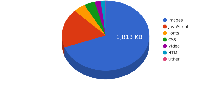 [Average mobile page bytes by content type](https://mobile.httparchive.org/)
## Summary
- Don't save images larger than their display size.
- Save multiple sizes for each image and use the [`srcset`](https://developer.mozilla.org/docs/Web/HTML/Element/img#attr-srcset) attribute to enable the browser to choose the smallest. The `w` value tells the browser the width of each version:
 ## Save images with the right size
You can make your website faster and less data hungry by using images with
dimensions that match the display size. In other words, give images the right
width and height when you save them.
Take a look at the images below.
They appear nearly identical, but the file size of one is more than 10 times
larger than the other.
 Saved width 1000 px, file size 184 KB  Saved width 300 px, file size 16 KB
The first image is much larger in file size because it's saved with dimensions
much larger than the display size. Both images are displayed with a fixed
width of 300 pixels, so it makes sense to use an image saved at the same
size.
**For fixed widths, use images saved with the same dimensions as the
display size.**
## But... what if display size varies?
In a multi-device world, images aren't always displayed at a single fixed size.
Image elements might have a percentage width, or be part of responsive layouts
where image display sizes change to fit the screen size.
...and what about pixel-hungry devices like Retina displays?
## Help the browser choose the right image size
Wouldn't it be great if you could make each image available at different sizes, then
let the browser choose the best size for the device and display size?
Unfortunately there's a
[catch-22](https://en.wikipedia.org/wiki/Catch-22_(logic)) when it comes to
working out which image is best. The browser should use the smallest possible
image, but it can't know the width of an image without downloading it to check.
This is where `srcset` comes in handy. You save images at different sizes, then
tell the browser the width of each version:
The `w` values show the width of each image in pixels. For example,
`small.jpg 500w` tells the browser that [small.jpg](https://web.dev/articles/use-srcset-to-automatically-choose-the-right-image/image/small.jpg?auto=format) is 500
pixels wide. This enables the browser to choose the smallest possible image,
depending on the screen type and the viewport size---without having to
download images to check their size.
> [!CAUTION]
> **Caution:** `srcset` gives the browser information about the saved width of each image file. It does *not* specify the size to display the image---you still need CSS for that!
You can see `srcset` in action for the image below. If you're on a laptop or
desktop computer, change your browser window size and reopen this page.
Then use the Network panel of your browser tools to check which image was used.
(You'll need to do that in an Incognito or Private window, otherwise the
original image file will be cached.)

## How can I create multiple image sizes?
You'll need to make multiple sizes available for every image you want to use
with `srcset`.
For one-off images such as hero images you can manually save different sizes. If
you have lots of images, such as product photos, you'll need to automate.
For that there are two approaches.
### Incorporate image processing in your build process
As part of your build process, you can add steps to create different sized
versions of your images. See ["Use Imagemin to compress images"](https://web.dev/articles/use-imagemin-to-compress-images.md.txt)
to learn more.
### Use an image service
Image creation and delivery can be automated using a commercial service like
[Cloudinary](https://cloudinary.com/), or an open source equivalent such as
[Thumbor](https://github.com/thumbor/thumbor) that you install and run yourself.
You upload your high resolution images, and the image service automatically
creates and delivers different image formats and sizes depending on the URL
parameters. For an example, open [this sample image on Cloudinary](https://res.cloudinary.com/webdotdev/f_auto/w_500/IMG_20190113_113201.jpg) and try changing the `w` value or the file extension in the URL bar.
Image services also have more advanced features such as the ability to automate
"smart cropping" for different image sizes and automatically deliver [WebP](https://developers.google.com/speed/webp/) images
to browsers that support the format, instead of JPEGs---without changing the file
extension.
> [!NOTE]
> **Note:** You can check the format delivered using your browser tools. For the image URL above, a WebP file is automatically delivered to browsers that support WebP, without changing the `.jpg` file extension.

## What if the image doesn't look right at different sizes?
In that case, you'll need to use the `` element for "art direction":
providing a different image or image crop at different sizes. To learn more
take a look at the ["Art direction"](https://web.dev/articles/codelab-art-direction.md.txt) codelab.
## What about pixel density?
High-end devices have smaller (more dense) physical pixels. For example, a
high-end phone might have two or three times as many pixels in each row of
pixels as a cheaper device.
That can affect the size you need to save your images. We won't go into the gory
details here, but you can find out more from the
["Use density descriptors"](https://web.dev/articles/codelab-density-descriptors.md.txt) codelab.
## What about the display size of the image?
You can use `sizes` to make `srcset` work even better.
Without it, the browser uses the full width of the viewport when choosing an
image from a `srcset`. The `sizes` attribute tells the browser the width that an
image element will be displayed, so the browser can choose the smallest possible
image file---before it makes any layout calculations.
In the example below, `sizes="50vw"` tells the browser that this image will be
displayed at 50% of the viewport width.
You can see this in action at
[simpl.info/sizes](https://simpl.info/sizeswvalues/) and the ["Specifying multiple slot widths"](https://web.dev/articles/codelab-specifying-multiple-slot-widths.md.txt) codelab.
> [!CAUTION]
> **Caution:** `sizes` gives the browser information about the display width of an image element. As with `srcset` it does NOT specify the size to display the image---you need CSS for that.
## What about browser support?
`srcset` and `sizes` are [supported by over 90% of
browsers globally](https://caniuse.com/#feat=srcset).
If a browser does not support `srcset` or `sizes` it will fall back to just using the `src` attribute.
This makes `srcset` and `sizes` great progressive enhancements!
## Learn more
Take a look at the ["Optimize your images"](https://web.dev/explore/fast#optimize-your-images) section
of web.dev for a deeper dive into image optimization. For a more guided
experience, consider trying the free ["Responsive
Images"](https://udacity.com/course/responsive-images--ud882) course offered by
Udacity.
> [!NOTE]
> **Note:** This post accompanies [**Top tips for web performance**](https://www.youtube.com/playlist?list=PLNYkxOF6rcICVl6Vb-AFlw81bQLuv6a_P): a fortnightly video series showing simple techniques to improve site speed.