
The benefits of using Custom Properties in design systems and component libraries.

I'm Dave and I'm a Senior Front-end Developer at Nordhealth. I work on the design and development of our design system Nord, which includes building Web Components for our component library. I wanted to share how we solved the problems around styling Web Components by using CSS Custom Properties, and some of the other benefits of using Custom Properties in design systems and component libraries.
How we build Web Components
To build our Web Components we use Lit, a library that provides a lot of boilerplate code such as state, scoped styles, templating, and more. Not only is Lit lightweight but it's also built on native JavaScript APIs, meaning we can deliver a lean bundle of code that takes advantage of features the browser already has.
import {html, css, LitElement} from 'lit';
export class SimpleGreeting extends LitElement {
static styles = css`:host { color: blue; font-family: sans-serif; }`;
static properties = {
name: {type: String},
};
constructor() {
super();
this.name = 'there';
}
render() {
return html`Hey ${this.name}, welcome to Web Components!
`;
}
}
customElements.define('simple-greeting', SimpleGreeting);
But the most appealing thing about Web Components is that they work with almost any existing JavaScript framework, or even no framework at all. Once the main JavaScript package is referenced in the page, using a Web Component is very much like using a native HTML element. The only real tell-tale sign that it isn't a native HTML element is the consistent hyphen within the tags, which is a standard to signify to the browser that this is a Web Component.
// TODO: DevSite - Code sample removed as it used inline event handlers
Shadow DOM style encapsulation
Much in the same way native HTML elements have a Shadow DOM, so do Web Components. Shadow DOM is a hidden tree of nodes within an element. The best way to visualise this is by opening up your web inspector and turning on the option to "Show Shadow DOM tree". Once you've done this, try looking at a native input element in the inspector—you'll now have the option to open up that input and see all the elements within it. You can even try this with one of our Web Components—try inspecting our custom input component to see its Shadow DOM.
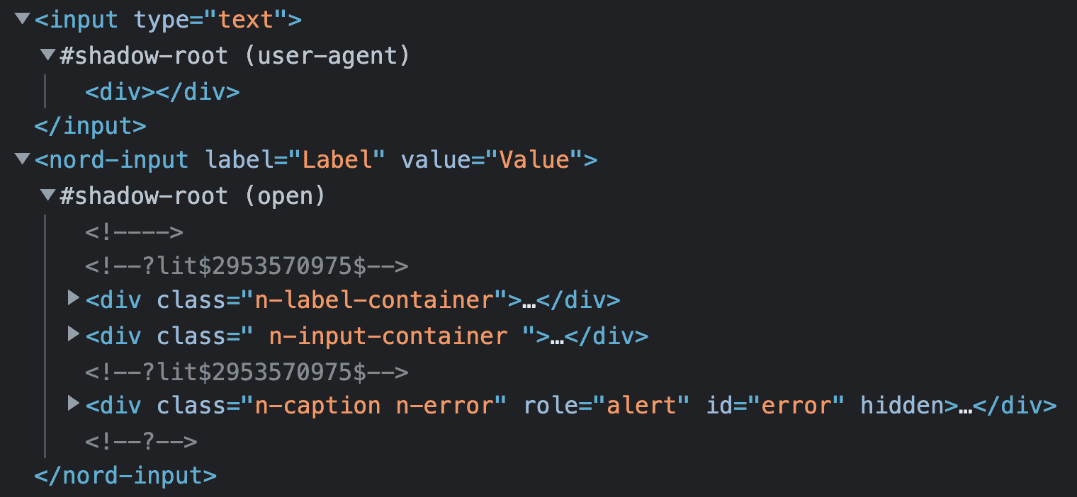
One of the advantages (or drawbacks, depending on your outlook) to Shadow DOM is style encapsulation. If you write CSS within your Web Component, those styles can't leak out and affect the main page or other elements; they are completely contained within the component. In addition, CSS written for the main page or a parent Web Component can't leak into your Web Component.
This encapsulation of styles is a benefit in our component library. It gives us more of a guarantee that when someone uses one of our components, it will look as we intended, regardless of the styles applied to the parent page. And to further make sure, we add all: unset; to the root, or "host", of all our Web Components.
:host {
  all: unset;
  display: block;
  box-sizing: border-box;
  text-align: start;
  /* ... */
}
However, what if someone using your Web Component has a legitimate reason to change certain styles? Maybe there's a line of text that needs more contrast due to its context, or a border needs to be thicker? If no styles can get into your component, how can you unlock those styling options?
That's where CSS Custom Properties come in.
CSS Custom Properties
Custom Properties are very appropriately named—they are CSS properties that you can entirely name yourself and apply whatever value is needed. The only requirement is that you prefix them with two hyphens. Once you've declared your custom property, the value can be used in your CSS using the var() function.
:root {
  --n-color-accent: rgb(53, 89, 199);
  /* ... */
}

.n-color-accent-text {
  color: var(--n-color-accent);
}
When it comes to inheritance, all Custom Properties are inherited, which follows the typical behaviour of regular CSS properties and values. Any custom property applied to a parent element, or the element itself, can be used as a value on other properties. We make heavy use of Custom Properties for our design tokens by applying them to the root element via our CSS Framework, which means that all elements on the page can use these token values, whether that be a Web Component, CSS helper class, or a developer wanting to pluck a value from our list of tokens.
This ability to inherit Custom Properties, with the use of the var() function, is how we pierce through our Web Components' Shadow DOM and let developers have more finegrained control when styling our components.
Custom Properties in a Nord Web Component
Whenever we're developing a component for our design system, we take a thoughtful approach to its CSS—we like to aim for lean but very maintainable code. The design tokens we have are defined as Custom Properties within our main CSS Framework on the root element.
:root {
  --n-space-m: 16px;
  --n-space-l: 24px;
  /* ... */
  --n-color-background: rgb(255, 255, 255);
  --n-color-border: rgb(216, 222, 228);
  /* ... */
}
These token values are then referenced within our components. In some cases, we'll apply the value directly on the CSS property, but for others, we'll actually define a new contextual Custom Property and apply the value to that.
:host {
  --n-tab-group-padding: 0;
  --n-tab-list-background: var(--n-color-background);
  --n-tab-list-border: inset 0 -1px 0 0 var(--n-color-border);
  /* ... */
}

.n-tab-group-list {
  box-shadow: var(--n-tab-list-border);
  background-color: var(--n-tab-list-background);
  gap: var(--n-space-s);
  /* ... */
}
We'll also abstract some values that are specific to the component but not in our tokens and turn them into a contextual Custom Property. Custom Properties that are contextual to the component provide us with two key benefits. First, it means we can be more "dry" with our CSS as that value can be applied to multiple properties inside the component.
.n-tab-group-list::before {
  /* ... */
  padding-inline-start: var(--n-tab-group-padding);
}

.n-tab-group-list::after {
  /* ... */
  padding-inline-end: var(--n-tab-group-padding);
}
And second, it makes component state and variation changes really clean—it's only the custom property that needs to be changed to update all those properties when, say, you're styling a hover or active state or, in this case, a variation.
:host([padding="l"]) {
  --n-tab-group-padding: var(--n-space-l);
}
But the most powerful benefit is that when we define these contextual Custom Properties on a component, we create a sort of custom CSS API for each of our components, which can be tapped into by the user of that component.
<nord-tab-group label="Title">
  <!-- ... -->
</nord-tab-group>

<style>
  nord-tab-group {
    --n-tab-group-padding: var(--n-space-xl);
  }
</style>
The preceding example shows one of our Web Components with a contextual Custom Property changed via a selector. The result of this entire approach is a component that provides enough styling flexibility to the user while still keeping most of the actual styles in check. Plus, as a bonus, we as component developers have the ability to intercept those styles applied by the user. If we wish to adjust or extend one of those properties, we can without the user needing to change any of their code.
We find this approach extremely powerful, not only for us as creators of our design system components, but also for our development team when they use these components in our products.
Taking Custom Properties further
At the time of writing we don't actually reveal these contextual Custom Properties in our documentation; however, we plan to so that our wider development team can understand and leverage these properties. Our components are packaged on npm with a manifest file, which contains everything there is to know about them. We then consume the manifest file as data when our documentation site is deployed, which is done using Eleventy and its Global Data feature. We plan to include these contextual Custom Properties in this manifest data file.
Another area we wish to improve on is how these contextual Custom Properties inherit values. Currently, for example, if you wanted to adjust the colour of two divider components, you'd need to target both of those components specifically with selectors, or apply the custom property directly on the element with the style attribute. This might seem fine, but it would be more helpful if the developer could define those styles on a containing element or even at the root level.
<nord-divider></nord-divider>

<section>
  <nord-divider></nord-divider>
   <!-- ... -->
</section>

<style>
  nord-divider {
    --n-divider-color: var(--n-color-status-danger);
  }

  section {
    padding: var(--n-space-s);
    background: var(--n-color-surface-raised);
  }

  section nord-divider {
    --n-divider-color: var(--n-color-status-success);
  }
</style>
The reason you have to set the Custom Property value directly on the component is because we're defining them on the same element via the component host selector. The global design tokens that we use directly in the component pass straight through, unaffected by this issue, and can even be intercepted on parent elements. How can we get the best of both worlds?
Private and public Custom Properties
Private custom properties is something that has been put together by Lea Verou, which is a contextual "private" Custom Property on the component itself but set to a "public" Custom Property with a fallback.
:host {
  --_n-divider-color: var(--n-divider-color, var(--n-color-border));
  --_n-divider-size: var(--n-divider-size, 1px);
}

.n-divider {
  border-block-start: solid var(--_n-divider-size) var(--_n-divider-color);
  /* ... */
}
Defining our contextual Custom Properties in this fashion means we can still do all the things we were doing before, such as inheriting global token values and reusing values throughout our component code; but the component will also gracefully inherit new definitions of that property on itself or any parent element.
<nord-divider></nord-divider>

<section>
  <nord-divider></nord-divider>
   <!-- ... -->
</section>

<style>
  nord-divider {
    --n-divider-color: var(--n-color-status-danger);
  }

  section {
    padding: var(--n-space-s);
    background: var(--n-color-surface-raised);
    --n-divider-color: var(--n-color-status-success);
  }
</style>
While it may be argued that this method isn't truly "private" we still think this is a rather elegant solution to a problem we were worried about. When we have the opportunity, we'll be tackling this in our components so our development team has more control over component usage while still benefiting from the guardrails we have in place.
I hope you found this insight into how we use Web Components with CSS Custom Properties useful. Let us know what you think and if you decide to use any of these methods in your own work, you can find me on Twitter @DavidDarnes. You can also find Nordhealth @NordhealthHQ on Twitter, as well as the rest of my team, who have worked hard on bringing this design system together and executing the features mentioned in this article: @Viljamis, @WickyNilliams and @eric_habich.
Hero image by Dan Cristian Pădureț