Responsive web design was in many ways a reaction to mobile phones. Before smartphones appeared, very few people seriously considered how websites should look and feel on handheld devices. That changed with the meteoric rise of mobile phones featuring built-in web browsers.
Responsive web design encouraged a mindset that questioned assumptions. Whereas previously it was common to assume that a website would only be viewed on a desktop computer, now it's standard practice to design that same website for phones and tablets as well. In fact, mobile usage has now eclipsed desktop usage on the web.
This responsive mindset will serve you well for the future. It's entirely possible that your websites will be viewed on devices and screens that we can't even imagine today. And this mindset extends beyond screens. Even now people are using devices with no screens to access your content. Voice assistants can use your websites if you are using a strong foundation of semantic HTML.
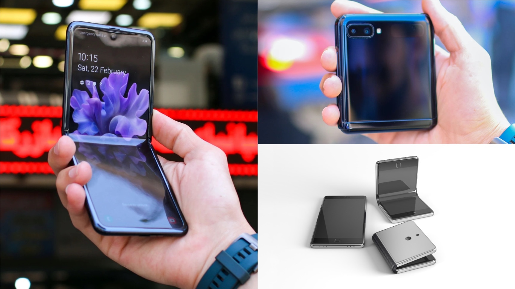
There's experimentation in the world of screens too. There are devices on the market today with foldable screens. That introduces some challenges for your designs.

Dual screens
Users of foldable devices can choose whether they want their web browser to occupy just one of the screens or span across both screens. If the browser spans both screens, then the website on display will be broken up by the hinge between the two screens. It doesn't look great.

Viewport segments
There's an experimental media feature designed to detect if your website is being displayed on a dual-screen device. The proposed name of the media feature is viewport-segments. There are two varieties: horizontal-viewport-segments and vertical-viewport-segments.
If the horizontal-viewport-segments media feature reports a value of 2 and vertical-viewport-segments reports a value of 1 that means the hinge on the device runs from top to bottom, splitting your content into two side-by-side panels.
@media (horizontal-viewport-segments: 2) and (vertical-viewport-segments: 1) {
  // Styles for side-by-side screens.
}
If the vertical-viewport-segments media feature reports a value of 2 and horizontal-viewport-segments reports a value of 1 then the hinge runs from side to side, dividing your content into two panels, one on top of the other.
@media (vertical-viewport-segments: 2) and (horizontal-viewport-segments: 1) {
  // Styles for stacked screens.
}

If both vertical-viewport-segments and horizontal-viewport-segments report a value of 1 this means the website is being displayed on just one screen, even if the device has more than one screen. This is equivalent to not using any media query.
Environment variables
The viewport-segments media feature by itself won't help you design around that annoying hinge. You need a way of knowing the size of the hinge. That's where environment variables can help.
Environment variables in CSS allow you to factor awkward device intrusions into your styles. For example, you can design around the "notch" on the iPhone X using the environment values safe-area-inset-top, safe-area-inset-right, safe-area-inset-bottom and safe-area-inset-left. These keywords are wrapped in an env() function.
body {
  padding-top: env(safe-area-inset-top);
  padding-right: env(safe-area-inset-right);
  padding-bottom: env(safe-area-inset-bottom);
  padding-left: env(safe-area-inset-left);
}
Environment variables work like custom properties. This means you can pass in a fallback option in case the environment variable doesn't exist.
body {
  padding-top: env(safe-area-inset-top, 1em);
  padding-right: env(safe-area-inset-right, 1em);
  padding-bottom: env(safe-area-inset-bottom, 1em);
  padding-left: env(safe-area-inset-left, 1em);
}
For those environment variables to work on the iPhone X, update the meta element that specifies viewport information:
<meta name="viewport" content="width=device-width, initial-scale=1, viewport-fit=cover">
Now your page layout will take up the entire viewport and safely pad the document with device-provided inset values.
For foldable screens, six new environment variables are being proposed: viewport-segment-width, viewport-segment-height, viewport-segment-top, viewport-segment-left, viewport-segment-bottom, viewport-segment-right.

Here's an example of a layout with two columns, one wider than the other.
@media (min-width: 45em) {
  main {
    display: flex;
    flex-direction: row;
  }
  main article {
    flex: 2;
  }
  main aside {
    flex: 1;
  }
}

For dual screens with a vertical hinge, set the first column to be the width of the first screen and the second column to be the width of the second screen.
@media (horizontal-viewport-segments: 2) and (vertical-viewport-segments: 1) {
  main article {
    flex: 1 1 env(viewport-segment-width 0 0);
  }
  main aside {
    flex: 1;
  }
}

Treat dual screens as an opportunity. Perhaps one screen could be used to display scrollable text content while the other displays a fixed element like an image or a map.

The future
Will foldable displays become the next big thing? Who knows. No one could've predicted how popular mobile devices would become so it's worth having an open mind about future form factors.
Above all, it's worth ensuring that your websites can respond to whatever the future may bring. That's what responsive design gives you: not just a set of practical techniques, but a mindset that will serve you well as you build the web of tomorrow.
Check your understanding
Test your knowledge of screen configurations
Which media query targets a foldable device in a split landscape mode?
@media (vertical-viewport-segments: 2) and (horizontal-viewport-segments: 1)@media (vertical-viewport-segments: 2) and (horizontal-viewport-segments: 2)@media (horizontal-viewport-segments: 2) and (vertical-viewport-segments: 1)@media (vertical-viewport-segments: 1) and (horizontal-viewport-segments: 1)What are environment variables? Eg env(safe-area-inset-top)
