HTML element attributes can enhance your <form> and form controls.
Help users fill in form controls
To make it easier for users to fill out forms,
use an appropriate type attribute for your <input> elements.
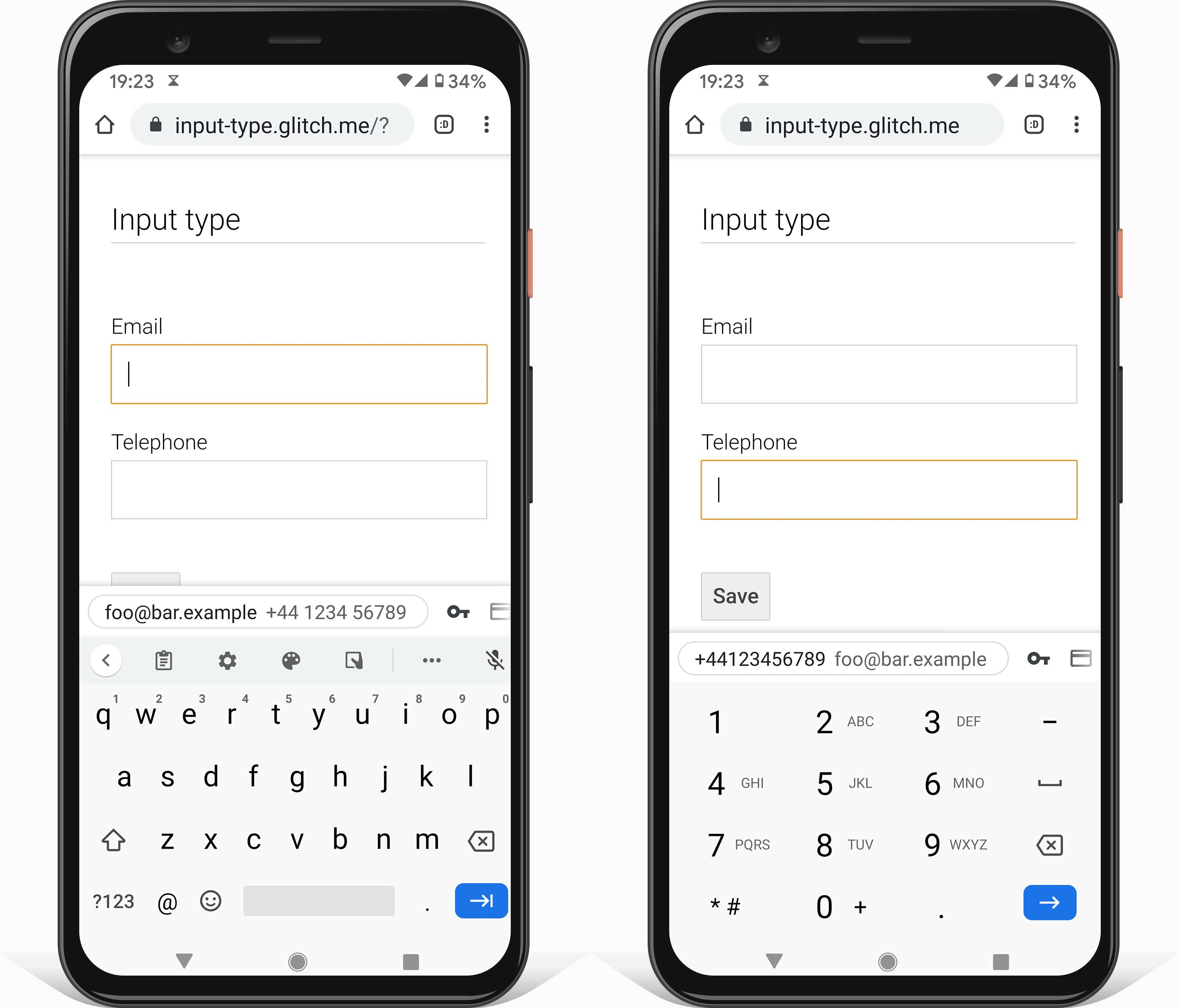
Browsers display a user interface appropriate for the type,
such as a date picker for an <input> of type date.
Browsers on mobile devices show an adapted on-screen keyboard,
such as a telephone number keypad for type="tel".
Some <input> types also change validation rules for an element when its form is submitted.
<input type="url">, for example, is only valid if it's not empty and the value is a URL.
Ensure users enter data
There are different attributes for providing an appropriate on-screen keyboard on touch devices.
The first option is to use the type attribute, as mentioned above.
Another option is the inputmode attribute supported on
Android and iOS.
In contrast to the type attribute, the inputmode attribute only changes the on-screen keyboard
provided, not the behavior of the element itself. Using inputmode is a good option if you want to
keep the default user interface and the default validation rules of an <input>, but still want an
optimized on-screen keyboard.

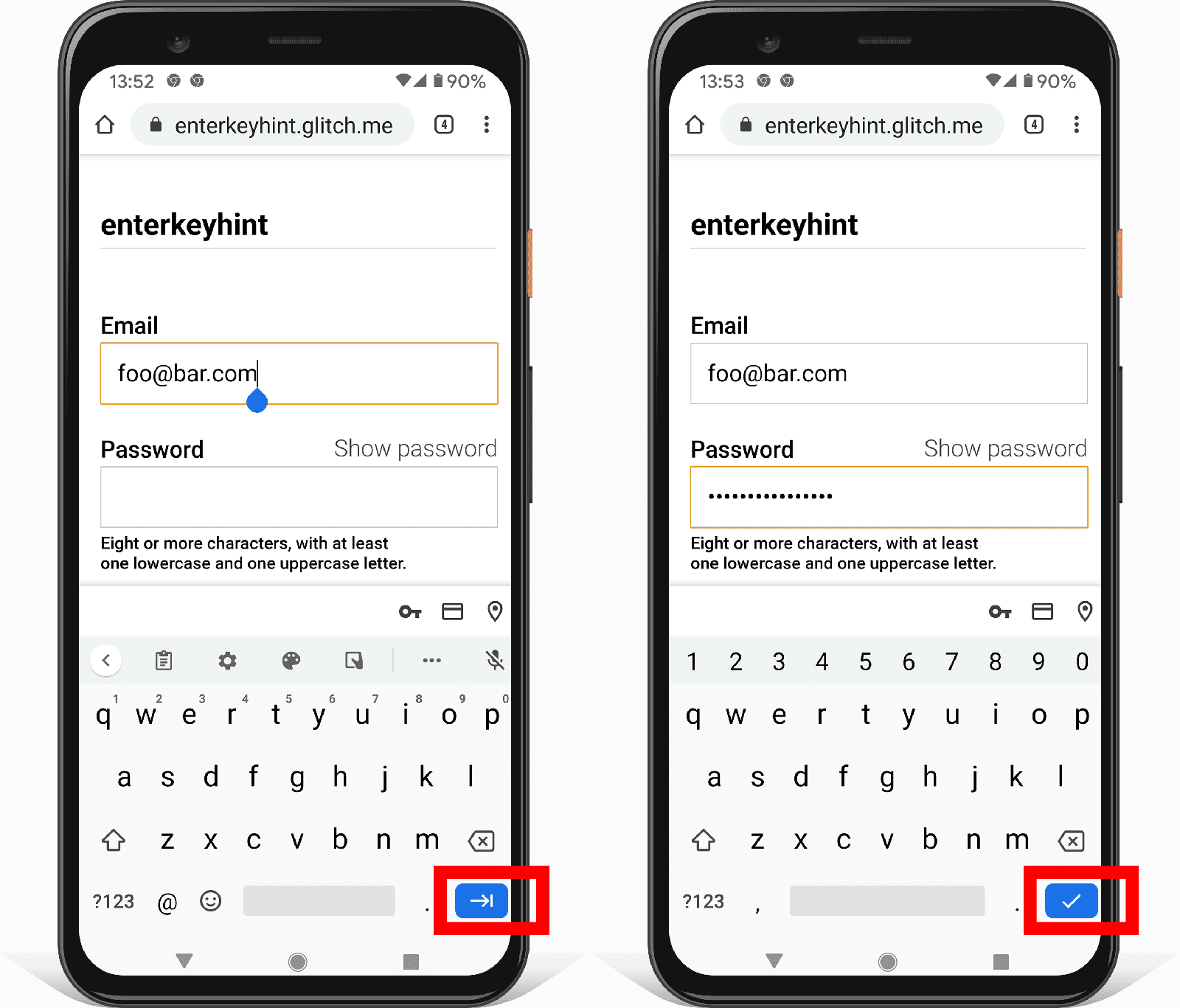
You can change the Enter key on on-screen keyboards with the enterkeyhint attribute.
For example, enterkeyhint="next" or enterkeyhint="done" changes the button label to an appropriate icon.
This helps make it clearer for users what happens when they submit the current form.

Ensure users can submit a form
Say, you fill out a <form>, click the Submit button, but nothing happens.
The issue may be that the button has been disabled with the disabled attribute.
It's a common pattern to disable the Submit button until the form is valid.
In theory this sounds sensible, but you shouldn't disable a Submit button while waiting on complete and valid user input. Instead, highlight invalid data when it's entered, and highlight problematic fields to the user when they submit the form.
However, you may want to disable the Submit button once the form is successfully submitted, but not yet processed. Learn more about disabled buttons.
Help users by showing the data they previously entered
Imagine you have a checkout form with multiple steps.
How do you ensure the previously entered values are still there when the user returns to a previous step?
Use the value attribute to show values already completed.
<label for="name">Name</label>
<input value="Hilda" name="name" id="name" type="text">
There are multiple ways to retrieve the value of a form control in JavaScript.
You can use the
value property, or you can access the value with
getAttribute('value').
There is one big difference,
the value property always returns the current value,
and using getAttribute() always returns the initial value.
Try it out!
Change the text of the name field and watch the console.
Notice how the value property returns the currently visible text,
while getAttribute('value') always returns the initial value.
Learn more about the difference between DOM attributes and DOM properties.
For <input> elements of type checkbox or radio use the checked attribute.
Add it if the user selected an option and remove it otherwise.
Ensure users understand the expected format
The value of the placeholder attribute is a hint for what kind of information is expected.
<label for="name">Name</label>
<input type="text" name="name" id="name" placeholder="Karin">
This may confuse users, as it may seem illogical why a form control appears to be already prefilled. In addition, adding a placeholder can make it difficult to see which form fields still need to be completed. Furthermore, the default style of placeholder text can be hard to read.
In general, be cautious when using the placeholder attribute and never use the placeholder attribute to explain a form control.
Use the <label> element instead.
Learn more about
why you should consider avoiding the placeholder attribute.
A better way to give users a hint about what kind of information is expected is to use an extra HTML element beneath the form control to add an explanation or example.
Ensure form controls are ready for validation
There are various HTML attributes available to activate built-in validation.
Use the required attribute to prevent the submission of empty fields.
Additional validations can be enforced with the type attribute.
For example, the value of a required <input> of type="url" must be a URL.
To ensure a user enters a minimum number of characters,
use the minlength attribute.
To disallow any value with more than a maximum number of characters,
use the maxlength attribute.
For numeric input types such as <input type="number">, use the min and max attribute instead.
Find out more about validation: Help users enter the right data in forms.
Check your understanding
Test your knowledge of form attributes
What attribute can you use to change the label of the Enter key on an on-screen keyboard?
enterkeyenterkeylabelenterkeyhintenterkeytextWhat's the difference between the value property and getAttribute('value')?
value property returns the initial value, getAttribute('value') returns the current value.value property returns the key and value, getAttribute('value') only returns the value.value property returns the current value, getAttribute('value') returns the initial value.