You can fill out a form in many ways. People might use your form on their smartphone while standing in a crowded bus, or with a screen reader, or from an old laptop. Let's see how you can ensure your form works on different devices, and in different contexts.
Ensure your form works for keyboard users
A good first test to ensure your form is accessible is to fill out your form using only your keyboard.
Open your form and try to navigate with the tab key.
Is it clear what form field is currently active?
To help users understand which form field is active,
you can use focus indicators.
Try it out.
Use your tab key to navigate to the input.
Do you see the outline when the input is active?
That's the focus indicator.
You can add focus indicators using the
:focus CSS pseudo-class.
input:focus {
  outline: 4px solid #222;
}
Learn more about designing accessible focus indicators.
Help users navigate your form
Another good test of usability and accessibility is to ensure that the logical tab order follows the visual tab order. How can you test the tab order? Tab completely through your form. Do you notice any illogical navigation jumps? Make sure the DOM order matches the visual order.
Learn more about how to ensure visual order on the page follows DOM order.
Help users complete your form on touch devices
Great! You made sure your form works with the keyboard. Now, let's see how you can ensure it also works on touch devices such as mobile phones.
Open your form on your touch device,
fill in all fields and submit the form.
Did you have to tap multiple times to select a form control?
The issue may be that the tap areas are too small.
Make sure the
tap target size of a button is at least 48px,
and that each <input> and <select> is large enough to tap into.
You can also help users navigate your form on touch devices by adding enough spacing between form controls.
Ensure users get an optimized keyboard
In previous modules, you learned how to activate a different on-screen keyboard
using the type or inputmode attributes.
Open
the demo
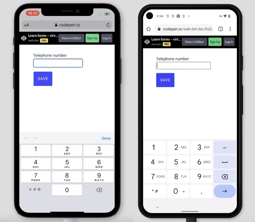
on your phone and tap in the telephone number field.
Notice that numbers are shown by default on the on-screen keyboard,
along with other characters you may need for a telephone number.
Use type="tel" to get an on-screen keyboard optimized for entering telephone numbers.

Use a phone to try it out for yourself,
and see if you can easily enter every character needed to fill in a telephone number.
If you're curious how the on-screen keyboard works for another type, try type="email" in the demo.
Make sure form buttons aren't hidden
Imagine that you filled out a long form,
and you're ready to submit it. But where is the Submit button?
It may be behind the browser toolbar, located at the bottom of the screen.
One way to ensure that buttons are visible is to use the env() CSS function.
Learn how to
ensure buttons aren't obscured by device user interfaces.
Ensure your form works on different platforms
Try to test your forms on as many devices as possible. Have an old laptop? Open the default browser on it and test your form. Your friend has a tablet? Borrow it and test your form there as well.
Does some styling look different in one browser? You can learn how to ensure your styles work across platforms in a later module.
BrowserStack offers free test accounts for open source projects, and Browserling offers a free trial to test on different browsers, devices and operating systems.
Help users complete your forms in different contexts
People don't just use different browsers, devices and operating systems. People also use your forms in different contexts. Try it out! Is the sun shining outside right now? Take your phone and go outside. Using your form in bright light is a good way to test if contrast ratios are usable.
Learn more about color and contrast accessibility.
Ensure your form works with poor connectivity
Say you travel somewhere on a train. You open a web page on your phone. You wonder how loading a website can take so long 😕.
You can simulate slow connections and different network types with WebPageTest or DevTools.
Learn more about testing with low bandwidth and high latency.
Help users use your form when they are on the go
Imagine that you're walking to an appointment. Suddenly, your phone rings, you answer the call, and at the same time, get an alert from your insurance company to complete the application form you started. You open the form, trying to fill it out while still walking and talking.
Remember that people will use your forms in many different contexts. In stressful situations, while doing other things, while on the go. You can help users by ensuring your form is easy to use.
Try setting yourself a time limit to complete your form. Try to simulate imperfect conditions where you can test your form.
Make sure to share test results
Document all tests, and share the results with your team. This will help prioritize action items, to ensure everybody in your team is aware of the most important tasks.
Learn more about sharing test results.
Check your understanding
Test your knowledge of cross-platform testing
Can you show focus indicators only for keyboard users?
:focus-detected.:focus-shown.:focus-visible.Resources
- WebPageTest: Website Performance and Optimization Tests
- Testing with low bandwidth and high latency
- Sharing test results
