The benefit of web components is their re-usability: you can create a UI widget once, and reuse it multiple times. While you do need JavaScript to create web components, you don't need a JavaScript library. HTML and the associated APIs provide everything you need.
The Web Component standard is made up of three parts—HTML templates, Custom Elements, and the Shadow DOM. Combined, they enable building customized, self-contained (encapsulated), reusable elements that can be seamlessly integrated into existing applications, like all the other HTML elements we've already covered.
In this section, we'll create the <star-rating> element, a web component that allows users to rate an experience on a
scale of one to five stars. When naming a custom element, it is recommended to use all lowercase letters. Also, include a dash,
as this helps distinguish between regular and custom elements.
We'll discuss using the <template> and <slot> elements, the slot attribute, and JavaScript to create a template with
an encapsulated Shadow DOM. We'll then re-use the defined element, customizing a section of text, just
like you would any element or web component. We'll also briefly discuss using CSS from within and outside of the custom element.
The <template> element
The <template> element is used to declare fragments of HTML to be cloned and inserted into the DOM with JavaScript. The contents of the element are not rendered by default. Rather, they are instantiated using JavaScript.
<template id="star-rating-template">
  <form>
    <fieldset>
      <legend>Rate your experience:</legend>
      <rating>
        <input type="radio" name="rating" value="1" aria-label="1 star" required />
        <input type="radio" name="rating" value="2" aria-label="2 stars" />
        <input type="radio" name="rating" value="3" aria-label="3 stars" />
        <input type="radio" name="rating" value="4" aria-label="4 stars" />
        <input type="radio" name="rating" value="5" aria-label="5 stars" />
      </rating>
    </fieldset>
    <button type="reset">Reset</button>
    <button type="submit">Submit</button>
  </form>
</template>
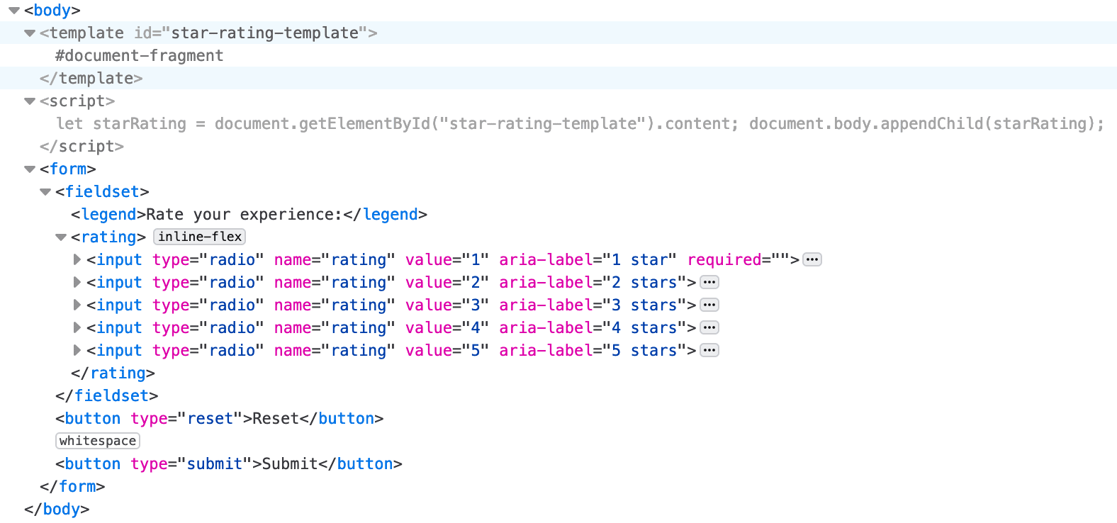
As the contents of a <template> element are not written to the screen, the <form> and its contents aren't rendered.
Yes, this Codepen is blank, but if you inspect the HTML tab, you'll see the <template> markup.
In this example, the <form> is not a child of a <template> in the DOM. Rather, contents of <template> elements are children
of a DocumentFragment returned by the HTMLTemplateElement.content
property. To be made visible, JavaScript must be used to grab the contents and append those contents to the DOM.
This brief JavaScript did not create a custom element. Rather, this example has appended the contents of the <template> into the <body>.
The content has become part of the visible, styleable DOM.

Requiring JavaScript to implement a template for just one star rating isn't very useful, but creating a web component for a repeatedly used, customizable star rating widget is useful.
The <slot> element
We include a slot to include a customized per occurrence legend. HTML provides a <slot>
element as a placeholder inside a <template> that, if provided a name, creates a "named slot". A named slot can be used
to customize content within a web component. The <slot> element gives us a way to control where the children of a custom
element should be inserted within its shadow tree.
In our template, we change the <legend> to a <slot>:
<template id="star-rating-template">
  <form>
    <fieldset>
      <slot name="star-rating-legend">
        <legend>Rate your experience:</legend>
      </slot>
The name attribute is used to assign slots to other elements if the element has a slot attribute whose value matches the
name of a named slot. If the custom element doesn't have a match for a slot, the contents of the <slot> will be rendered.
So we included a <legend> with generic content that is OK to be rendered if anyone simply includes <star-rating></star-rating>, with no content, in their HTML.
<star-rating>
  <legend slot="star-rating-legend">Blendan Smooth</legend>
</star-rating>
<star-rating>
  <legend slot="star-rating-legend">Hoover Sukhdeep</legend>
</star-rating>
<star-rating>
  <legend slot="star-rating-legend">Toasty McToastface</legend>
  <p>Is this text visible?</p>
</star-rating>
The slot attribute is a global attribute that is used
to replace the contents of the <slot> within a <template>. In our custom element, the element with the slot attribute
is a <legend>. It doesn't need to be. In our template, <slot name="star-rating-legend"> will be replaced with <anyElement slot="star-rating-legend">,
where <anyElement> can be any element, even another custom element.
Undefined elements
In our <template> we used a <rating> element. This is not a custom element. Rather, it's an unknown element. Browsers
don't fail when they don't recognize an element. Unrecognized HTML elements are treated by the browser as anonymous inline
elements that can be styled with CSS. Similar to <span>, the <rating> and <star-rating> elements have no user-agent applied
styles or semantics.
Note that the <template> and contents are not rendered. The <template> is a known element that contains content that
is not to be rendered. The <star-rating> element has yet to be defined. Until we define an element, the browser displays it
like all unrecognized elements. For now, the unrecognized <star-rating> is treated as an anonymous inline element, so the content
including legends and the <p> in the third <star-rating> are displayed as they would be if they were in a <span> instead.
Let's define our element to convert this unrecognized element into a custom element.
Custom elements
JavaScript is required to define custom elements. When defined, the contents of the <star-rating> element will be replaced by a
shadow root containing all the contents of the template we associate with it. The <slot> elements from the template are replaced
with the contents of the element within the <star-rating> whose slot attribute value matches the <slot>'s name value, if
there is one. If not, the contents of the template's slots are displayed.
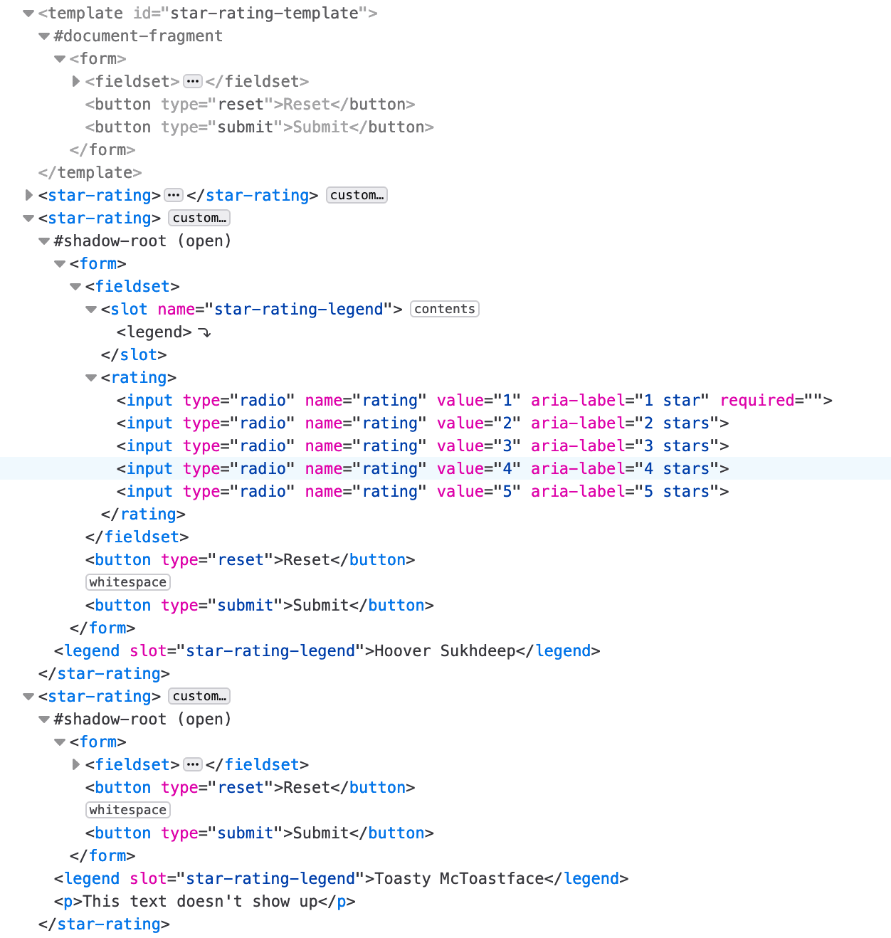
Content within a custom element that isn't associated with a slot—the <p>Is this text visible?</p> in our third <star-rating>—is not included in
the shadow root and therefore not displayed.
We define the custom element named star-rating
by extending the HTMLElement:
customElements.define('star-rating',
  class extends HTMLElement {
    constructor() {
      super(); // Always call super first in constructor
      const starRating = document.getElementById('star-rating-template').content;
      const shadowRoot = this.attachShadow({
        mode: 'open'
      });
      shadowRoot.appendChild(starRating.cloneNode(true));
    }
  });
Now that the element is defined, every time the browser encounters a <star-rating> element, it will be rendered as defined
by the element with the #star-rating-template, which is our template. The browser will attach a shadow DOM tree to the node, appending
a clone of the template contents to that shadow DOM.
Note that the elements upon which you can attachShadow() are limited.
const shadowRoot = this.attachShadow({mode: 'open'});
shadowRoot.appendChild(starRating.cloneNode(true));
If you take a look at the developer tools, you'll note the <form> from the <template> is part of the shadow root of each custom element.
A clone of the <template> contents is apparent in each custom element in the developer tools and visible in the browser, but the contents
of the custom element itself are not rendered to the screen.

In the <template> example, we appended the template contents to the document body, adding the content to the regular DOM.
In the customElements definition, we used the same
appendChild(), but the cloned template contents were appended to an
encapsulated shadow DOM.
Notice how the stars went back to being unstyled radio buttons? Being part of a shadow DOM rather than the standard DOM, the styling within Codepen's CSS tab does not apply. That tab's CSS styles are scoped to the document, not to the shadow DOM, so the styles aren't applied. We have to create encapsulated styles to style our encapsulated Shadow DOM content.
Shadow DOM
The Shadow DOM scopes CSS styles to each shadow tree, isolating it from the rest of the document. This means external CSS doesn't apply to your component, and component styles have no effect on the rest of the document, unless we intentionally direct them to.
Because we have appended the contents to a shadow DOM, we can include a <style> element
providing encapsulated CSS to the custom element.
Being scoped to the custom element, we don't have to worry about styles seeping out to the rest of the document. We can
substantially reduce the specificity of the selectors. For example, as the only inputs used in the custom element are radio
buttons, we can use input instead of input[type="radio"] as a selector.
 <template id="star-rating-template">
  <style>
    rating {
      display: inline-flex;
    }
    input {
      appearance: none;
      margin: 0;
      box-shadow: none;
    }
    input::after {
      content: '\2605'; /* solid star */
      font-size: 32px;
    }
    rating:hover input:invalid::after,
    rating:focus-within input:invalid::after {
      color: #888;
    }
    input:invalid::after,
      rating:hover input:hover ~ input:invalid::after,
      input:focus ~ input:invalid::after  {
      color: #ddd;
    }
    input:valid {
      color: orange;
    }
    input:checked ~ input:not(:checked)::after {
      color: #ccc;
      content: '\2606'; /* hollow star */
    }
  </style>
  <form>
    <fieldset>
      <slot name="star-rating-legend">
        <legend>Rate your experience:</legend>
      </slot>
      <rating>
        <input type="radio" name="rating" value="1" aria-label="1 star" required/>
        <input type="radio" name="rating" value="2" aria-label="2 stars"/>
        <input type="radio" name="rating" value="3" aria-label="3 stars"/>
        <input type="radio" name="rating" value="4" aria-label="4 stars"/>
        <input type="radio" name="rating" value="5" aria-label="5 stars"/>
      </rating>
    </fieldset>
    <button type="reset">Reset</button>
    <button type="submit">Submit</button>
  </form>
</template>
While web components are encapsulated with in-<template> markup and CSS styles are scoped to the shadow DOM and hidden
from everything outside of the components, the slot content which gets rendered, the <anyElement slot="star-rating-legend">
portion of the <star-rating>, is not encapsulated.
Styling outside of the current scope
It is possible, but not simple, to style the document from within a shadow DOM and to style the contents of a shadow DOM from the global styles. The shadow boundary, where the shadow DOM ends and the regular DOM begins, can be traversed, but only very intentionally.
The shadow tree is the DOM tree inside the shadow DOM. The shadow root is the root node of the shadow tree.
The :host pseudo-class selects the <star-rating>, the shadow host element.
The shadow host is the DOM node that the shadow DOM is attached to. To target only specific versions of the host, use :host().
This will select only the shadow host elements that match the parameter passed, like a class or attribute selector. To select
all the custom elements, you can use star-rating { /* styles */ } in the global CSS, or :host(:not(#nonExistantId)) in the template styles. In terms
of specificity, the global CSS wins.
The ::slotted() pseudo-element crosses the shadow DOM boundary
from within the shadow DOM. It selects a slotted element if it matches the selector. In our example, ::slotted(legend) matches our three legends.
To target a shadow DOM from CSS in the global scope, the template needs to be edited. The part
attribute can be added to any element that you want to style. Then use the ::part() pseudo-element
to match elements within a shadow tree that match the parameter passed. The anchor or originating element for the pseudo-element is
the host, or custom element name, in this case star-rating. The parameter is the value of the part attribute.
If our template markup began as such:
<template id="star-rating-template">
  <form part="formPart">
    <fieldset part="fieldsetPart">
We could target the <form> and <fieldset> with:
star-rating::part(formPart) { /* styles */ }
star-rating::part(fieldsetPart) { /* styles */ }
Part names act similarly to classes: an element can have multiple space-separated part names, and multiple elements can have the same part name.
Google has a fantastic checklist for creating custom elements. You may also want to learn about declarative shadow DOMs.
Check your understanding
Test your knowledge of template, slot, and shadow.
By default styles from outside the shadow DOM will style elements inside.
Which answer is a correct description of the <template> element?
