


Browser Support
- 77
- 79
- 75
- 15.4
You can use the loading attribute to lazy-load images without the need to
write custom lazy-loading code or use a separate JavaScript library. Here's a
demo of the feature:
This page walks through the details of implementing lazy-loading in the browser.
Why browser-level lazy loading?
According to the HTTP Archive, images are the most-requested asset type for most websites, and they usually take up more bandwidth than any other resource. At the 90th percentile, sites send over 5 MB of images on desktop and mobile.
Previously, there were two ways to defer the loading of off-screen images:
- Using the Intersection Observer API
- Using
scroll,resize, ororientationchangeevent handlers
Either option can let developers include lazy loading behavior, and many developers have built third-party libraries to provide abstractions that are even easier to use.
With lazy loading supported directly by the browser, however, there's no need for an external library. Browser-level lazy loading also ensures that loading of images still works even if the client disables JavaScript. Note however that loading is only deferred when JavaScript is enabled.
The loading attribute
Chrome loads images at different priorities depending on where they're located relative to the device viewport. Images below the viewport are loaded with a lower priority, but they're still fetched as the page loads.
You can use the loading attribute to completely defer the loading of offscreen
images:
<img src="image.png" loading="lazy" alt="…" width="200" height="200">
Here are the supported values for the loading attribute:
lazy: Defer loading of the resource until it reaches a calculated distance from the viewport.eager: Default loading behavior of the browser, which is the same as not including the attribute and means the image is loaded regardless of where it's located on the page. This is the default, but it can be useful to set explicitly if your tooling automatically addsloading="lazy"when there's no explicit value, or if your linter complains if it isn't explicitly set.
Relationship between the loading attribute and fetch priority
The eager value is an instruction to load the image as usual, without delaying
the load further if the image is off-screen. It doesn't load the image faster
than another image that doesn't have a loading attribute.
If you want to increase the fetch priority of an important image (for example,
the LCP image), use Fetch Priority with
fetchpriority="high".
An image with loading="lazy" and fetchpriority="high" is still delayed while
it's off-screen, and then fetched with a high priority when it's almost within
the viewport. This combination isn't really necessary because the browser would
likely load that image with high priority anyway.
Distance-from-viewport thresholds
All images that are immediately viewable without scrolling load normally. Images far below the device viewport are only fetched when the user scrolls near them.
Chromium's implementation of lazy loading tries to ensure that offscreen images are loaded early enough that they finish loading by the time the user scrolls to them by fetching them well before they become visible in the viewport.
The distance threshold varies depending on the following factors:
- The type of image resource being fetched
- The effective connection type
You can find the default values for the different effective connection types in the Chromium source. You can experiment with these different thresholds by throttling the network in DevTools.
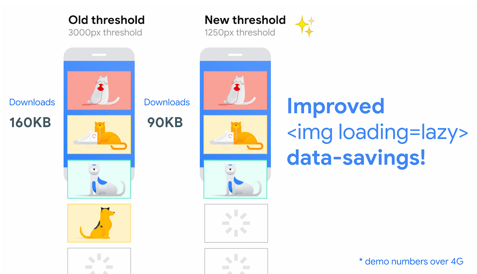
Improved data-savings and distance-from-viewport thresholds
In July 2020, Chrome made significant improvements to align the image lazy loading distance-from-viewport thresholds to better meet developer expectations.
On fast connections (4G), we reduced Chrome's distance-from-viewport thresholds from 3000px to 1250px and on slower connections (3G or lower), changed the threshold from 4000px to 2500px. This change achieves two things:
<img loading=lazy>behaves closer to the experience offered by JavaScript lazy loading libraries.- The new distance-from-viewport thresholds still means images will probably have loaded by the time a user has scrolled to them.
You can find a comparison between the old versus new distance-from-viewport thresholds for one of our demos on a fast connection (4G) below:
Old thresholds versus new thresholds:
and the new thresholds versus LazySizes (a popular JavaScript lazy loading library):

Give your images dimension attributes
While the browser loads an image, it doesn't immediately know the image's
dimensions, unless they're explicitly specified. To let the browser reserve
enough space on a page for images, and avoid disruptive layout shifts,
we recommend adding width and height attributes to all <img> tags.
<img src="image.png" loading="lazy" alt="…" width="200" height="200">
Alternatively, specify their values directly in an inline style:
<img src="image.png" loading="lazy" alt="…" style="height:200px; width:200px;">
The best practice of setting dimensions applies to <img> tags regardless of
whether you're lazy loading them, but lazy loading can make it more important.
Lazy loading in Chromium is implemented in a way that makes images more likely
to be loaded as soon as they're visible, but there's still a chance that
they won't load at the right time. If that happens, not specifying width and
height on your images increases their impact on Cumulative Layout Shift. If
you can't specify your images' dimensions, lazy loading them can save network
resources at the risk of these increased layout shifts.
In most scenarios, images still lazy load if you don't specify dimensions, but
there are a few edge cases you should be aware of. Without width and height
specified, image dimensions default to 0×0 pixels. If you have a gallery of
images, the browser might decide that all of them fit inside the viewport at the
start, because each image takes up no space and no image is pushed offscreen. In
this case, the browser decides to load everything, making the page load more
slowly.
For an example of how loading works with large numbers of images, refer to
this demo.
You can also lazy-load images you've defined using the <picture> element:
<picture>
  <source media="(min-width: 800px)" srcset="large.jpg 1x, larger.jpg 2x">
  <img src="photo.jpg" loading="lazy">
</picture>
Although the browser decides which image to load from any of the <source>
elements, you only need to add loading to the fallback <img> element.
Always eager-load images visible in the first viewport
For images that are visible when the user first loads the page, and especially for LCP images, use the browser's default eager loading so they can be available right away. For more information, see The performance effects of too much lazy-loading.
Use loading=lazy only for images outside the initial viewport. The browser
can't lazy-load an image until it knows where the image should be on the page,
which causes them to load more slowly.
<!-- visible in the viewport -->
<img src="product-1.jpg" alt="..." width="200" height="200">
<img src="product-2.jpg" alt="..." width="200" height="200">
<img src="product-3.jpg" alt="..." width="200" height="200">

<!-- offscreen images -->
<img src="product-4.jpg" loading="lazy" alt="..." width="200" height="200">
<img src="product-5.jpg" loading="lazy" alt="..." width="200" height="200">
<img src="product-6.jpg" loading="lazy" alt="..." width="200" height="200">
Graceful degradation
Browsers that don't support the loading attribute ignore it. They don't get
the benefits of lazy loading, but there's no negative impact from including it.
FAQ
Can I automatically lazy-load images in Chrome?
Previously, Chromium automatically lazy-loaded any images that were well suited
to being deferred if Lite mode
was enabled on Chrome for Android and the loading attribute was either not
provided or set to loading="auto". However,
Lite mode and loading="auto" have been deprecated
and there are no plans to provide automatically lazy-load of images in Chrome.
Can I change how close an image needs to be to the viewport before it loads?
These values are hardcoded and can't be changed through the API. However, they might change in the future as browsers experiment with different threshold distances and variables.
Can CSS background images use the loading attribute?
No, you can only use it with <img> tags.
Can loading work with images in the viewport that aren't immediately visible?
Using loading="lazy" can prevent images being loaded when they aren't
visible but are within the calculated distance.
These images might be behind a carousel or hidden by CSS for certain screen
sizes. For example, Chrome, Safari, and Firefox don't load images using
display: none; styling, either on the image element or on a parent
element. However, other image hiding techniques, such as using opacity:0
styling, still cause the browser to load the image. Always test your
implementation thoroughly to make sure it's acting as intended.
Chrome 121 changed the behavior for horizontal-scrolling images like carousels. These now use the same thresholds as vertical scrolling. This means for the carousel use case, images will be loaded before they visible in the viewport. This means the image loading is less likely to be noticeable to the user, but at the cost of more downloads. Use the Horizontal Lazy Loading demo to compare behaviour in Chrome versus Safari and Firefox.
What if I'm already using a third-party library or a script to lazy-load images?
With full support of lazy loading built into modern browsers, you probably don't need a third-party library or script to lazy-load images.
One reason to continue to use a third-party library alongside loading="lazy"
is to provide a polyfill for browsers that don't support the attribute, or to
have more control over when lazy loading is triggered.
How do I handle browsers that don't support lazy loading? {browsers-dont-support}
Create a polyfill or use a third-party library to lazy-load images on your site.
You can use the loading property to detect whether a browser supports the
feature:
if ('loading' in HTMLImageElement.prototype) {
  // supported in browser
} else {
  // fetch polyfill/third-party library
}
For example, lazysizes is a popular
JavaScript lazy loading library. You can detect support for the loading
attribute to load lazysizes as a fallback library only when loading isn't
supported. This works as follows:
- Replace
<img src>with<img data-src>to avoid an eager load in unsupported browsers. If theloadingattribute is supported, swapdata-srcforsrc. - If
loadingisn't supported, load a fallback from lazysizes and initiate it, using thelazyloadclass to indicate which images to lazy-load:
<!-- Let's load this in-viewport image normally -->
<img src="hero.jpg" alt="…">

<!-- Let's lazy-load the rest of these images -->
<img data-src="unicorn.jpg" alt="…" loading="lazy" class="lazyload">
<img data-src="cats.jpg" alt="…" loading="lazy" class="lazyload">
<img data-src="dogs.jpg" alt="…" loading="lazy" class="lazyload">

<script>
  if ('loading' in HTMLImageElement.prototype) {
    const images = document.querySelectorAll('img[loading="lazy"]');
    images.forEach(img => {
      img.src = img.dataset.src;
    });
  } else {
    // Dynamically import the LazySizes library
    const script = document.createElement('script');
    script.src =
      'https://cdnjs.cloudflare.com/ajax/libs/lazysizes/5.1.2/lazysizes.min.js';
    document.body.appendChild(script);
  }
</script>
Here's a demo of this pattern. Try it in an older browser to see the fallback in action.
Is lazy loading for iframes also supported in browsers?
Browser Support
- 77
- 79
- 121
- 16.4
<iframe loading=lazy> has also been standardized. This lets you lazy-load iframes using the loading
attribute. For more information, see It's time to lazy-load offscreen iframes!
How does browser-level lazy loading affect advertisements on a web page?
All ads displayed to the user as images or iframes lazy-load just like any other image or iframe.
How are images handled when a web page is printed?
All images and iframes load immediately when the page is printed. See issue #875403 for details.
Does Lighthouse recognize browser-level lazy loading?
Lighthouse 6.0 and higher factor in approaches for offscreen image lazy loading that can use different thresholds, letting them pass the Defer offscreen images audit.
Lazy-load images to improve performance
Browser support for lazy loading images can make it significantly easier for you to improve your pages' performance.
Are you noticing any unusual behavior with this feature enabled in Chrome? File a bug!