
A foundational overview of how to build color-adaptive, responsive, and accessible mini and mega modals with the <dialog> element.

In this post I want to share my thoughts on how to build color-adaptive,
responsive, and accessible mini and mega modals with the <dialog> element.
Try the demo and view the
source!
If you prefer video, here's a YouTube version of this post:
Overview
The
<dialog>
element is great for in-page contextual information or action. Consider when the
user experience can benefit from a same page action instead of multi-page
action: perhaps because the form is small or the only action required from the
user is confirm or cancel.
The <dialog> element has recently become stable across browsers:
' d='M96 183a64 64 0 0 1-23-23L17 64a128 128 0 0 0 111 192l55-96a64 64 0 0 1-87 23Z'/%3E%3Cpath fill='url(%23b)' d='M192 128a64 64 0 0 1-9 32l-55 96A128 128 0 0 0 239 64H128a64 64 0 0 1 64 64Z'/%3E%3Ccircle cx='128' cy='128' r='52' fill='%231a73e8'/%3E%3Cpath fill='url(%23c)' d='M96 73a64 64 0 0 1 32-9h111a128 128 0 0 0-222 0l56 96a64 64 0 0 1 23-87Z'/%3E%3C/svg%3E)
' xlink:href='%23A'%3E%3Cstop offset='.76' stop-opacity='0'/%3E%3Cstop offset='.95' stop-opacity='.5'/%3E%3Cstop offset='1'/%3E%3C/radialGradient%3E%3CradialGradient id='F' cx='2523' cy='4680' r='20243' gradientTransform='matrix(-.03715 .99931 -2.12836 -.07913 13579 3530)' xlink:href='%23A'%3E%3Cstop offset='0' stop-color='%2335c1f1'/%3E%3Cstop offset='.11' stop-color='%2334c1ed'/%3E%3Cstop offset='.23' stop-color='%232fc2df'/%3E%3Cstop offset='.31' stop-color='%232bc3d2'/%3E%3Cstop offset='.67' stop-color='%2336c752'/%3E%3C/radialGradient%3E%3CradialGradient id='G' cx='24247' cy='7758' r='9734' gradientTransform='matrix(.28109 .95968 -.78353 .22949 24510 -16292)' xlink:href='%23A'%3E%3Cstop offset='0' stop-color='%2366eb6e'/%3E%3Cstop offset='1' stop-color='%2366eb6e' stop-opacity='0'/%3E%3C/radialGradient%3E%3Cpath id='H' d='M24105 20053a9345 9345 0 01-1053 472 10202 10202 0 01-3590 646c-4732 0-8855-3255-8855-7432 0-1175 680-2193 1643-2729-4280 180-5380 4640-5380 7253 0 7387 6810 8137 8276 8137 791 0 1984-230 2704-456l130-44a12834 12834 0 006660-5282c220-350-168-757-535-565z'/%3E%3Cpath id='I' d='M11571 25141a7913 7913 0 01-2273-2137 8145 8145 0 01-1514-4740 8093 8093 0 013093-6395 8082 8082 0 011373-859c312-148 846-414 1554-404a3236 3236 0 012569 1297 3184 3184 0 01636 1866c0-21 2446-7960-8005-7960-4390 0-8004 4166-8004 7820 0 2319 538 4170 1212 5604a12833 12833 0 007684 6757 12795 12795 0 003908 610c1414 0 2774-233 4045-656a7575 7575 0 01-6278-803z'/%3E%3Cpath id='J' d='M16231 15886c-80 105-330 250-330 566 0 260 170 512 472 723 1438 1003 4149 868 4156 868a5954 5954 0 003027-839 6147 6147 0 001133-850 6180 6180 0 001910-4437c26-2242-796-3732-1133-4392-2120-4141-6694-6525-11668-6525-7011 0-12703 5635-12798 12620 47-3654 3679-6605 7996-6605 350 0 2346 34 4200 1007 1634 858 2490 1894 3086 2921 618 1067 728 2415 728 2952s-271 1333-780 1990z'/%3E%3Cuse fill='url(%23B)' xlink:href='%23H'/%3E%3Cuse fill='url(%23D)' opacity='.35' xlink:href='%23H'/%3E%3Cuse fill='url(%23C)' xlink:href='%23I'/%3E%3Cuse fill='url(%23E)' opacity='.4' xlink:href='%23I'/%3E%3Cuse fill='url(%23F)' xlink:href='%23J'/%3E%3Cuse fill='url(%23G)' xlink:href='%23J'/%3E%3C/svg%3E)
' gradientUnits='userSpaceOnUse'%3E%3Cstop offset='.2' stop-color='%239059ff' stop-opacity='0'/%3E%3Cstop offset='.3' stop-color='%238c4ff3' stop-opacity='.1'/%3E%3Cstop offset='.8' stop-color='%237716a8' stop-opacity='.5'/%3E%3Cstop offset='1' stop-color='%236e008b' stop-opacity='.6'/%3E%3C/radialGradient%3E%3CradialGradient id='ff-g' cx='239.1' cy='34.6' r='171.6' gradientUnits='userSpaceOnUse'%3E%3Cstop offset='0' stop-color='%23ffe226'/%3E%3Cstop offset='.1' stop-color='%23ffdb27'/%3E%3Cstop offset='.3' stop-color='%23ffc82a'/%3E%3Cstop offset='.5' stop-color='%23ffa930'/%3E%3Cstop offset='.7' stop-color='%23ff7e37'/%3E%3Cstop offset='.8' stop-color='%23ff7139'/%3E%3C/radialGradient%3E%3CradialGradient id='ff-h' cx='374' cy='-74.3' r='732.2' gradientUnits='userSpaceOnUse'%3E%3Cstop offset='.1' stop-color='%23fff44f'/%3E%3Cstop offset='.5' stop-color='%23ff980e'/%3E%3Cstop offset='.6' stop-color='%23ff5634'/%3E%3Cstop offset='.7' stop-color='%23ff3647'/%3E%3Cstop offset='.9' stop-color='%23e31587'/%3E%3C/radialGradient%3E%3CradialGradient id='ff-i' cx='304.6' cy='7.1' r='536.4' gradientTransform='rotate(84 303 4)' gradientUnits='userSpaceOnUse'%3E%3Cstop offset='0' stop-color='%23fff44f'/%3E%3Cstop offset='.1' stop-color='%23ffe847'/%3E%3Cstop offset='.2' stop-color='%23ffc830'/%3E%3Cstop offset='.3' stop-color='%23ff980e'/%3E%3Cstop offset='.4' stop-color='%23ff8b16'/%3E%3Cstop offset='.5' stop-color='%23ff672a'/%3E%3Cstop offset='.6' stop-color='%23ff3647'/%3E%3Cstop offset='.7' stop-color='%23e31587'/%3E%3C/radialGradient%3E%3CradialGradient id='ff-j' cx='235' cy='98.1' r='457.1' gradientUnits='userSpaceOnUse'%3E%3Cstop offset='.1' stop-color='%23fff44f'/%3E%3Cstop offset='.5' stop-color='%23ff980e'/%3E%3Cstop offset='.6' stop-color='%23ff5634'/%3E%3Cstop offset='.7' stop-color='%23ff3647'/%3E%3Cstop offset='.9' stop-color='%23e31587'/%3E%3C/radialGradient%3E%3CradialGradient id='ff-k' cx='355.7' cy='124.9' r='500.3' gradientUnits='userSpaceOnUse'%3E%3Cstop offset='.1' stop-color='%23fff44f'/%3E%3Cstop offset='.2' stop-color='%23ffe141'/%3E%3Cstop offset='.5' stop-color='%23ffaf1e'/%3E%3Cstop offset='.6' stop-color='%23ff980e'/%3E%3C/radialGradient%3E%3ClinearGradient id='ff-a' x1='446.9' y1='76.8' x2='47.9' y2='461.8' gradientUnits='userSpaceOnUse'%3E%3Cstop offset='.1' stop-color='%23fff44f'/%3E%3Cstop offset='.1' stop-color='%23ffe847'/%3E%3Cstop offset='.2' stop-color='%23ffc830'/%3E%3Cstop offset='.4' stop-color='%23ff980e'/%3E%3Cstop offset='.4' stop-color='%23ff8b16'/%3E%3Cstop offset='.5' stop-color='%23ff672a'/%3E%3Cstop offset='.5' stop-color='%23ff3647'/%3E%3Cstop offset='.7' stop-color='%23e31587'/%3E%3C/linearGradient%3E%3ClinearGradient id='ff-l' x1='442.1' y1='74.8' x2='102.6' y2='414.3' gradientUnits='userSpaceOnUse'%3E%3Cstop offset='.2' stop-color='%23fff44f' stop-opacity='.8'/%3E%3Cstop offset='.3' stop-color='%23fff44f' stop-opacity='.6'/%3E%3Cstop offset='.5' stop-color='%23fff44f' stop-opacity='.2'/%3E%3Cstop offset='.6' stop-color='%23fff44f' stop-opacity='0'/%3E%3C/linearGradient%3E%3C/defs%3E%3Cpath d='M479 166c-11-25-32-52-49-60a249 249 0 0 1 25 73c-27-68-73-95-111-155a255 255 0 0 1-8-14 44 44 0 0 1-4-9 1 1 0 0 0 0-1 1 1 0 0 0-1 0c-60 35-81 101-83 134a120 120 0 0 0-66 25 71 71 0 0 0-6-5 111 111 0 0 1-1-58c-25 11-44 29-58 44-9-12-9-52-8-60l-8 4a175 175 0 0 0-24 21 210 210 0 0 0-22 26 203 203 0 0 0-32 73l-1 2-2 15a229 229 0 0 0-4 34v1a240 240 0 0 0 477 40l1-9c5-41 0-84-15-121zM202 355l3 1-3-1zm55-145zm198-31z' fill='url(%23ff-a)'/%3E%3Cpath d='M479 166c-11-25-32-52-49-60 14 26 22 53 25 72v1a207 207 0 0 1-206 279c-113-3-212-87-231-197-3-17 0-26 2-40-2 11-3 14-4 34v1a240 240 0 0 0 477 40l1-9c5-41 0-84-15-121z' fill='url(%23ff-b)'/%3E%3Cpath d='M479 166c-11-25-32-52-49-60 14 26 22 53 25 72v1a207 207 0 0 1-206 279c-113-3-212-87-231-197-3-17 0-26 2-40-2 11-3 14-4 34v1a240 240 0 0 0 477 40l1-9c5-41 0-84-15-121z' fill='url(%23ff-c)'/%3E%3Cpath d='m362 195 1 1a130 130 0 0 0-22-29C266 92 322 5 331 0c-60 35-81 101-83 134l9-1c45 0 84 25 105 62z' fill='url(%23ff-d)'/%3E%3Cpath d='M257 210c-1 6-22 26-29 26-68 0-80 41-80 41 3 35 28 64 57 79l4 2 7 3a107 107 0 0 0 31 6c120 6 143-143 57-186 22-4 45 5 58 14-21-37-60-62-105-62l-9 1a120 120 0 0 0-66 25l17 16c16 16 58 33 58 35z' fill='url(%23ff-e)'/%3E%3Cpath d='M257 210c-1 6-22 26-29 26-68 0-80 41-80 41 3 35 28 64 57 79l4 2 7 3a107 107 0 0 0 31 6c120 6 143-143 57-186 22-4 45 5 58 14-21-37-60-62-105-62l-9 1a120 120 0 0 0-66 25l17 16c16 16 58 33 58 35z' fill='url(%23ff-f)'/%3E%3Cpath d='m171 151 5 3a111 111 0 0 1-1-58c-25 11-44 29-58 44 1 0 36 0 54 11z' fill='url(%23ff-g)'/%3E%3Cpath d='M18 261a242 242 0 0 0 231 197 207 207 0 0 0 206-279c8 56-20 110-64 146-86 71-169 43-186 31l-3-1c-50-24-71-70-67-110-42 0-57-35-57-35s38-28 89-4c46 22 90 4 90 4 0-2-42-19-58-35l-17-16a71 71 0 0 0-6-5l-5-3c-18-11-52-11-54-11-9-12-9-51-8-60l-8 4a175 175 0 0 0-24 21 210 210 0 0 0-22 26 203 203 0 0 0-32 73c0 1-9 38-5 57z' fill='url(%23ff-h)'/%3E%3Cpath d='M341 167a130 130 0 0 1 22 29 46 46 0 0 1 4 3c55 50 26 121 24 126 44-36 72-90 64-146-27-68-73-95-111-155a255 255 0 0 1-8-14 44 44 0 0 1-4-9 1 1 0 0 0 0-1 1 1 0 0 0-1 0c-9 5-65 92 10 167z' fill='url(%23ff-i)'/%3E%3Cpath d='M367 199a46 46 0 0 0-4-3l-1-1c-13-9-36-18-58-15 86 44 63 193-57 187a107 107 0 0 1-31-6 131 131 0 0 1-11-5c17 12 99 39 186-31 2-5 31-76-24-126z' fill='url(%23ff-j)'/%3E%3Cpath d='M148 277s12-41 80-41c7 0 28-20 29-26s-44 18-90-4c-51-24-89 4-89 4s15 35 57 35c-4 40 16 85 67 110l3 1c-29-15-54-44-57-79z' fill='url(%23ff-k)'/%3E%3Cpath d='M479 166c-11-25-32-52-49-60a249 249 0 0 1 25 73c-27-68-73-95-111-155a255 255 0 0 1-8-14 44 44 0 0 1-4-9 1 1 0 0 0 0-1 1 1 0 0 0-1 0c-60 35-81 101-83 134l9-1c45 0 84 25 105 62-13-9-36-18-58-14 86 43 63 192-57 186a107 107 0 0 1-31-6 131 131 0 0 1-11-5l-3-1 3 1c-29-15-54-44-57-79 0 0 12-41 80-41 7 0 28-20 29-26 0-2-42-19-58-35l-17-16a71 71 0 0 0-6-5 111 111 0 0 1-1-58c-25 11-44 29-58 44-9-12-9-52-8-60l-8 4a175 175 0 0 0-24 21 210 210 0 0 0-22 26 203 203 0 0 0-32 73l-1 2-2 15a279 279 0 0 0-4 34v1a240 240 0 0 0 477 40l1-9c5-41 0-84-15-121zm-24 13z' fill='url(%23ff-l)'/%3E%3C/svg%3E)
' xlink:href='%23s-b'%3E%3Cstop offset='0' stop-color='%2324a5f3' stop-opacity='0' /%3E%3Cstop offset='1' stop-color='%231e8ceb' /%3E%3C/radialGradient%3E%3CradialGradient id='s-j' cx='109.3' cy='13.8' r='93.1' gradientTransform='matrix(-.02 1.1 -1.04 -.02 137 -115)' xlink:href='%23s-b'%3E%3Cstop offset='0' stop-opacity='0' /%3E%3Cstop offset='1' stop-color='%235488d6' stop-opacity='0' /%3E%3Cstop offset='1' stop-color='%235d96eb' /%3E%3C/radialGradient%3E%3C/defs%3E%3Crect width='220' height='220' x='22' y='-107' fill='url(%23s-a)' ry='49' transform='matrix(.57 0 0 .57 187 256)' /%3E%3Cg transform='translate(194 190)'%3E%3Ccircle cx='67.8' cy='67.7' fill='url(%23s-c)' paint-order='stroke fill markers' r='54' /%3E%3Ccircle cx='-69.9' cy='69.3' fill='url(%23s-i)' transform='translate(138 -2)' r='54' /%3E%3C/g%3E%3Cellipse cx='120' cy='14.2' fill='url(%23s-j)' rx='93.1' ry='93.7' transform='matrix(.58 0 0 .58 192 250)' /%3E%3Cg transform='matrix(.58 0 0 .57 197 182)'%3E%3Cpath fill='%23cac7c8' d='M46 192h1l72-48-7-9-66 57Z' /%3E%3Cpath fill='%23fbfffc' d='M46 191v1l66-57-7-9-59 65Z' /%3E%3Cpath fill='url(%23s-d)' d='m119 144-7-9 66-57-59 66Z' /%3E%3Cpath fill='%23fb645c' d='m105 126 7 9 66-57-1-1-72 49Z' /%3E%3C/g%3E%3Cpath stroke='%23fff' stroke-linecap='round' stroke-miterlimit='1' stroke-width='1.3' d='m287 278 3-2m-12-17 8-2m-8-3h4m-4-13 8 2m-8 3h4m-1-13 7 3m-4-11 7 4m-2-11 6 6m0-12 6 7m1-11 4 6m4-10 3 7m5-9 2 7m15-7-1 7m10-5-3 7m11-4-4 7m11-2-5 6m16 7-7 4m10 4-7 3m10 6-8 1m8 16-8-2m5 10-7-3m4 11-7-4m2 11-6-5m0 11-5-6m-2 11-4-7m-4 11-3-8m-6 10-1-8m-16 8 2-8m-10 5 3-7m-11 4 4-7m-11 2 5-6m-8 3 3-3m4 8 2-3m5 8 2-4m6 7 1-4m8 5v-4m8 4v-4m9 3-1-4m9 1-2-4m9 0-2-4m9-2-3-3m8-4-3-2m8-5-4-2m7-6-4-1m5-8h-4m4-8h-4m3-9-4 1m1-9-4 2m-1-9-3 2m-2-9-3 3m-4-8-2 3m-5-8-2 4m-6-6-1 3m-8-5v4m-8-4v4m-9-2 1 3m-9 0 2 3m-9 1 2 3m-9 2 3 3m-8 4 3 2m-8 5 4 2m-7 6 4 1m-4 25 4-1m-2 5 7-3m-6 7 4-2m-2 6 7-4m-13-21h8m41-41v-8m0 99v-8m49-42h-8' transform='translate(-65 8)' /%3E%3C/svg%3E)
I found the element was missing a few things, so in this GUI Challenge I add the developer experience items I expect: additional events, light dismiss, custom animations, and a mini and mega type.
Markup
The essentials of a <dialog> element are modest. The element will
automatically be hidden and has styles built in to overlay your content.
<dialog>
  …
</dialog>
We can improve this baseline.
Traditionally, a dialog element shares a lot with a modal, and often the names
are interchangeable. I took the liberty here of using the dialog element for
both small dialog popups (mini), as well as full page dialogs (mega). I named
them mega and mini, with both dialogs slightly adapted for different use cases.
I added a modal-mode attribute to allow you to specify the type:
<dialog id="MegaDialog" modal-mode="mega"></dialog>
<dialog id="MiniDialog" modal-mode="mini"></dialog>

Not always, but generally dialog elements will be used to gather some
interaction information. Forms inside dialog elements are made to go
together.
It's a good idea to have a form element wrap your dialog content so that
JavaScript can access the data the user has entered. Furthermore, buttons inside
a form using method="dialog" can close a dialog without JavaScript and pass
data.
<dialog id="MegaDialog" modal-mode="mega">
  <form method="dialog">
    …
    <button value="cancel">Cancel</button>
    <button value="confirm">Confirm</button>
  </form>
</dialog>
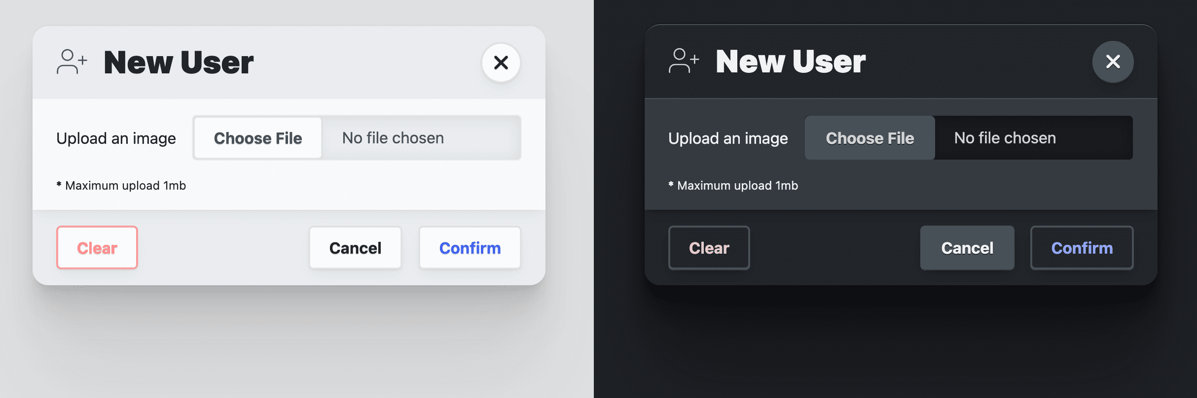
Mega dialog
A mega dialog has three elements inside the form:
<header>,
<article>,
and
<footer>.
These serve as semantic containers, as well as style targets for the
presentation of the dialog. The header titles the modal and offers a close
button. The article is for form inputs and information. The footer holds a
<menu> of
action buttons.
<dialog id="MegaDialog" modal-mode="mega">
  <form method="dialog">
    <header>
      <h3>Dialog title</h3>
      <button onclick="this.closest('dialog').close('close')"></button>
    </header>
    <article>...</article>
    <footer>
      <menu>
        <button autofocus type="reset" onclick="this.closest('dialog').close('cancel')">Cancel</button>
        <button type="submit" value="confirm">Confirm</button>
      </menu>
    </footer>
  </form>
</dialog>
The first menu button has
autofocus
and an onclick inline event handler. The autofocus attribute will receive
focus when the dialog is opened, and I find it's best practice to put this on
the cancel button, not the confirm button. This ensures that confirmation is
deliberate and not accidental.
Mini dialog
The mini dialog is very similar to the mega dialog, it's just missing a
<header> element. This allows it to be smaller and more inline.
<dialog id="MiniDialog" modal-mode="mini">
  <form method="dialog">
    <article>
      <p>Are you sure you want to remove this user?</p>
    </article>
    <footer>
      <menu>
        <button autofocus type="reset" onclick="this.closest('dialog').close('cancel')">Cancel</button>
        <button type="submit" value="confirm">Confirm</button>
      </menu>
    </footer>
  </form>
</dialog>
The dialog element provides a strong foundation for a full viewport element that can collect data and user interaction. These essentials can make for some very interesting and powerful interactions in your site or app.
Accessibility
The dialog element has very good built-in accessibility. Instead of adding these features like I usually do, many are already there.
Restoring focus
As we did by hand in Building a sidenav component, it's important that opening and closing something properly puts focus on the relevant open and close buttons. When that sidenav opens, focus is put on the close button. When the close button is pressed, focus is restored to the button that opened it.
With the dialog element, this is built-in default behavior:
Unfortunately, if you want to animate the dialog in and out, this functionality is lost. In the JavaScript section I'll be restoring that functionality.
Trapping focus
The dialog element manages
inert
for you on the document. Before inert, JavaScript was used to watch for focus
leaving an element, at which point it intercepts and puts it back.
After inert, any parts of the document can be "frozen" insomuch that they are
no longer focus targets or are interactive with a mouse. Instead of trapping
focus, focus is guided into the only interactive part of the document.
Open and auto focus an element
By default, the dialog element will assign focus to the first focusable element
in the dialog markup. If this isn't the best element for the user to default to,
use the autofocus attribute. As described earlier, I find it's best practice
to put this on the cancel button and not the confirm button. This ensures that
confirmation is deliberate and not accidental.
Closing with the escape key
It's important to make it easy to close this potentially interruptive element. Fortunately, the dialog element will handle the escape key for you, freeing you from the orchestration burden.
Styles
There's an easy path to styling the dialog element and a hard path. The easy
path is achieved by not changing the display property of the dialog and working
with its limitations. I go down the hard path to provide custom animations for
opening and closing the dialog, taking over the display property and more.
Styling with Open Props
To accelerate adaptive colors and overall design consistency, I've shamelessly brought in my CSS variable library Open Props. In addition to the free provided variables, I also import a normalize file and some buttons, both of which Open Props provides as optional imports. These imports help me focus on customizing the dialog and demo while not needing a lot of styles to support it and make it look good.
Styling the <dialog> element
Owning the display property
The default show and hide behavior of a dialog element toggles the display
property from block to none. This unfortunately means it can't be animated
in and out, only in. I'd like to animate both in and out, and the first step is
to set my own
display property:
dialog {
  display: grid;
}
By changing, and therefore owning, the display property value, as shown in the above CSS snippet, a considerable amount of styles needs managed in order to facilitate the proper user experience. First, the default state of a dialog is closed. You can represent this state visually and prevent the dialog from receiving interactions with the following styles:
dialog:not([open]) {
  pointer-events: none;
  opacity: 0;
}
Now the dialog is invisible and cannot be interacted with when not open. Later
I'll add some JavaScript to manage the inert attribute on the dialog, ensuring
that keyboard and screen-reader users also can't reach the hidden dialog.
Giving the dialog an adaptive color theme
While color-scheme opts your document into a browser-provided
adaptive color theme to light and dark system preferences, I wanted to customize
the dialog element more than that. Open Props provides a few surface
colors that adapt automatically to
light and dark system preferences, similar to using the color-scheme. These
are great for creating layers in a design and I love using color to help
visually support this appearance of layer surfaces. The background color is
var(--surface-1); to sit on top of that layer, use var(--surface-2):
dialog {
  …
  background: var(--surface-2);
  color: var(--text-1);
}

@media (prefers-color-scheme: dark) {
  dialog {
    border-block-start: var(--border-size-1) solid var(--surface-3);
  }
}
More adaptive colors will be added later for child elements, such as the header and footer. I consider them extra for a dialog element, but really important in making a compelling and well designed dialog design.
Responsive dialog sizing
The dialog defaults to delegating its size to its contents, which is generally
great. My goal here is to constrain the
max-inline-size
to a readable size (--size-content-3 = 60ch) or 90% of the viewport width. This
ensures the dialog won't go edge to edge on a mobile device, and won't be so
wide on a desktop screen that it's hard to read. Then I add a
max-block-size
so the dialog won't exceed the height of the page. This also means that we'll
need to specify where the scrollable area of the dialog is, in case it's a tall
dialog element.
dialog {
  …
  max-inline-size: min(90vw, var(--size-content-3));
  max-block-size: min(80vh, 100%);
  max-block-size: min(80dvb, 100%);
  overflow: hidden;
}
Notice how I have max-block-size twice? The first uses 80vh, a physical
viewport unit. What I really want is to keep the dialog within relative flow,
for international users, so I use the logical, newer, and only partially
supported dvb unit in the second declaration for when it becomes more stable.
Mega dialog positioning
To assist in positioning a dialog element, it's worth breaking down its two parts: the full screen backdrop and the dialog container. The backdrop must cover everything, providing a shade effect to help support that this dialog is in front and the content behind is inaccessible. The dialog container is free to center itself over this backdrop and take whatever shape its contents require.
The following styles fix the dialog element to the window, stretching it to each
corner, and uses margin: auto to center the content:
dialog {
  …
  margin: auto;
  padding: 0;
  position: fixed;
  inset: 0;
  z-index: var(--layer-important);
}
Mobile mega dialog styles
On small viewports, I style this full page mega modal a little differently. I
set the bottom margin to 0, which brings the dialog content to the bottom of
the viewport. With a couple of style adjustments, I can turn the dialog into an
actionsheet, closer to the user's thumbs:
@media (max-width: 768px) {
  dialog[modal-mode="mega"] {
    margin-block-end: 0;
    border-end-end-radius: 0;
    border-end-start-radius: 0;
  }
}

Mini dialog positioning
When using a larger viewport such as on a desktop computer, I chose to position the mini dialogs over the element that called them. To do this I need JavaScript. You can find the technique I use here, but I feel it is beyond the scope of this article. Without the JavaScript, the mini dialog appears in the center of the screen, just like mega dialog.
Make it pop
Last, add some flair to the dialog so it looks like a soft surface sitting far above the page. The softness is achieved by rounding the corners of the dialog. The depth is achieved with one of Open Props’ carefully crafted shadow props:
dialog {
  …
  border-radius: var(--radius-3);
  box-shadow: var(--shadow-6);
}
Customizing the backdrop pseudo element
I chose to work very lightly with the backdrop, only adding a blur effect with
backdrop-filter
to the mega dialog:
dialog[modal-mode="mega"]::backdrop {
  backdrop-filter: blur(25px);
}
I also chose to put a transition on backdrop-filter, in the hope that browsers
will allow transitioning the backdrop element in the future:
dialog::backdrop {
  transition: backdrop-filter .5s ease;
}

Styling extras
I call this section "extras" because it has more to do with my dialog element demo than it does the dialog element in general.
Scroll containment
When the dialog is shown, the user is still able to scroll the page behind it, which I do not want:
Normally,
overscroll-behavior
would be my usual solution, but according to the
spec,
it has no effect on the dialog because it's not a scroll port, that is, it's not
a scroller so there's nothing to prevent. I could use JavaScript to watch for
the new events from this guide, such as "closed" and "opened", and toggle
overflow: hidden on the document, or I could wait for :has() to be stable in
all browsers:
html:has(dialog[open][modal-mode="mega"]) {
  overflow: hidden;
}
Now when a mega dialog is open, the html document has overflow: hidden.
The <form> layout
Besides being a very important element for collecting the interaction
information from the user, I use it here to lay out the header, footer and
article elements. With this layout I intend to articulate the article child as a
scrollable area. I achieve this with
grid-template-rows.
The article element is given 1fr and the form itself has the same maximum
height as the dialog element. Setting this firm height and firm row size is what
allows the article element to be constrained and scroll when it overflows:
dialog > form {
  display: grid;
  grid-template-rows: auto 1fr auto;
  align-items: start;
  max-block-size: 80vh;
  max-block-size: 80dvb;
}

Styling the dialog <header>
The role of this element is to provide a title for the dialog content and offer an easy to find close button. It's also given a surface color to make it appear to be behind the dialog article content. These requirements lead to a flexbox container, vertically aligned items that are spaced to their edges, and some padding and gaps to give the title and close buttons some room:
dialog > form > header {
  display: flex;
  gap: var(--size-3);
  justify-content: space-between;
  align-items: flex-start;
  background: var(--surface-2);
  padding-block: var(--size-3);
  padding-inline: var(--size-5);
}

@media (prefers-color-scheme: dark) {
  dialog > form > header {
    background: var(--surface-1);
  }
}

Styling the header close button
Since the demo is using the Open Props buttons, the close button is customized into a round icon centric button like so:
dialog > form > header > button {
  border-radius: var(--radius-round);
  padding: .75ch;
  aspect-ratio: 1;
  flex-shrink: 0;
  place-items: center;
  stroke: currentColor;
  stroke-width: 3px;
}

Styling the dialog <article>
The article element has a special role in this dialog: it's a space intended to be scrolled in the case of a tall or long dialog.
To accomplish this, the parent form element has established some maximums for
itself which provide constraints for this article element to reach if it gets
too tall. Set overflow-y: auto so scrollbars are only shown when needed,
contain scrolling within it with overscroll-behavior: contain, and the rest
will be custom presentation styles:
dialog > form > article {
  overflow-y: auto;
  max-block-size: 100%; /* safari */
  overscroll-behavior-y: contain;
  display: grid;
  justify-items: flex-start;
  gap: var(--size-3);
  box-shadow: var(--shadow-2);
  z-index: var(--layer-1);
  padding-inline: var(--size-5);
  padding-block: var(--size-3);
}

@media (prefers-color-scheme: light) {
  dialog > form > article {
    background: var(--surface-1);
  }
}
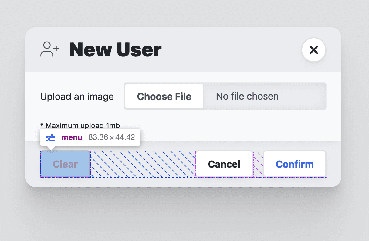
Styling the dialog <footer>
The footer's role is to contain menus of action buttons. Flexbox is used to align the content to the end of the footer inline axis, then some spacing to give the buttons some room.
dialog > form > footer {
  background: var(--surface-2);
  display: flex;
  flex-wrap: wrap;
  gap: var(--size-3);
  justify-content: space-between;
  align-items: flex-start;
  padding-inline: var(--size-5);
  padding-block: var(--size-3);
}

@media (prefers-color-scheme: dark) {
  dialog > form > footer {
    background: var(--surface-1);
  }
}

Styling the dialog footer menu
The menu
element is used to contain the action buttons for the dialog. It uses a wrapping
flexbox layout with gap to provide space between the buttons. Menu elements
have padding such as a <ul>. I also remove that style since I don't need it.
dialog > form > footer > menu {
  display: flex;
  flex-wrap: wrap;
  gap: var(--size-3);
  padding-inline-start: 0;
}

dialog > form > footer > menu:only-child {
  margin-inline-start: auto;
}
Animation
Dialog elements are often animated because they enter and exit the window. Giving dialogs some supportive motion for this entrance and exit helps users orient themselves in the flow.
Normally the dialog element can only be animated in, not out. This is because
the browser toggles the display property on the element. Earlier, the guide
set display to grid, and never sets it to none. This unlocks the ability to
animate in and out.
Open Props comes with many keyframe animations for use, which makes orchestration easy and legible. Here are the animation goals and layered approach I took:
- Reduced motion is the default transition, a simple opacity fade in and out.
- If motion is ok, slide and scale animations are added.
- The responsive mobile layout for the mega dialog is adjusted to slide out.
A safe and meaningful default transition
While Open Props comes with keyframes for fading in and out, I prefer this
layered approach of transitions as the default with keyframe animations as
potential upgrades. Earlier we already styled the dialog’s visibility with
opacity, orchestrating 1 or 0 depending on the [open] attribute. To
transition between 0% and 100%, tell the browser how long and what kind of
easing you'd like:
dialog {
  transition: opacity .5s var(--ease-3);
}
Adding motion to the transition
If the user is ok with motion, both the mega and the mini dialogs should slide
up as their entrance, and scale out as their exit. You can achieve this with the
prefers-reduced-motion media query and a few Open Props:
@media (prefers-reduced-motion: no-preference) {
  dialog {
    animation: var(--animation-scale-down) forwards;
    animation-timing-function: var(--ease-squish-3);
  }

  dialog[open] {
    animation: var(--animation-slide-in-up) forwards;
  }
}
Adapting the exit animation for mobile
Earlier in the styling section, the mega dialog style is adapted for mobile devices to be more like an action sheet, as if a small piece of paper has slid up from the bottom of the screen and is still attached to the bottom. The scale out exit animation doesn't fit this new design well, and we can adapt this with a couple media queries and some Open Props:
@media (prefers-reduced-motion: no-preference) and @media (max-width: 768px) {
  dialog[modal-mode="mega"] {
    animation: var(--animation-slide-out-down) forwards;
    animation-timing-function: var(--ease-squish-2);
  }
}
JavaScript
There are quite a few things to add with JavaScript:
// dialog.js
export default async function (dialog) {
  // add light dismiss
  // add closing and closed events
  // add opening and opened events
  // add removed event
  // removing loading attribute
}
These additions stem from the desire for light dismiss (clicking the dialog backdrop), animation, and some additional events for better timing on getting the form data.
Adding light dismiss
This task is straightforward and a great addition to a dialog element that isn't
being animated. The interaction is achieved by watching clicks on the dialog
element and leveraging event
bubbling
to assess what was clicked, and will only
close()
if it's the top-most element:
export default async function (dialog) {
  dialog.addEventListener('click', lightDismiss)
}

const lightDismiss = ({target:dialog}) => {
  if (dialog.nodeName === 'DIALOG')
    dialog.close('dismiss')
}
Notice dialog.close('dismiss'). The event is called and a string is provided.
This string can be retrieved by other JavaScript to get insights into how the
dialog was closed. You'll find I've also provided close strings each time I call
the function from various buttons, to provide context to my application about
the user interaction.
Adding closing and closed events
The dialog element comes with a close event: it emits immediately when the
dialog close() function is called. Since we're animating this element, it's
nice to have events for before and after the animation, for a change to grab the
data or reset the dialog form. I use it here to manage the addition of the
inert attribute on the closed dialog, and in the demo I use these to modify
the avatar list if the user has submitted a new image.
To achieve this, create two new events called closing and closed. Then
listen for the built-in close event on the dialog. From here, set the dialog to
inert and dispatch the closing event. The next task is to wait for the
animations and transitions to finish running on the dialog, then dispatch the
closed event.
const dialogClosingEvent = new Event('closing')
const dialogClosedEvent  = new Event('closed')

export default async function (dialog) {
  …
  dialog.addEventListener('close', dialogClose)
}

const dialogClose = async ({target:dialog}) => {
  dialog.setAttribute('inert', '')
  dialog.dispatchEvent(dialogClosingEvent)

  await animationsComplete(dialog)

  dialog.dispatchEvent(dialogClosedEvent)
}

const animationsComplete = element =>
  Promise.allSettled(
    element.getAnimations().map(animation =>
      animation.finished))
The animationsComplete function, which is also used in the Building a toast
component, returns a promise based on the
completion of the animation and transition promises. This is why dialogClose
is an async
function;
it can then
await
the promise returned and move forward confidently to the closed event.
Adding opening and opened events
These events aren't as easy to add since the built-in dialog element doesn't provide an open event like it does with close. I use a MutationObserver to provide insights into the dialog’s attributes changing. In this observer, I'll watch for changes to the open attribute and manage the custom events accordingly.
Similar to how we started the closing and closed events, create two new events
called opening and opened. Where we previously listened for the dialog close
event, this time use a created mutation observer to watch the dialog's
attributes.
…
const dialogOpeningEvent = new Event('opening')
const dialogOpenedEvent  = new Event('opened')

export default async function (dialog) {
  …
  dialogAttrObserver.observe(dialog, {
    attributes: true,
  })
}

const dialogAttrObserver = new MutationObserver((mutations, observer) => {
  mutations.forEach(async mutation => {
    if (mutation.attributeName === 'open') {
      const dialog = mutation.target

      const isOpen = dialog.hasAttribute('open')
      if (!isOpen) return

      dialog.removeAttribute('inert')

      // set focus
      const focusTarget = dialog.querySelector('[autofocus]')
      focusTarget
        ? focusTarget.focus()
        : dialog.querySelector('button').focus()

      dialog.dispatchEvent(dialogOpeningEvent)
      await animationsComplete(dialog)
      dialog.dispatchEvent(dialogOpenedEvent)
    }
  })
})
The mutation observer callback function will be called when the dialog
attributes are changed, providing the list of changes as an array. Iterate over
the attribute changes, looking for the attributeName to be open. Next, check
if the element has the attribute or not: this informs whether or not the dialog
has become open. If it has been opened, remove the inert attribute, set focus
to either an element requesting
autofocus
or the first button element found in the dialog. Last, similar to the closing
and closed event, dispatch the opening event right away, wait for the animations
to finish, then dispatch the opened event.
Adding a removed event
In single page applications, dialogs are often added and removed based on routes or other application needs and state. It can be useful to clean up events or data when a dialog is removed.
You can achieve this with another mutation observer. This time, instead of observing attributes on a dialog element, we'll observe the children of the body element and watch for dialog elements being removed.
…
const dialogRemovedEvent = new Event('removed')

export default async function (dialog) {
  …
  dialogDeleteObserver.observe(document.body, {
    attributes: false,
    subtree: false,
    childList: true,
  })
}

const dialogDeleteObserver = new MutationObserver((mutations, observer) => {
  mutations.forEach(mutation => {
    mutation.removedNodes.forEach(removedNode => {
      if (removedNode.nodeName === 'DIALOG') {
        removedNode.removeEventListener('click', lightDismiss)
        removedNode.removeEventListener('close', dialogClose)
        removedNode.dispatchEvent(dialogRemovedEvent)
      }
    })
  })
})
The mutation observer callback is called whenever children are added or removed
from the body of the document. The specific mutations being watched are for
removedNodes that have the
nodeName of
a dialog. If a dialog was removed, the click and close events are removed to
free up memory, and the custom removed event is dispatched.
Removing the loading attribute
To prevent the dialog animation from playing its exit animation when added to the page or on page load, a loading attribute has been added to the dialog. The following script waits for the dialog animations to finish running, then removes the attribute. Now the dialog is free to animate in and out, and we've effectively hidden an otherwise distracting animation.
export default async function (dialog) {
  …
  await animationsComplete(dialog)
  dialog.removeAttribute('loading')
}
Learn more about the problem of preventing keyframe animations on page load here.
All together
Here is dialog.js in its entirety, now that we've explained each section
individually:
// custom events to be added to <dialog>
const dialogClosingEvent = new Event('closing')
const dialogClosedEvent  = new Event('closed')
const dialogOpeningEvent = new Event('opening')
const dialogOpenedEvent  = new Event('opened')
const dialogRemovedEvent = new Event('removed')

// track opening
const dialogAttrObserver = new MutationObserver((mutations, observer) => {
  mutations.forEach(async mutation => {
    if (mutation.attributeName === 'open') {
      const dialog = mutation.target

      const isOpen = dialog.hasAttribute('open')
      if (!isOpen) return

      dialog.removeAttribute('inert')

      // set focus
      const focusTarget = dialog.querySelector('[autofocus]')
      focusTarget
        ? focusTarget.focus()
        : dialog.querySelector('button').focus()

      dialog.dispatchEvent(dialogOpeningEvent)
      await animationsComplete(dialog)
      dialog.dispatchEvent(dialogOpenedEvent)
    }
  })
})

// track deletion
const dialogDeleteObserver = new MutationObserver((mutations, observer) => {
  mutations.forEach(mutation => {
    mutation.removedNodes.forEach(removedNode => {
      if (removedNode.nodeName === 'DIALOG') {
        removedNode.removeEventListener('click', lightDismiss)
        removedNode.removeEventListener('close', dialogClose)
        removedNode.dispatchEvent(dialogRemovedEvent)
      }
    })
  })
})

// wait for all dialog animations to complete their promises
const animationsComplete = element =>
  Promise.allSettled(
    element.getAnimations().map(animation =>
      animation.finished))

// click outside the dialog handler
const lightDismiss = ({target:dialog}) => {
  if (dialog.nodeName === 'DIALOG')
    dialog.close('dismiss')
}

const dialogClose = async ({target:dialog}) => {
  dialog.setAttribute('inert', '')
  dialog.dispatchEvent(dialogClosingEvent)

  await animationsComplete(dialog)

  dialog.dispatchEvent(dialogClosedEvent)
}

// page load dialogs setup
export default async function (dialog) {
  dialog.addEventListener('click', lightDismiss)
  dialog.addEventListener('close', dialogClose)

  dialogAttrObserver.observe(dialog, {
    attributes: true,
  })

  dialogDeleteObserver.observe(document.body, {
    attributes: false,
    subtree: false,
    childList: true,
  })

  // remove loading attribute
  // prevent page load @keyframes playing
  await animationsComplete(dialog)
  dialog.removeAttribute('loading')
}
Using the dialog.js module
The exported function from the module expects to be called and passed a dialog element that wants to have these new events and functionality added:
import GuiDialog from './dialog.js'

const MegaDialog = document.querySelector('#MegaDialog')
const MiniDialog = document.querySelector('#MiniDialog')

GuiDialog(MegaDialog)
GuiDialog(MiniDialog)
Just like that, the two dialogs are upgraded with light dismiss, animation loading fixes, and more events to work with.
Listening to the new custom events
Each upgraded dialog element can now listen for five new events, like this:
MegaDialog.addEventListener('closing', dialogClosing)
MegaDialog.addEventListener('closed', dialogClosed)

MegaDialog.addEventListener('opening', dialogOpening)
MegaDialog.addEventListener('opened', dialogOpened)

MegaDialog.addEventListener('removed', dialogRemoved)
Here are two examples of handling those events:
const dialogOpening = ({target:dialog}) => {
  console.log('Dialog opening', dialog)
}

const dialogClosed = ({target:dialog}) => {
  console.log('Dialog closed', dialog)
  console.info('Dialog user action:', dialog.returnValue)

  if (dialog.returnValue === 'confirm') {
    // do stuff with the form values
    const dialogFormData = new FormData(dialog.querySelector('form'))
    console.info('Dialog form data', Object.fromEntries(dialogFormData.entries()))

    // then reset the form
    dialog.querySelector('form')?.reset()
  }
}
In the demo that I built with the dialog element, I use that closed event and the form data to add a new avatar element to the list. The timing is good in that the dialog has completed its exit animation, and then some scripts animate in the new avatar. Thanks to the new events, orchestrating the user experience can be smoother.
Notice dialog.returnValue: this contains the close string passed when the
dialog close() event is called. It's critical in the dialogClosed event to
know if the dialog was closed, canceled, or confirmed. If it's confirmed, the
script then grabs the form values and resets the form. The reset is useful so
that when the dialog is shown again, it's blank and ready for a new submission.
Conclusion
Now that you know how I did it, how would you‽ 🙂
Let's diversify our approaches and learn all the ways to build on the web.
Create a demo, tweet me links, and I'll add it to the community remixes section below!
Community remixes
- @GrimLink with a 3-in-1 dialog.
- @mikemai2awesome with a nice
remix that doesn't change the
displayproperty. - @geoffrich_ with Svelte and nice Svelte FLIP polish.
Resources
- Source code on Github
- Doodle Avatars