

Introduction
If you’re the type of person who keeps up with things like how browsers work, then you already know that there’s been some amazing articles lately detailing Chrome’s GPU accelerated renderer/composite operation. Firstly Accelerated Rendering in Chrome: The Layer Model is a great introduction to how Chrome uses the concept of layers to draw their page; and for a deeper dive GPU Accelerated Compositing in Chrome discusses how Chrome uses these layers, alongside the GPU for rendering your page.
The philosophical question
Having spent a great deal of time writing software rasterizers for 3D purposes, it became apparent in my mind that some CSS properties should have varied performance when drawing your page. For example, rasterizing a small image to the screen is a completely different algorithmic operation that drawing a drop shadow on an arbitrary shape. So the question became: How do different CSS properties affect the render-weight of your page?
My goal was to categorize a large set of CSS properties/values by their paint times, so that we can create an understanding of what types of CSS properties are more performant than others. To do this, I wrote some automation with duct-tape and bubble gum to attempt to add numerical visibility to CSS paint times, which worked like this:
- Generate a suite of individual HTML pages; each one with a single DOM element and some permutation of CSS properties attached to it.
- Run some automation script that, for each page, will:
- Launch Chrome
- Load a page
- Produce a Skia Picture for the page
- Run each Skia Picture taken through Skia Benchmark to obtain timings
- Dump out all the timings, and marvel at the numbers. (This part is important…)
With this setup, we generate a suite of HTML pages, where each page contains a unique permutation of CSS properties and values; for instance, here’s two html files:
<style>
#example1 {
    background: url(foo.png) top left / 50% 60%;
    padding: 20px;
    margin-top: 10px;
    margin-right: 20px;
    text-align: center;
}
</style>
<div id="example1">WOAH</div>
And another, that’s more complex
<style>
#example1 {
    background-color:#eee;
    box-shadow: 1px 2px 3px 4px black;
    border-radius: 50%;
    background: radial-gradient(circle closest-corner, white, black);
    padding: 20px;
    margin-top: 10px;
    margin-right: 20px;
    text-align: center;
}
</style>
<div id="example1">WOAH</div>
Below, as a variant of the last example, where we only change the radial-gradient value:
<style>
#example1
{
    background-color:#eee;
    box-shadow: 1px 2px 3px 4px black;
    border-radius: 50%;
    background: radial-gradient(farthest-side, white, black);
    padding: 20px;
    margin-top: 10px;
    margin-right: 20px;
    text-align: center;
}
</style>
<div id="example1" style="padding: 20px; margin-top: 10px;margin-right: 20px; text-align: center;">WOAH</div>
Each page is then loaded into a fresh instance of Chrome (to ensure that timings weren’t somehow biased by any stale states in page reloads), and a Skia Picture (*.SKP) is taken to evaluate what Skia commands are used to paint the page. Once SKP files have been generated for each HTML file, we run another batch to push the *.SKP files through the Skia Benchmark application (built from the Skia source code) which dumps out the average time taken to render that page.
Evaluating the data
From this, we now have some rough ability to chart how much a suite of CSS properties take to paint. Or rather, we can start stack-ranking CSS properties by their paint performance. Here’s a large graph taken with Chrome 27 betashowing off all the full set of timing data from this process. Note that all data is subject to change as Chrome becomes faster and faster with time.
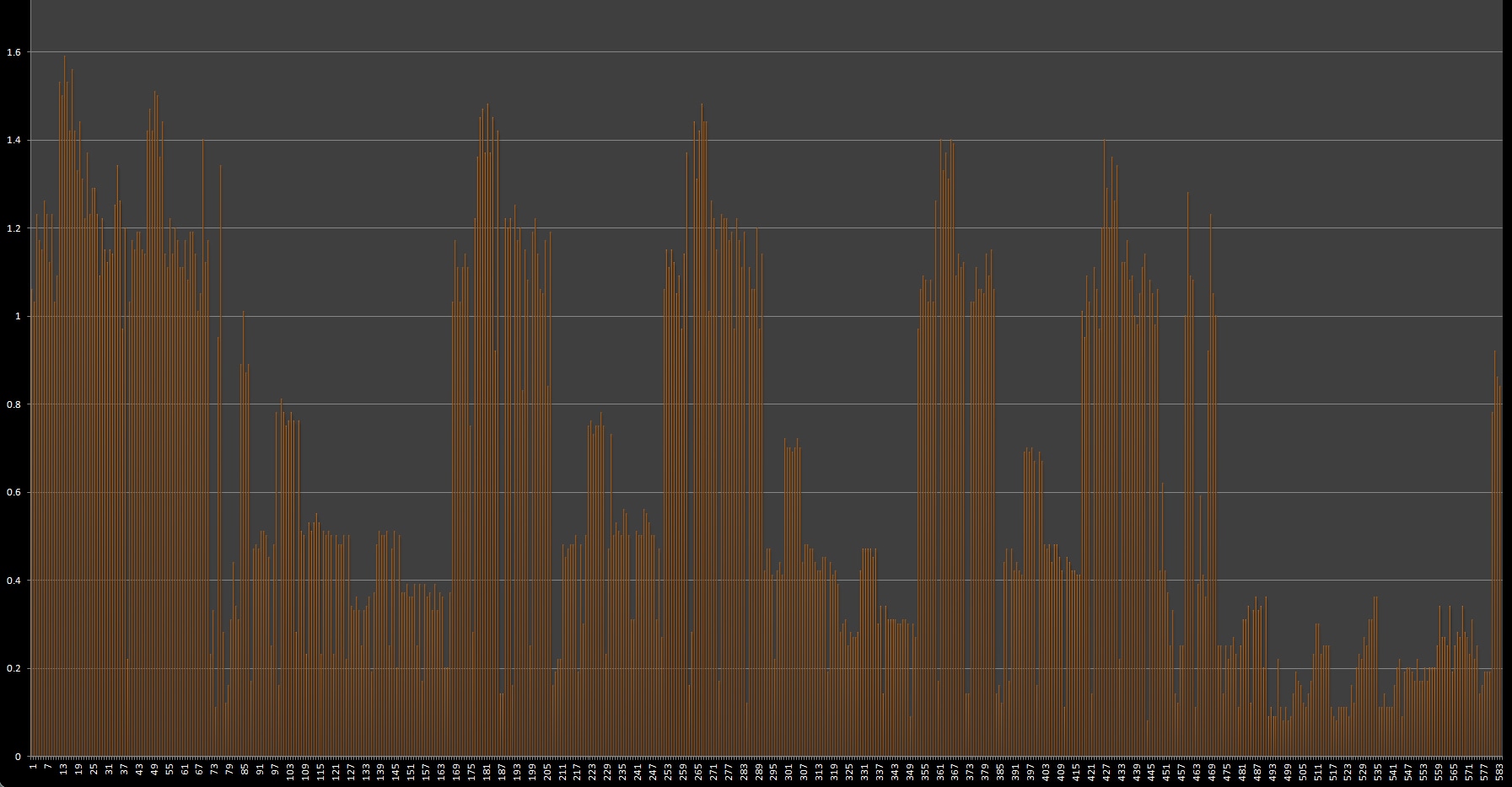
Each vertical bar represents the paint-time of a page with a single combination of CSS properties, (magnified by 100x; True-scale value of this graph is 0,1.56ms). Lots of pretty lines, but in this form it’s somewhat useless; we need to do some data mining to find useful trends.
Firstly we find proof that some CSS properties are just plain more expensive to render than others. For example, drawing a drop-shadow on a DOM element involves a multi-pass operation with splines and other sorts of nasty things, as opposed to opacity which should be easier to render.
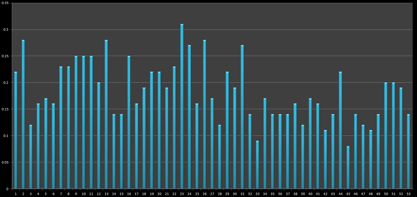
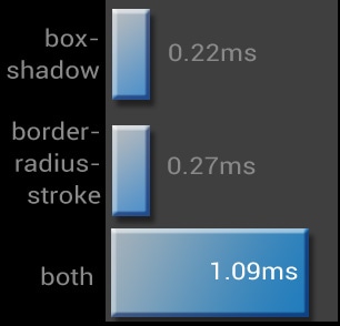
Secondly, and more interestingly, combinations of CSS Properties can have a greater paint time than the sum of their parts. From an observer’s perspective, this is a bit odd, we’d expect that A+B = C, not 2.2C. For example adding box-shadow and border-radius-stroke :
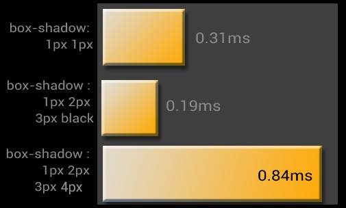
What’s really interesting about this, is that it’s not just the box-shadow property itself, but rather that specific value permutation. For example, below shows a grouping of box-shadow : 50% and border-radius with value variations.
Looking at the data, this goes on for a while. There’s lots of various odd combinations, and my test suite hardly touches them all; there’s still tons of tests and combinations that could yield interesting results
Finding your page render-weight
Armed with the ability to track the render times for each element on your page, developers have the ability to start evaluating their page-render-weight, and how it affects the responsiveness of your site; Here’s a couple tips to get started
- Use Chrome’s Continuous Paint mode in Chrome Dev Tools to get an understanding of what CSS properties are costing you.
- Incorporate CSS reviews into your existing code review process to catch performance issues Look for places in your CSS where you are using things that are known to be more expensive, like gradients and shadows. Ask yourself, do I really need these here?
- When in doubt, always err on the side of better performance. Your users may not remember what the padding width is on your columns, but they will remember how it feels to visit your site.
Final Thoughts
One of the most interesting things about this experiment is that the timings will continue to change with each version of Chrome (hopefully getting faster ;) browser software is an ever-changing surface area. What’s slow today, could be fast tomorrow. You could take away from this article to avoid putting box-shadow: 1px 2px 3px 4px an an element that already has border-radius:5. However the more valuable takeaway should be that CSS properties directly affect your page paint times.