
Allowing your pages to respond to different screen sizes is just one way of making sure your website is accessible to as many people as possible. Consider some of these other factors that you should keep in mind.
Color vision deficiency
Different people perceive color differently. People with protanopia don't perceive red as a distinct color. With deuteranopia, green is missing. For people with tritanopia, it's blue.
Some tools can give you a general idea of how your color schemes appear to people with different kinds of color vision.
Firefox's Accessibility tab includes a dropdown labeled Simulate with a list of options.


In Chrome DevTools, the rendering tab allows you to emulate vision deficiencies.
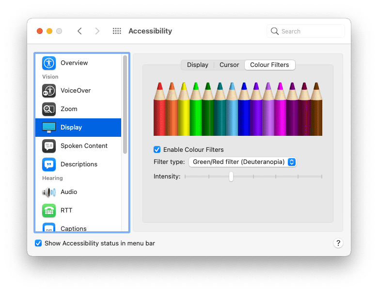
Those are browser-specific tools. It's also possible to emulate different vision types at the operating system level.
On the Mac, go to:
- System Preferences
- Accessibility
- Display
- Color Filters
- Enable Color Filters
Select one of the options.
In general it's not a good idea to rely purely on color to differentiate between different elements. For example, you can—and should—make your links a different color to the surrounding text. But you should also apply some other styling indicator like underlining the links or making them bold.
a {
  color: red;
}
a {
  color: red;
  font-weight: bold;
}
Color contrast
Some color combinations can cause trouble. If there isn't enough contrast between the foreground color and background color, text becomes difficult to read. Poor color contrast is one of the most common accessibility issues on the web, but fortunately, it's one that you can catch early in the design process.
Here are some tools you can use to test the contrast ratio of your text and background colors:
- VisBug is a browser extension available for all major desktop browsers.
- Firefox's Accessibility Inspector can check for issues with visual contrast.
- You can also discover and fix low-contrast text with Chrome DevTools.
- In Microsoft's Edge browser, you can test text-color contrast using the color picker.
It's a good idea to always declare color and background-color together in your CSS. Don't assume that the background color will be the browser default. People can and do change the colors used by their browser.
body {
  color: black;
}
body {
  color: black;
  background-color: white;
}
High contrast
Some people set their operating systems to use a high-contrast mode. You can try this on your operating system.
On the Mac, go to:
- System Preferences
- Accessibility
- Display
Select the option to increase contrast.

There's a media feature to detect if someone has enabled high contrast mode. The prefers-contrast media feature can be queried for three values: no-preference, less, and more. You can use this information to adjust your site's color palette.
' d='M96 183a64 64 0 0 1-23-23L17 64a128 128 0 0 0 111 192l55-96a64 64 0 0 1-87 23Z'/%3E%3Cpath fill='url(%23b)' d='M192 128a64 64 0 0 1-9 32l-55 96A128 128 0 0 0 239 64H128a64 64 0 0 1 64 64Z'/%3E%3Ccircle cx='128' cy='128' r='52' fill='%231a73e8'/%3E%3Cpath fill='url(%23c)' d='M96 73a64 64 0 0 1 32-9h111a128 128 0 0 0-222 0l56 96a64 64 0 0 1 23-87Z'/%3E%3C/svg%3E)
' xlink:href='%23A'%3E%3Cstop offset='.76' stop-opacity='0'/%3E%3Cstop offset='.95' stop-opacity='.5'/%3E%3Cstop offset='1'/%3E%3C/radialGradient%3E%3CradialGradient id='F' cx='2523' cy='4680' r='20243' gradientTransform='matrix(-.03715 .99931 -2.12836 -.07913 13579 3530)' xlink:href='%23A'%3E%3Cstop offset='0' stop-color='%2335c1f1'/%3E%3Cstop offset='.11' stop-color='%2334c1ed'/%3E%3Cstop offset='.23' stop-color='%232fc2df'/%3E%3Cstop offset='.31' stop-color='%232bc3d2'/%3E%3Cstop offset='.67' stop-color='%2336c752'/%3E%3C/radialGradient%3E%3CradialGradient id='G' cx='24247' cy='7758' r='9734' gradientTransform='matrix(.28109 .95968 -.78353 .22949 24510 -16292)' xlink:href='%23A'%3E%3Cstop offset='0' stop-color='%2366eb6e'/%3E%3Cstop offset='1' stop-color='%2366eb6e' stop-opacity='0'/%3E%3C/radialGradient%3E%3Cpath id='H' d='M24105 20053a9345 9345 0 01-1053 472 10202 10202 0 01-3590 646c-4732 0-8855-3255-8855-7432 0-1175 680-2193 1643-2729-4280 180-5380 4640-5380 7253 0 7387 6810 8137 8276 8137 791 0 1984-230 2704-456l130-44a12834 12834 0 006660-5282c220-350-168-757-535-565z'/%3E%3Cpath id='I' d='M11571 25141a7913 7913 0 01-2273-2137 8145 8145 0 01-1514-4740 8093 8093 0 013093-6395 8082 8082 0 011373-859c312-148 846-414 1554-404a3236 3236 0 012569 1297 3184 3184 0 01636 1866c0-21 2446-7960-8005-7960-4390 0-8004 4166-8004 7820 0 2319 538 4170 1212 5604a12833 12833 0 007684 6757 12795 12795 0 003908 610c1414 0 2774-233 4045-656a7575 7575 0 01-6278-803z'/%3E%3Cpath id='J' d='M16231 15886c-80 105-330 250-330 566 0 260 170 512 472 723 1438 1003 4149 868 4156 868a5954 5954 0 003027-839 6147 6147 0 001133-850 6180 6180 0 001910-4437c26-2242-796-3732-1133-4392-2120-4141-6694-6525-11668-6525-7011 0-12703 5635-12798 12620 47-3654 3679-6605 7996-6605 350 0 2346 34 4200 1007 1634 858 2490 1894 3086 2921 618 1067 728 2415 728 2952s-271 1333-780 1990z'/%3E%3Cuse fill='url(%23B)' xlink:href='%23H'/%3E%3Cuse fill='url(%23D)' opacity='.35' xlink:href='%23H'/%3E%3Cuse fill='url(%23C)' xlink:href='%23I'/%3E%3Cuse fill='url(%23E)' opacity='.4' xlink:href='%23I'/%3E%3Cuse fill='url(%23F)' xlink:href='%23J'/%3E%3Cuse fill='url(%23G)' xlink:href='%23J'/%3E%3C/svg%3E)
' gradientUnits='userSpaceOnUse'%3E%3Cstop offset='.2' stop-color='%239059ff' stop-opacity='0'/%3E%3Cstop offset='.3' stop-color='%238c4ff3' stop-opacity='.1'/%3E%3Cstop offset='.8' stop-color='%237716a8' stop-opacity='.5'/%3E%3Cstop offset='1' stop-color='%236e008b' stop-opacity='.6'/%3E%3C/radialGradient%3E%3CradialGradient id='ff-g' cx='239.1' cy='34.6' r='171.6' gradientUnits='userSpaceOnUse'%3E%3Cstop offset='0' stop-color='%23ffe226'/%3E%3Cstop offset='.1' stop-color='%23ffdb27'/%3E%3Cstop offset='.3' stop-color='%23ffc82a'/%3E%3Cstop offset='.5' stop-color='%23ffa930'/%3E%3Cstop offset='.7' stop-color='%23ff7e37'/%3E%3Cstop offset='.8' stop-color='%23ff7139'/%3E%3C/radialGradient%3E%3CradialGradient id='ff-h' cx='374' cy='-74.3' r='732.2' gradientUnits='userSpaceOnUse'%3E%3Cstop offset='.1' stop-color='%23fff44f'/%3E%3Cstop offset='.5' stop-color='%23ff980e'/%3E%3Cstop offset='.6' stop-color='%23ff5634'/%3E%3Cstop offset='.7' stop-color='%23ff3647'/%3E%3Cstop offset='.9' stop-color='%23e31587'/%3E%3C/radialGradient%3E%3CradialGradient id='ff-i' cx='304.6' cy='7.1' r='536.4' gradientTransform='rotate(84 303 4)' gradientUnits='userSpaceOnUse'%3E%3Cstop offset='0' stop-color='%23fff44f'/%3E%3Cstop offset='.1' stop-color='%23ffe847'/%3E%3Cstop offset='.2' stop-color='%23ffc830'/%3E%3Cstop offset='.3' stop-color='%23ff980e'/%3E%3Cstop offset='.4' stop-color='%23ff8b16'/%3E%3Cstop offset='.5' stop-color='%23ff672a'/%3E%3Cstop offset='.6' stop-color='%23ff3647'/%3E%3Cstop offset='.7' stop-color='%23e31587'/%3E%3C/radialGradient%3E%3CradialGradient id='ff-j' cx='235' cy='98.1' r='457.1' gradientUnits='userSpaceOnUse'%3E%3Cstop offset='.1' stop-color='%23fff44f'/%3E%3Cstop offset='.5' stop-color='%23ff980e'/%3E%3Cstop offset='.6' stop-color='%23ff5634'/%3E%3Cstop offset='.7' stop-color='%23ff3647'/%3E%3Cstop offset='.9' stop-color='%23e31587'/%3E%3C/radialGradient%3E%3CradialGradient id='ff-k' cx='355.7' cy='124.9' r='500.3' gradientUnits='userSpaceOnUse'%3E%3Cstop offset='.1' stop-color='%23fff44f'/%3E%3Cstop offset='.2' stop-color='%23ffe141'/%3E%3Cstop offset='.5' stop-color='%23ffaf1e'/%3E%3Cstop offset='.6' stop-color='%23ff980e'/%3E%3C/radialGradient%3E%3ClinearGradient id='ff-a' x1='446.9' y1='76.8' x2='47.9' y2='461.8' gradientUnits='userSpaceOnUse'%3E%3Cstop offset='.1' stop-color='%23fff44f'/%3E%3Cstop offset='.1' stop-color='%23ffe847'/%3E%3Cstop offset='.2' stop-color='%23ffc830'/%3E%3Cstop offset='.4' stop-color='%23ff980e'/%3E%3Cstop offset='.4' stop-color='%23ff8b16'/%3E%3Cstop offset='.5' stop-color='%23ff672a'/%3E%3Cstop offset='.5' stop-color='%23ff3647'/%3E%3Cstop offset='.7' stop-color='%23e31587'/%3E%3C/linearGradient%3E%3ClinearGradient id='ff-l' x1='442.1' y1='74.8' x2='102.6' y2='414.3' gradientUnits='userSpaceOnUse'%3E%3Cstop offset='.2' stop-color='%23fff44f' stop-opacity='.8'/%3E%3Cstop offset='.3' stop-color='%23fff44f' stop-opacity='.6'/%3E%3Cstop offset='.5' stop-color='%23fff44f' stop-opacity='.2'/%3E%3Cstop offset='.6' stop-color='%23fff44f' stop-opacity='0'/%3E%3C/linearGradient%3E%3C/defs%3E%3Cpath d='M479 166c-11-25-32-52-49-60a249 249 0 0 1 25 73c-27-68-73-95-111-155a255 255 0 0 1-8-14 44 44 0 0 1-4-9 1 1 0 0 0 0-1 1 1 0 0 0-1 0c-60 35-81 101-83 134a120 120 0 0 0-66 25 71 71 0 0 0-6-5 111 111 0 0 1-1-58c-25 11-44 29-58 44-9-12-9-52-8-60l-8 4a175 175 0 0 0-24 21 210 210 0 0 0-22 26 203 203 0 0 0-32 73l-1 2-2 15a229 229 0 0 0-4 34v1a240 240 0 0 0 477 40l1-9c5-41 0-84-15-121zM202 355l3 1-3-1zm55-145zm198-31z' fill='url(%23ff-a)'/%3E%3Cpath d='M479 166c-11-25-32-52-49-60 14 26 22 53 25 72v1a207 207 0 0 1-206 279c-113-3-212-87-231-197-3-17 0-26 2-40-2 11-3 14-4 34v1a240 240 0 0 0 477 40l1-9c5-41 0-84-15-121z' fill='url(%23ff-b)'/%3E%3Cpath d='M479 166c-11-25-32-52-49-60 14 26 22 53 25 72v1a207 207 0 0 1-206 279c-113-3-212-87-231-197-3-17 0-26 2-40-2 11-3 14-4 34v1a240 240 0 0 0 477 40l1-9c5-41 0-84-15-121z' fill='url(%23ff-c)'/%3E%3Cpath d='m362 195 1 1a130 130 0 0 0-22-29C266 92 322 5 331 0c-60 35-81 101-83 134l9-1c45 0 84 25 105 62z' fill='url(%23ff-d)'/%3E%3Cpath d='M257 210c-1 6-22 26-29 26-68 0-80 41-80 41 3 35 28 64 57 79l4 2 7 3a107 107 0 0 0 31 6c120 6 143-143 57-186 22-4 45 5 58 14-21-37-60-62-105-62l-9 1a120 120 0 0 0-66 25l17 16c16 16 58 33 58 35z' fill='url(%23ff-e)'/%3E%3Cpath d='M257 210c-1 6-22 26-29 26-68 0-80 41-80 41 3 35 28 64 57 79l4 2 7 3a107 107 0 0 0 31 6c120 6 143-143 57-186 22-4 45 5 58 14-21-37-60-62-105-62l-9 1a120 120 0 0 0-66 25l17 16c16 16 58 33 58 35z' fill='url(%23ff-f)'/%3E%3Cpath d='m171 151 5 3a111 111 0 0 1-1-58c-25 11-44 29-58 44 1 0 36 0 54 11z' fill='url(%23ff-g)'/%3E%3Cpath d='M18 261a242 242 0 0 0 231 197 207 207 0 0 0 206-279c8 56-20 110-64 146-86 71-169 43-186 31l-3-1c-50-24-71-70-67-110-42 0-57-35-57-35s38-28 89-4c46 22 90 4 90 4 0-2-42-19-58-35l-17-16a71 71 0 0 0-6-5l-5-3c-18-11-52-11-54-11-9-12-9-51-8-60l-8 4a175 175 0 0 0-24 21 210 210 0 0 0-22 26 203 203 0 0 0-32 73c0 1-9 38-5 57z' fill='url(%23ff-h)'/%3E%3Cpath d='M341 167a130 130 0 0 1 22 29 46 46 0 0 1 4 3c55 50 26 121 24 126 44-36 72-90 64-146-27-68-73-95-111-155a255 255 0 0 1-8-14 44 44 0 0 1-4-9 1 1 0 0 0 0-1 1 1 0 0 0-1 0c-9 5-65 92 10 167z' fill='url(%23ff-i)'/%3E%3Cpath d='M367 199a46 46 0 0 0-4-3l-1-1c-13-9-36-18-58-15 86 44 63 193-57 187a107 107 0 0 1-31-6 131 131 0 0 1-11-5c17 12 99 39 186-31 2-5 31-76-24-126z' fill='url(%23ff-j)'/%3E%3Cpath d='M148 277s12-41 80-41c7 0 28-20 29-26s-44 18-90-4c-51-24-89 4-89 4s15 35 57 35c-4 40 16 85 67 110l3 1c-29-15-54-44-57-79z' fill='url(%23ff-k)'/%3E%3Cpath d='M479 166c-11-25-32-52-49-60a249 249 0 0 1 25 73c-27-68-73-95-111-155a255 255 0 0 1-8-14 44 44 0 0 1-4-9 1 1 0 0 0 0-1 1 1 0 0 0-1 0c-60 35-81 101-83 134l9-1c45 0 84 25 105 62-13-9-36-18-58-14 86 43 63 192-57 186a107 107 0 0 1-31-6 131 131 0 0 1-11-5l-3-1 3 1c-29-15-54-44-57-79 0 0 12-41 80-41 7 0 28-20 29-26 0-2-42-19-58-35l-17-16a71 71 0 0 0-6-5 111 111 0 0 1-1-58c-25 11-44 29-58 44-9-12-9-52-8-60l-8 4a175 175 0 0 0-24 21 210 210 0 0 0-22 26 203 203 0 0 0-32 73l-1 2-2 15a279 279 0 0 0-4 34v1a240 240 0 0 0 477 40l1-9c5-41 0-84-15-121zm-24 13z' fill='url(%23ff-l)'/%3E%3C/svg%3E)
' xlink:href='%23s-b'%3E%3Cstop offset='0' stop-color='%2324a5f3' stop-opacity='0' /%3E%3Cstop offset='1' stop-color='%231e8ceb' /%3E%3C/radialGradient%3E%3CradialGradient id='s-j' cx='109.3' cy='13.8' r='93.1' gradientTransform='matrix(-.02 1.1 -1.04 -.02 137 -115)' xlink:href='%23s-b'%3E%3Cstop offset='0' stop-opacity='0' /%3E%3Cstop offset='1' stop-color='%235488d6' stop-opacity='0' /%3E%3Cstop offset='1' stop-color='%235d96eb' /%3E%3C/radialGradient%3E%3C/defs%3E%3Crect width='220' height='220' x='22' y='-107' fill='url(%23s-a)' ry='49' transform='matrix(.57 0 0 .57 187 256)' /%3E%3Cg transform='translate(194 190)'%3E%3Ccircle cx='67.8' cy='67.7' fill='url(%23s-c)' paint-order='stroke fill markers' r='54' /%3E%3Ccircle cx='-69.9' cy='69.3' fill='url(%23s-i)' transform='translate(138 -2)' r='54' /%3E%3C/g%3E%3Cellipse cx='120' cy='14.2' fill='url(%23s-j)' rx='93.1' ry='93.7' transform='matrix(.58 0 0 .58 192 250)' /%3E%3Cg transform='matrix(.58 0 0 .57 197 182)'%3E%3Cpath fill='%23cac7c8' d='M46 192h1l72-48-7-9-66 57Z' /%3E%3Cpath fill='%23fbfffc' d='M46 191v1l66-57-7-9-59 65Z' /%3E%3Cpath fill='url(%23s-d)' d='m119 144-7-9 66-57-59 66Z' /%3E%3Cpath fill='%23fb645c' d='m105 126 7 9 66-57-1-1-72 49Z' /%3E%3C/g%3E%3Cpath stroke='%23fff' stroke-linecap='round' stroke-miterlimit='1' stroke-width='1.3' d='m287 278 3-2m-12-17 8-2m-8-3h4m-4-13 8 2m-8 3h4m-1-13 7 3m-4-11 7 4m-2-11 6 6m0-12 6 7m1-11 4 6m4-10 3 7m5-9 2 7m15-7-1 7m10-5-3 7m11-4-4 7m11-2-5 6m16 7-7 4m10 4-7 3m10 6-8 1m8 16-8-2m5 10-7-3m4 11-7-4m2 11-6-5m0 11-5-6m-2 11-4-7m-4 11-3-8m-6 10-1-8m-16 8 2-8m-10 5 3-7m-11 4 4-7m-11 2 5-6m-8 3 3-3m4 8 2-3m5 8 2-4m6 7 1-4m8 5v-4m8 4v-4m9 3-1-4m9 1-2-4m9 0-2-4m9-2-3-3m8-4-3-2m8-5-4-2m7-6-4-1m5-8h-4m4-8h-4m3-9-4 1m1-9-4 2m-1-9-3 2m-2-9-3 3m-4-8-2 3m-5-8-2 4m-6-6-1 3m-8-5v4m-8-4v4m-9-2 1 3m-9 0 2 3m-9 1 2 3m-9 2 3 3m-8 4 3 2m-8 5 4 2m-7 6 4 1m-4 25 4-1m-2 5 7-3m-6 7 4-2m-2 6 7-4m-13-21h8m41-41v-8m0 99v-8m49-42h-8' transform='translate(-65 8)' /%3E%3C/svg%3E)
People can also set a preference in their operating system to use inverted colors.
On the Mac, go to:
- System Preferences
- Accessibility
- Display
Select the option to invert colors.

Make sure your website still makes sense for someone browsing with inverted colors. Watch out for box shadows—these may need adjusting when colors are inverted.
Font size
Color isn't the only thing that people can adjust in their browser, they can also adjust the default font size. As their vision declines, they might adjust the default font size in their browsers or operating systems, bumping up the numbers with the passing of the years.
You can respond to these settings by using relative font sizes. Avoid using units like px. Use relative units like rem or ch instead.
Try changing the default text size setting in your browser. You can do that in your browser preferences. Or you can do it while you're visiting a web page by zooming in. Does your website still work if the default font size is increased by 200%? How about 400%?
Someone visiting your website on a desktop computer with their font size bumped up to 400% should get the same layout as someone visiting your site on a small-screen device.

Keyboard navigation
Not everyone uses a mouse or a trackpad to navigate web pages. A keyboard is another way of getting around a page, with the tab key being particularly useful. Users can quickly move from one link or form field to the next.
Links styled with the :hover and :focus pseudo-classes, will display those styles regardless of whether someone is using a mouse, a trackpad, or a keyboard. Use the :focus-visible pseudo-class to style your links for just keyboard navigation. You can make those styles extra noticeable.
a:focus,
a:hover {
  outline: 1px dotted;
}
a:focus-visible {
  outline: 3px solid;
}
As the user tabs from link to link or form field to form field, those elements will be focused in the order they appear in the document structure. This should also match the visual order.
Be careful with the CSS order property. You can use this in combination with flexbox and grid to place elements in a different visual order to their order in the HTML. That's a powerful feature but it could confuse people navigating with a keyboard.
Test your web pages by using the tab key on your keyboard to make sure that the tabbing order makes sense.
In the Accessibility panel of the Firefox browser's developer tools there's an option to Show Tabbing Order. Enabling this will overlay numbers on each focusable element.

Reduced motion
Animation and motion are wonderful ways to bring web designs to life. But for some people these movements can be very disorienting and even cause nausea.
There's a feature query that communicates whether the user would prefer less motion. It's called prefers-reduced-motion. Include it wherever you are using CSS transitions or animations.
a:hover {
  transform: scale(150%);
}
@media (prefers-reduced-motion: no-preference) {
  a {
    transition-duration: 0.4s;
    transition-property: transform;
  }
}
The prefers-reduced-motion media query is specifically for movement on the screen. If you are using transitions on an element's color that shouldn't be affected by prefers-reduced-motion. It's also ok to transition opacity and cross-fade. Reduced motion doesn't have to mean no animation.
Voice
People experience the web differently. Not everyone is seeing your website on a screen. Assistive technologies such as screen readers convert the information output to a screen into spoken words.
Screen readers work with all kinds of applications including web browsers. In order for a web browser to communicate usefully with a screen reader, there needs to be useful semantic information in the web page currently being accessed.
Previously, you learned how icon-only buttons need to include an attribute to specify the button's purpose to non-sighted users. This is just one example of the importance of strong foundational HTML.
Headings
Use headings like <h1>, <h2>, <h3>, etc. sensibly. Screen readers use these headings to generate an outline of your document which can be navigated with keyboard shortcuts.
<div class="heading-main">Welcome to my page</div>

<div class="heading-secondary">About me</div>

<div class="heading-tertiary">My childhood</div>

<div class="heading-secondary">About this website</div>

<div class="heading-tertiary">How this site was built</div>
<h1>Welcome to my page</h1>
  <h2>About me</h2>
    <h3>My childhood</h3>
  <h2>About this website</h2>
    <h3>How this site was built</h3>
Structure
Use landmark elements like <main>, <nav>, <aside>, <header>, and <footer> to structure your page's contents. Screen-reader users can then jump straight to these landmarks.
<div class="header">...</div>

<div class="navigation">...</div>

<div class="maincontent">...</div>

<div class="sidebar">...</div>

<div class="footer">...</div>
<header>...</header>
<nav>...</nav>
<main>...</main>
<aside>...</aside>
<footer>...</footer>
Forms
Make sure that every form field has an associated <label> element. You can associate a label with a form field using the for attribute on the <label> element and the corresponding id attribute on the form field.
<span class="formlabel">Your name</span>
<input type="text">
<label for="name">Your name</label>
<input id="name" type="text">
Images
Always provide a text description of images using the alt attribute.
<img src="dog.jpg">
<img src="dog.jpg" alt="A golden retriever sitting on the grass looking happy.">
If the image is purely presentational, you should still include the alt attribute but you can give it an empty value.
<img src="texture.png">
<img src="texture.png" alt="">
Jake Archibald published an article on writing great alt text.
Links
Try to provide descriptive text within links. Avoid using phrases like "click here" or "more."
<p>To find out more about our latest offers, <a href="/offers.html">click here</a>.</p>
<p>Find out more about <a href="/offers.html"> our latest offers</a>.</p>
ARIA
Using sensible semantic HTML will make your web pages more accessible to assistive technologies like screen readers and also to other audio outputs like voice assistants.
Some interface widgets that don't have a corresponding HTML element: carousels, tabs, accordions, and so on. Those need to be built from scratch with a combination of HTML, CSS, JavaScript, and ARIA.
ARIA stands for Accessible Rich Internet Applications. Its vocabulary allows you to provide semantic information when there isn't a suitable HTML element available.
If you need to create interface elements that aren't yet available as HTML elements, familiarize yourself with ARIA.
The more bespoke functionality you add with JavaScript, the more you'll need to understand ARIA. If you stick with native HTML elements, you may not need any ARIA.
If it's at all possible, test with real users of screen readers. Not only will this give you a better understanding of how they navigate the web, it will also take the guesswork out of designing with accessibility in mind.
Testing with actual people is a great way of exposing any assumptions you might be making. In the next module, you'll learn about the different ways people interact with your websites—another area where it's all too easy to make assumptions.
Check your understanding
Test your knowledge of accessibility
With CSS, a developer can overwrite a user preference like font size, for the worst?
body { font-size: 12px; } is enough.To avoid overwriting a user's font size preference, use?
px.rem.Everyone in the world uses a mouse.
An image with an empty alt attribute does what?