
Right from the start, the World Wide Web was designed to be independent of your choice of hardware and operating system. As long as you can connect to the internet, the World Wide Web is accessible to you.
In the early days of the web, most people were using desktop computers. These days the web is available on desktops, laptops, tablets, foldable phones, fridges, and cars. People rightly expect that websites look good no matter what device they use. Responsive design makes this possible.
Responsive design isn't the first approach to designing websites. In the years before responsive design, web designers and developers tried many different techniques.
Early design choices
Developers built websites that were either fixed-width or liquid layouts.
Fixed-width design
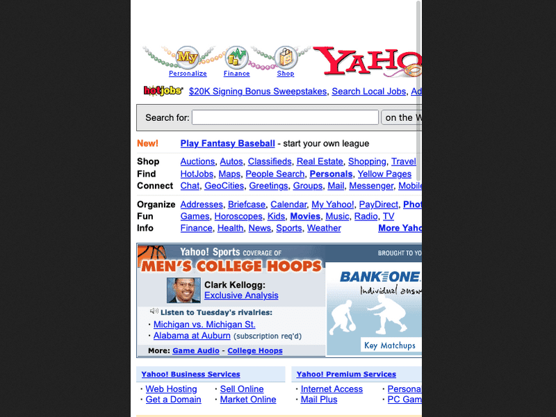
In the early 1990s, when the web was first becoming popular, most monitors had screen dimensions of 640 pixels wide by 480 pixels tall. These were convex cathode ray tubes, unlike the flat liquid crystal displays we have now.
In the formative days of early web design, it was a safe bet to design web pages with a width of 640 pixels. But while other technologies like phones and cameras were miniaturizing, screens were getting bigger (and eventually, flatter). Before long, most screens had dimensions of 800 by 600 pixels. Web designs changed accordingly. Designers and developers started assuming that 800 pixels was a safe default.
Then the screens got bigger again. 1024 by 768 became the default. It felt like an arms race between web designers and hardware manufacturers.
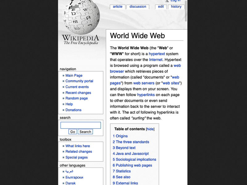
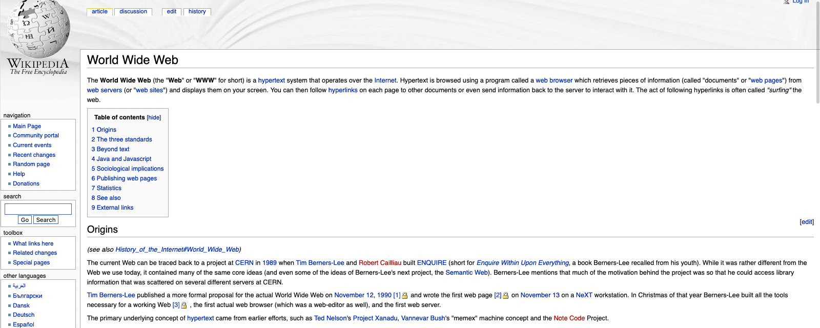
Whether it was 640, 800, or 1024 pixels, choosing one specific width to design for was called fixed-width design.
If you specify a fixed width for your layout, then your layout only looks good at that specific width. If a visitor to your site has a wider screen than the width you have chosen, then there's wasted space on the screen. You can center the content of your pages to distribute that space more evenly (instead of having empty space on one side) but you still wouldn't be taking full advantage of the available space.
Similarly, if a visitor arrives with a narrower screen than the width you've chosen, then your content won't fit horizontally. The browser generates a crawlbar—the horizontal equivalent of a scrollbar—and the user has to move the whole page left and right to see all the content.
Liquid layouts
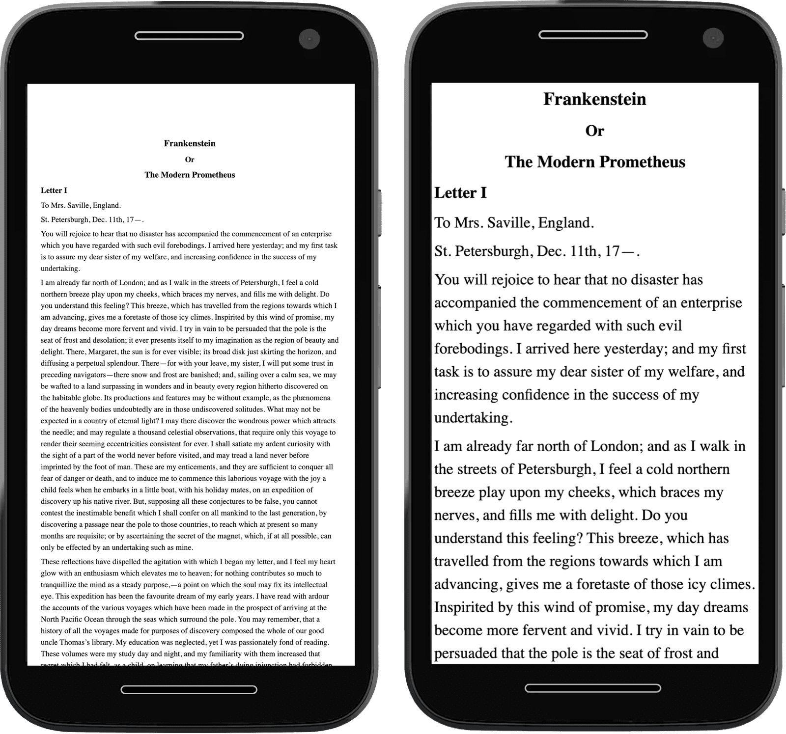
While the majority of designers used fixed-width layouts, some chose to make their layouts flexible. Instead of using fixed widths for your layouts you could make a flexible layout using percentages for your column widths. These designs work in more situations than a fixed-width layout that only looks right at one specific size.
These were called liquid layouts. But while a liquid layout can look good across a wide range of widths, it worsens at the extremes. On a wide screen the layout looks stretched. On a narrow screen the layout looks squashed. Both scenarios aren't ideal.
You can mitigate these problems by using min-width and max-width for your layout.
But then at any size below the minimum width or above the maximum width you've got the same issues you'd have with a fixed-width layout.
On a wide screen there'd be unused space going to waste.
On a narrow screen, the user would have to move the whole page left and right to see everything.
The word liquid is just one of the terms used to describe this kind of layout. These kinds of designs were also called fluid layouts or flexible layouts. The terminology was as fluid as the technique.
Build for different screen sizes
In the 21st century, the web continued to get bigger and bigger. So did monitors. But new screens arrived that were smaller than any desktop device. With the arrival of mobile phones with fully-featured web browsers, designers faced a dilemma. How could they ensure their designs would look good on a desktop computer and a mobile phone? They needed a way of styling their content for screens as small as 240 pixels wide and as large as thousands of pixels wide.
Separate sites
One option is to make a separate subdomain for mobile visitors. But then you have to maintain two separate codebases and designs. And in order to redirect visitors on mobile devices, you'd need to do user-agent sniffing, which can be unreliable and spoofed. Chrome has reduced the user-agent string to prevent such passive fingerprinting. Also, there's no clear line between mobile and not-mobile. Which site do you send tablet devices to?
Adaptive layouts
Instead of having separate sites on different subdomains, you could have a single site with two or three fixed-width layouts.
When media queries first arrived in CSS, they opened the door to making layouts more flexible. But many developers were still most comfortable making fixed-width layouts. One technique involved switching between a handful of fixed-width layouts at specified widths. Some people call this an adaptive design.
Adaptive design allowed designers to provide layouts that looked good at a few different sizes, but the design never looked quite right when viewed between those sizes. The problem of excess space persisted although it wasn't as bad as in a fixed-width layout.
Using CSS media queries, you can give people the layout that's closest to their browser width. But given the variety of device sizes, chances are the layout looks less than perfect for most people.
Responsive web design
If adaptive layouts are a mashup of media queries and fixed-width layouts, responsive web design is a mashup of media queries and liquid layouts.
The term was coined by Ethan Marcotte in an article in A List Apart in 2010.
Ethan defined three criteria for responsive design:
- Fluid grids
- Fluid media
- Media queries
The layout and images of a responsive site would look good on any device. But there was one problem.
A meta element for viewport
Browsers on mobile phones had to deal with websites that were designed with fixed-width layouts for wider screens. By default mobile browsers assumed that 980 pixels was the width that people were designing for (and they weren't wrong). So even if you used a liquid layout, the browser would apply a width of 980 pixels and then scale the rendered web page down to the actual width of the screen.
If you use responsive design, you need to tell the browser not to do that scaling.
You can do that with a meta element in the head of the web page:
<meta name="viewport" content="width=device-width, initial-scale=1">
There are two values, separated by commas.
The first one is width=device-width.
This tells the browser to assume the width of the website is the same as the width of the device
(instead of assuming the width of the website is 980 pixels).
The second value is initial-scale=1.
This tells the browser how much or how little scaling to do.
With a responsive design, you don't want the browser to do any scaling at all.
With that meta element in place, your web pages are ready to be responsive.
Modern responsive design
Now, we can make websites that are responsive in ways far beyond viewport sizes.
Media features give developers access to user preferences and enable customized experiences.
Container queries enable components to own their own responsive information.
The picture element empowers designers to make art-direction decisions based on screen ratios.
Check your understanding
Test your knowledge of responsive web design
In 2021, it's a safe bet to design web pages at a fixed width?
Liquid layouts generally struggle at which kind of screen sizes?
The original three criteria for responsive design are?
Responsive design is an exciting, growing world of possibilities. In the rest of this course, you'll learn about these technologies and how to use them to create beautiful, responsive websites for everyone.