
Overhyped or necessity? Learn everything about dark mode and how to support it to the benefit of your users!

Introduction
Dark mode before Dark Mode

We have gone full circle with dark mode. In the dawn of personal computing, dark mode wasn't a matter of choice, but a matter of fact: Monochrome CRT computer monitors worked by firing electron beams on a phosphorescent screen and the phosphor used in early CRTs was green. Because text was displayed in green and the rest of the screen was black, these models were often referred to as green screens.
The subsequently introduced Color CRTs displayed multiple colors through the use of red, green, and blue phosphors. They created white by activating all three phosphors simultaneously. With the advent of more sophisticated WYSIWYG desktop publishing, the idea of making the virtual document resemble a physical sheet of paper became popular.

This is where dark-on-white as a design trend started, and this trend was carried over to the early document-based web. The first ever browser, WorldWideWeb (remember, CSS wasn't even invented yet), displayed webpages this way. Fun fact: the second ever browser, Line Mode Browser—a terminal-based browser—was green on dark. These days, web pages and web apps are typically designed with dark text on a light background, a baseline assumption that is also hard-coded in user agent stylesheets, including Chrome's.

The days of CRTs are long over. Content consumption and creation has shifted to mobile devices that use backlit LCD or energy-saving AMOLED screens. Smaller and more transportable computers, tablets, and smartphones led to new usage patterns. Leisure tasks like web browsing, coding for fun, and high-end gaming frequently happen after-hours in dim environments. People even enjoy their devices in their beds at night-time. The more people use their devices in the dark, the more the idea of going back to the roots of light-on-dark becomes popular.
Why dark mode
Dark mode for aesthetic reasons
When people get asked why they like or want dark mode, the most popular response is that "it's easier on the eyes," followed by "it's elegant and beautiful." Apple in their Dark Mode developer documentation explicitly writes: "The choice of whether to enable a light or dark appearance is an aesthetic one for most users, and might not relate to ambient lighting conditions."

Dark mode as an accessibility tool
There are also people who actually need dark mode and use it as another accessibility tool, for example, users with low vision. The earliest occurrence of such an accessibility tool I could find is System 7's CloseView feature, which had a toggle for Black on White and White on Black. While System 7 supported color, the default user interface was still black-and-white.
These inversion-based implementations demonstrated their weaknesses once color was introduced. User research by Szpiro et al. on how people with low vision access computing devices showed that all interviewed users disliked inverted images, but that many preferred light text on a dark background. Apple accommodates for this user preference with a feature called Smart Invert, which reverses the colors on the display, except for images, media, and some apps that use dark color styles.
A special form of low vision is Computer Vision Syndrome, also known as Digital Eye Strain, which is defined as "the combination of eye and vision problems associated with the use of computers (including desktop, laptop, and tablets) and other electronic displays (e.g. smartphones and electronic reading devices)." It has been proposed that the use of electronic devices by adolescents, particularly at night time, leads to an increased risk of shorter sleep duration, longer sleep-onset latency, and increased sleep deficiency. Additionally, exposure to blue light has been widely reported to be involved in the regulation of circadian rhythm and the sleep cycle, and irregular light environments may lead to sleep deprivation, possibly affecting mood and task performance, according to research by Rosenfield. To limit these negative effects, reducing blue light by adjusting the display color temperature through features like iOS' Night Shift or Android's Night Light can help, as well as avoiding bright lights or irregular lights in general through dark themes or dark modes.
Dark mode power savings on AMOLED screens
Finally, dark mode is known to save a lot of energy on AMOLED screens. Android case studies that focused on popular Google apps like YouTube have shown that the power savings can be up to 60%. The video below has more details on these case studies and the power savings per app.
Activating dark mode in the operating system
Now that I have covered the background of why dark mode is such a big deal for many users, let's review how you can support it.

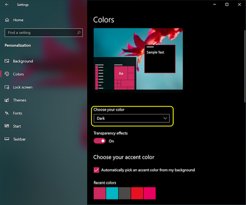
Operating systems that support a dark mode or dark theme typically have an option to activate it somewhere in the settings. On macOS X, it's in the system preference's General section and called Appearance (screenshot), and on Windows 10, it's in the Colors section and called Choose your color (screenshot). For Android Q, you can find it under Display as a Dark Theme toggle switch (screenshot), and on iOS 13, you can change the Appearance in the Display & Brightness section of the settings (screenshot).
The prefers-color-scheme media query
One last bit of theory before I get going.
Media queries
allow authors to test and query values or features of the user agent or display device,
independent of the document being rendered.
They are used in the CSS @media rule to conditionally apply styles to a document,
and in various other contexts and languages, such as HTML and JavaScript.
Media Queries Level 5
introduces so-called user preference media features, that is,
a way for sites to detect the user's preferred way to display content.
The prefers-color-scheme
media feature is used to detect
if the user has requested the page to use a light or dark color theme.
It works with the following values:
light: Indicates that the user has notified the system that they prefer a page that has a light theme (dark text on light background).dark: Indicates that the user has notified the system that they prefer a page that has a dark theme (light text on dark background).
Supporting dark mode
Finding out if dark mode is supported by the browser
As dark mode is reported through a media query, you can easily check if the current browser
supports dark mode by checking if the media query prefers-color-scheme matches at all.
Note how I don't include any value, but purely check if the media query alone matches.
if (window.matchMedia('(prefers-color-scheme)').media !== 'not all') {
  console.log('🎉 Dark mode is supported');
}
At the time of writing, prefers-color-scheme is supported on both desktop and mobile (where available)
by Chrome and Edge as of version 76, Firefox as of version 67,
and Safari as of version 12.1 on macOS and as of version 13 on iOS.
For all other browsers, you can check the Can I use support tables.
Learning about a user's preferences at request time
The Sec-CH-Prefers-Color-Scheme client hint header
allows sites to obtain the user's color scheme preferences optionally at request time,
allowing servers to inline the right CSS and therefore avoid a flash of incorrect color theme.
Dark mode in practice
Let's finally see how supporting dark mode looks like in practice. Just like with the Highlander, with dark mode there can be only one: dark or light, but never both! Why do I mention this? Because this fact should have an impact on the loading strategy. Please don't force users to download CSS in the critical rendering path that is for a mode they don't currently use. To optimize load speed, I have therefore split my CSS for the example app that shows the following recommendations in practice into three parts in order to defer non-critical CSS:
style.cssthat contains generic rules that are used universally on the site.dark.cssthat contains only the rules needed for dark mode.light.cssthat contains only the rules needed for light mode.
Loading strategy
The two latter ones, light.css and dark.css,
are loaded conditionally with a <link media> query.
Initially,
not all browsers will support prefers-color-scheme
(detectable using the pattern above),
which I deal with dynamically by loading the default light.css file
via a conditionally inserted <link rel="stylesheet"> element in a minuscule inline script
(light is an arbitrary choice, I could also have made dark the default fallback experience).
To avoid a flash of unstyled content,
I hide the content of the page until light.css has loaded.
<script>
  // If `prefers-color-scheme` is not supported, fall back to light mode.
  // In this case, light.css will be downloaded with `highest` priority.
  if (window.matchMedia('(prefers-color-scheme: dark)').media === 'not all') {
    document.documentElement.style.display = 'none';
    document.head.insertAdjacentHTML(
      'beforeend',
      '<link rel="stylesheet" href="/light.css" onload="document.documentElement.style.display = \'\'">',
    );
  }
</script>
<!--
  Conditionally either load the light or the dark stylesheet. The matching file
  will be downloaded with `highest`, the non-matching file with `lowest`
  priority. If the browser doesn't support `prefers-color-scheme`, the media
  query is unknown and the files are downloaded with `lowest` priority (but
  above I already force `highest` priority for my default light experience).
-->
<link rel="stylesheet" href="/dark.css" media="(prefers-color-scheme: dark)" />
<link
  rel="stylesheet"
  href="/light.css"
  media="(prefers-color-scheme: light)"
/>
<!-- The main stylesheet -->
<link rel="stylesheet" href="/style.css" />
Stylesheet architecture
I make maximum use of CSS variables,
this allows my generic style.css to be, well, generic,
and all the light or dark mode customization happens in the two other files dark.css and light.css.
Below you can see an excerpt of the actual styles, but it should suffice to convey the overall idea.
I declare two variables, --color and --background-color
that essentially create a dark-on-light and a light-on-dark baseline theme.
/* light.css: 👉 dark-on-light */
:root {
  --color: rgb(5, 5, 5);
  --background-color: rgb(250, 250, 250);
}
/* dark.css: 👉 light-on-dark */
:root {
  --color: rgb(250, 250, 250);
  --background-color: rgb(5, 5, 5);
}
In my style.css, I then use these variables in the body { … } rule.
As they are defined on the
:root CSS pseudo-class—a
selector that in HTML represents the <html> element
and is identical to the selector html, except that its specificity is
higher—they cascade down, which serves me for declaring global CSS variables.
/* style.css */
:root {
  color-scheme: light dark;
}

body {
  color: var(--color);
  background-color: var(--background-color);
}
In the code sample above, you will probably have noticed a property
color-scheme
with the space-separated value light dark.
This tells the browser which color themes my app supports
and allows it to activate special variants of the user agent stylesheet,
which is useful to, for example, let the browser render form fields
with a dark background and light text, adjust the scroll bars,
or to enable a theme-aware highlight color.
The exact details of color-scheme are specified in
CSS Color Adjustment Module Level 1.
Everything else is then just a matter of defining CSS variables
for things that matter on my site.
Semantically organizing styles helps a lot when working with dark mode.
For example, rather than --highlight-yellow, consider calling the variable
--accent-color, as "yellow" may actually not be yellow in dark mode or vice versa.
Below is an example of some more variables that I use in my example.
/* dark.css */
:root {
  --color: rgb(250, 250, 250);
  --background-color: rgb(5, 5, 5);
  --link-color: rgb(0, 188, 212);
  --main-headline-color: rgb(233, 30, 99);
  --accent-background-color: rgb(0, 188, 212);
  --accent-color: rgb(5, 5, 5);
}
/* light.css */
:root {
  --color: rgb(5, 5, 5);
  --background-color: rgb(250, 250, 250);
  --link-color: rgb(0, 0, 238);
  --main-headline-color: rgb(0, 0, 192);
  --accent-background-color: rgb(0, 0, 238);
  --accent-color: rgb(250, 250, 250);
}
Full example
In the following Glitch embed, you can see the complete example that puts the concepts from above into practice. Try toggling dark mode in your particular operating system's settings and see how the page reacts.
Loading impact
When you play with this example, you can see
why I load my dark.css and light.css via media queries.
Try toggling dark mode and reload the page:
the particular currently non-matching stylesheets are still loaded, but with the lowest priority,
so that they never compete with resources that are needed by the site right now.


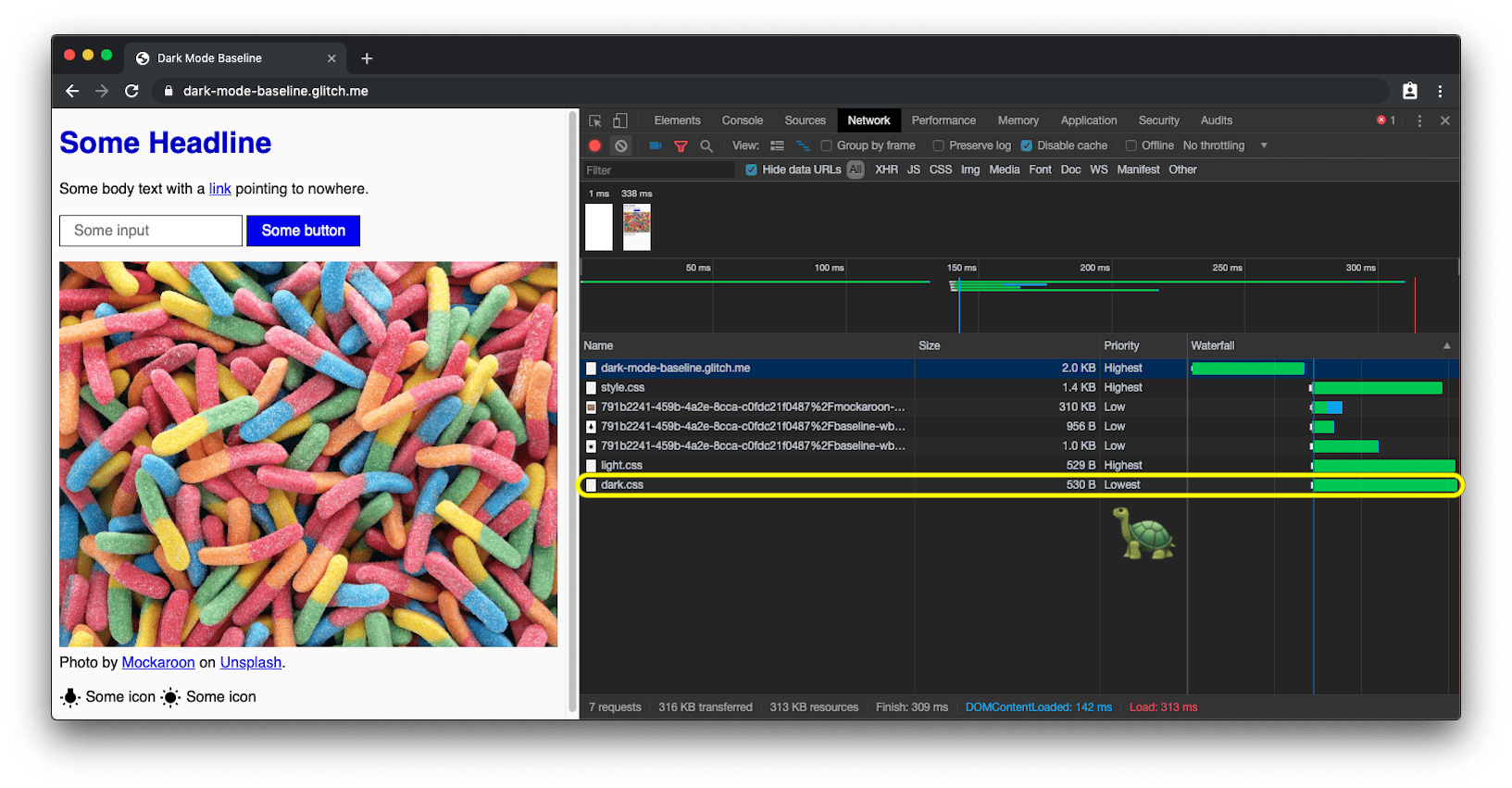
prefers-color-scheme loads the dark mode CSS with lowest priority.Reacting on dark mode changes
Like any other media query change, dark mode changes can be subscribed to via JavaScript.
You can use this to, for example, dynamically change the
favicon
of a page or change the
<meta name="theme-color">
that determines the color of the URL bar in Chrome.
The full example above shows this in action,
in order to see the theme color and favicon changes, open the
demo in a separate tab.
const darkModeMediaQuery = window.matchMedia('(prefers-color-scheme: dark)');
darkModeMediaQuery.addEventListener('change', (e) => {
  const darkModeOn = e.matches;
  console.log(`Dark mode is ${darkModeOn ? '🌒 on' : '☀️ off'}.`);
});
As of Chromium 93 and Safari 15, you can adjust the color based on a
media query with the media attribute of the meta theme color element. The
first one that matches will be picked. For example, you could have one color for
light mode and another one for dark mode. At the time of writing, you can't
define those in your manifest. See w3c/manifest#975 GitHub
issue.
<meta
  name="theme-color"
  media="(prefers-color-scheme: light)"
  content="white"
/>
<meta name="theme-color" media="(prefers-color-scheme: dark)" content="black" />
Debugging and testing dark mode
Emulating prefers-color-scheme in DevTools
Switching the entire operating system's color scheme can get annoying real quick,
so Chrome DevTools now allows you to emulate the user's preferred color scheme
in a way that only affects the currently visible tab.
Open the Command Menu, start typing Rendering, run the Show Rendering command, and then change the Emulate CSS media feature prefers-color-scheme option.

Screenshotting prefers-color-scheme with Puppeteer
Puppeteer is a Node.js library
that provides a high-level API to control Chrome or Chromium over the
DevTools Protocol.
With dark-mode-screenshot, we provide
a Puppeteer script that lets you create screenshots of your pages in both dark and light mode.
You can run this script as a one-off, or alternatively make it part of your
Continuous Integration (CI) test suite.
npx dark-mode-screenshot --url https://googlechromelabs.github.io/dark-mode-toggle/demo/ --output screenshot --fullPage --pause 750
Dark mode best practices
Avoid pure white
A small detail you may have noticed is that I don't use pure white.
Instead, to prevent glowing and bleeding against the surrounding dark content,
I choose a slightly darker white. Something like rgb(250, 250, 250) works well.
Re-colorize and darken photographic images
If you compare the two screenshots below, you will notice that not only the core theme has changed from dark-on-light to light-on-dark, but that also the hero image looks slightly different. My user research has shown that the majority of the surveyed people prefer slightly less vibrant and brilliant images when dark mode is active. I refer to this as re-colorization.


Re-colorization can be achieved through a CSS filter on my images.
I use a CSS selector that matches all images that don't have .svg in their URL,
the idea being that I can give vector graphics (icons) a different re-colorization treatment
than my images (photos), more about this in the next paragraph.
Note how I again use a CSS variable,
so I can later on flexibly change my filter.
As re-colorization is only needed in dark mode, that is, when dark.css is active,
there are no corresponding rules in light.css.
/* dark.css */
--image-filter: grayscale(50%);

img:not([src*='.svg']) {
  filter: var(--image-filter);
}
Customizing dark mode re-colorization intensities with JavaScript
Not everyone is the same and people have different dark mode needs.
By sticking to the re-colorization method described above,
I can easily make the grayscale intensity a user preference that I can
change via JavaScript,
and by setting a value of 0%, I can also disable re-colorization completely.
Note that document.documentElement
provides a reference to the root element of the document,
that is, the same element I can reference with the
:root CSS pseudo-class.
const filter = 'grayscale(70%)';
document.documentElement.style.setProperty('--image-filter', value);
Invert vector graphics and icons
For vector graphics—that in my case are used as icons that I reference via <img> elements—I
use a different re-colorization method.
While research has shown
that people don't like inversion for photos, it does work very well for most icons.
Again I use CSS variables to determine the inversion amount
in the regular and in the :hover state.
Note how again I only invert icons in dark.css but not in light.css, and how :hover
gets a different inversion intensity in the two cases to make the icon appear
slightly darker or slightly brighter, dependent on the mode the user has selected.
/* dark.css */
--icon-filter: invert(100%);
--icon-filter_hover: invert(40%);

img[src*='.svg'] {
  filter: var(--icon-filter);
}
/* light.css */
--icon-filter_hover: invert(60%);
/* style.css */
img[src*='.svg']:hover {
  filter: var(--icon-filter_hover);
}
Use currentColor for inline SVGs
For inline SVG images, instead of using inversion filters,
you can leverage the currentColor
CSS keyword that represents the value of an element's color property.
This lets you use the color value on properties that do not receive it by default.
Conveniently, if currentColor is used as the value of the SVG
fill or stroke attributes,
it instead takes its value from the inherited value of the color property.
Even better: this also works for
<svg><use href="…"></svg>,
so you can have separate resources
and currentColor will still be applied in context.
Please note that this only works for inline or <use href="…"> SVGs,
but not SVGs that are referenced as the src of an image or somehow via CSS.
You can see this applied in the demo below.
<!-- Some inline SVG -->
<svg xmlns="http://www.w3.org/2000/svg"
    stroke="currentColor"
>
  […]
</svg>
Smooth transitions between modes
Switching from dark mode to light mode or vice versa can be smoothed thanks to the fact
that both color and background-color are
animatable CSS properties.
Creating the animation is as easy as declaring two transitions for the two properties.
The example below illustrates the overall idea, you can experience it live in the
demo.
body {
  --duration: 0.5s;
  --timing: ease;

  color: var(--color);
  background-color: var(--background-color);

  transition: color var(--duration) var(--timing), background-color var(
        --duration
      ) var(--timing);
}
Art direction with dark mode
While for loading performance reasons in general I recommend to exclusively work with prefers-color-scheme
in the media attribute of <link> elements (rather than inline in stylesheets),
there are situations where you actually may want to work with prefers-color-scheme directly inline in your HTML code.
Art direction is such a situation.
On the web, art direction deals with the overall visual appearance of a page and how it communicates visually,
stimulates moods, contrasts features, and psychologically appeals to a target audience.
With dark mode, it's up to the judgment of the designer to decide what is the best image at a particular mode
and whether re-colorization of images is maybe not good enough.
If used with the <picture> element, the <source> of the image to be shown can be made dependent on the media attribute.
In the example below, I show the Western hemisphere for dark mode, and the Eastern hemisphere for light mode
or when no preference is given, defaulting to the Eastern hemisphere in all other cases.
This is of course purely for illustrative purposes.
Toggle dark mode on your device to see the difference.
<picture>
  <source srcset="western.webp" media="(prefers-color-scheme: dark)" />
  <source srcset="eastern.webp" media="(prefers-color-scheme: light)" />
  <img src="eastern.webp" />
</picture>
Dark mode, but add an opt-out
As mentioned in the why dark mode section above,
dark mode is an aesthetic choice for most users.
In consequence, some users may actually like to have their operating system UI
in dark, but still prefer to see their webpages the way they are used to seeing them.
A great pattern is to initially adhere to the signal the browser sends through
prefers-color-scheme, but to then optionally allow users to override their system-level setting.
The <dark-mode-toggle> custom element
You can of course create the code for this yourself, but you can also just use
a ready-made custom element (web component) that I have created right for this purpose.
It's called <dark-mode-toggle>
and it adds a toggle (dark mode: on/off) or
a theme switcher (theme: light/dark) to your page that you can fully customize.
The demo below shows the element in action
(oh, and I have also 🤫 silently snuck it in all of the
other
examples
above).
<dark-mode-toggle
  legend="Theme Switcher"
  appearance="switch"
  dark="Dark"
  light="Light"
  remember="Remember this"
></dark-mode-toggle>

<dark-mode-toggle> in light mode.

<dark-mode-toggle> in dark mode.
Try clicking or tapping the dark mode controls in the upper right corner in the demo below. If you check the checkbox in the third and the fourth control, see how your mode selection is remembered even when you reload the page. This allows your visitors to keep their operating system in dark mode, but enjoy your site in light mode or vice versa.
Conclusions
Working with and supporting dark mode is fun and opens up new design avenues.
For some of your visitors it can be the difference between not being able to handle your site
and being a happy user.
There are some pitfalls and careful testing is definitely required,
but dark mode is definitely a great opportunity for you to show that you care about all of your users.
The best practices mentioned in this post and helpers like the
<dark-mode-toggle> custom element
should make you confident in your ability to create an amazing dark mode experience.
Let me know on Twitter what you create and if this post was useful
or also suggestions for improving it.
Thanks for reading! 🌒
Related links
Resources for the prefers-color-scheme media query:
Resources for the color-scheme meta tag and CSS property:
- The
color-schemeCSS property and meta tag - Chrome Platform Status page
- Chromium bug
- CSS Color Adjustment Module Level 1 spec
- CSS WG GitHub Issue for the meta tag and the CSS property
- HTML WHATWG GitHub Issue for the meta tag
General dark mode links:
- Material Design—Dark Theme
- Dark Mode in Web Inspector
- Dark Mode Support in WebKit
- Apple Human Interface Guidelines—Dark Mode
Background research articles for this post:
- What Does Dark Mode's "supported-color-schemes" Actually Do? 🤔
- Let there be darkness! 🌚 Maybe…
- Re-Colorization for Dark Mode
Acknowledgements
The prefers-color-scheme media feature, the color-scheme CSS property,
and the related meta tag are the implementation work of 👏 Rune Lillesveen.
Rune is also a co-editor of the CSS Color Adjustment Module Level 1 spec.
I would like to 🙏 thank Lukasz Zbylut,
Rowan Merewood,
Chirag Desai,
and Rob Dodson
for their thorough reviews of this article.
The loading strategy is the brainchild of Jake Archibald.
Emilio Cobos Álvarez has pointed me to the correct prefers-color-scheme detection method.
The tip with referenced SVGs and currentColor came from
Timothy Hatcher.
Finally, I am thankful to the many anonymous participants of the various user studies
that have helped shape the recommendations in this article.
Hero image by Nathan Anderson.