
Think about your favorite website or app. What makes it your favorite? Now, think about a website or app you dislike. What do you not like about it? How users interact with your design and their experience on your website and app can vary.
That experience can change based on the time of day, the type of device used, if they've had enough sleep the night before, if they are unwell, if they're using assistive technology, and so much more. With close to eight billion people worldwide, the possibilities of how people use and experience your designs are limitless.
Inclusive design
How can we address all of the potential user needs at once? Enter inclusive design. Inclusive design utilizes a human-centered approach that weaves together inclusivity, usability, and accessibility into one.
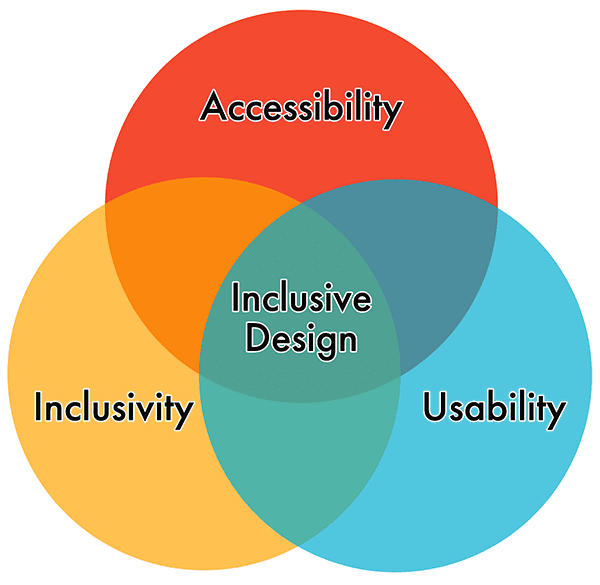
And unlike universal design, which focuses on a single design that as many people can use as possible, inclusive design principles center on designing for a specific individual or use case, and then extending that design to others.
There are seven accessibility-focused inclusive design principles:
- Provide comparable experience: Ensure your interface provides an equal experience for all, so people can accomplish tasks in a way that suits their needs without undermining the quality of the content.
- Consider the situation: Make sure your interface delivers a valuable experience to people, regardless of their circumstances.
- Be consistent: Use familiar conventions and apply them in a logical manner.
- Give control: Ensure people can access and interact with content in their preferred way.
- Offer choice: Consider providing different ways for people to complete tasks, especially those that are complex or non-standard.
- Prioritize content: Help users focus on core tasks, features, and information by arranging these elements in the preferred order within the content and layout.
- Add value: Consider the purpose and significance of features and how they improve the experience for different users.
Personas
When developing a new design or feature, many teams rely on user personas to guide them through the process. Personas are fictitious characters that use your digital products, often based on quantitative and qualitative user research.
Personas also offer a quick and inexpensive way to test and prioritize those features throughout the design and development process. They help to focus decisions surrounding site components by adding a layer of real-world consideration to the conversation to help align strategy and create goals focused on specific user groups.
Incorporate disabilities
"People are all different. I can only speak from my experience. When you meet one Deaf person, then you've met one Deaf person—not all of us."
Meryl Evans from the ID24 talk Deaf Tech: Travel Through Time from Past to Future.
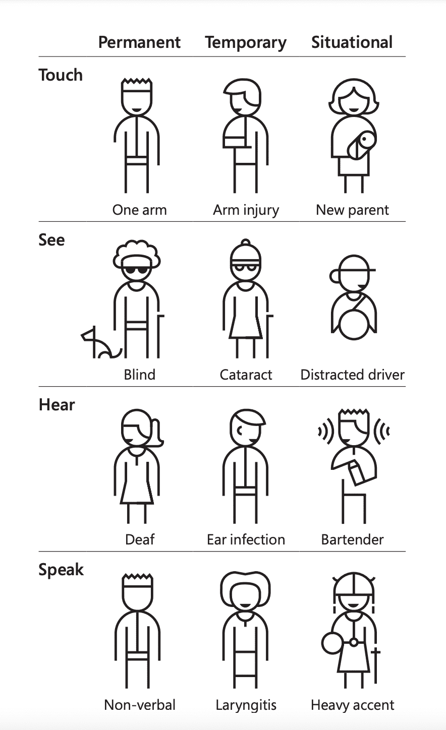
Personas can be used as an inclusive design tool when you incorporate people with disabilities into your personas. There are many different ways to do this. You may create disability-specific personas, add disabilities to existing user personas, or even create a persona spectrum to reflect the dynamic reality of situational, temporary, and permanent disabilities.
No matter how you incorporate people with disabilities into your personas, they should not be based on real people or stereotypes. And personas are never a substitute for user testing.

- Name: Jane Bennet
- Age: 57 years old
- Location: Essex, United Kingdom
- Occupation: UX engineer
- Disability: Hand tremor from Young Onset Parkinson's disease (YOPD)
- Goals: use speech-to-text input to make adding code suggestions easier; find biking equipment online with minimal keystrokes.
- Frustrations: websites lacking keyboard-only support; apps for design with small areas for touch interaction.
As a UX engineer, Jane designs and builds pages that are vital to keeping her company's site relevant. She supports a lot of team members throughout the day. She's the queen of putting out technical fires, and everyone's go-to in the department when anything goes down unexpectedly.
Losing her fine motor skills to tremors is making it increasingly difficult for her to use a mouse. She's been steadily relying on the keyboard more and more to navigate the web. Jane has always been dedicated to her physical fitness. She loves road racing and BMX. This made it all the more of a blow when she was diagnosed with Young Onset Parkinson's disease last year.
Disability simulators
Use extreme caution when using disability simulators to emulate or supplement your personas.
Disability simulators are a double-edged sword in that they can build sympathy or empathy—it can depend on the individual, the context in which the simulator is used, and many other uncontrollable factors. Many accessibility advocates are against using disability simulator tools and recommend seeking out movies, demos, tutorials, and other content created by people with disabilities, and learning about their experiences first-hand.
"I think we need to be completely honest that any simulation activity does not impact some of the most important understandings we want the sighted to know in their heart and their head. Blindness is not the characteristic that defines us, that the misunderstandings and low expectations about blindness are our biggest obstacle.
Those misunderstandings create artificial barriers that prevent us from fully participating, and those false limitations build into something that holds us back."
Mark Riccobono, President of the National Federation of the Blind.
Accessibility heuristics
Consider adding heuristics into your workflow as you build your personas and designs. Heuristics are rules for interaction design, introduced in 1990 by Jakob Nielsen and Rolf Molich. These ten principles were developed based on years of experience in the field of usability engineering, and have been used in design and human-computer interaction programs ever since.
Fast-forward to 2019, and the design team at Deque created and shared a new set of heuristics focused on digital accessibility. According to their research, up to 67% of all accessibility bugs for a website or app can be avoided when accessibility is part of the design process. That's a huge impact that can be made before even one line of code is written.
Similar to the original set of heuristics, there are ten accessibility heuristics to consider when planning your design.
- Interaction methods and modalities: Users can efficiently interact with the system using the input method of their choosing (such as a mouse, keyboard, touch, etc.).
- Navigation and wayfinding: Users can navigate, find content, and determine where they are, at all times, within the system.
- Structure and semantics: Users can make sense of the structure of the content on each page and understand how to operate within the system.
- Error prevention and states: Interactive controls have persistent, meaningful instructions to help prevent mistakes, and provide users with clear error states which indicate what the problems are and how to fix them whenever errors are returned.
- Contrast and legibility: Users can easily distinguish and read text and other meaningful information.
- Language and readability: Users can easily read and understand the content.
- Predictability and consistency: Users can predict each element's purpose. It's clear how each element relates to the system as a whole.
- Timing and preservation: Users are given enough time to complete their tasks and don't lose information if their time (i.e., a session) runs out.
- Movement and flashing: Users can stop elements on the page that move, flash, or are animated. Users shouldn't be distracted or otherwise harmed by these elements.
- Visual and auditory alternatives: Users can access text-based alternatives for any visual or auditory content which conveys information.
Once you have a basic understanding of these accessibility heuristics, you can apply it to a persona or design using the accessibility heuristics worksheet and by following the instructions provided. This exercise is more enlightening when you gather multiple perspectives.
An example accessibility heuristic review for the navigation and wayfinding checkpoint could look like the following:
| Checkpoints for navigation and wayfinding | Excels (+2 pt) | Passes (+1 pt) | Fails (-1 pt) | N/A (0 pt) |
|---|---|---|---|---|
| Is a clear, visible indicator set on all active elements as they receive focus? | ||||
| Does the page have meaningful title text, with page-specific information first? | ||||
| Are the page title element and H1 the same or similar? | ||||
| Are there meaningful headings for each major section? | ||||
| Is the links' purpose defined from the link text alone or its immediate context? | ||||
| Is a skip link provided at the very top of the page and is it revealed on focus? | ||||
| Does the organization of navigational elements facilitate wayfinding? |
After everyone on the team looks at the page or component and conducts their accessibility heuristic review, the totals are tallied up for each checkpoint. At this point, you can decide how to remedy any found issues or correct any omissions that are paramount to supporting digital accessibility.
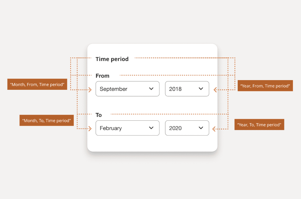
Accessibility annotations
Before you hand off your design to the development team, you should consider adding accessibility annotations.
Annotations, in general, are used to explain creative choices and describe different aspects of the design. Accessibility annotations focus on areas where developers can make more accessible programmatic choices with the guidance of the design team or an accessibility-focused specialist.
Accessibility annotations can be applied during any stage of the design process, from wireframes to high-fidelity mockups. They can include user flows, conditional states, and functionality. They often use symbols and labels to streamline the process and keep the design as the main focus.
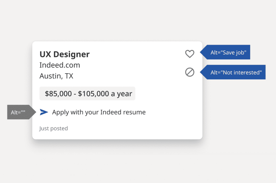
The following design illustrations examples are from Indeed.com's accessibility annotations kit for Figma.
Depending on your design program, you should have multiple accessibility annotation starter kits to choose from. Or, if you prefer, you can create your own set. In either case, you should decide which information needs to be communicated to the hand-off team and what format works best.
Some areas to consider for accessibility annotations include:
- Color: include contrast ratios of all of the different combinations of colors in the palette.
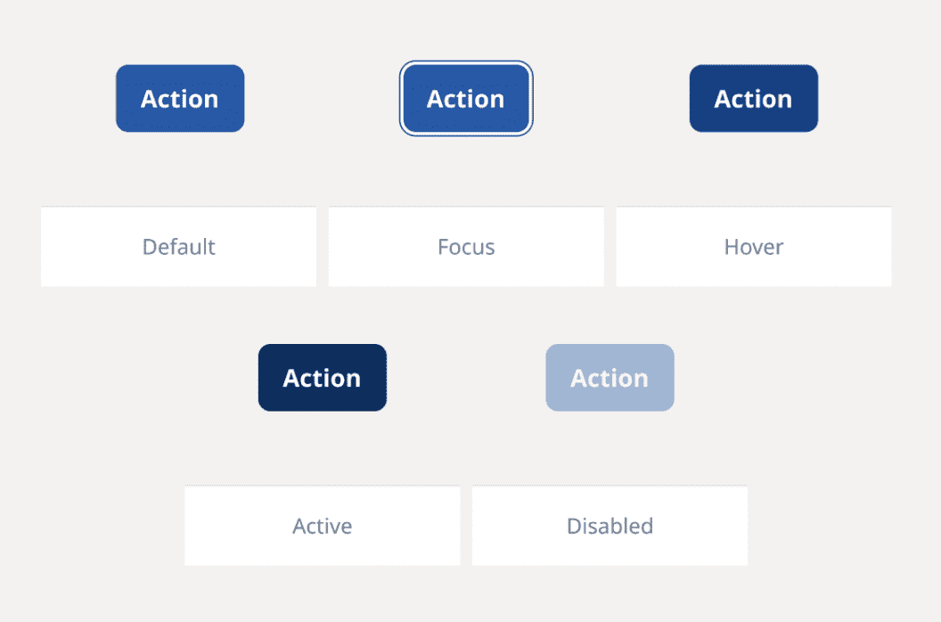
- Buttons and links: identify default, hover, active, focus, and disabled states.
- Skip links: highlight the hidden and visible design aspects and where they link to on the page.
- Images and icons: add alternative text recommendations for essential images and icons.
- Audio and video: highlight areas and links for captions, transcripts, and audio descriptions.
- Headings: add programmatic levels and include everything that looks like a heading.
- Landmarks: highlight the different sections of the design with HTML or ARIA.
- Interactive components: identify clickable elements, hover effects, focus area.
- Keyboard: identify where the focus should start (alpha stop) and the following tab order.
- Forms: add field labels, helper text, error messages, and success messages.
- Accessible names: identify how assistive technology should recognize the element.