
Manual testing basics
Manual accessibility testing uses keyboard, visual, and cognitive tests, tools, and techniques to find issues that automated tooling cannot. As automated tooling doesn't cover all of the success criteria identified in WCAG, it's vital that you run automated accessibility tests and keep testing!
As technology advances, more tests could be covered by automated tooling alone, but today, both manual and assistive technology checks need to be added to your testing protocols to cover all of the applicable WCAG checkpoints.
Benefits of manual accessibility tests:
- Reasonably straightforward and quick to run
- Catch a higher percentage of issues than automated tests alone
- Little tooling and expertise needed for success
Disadvantages of manual accessibility tests:
- More complex and time-consuming than automated tests
- May be difficult to repeat at scale
- Require more accessibility expertise to run tests and interpret the results
Compare what accessibility elements and details can be detected by an automated tool, versus those that won't be detected.
Types of manual tests
There are many manual tools and techniques to consider when looking at your web page or app for digital accessibility. The three biggest focus areas in manual testing are keyboard functionality, visually-focused reviews, and general content checks.
We cover each of these topics at a high level in this module, but the following tests are not meant to be an exhaustive list of all the manual tests you can or should run. We encourage you to start with a manual accessibility checklist from a reputable source and develop your own focused manual testing checklist for your specific digital product and team needs.
Keyboard checks
It's estimated that about 25% of all digital accessibility issues are related to a lack of keyboard support. As we learned in the keyboard focus module, this affects all types of users, including sighted keyboard-only users, low-vision/blind screen reader users, and people using voice recognition software that uses technology that relies on content being keyboard accessible as well.
Keyboard tests answer questions such as:
- Does the web page or feature require a mouse to function?
- Is the tabbing order logical and intuitive?
- Is the keyboard focus indicator always visible?
- Can you get stuck in an element that shouldn't trap focus?
- Can you navigate behind or around an element that should be trapping focus?
- When closing an element that received focus, did the focus indicator return to a logical place?
While the impact of keyboard functionality is huge, the testing procedure is quite simple. All you need to do is set aside your mouse or install a small JavaScript package and test your website using only your keyboard. The following commands are essential for keyboard testing.
Visual checks
Visual checks focus on visual elements of the page and utilize tools such as screen magnification or browser zoom to review the website or app for accessibility.
Visual checks can tell you:
- Are there color contrast issues that an automated tool couldn't pick up, such as text on top of a gradient or image?
- Are there any elements that look like headings, lists, and other structural elements but are not coded as such?
- Are navigation links and form inputs consistent throughout the website or app?
- Is there any flashing, strobing, or animation that exceeds the recommendations?
- Does the content have proper spacing? For letters, words, lines, and paragraphs?
- Can you see all the content using a screen magnifier or browser zoom?
Content checks
Unlike visual tests that focus on layouts, movement, and colors, content checks focus on the words on the page. Not only should you be looking at the copy itself, but you should review the context to be sure it makes sense to others.
Content checks answer questions such as:
- Are page titles, headings, and form labels clear and descriptive?
- Are image alternatives concise, accurate, and useful?
- Is color alone used as the only way of conveying meaning or information?
- Are links descriptive or do you use generic text such as "read more" or "click here"?
- Are there any changes to the language within a page?
- Is plain language used and are all acronyms spelled out when first referenced?
Some content checks can be automated, in part. For example, you could write a JavaScript linter that checks for "Click here" and suggests you make a change. However, these custom solutions often still need a human to change the copy to something contextual.
Demo: Manual test
So far, we have run automated tests on our demo web page and found and remediated eight different issue types. We are now ready to run manual checks to see if we can discover even more accessibility issues.
Step 1
Our updated CodePen demo has all of the automated accessibility updates applied.
View it in debug mode to proceed with the
next tests. This is important, as it removes the <iframe> which surrounds the
demo web page, which may interfere with some testing tools. Learn more about
CodePen's debug mode.
Step 2
Start your manual testing process by setting your mouse or trackpad aside and navigate up and down the DOM using only your keyboard.
Issue 1: Visible focus indicator
You should see the first keyboard issue right away—or rather, you shouldn't see it—as the visible focus indicator has been removed. When you scan the CSS in the demo, you should find the dreaded "outline: none" added to the codebase.
  :focus {
    outline: none;
  }
 Let's fix it.
As you learned in the Keyboard focus module, you need to remove this line of code to allow web browsers to add a visible focus for users. You can go one step further and create a focus indicator styled to meet the aesthetics of your digital product.
:focus {
  outline: 3px dotted #008576;
}
Issue 2: Focus order
Once you have modified the focus indicator and it's visible, be sure to tab through the page. As you do so, you should notice that the form input field used to subscribe to the newsletter does not receive focus. It has been removed from the natural focus order by a negative tabindex.
<input type="email" placeholder="Enter your e-mail address" aria-hidden="true" tabindex="-1" required>
Since we would like people to use this field to sign-up for our newsletter, all we need to do is remove the negative tabindex or set it to zero to allow the input to become keyboard focusable again.
<input type="email" placeholder="Enter your e-mail address" aria-hidden="true" required>
Step 3
Once keyboard focus has been checked, we move on to visual and content checks.
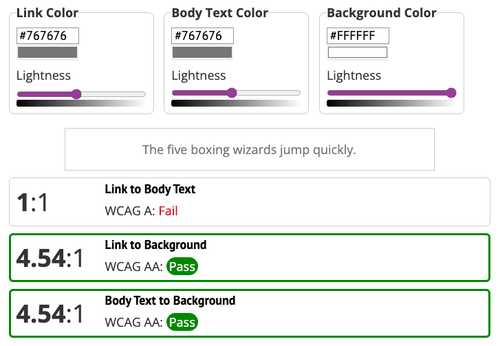
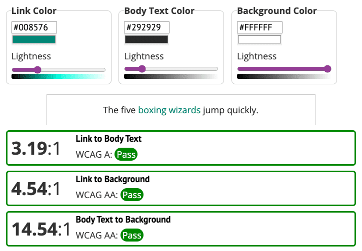
Issue 3: Link color contrast
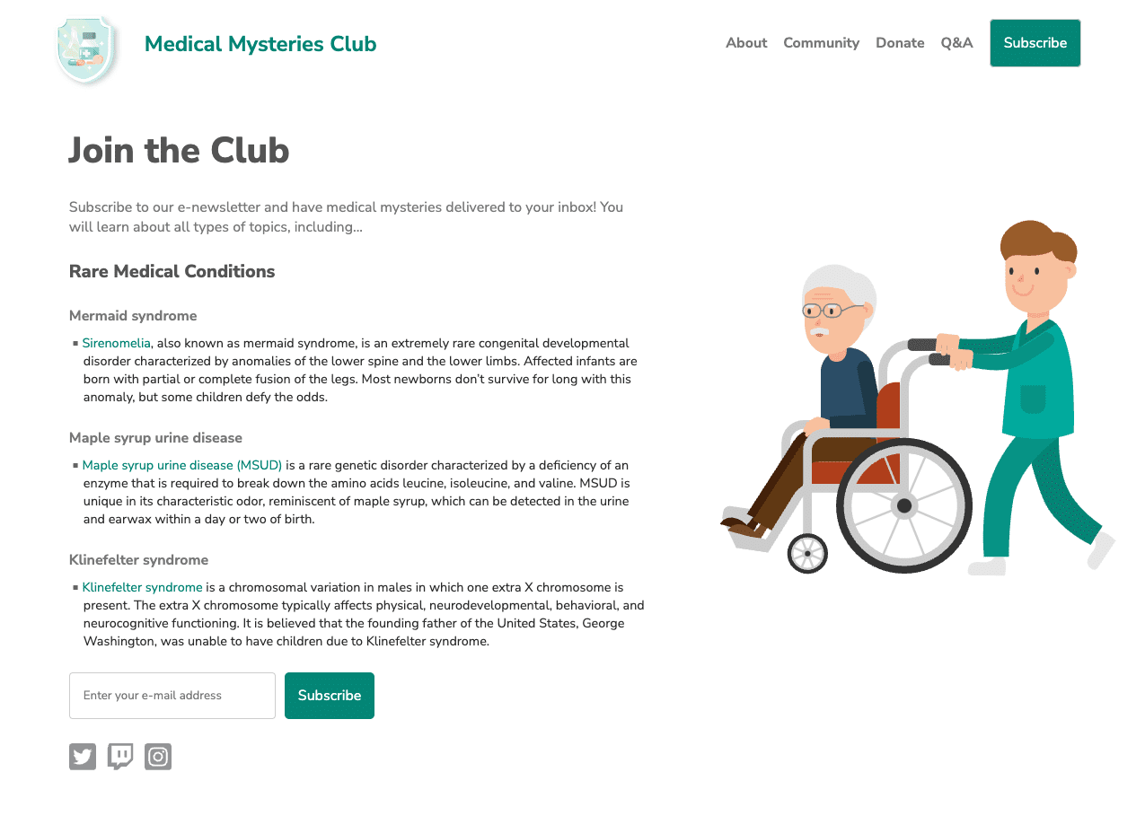
As you went through the keyboard tests by tabbing up and down the demo page, you probably noticed the keyboard focused on three visually hidden links in the paragraphs about the different medical conditions.
For our page to be accessible, links must stand out from the surrounding text and include a non-color style change on mouse hover and keyboard focus.
Let's fix it.
A quick solution is to add an underline to the links inside the paragraphs to make them stand out. This would solve the accessibility issue, but it might not suit the overall design aesthetics you hope to achieve.
If you choose not to add an underline, you will need to modify the colors in such a way as to meet the requirements for both the background and copy.
When looking at the demo using a link contrast checker tool, you will see that the link color meets the 4.5:1 color contrast requirement between regular-sized text and the background. However, non-underlined links must also meet a 3:1 color contrast requirement against the surrounding text.
One option is to change the link color to match the other elements on the page. But if you change the link color to green, the body copy must also be modified to meet the overall color contrast requirements between all three elements: links, background, and surrounding text.
Issue 4: Icon color contrast
Another missed color contrast issue is the social media icons. In the color and contrast module, you learned that essential icons need to meet a 3:1 color contrast against the background. However, in the demo, the social media icons have a contrast ratio of 1.3:1.
Let's fix it.
To meet the 3:1 color contrast requirements, the social media icons are changed to a darker gray.

Issue 5: Content layout
If you look at the layout of the paragraph content, the text is fully justified. As you learned in the Typography module, this creates "rivers of space," which may make the text difficult for some users to read.
p.bullet {
   text-align: justify;
}
To reset the text alignment in the demo, you can update the code to
text-align: left; or remove that line entirely from the CSS, as left is the
default alignment for browsers. Be sure to test the code, in case other
inherited styles remove the default text alignment.
p.bullet {
   text-align: left;
}
Step 4
Once you've identified and fixed all the manual accessibility issues outlined in the previous steps, your page should look similar to our screenshot.
It's possible that you'll find more accessibility issues in your manual checks than we covered in this module. We'll discover many of these issues in the next module.
Next step
Way to go! You have completed the automated and manual testing modules. You can view our updated CodePen, which has all the automated and manual accessibility fixes applied.
Now, head over to the last testing module focused on assistive technology testing.