


We know that it's a good idea to design responsively to provide the best multi-device experience, but responsive design also yields a win for accessibility.
Consider a site like Udacity:
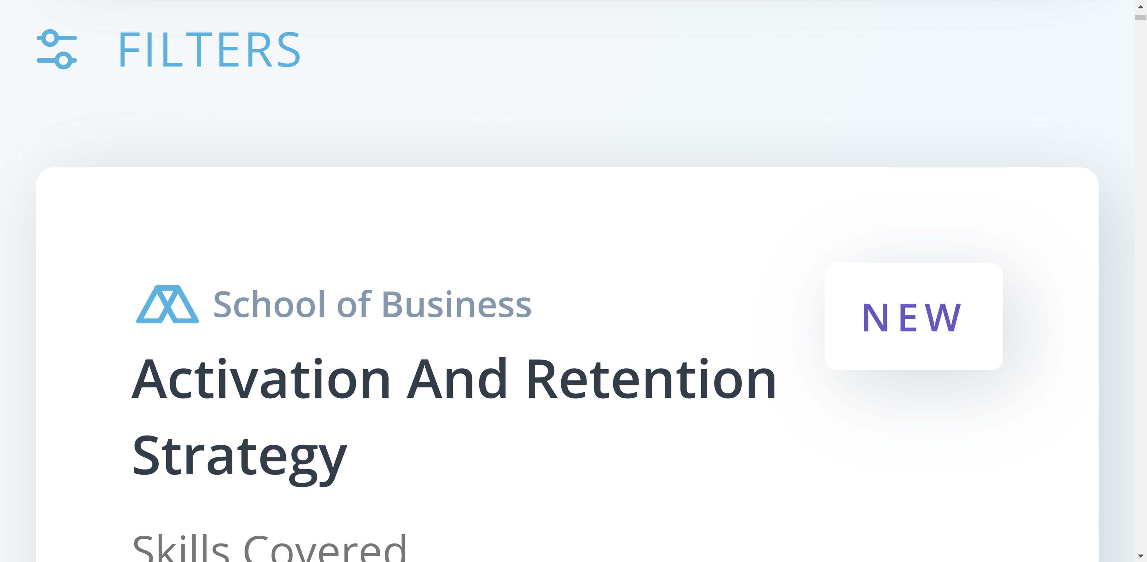
A low-vision user who has difficulty reading small print might zoom in the page, perhaps as much as 400%. Because the site uses responsive design, the interface rearranges itself for the "smaller viewport" (actually for the larger page), which is great for desktop users who require screen magnification and for mobile screen reader users as well. It's a win-win. Here's the same page magnified to 400%:
In fact, just by designing responsively, we're meeting rule 1.4.4 of the WebAIM checklist, which states that a page is: "readable and functional when the text size is doubled."
Going over all of responsive design is outside the scope of this guide, but here are a few important takeaways that improve your responsive experience and give your users better access to your content.
Use the viewport meta tag
<meta name="viewport" content="width=device-width, initial-scale=1.0">
Setting width=device-width matches the screen's width in device-independent
pixels, and setting initial-scale=1 establishes a 1:1 relationship between CSS
pixels and device-independent pixels. Doing this instructs the browser to fit
your content to the screen size, so users don't just see a bunch of scrunched-up
text.
See Size content to viewport to learn more.
Allow users to zoom
You can use the viewport meta tag to prevent zooming, by setting
maximum-scale=1 or user-scaleable=no. Avoid doing this, and let your users
zoom in if they need to.
Design with flexibility
Avoid targeting specific screen sizes and instead use a flexible grid, making changes to the layout when the content dictates. As we saw with the Udacity example, this approach ensures that the design responds whether the reduced space is due to a smaller screen or a higher zoom level.
Read more about these techniques in Responsive web design basics.
Use relative units for text
To get the best out of your flexible grid use relative units like em or rem for things like text size, instead of pixel values. Some browsers support resizing text only in user preferences, and if you're using a pixel value for text, this setting does not affect your copy. If, however, you've used relative units throughout, then the site copy updates to reflect the user's preference.
This enables the whole site to reflow as the user zooms, creating the reading experience they need to use your site.
Avoid disconnecting the visual view from the source order
Keyboard users that tab through your site follow the order of the content in your HTML documents. When using layout methods like Flexbox and Grid, you can change the visual ordering of elements, which may lead to a mismatch with the source order. This can lead to the user jumping around the page with each tab.
Test your design at each breakpoint by tabbing through the content. Ask yourself, "Does the flow through the page still make sense?"
Read more about disconnects between source and visual display.
Take care with spatial clues
When writing microcopy, avoid using language that indicates the location of an element on the page. For users with visual impairments, they may not have that shared context, and would better benefit from identification of the exact element copy, making it searchable.
This also helps all users, as referring to navigation as "on your left" may not make sense in a mobile version, where navigation could move to a different location.
Ensure tap targets are large enough on touchscreen devices
On touchscreen devices make sure your tap targets are large enough to make them easier to activate without hitting other links. A good size for any tappable element is 48px, read more guidance on tap targets.