


When your design is displayed on a mobile device, make sure that interactive elements, such as buttons or links, are large enough and have enough space around them. This makes it easier for users to press without accidentally overlapping onto other elements. This benefits all users, but is especially helpful for anyone with a motor impairment.
A minimum recommended touch target size is around 48 device independent pixels on a site with a properly set mobile viewport. For example, while an icon may only have a width and height of 24px, you can use additional padding to bring the tap target size up to 48px. The 48x48 pixel area corresponds to around 9mm, which is about the size of a person's finger pad area.
Touch targets should also be spaced about 8 pixels apart, horizontally and vertically, so that a user's finger pressing on one tap target does not inadvertently touch another tap target.
Test your touch targets
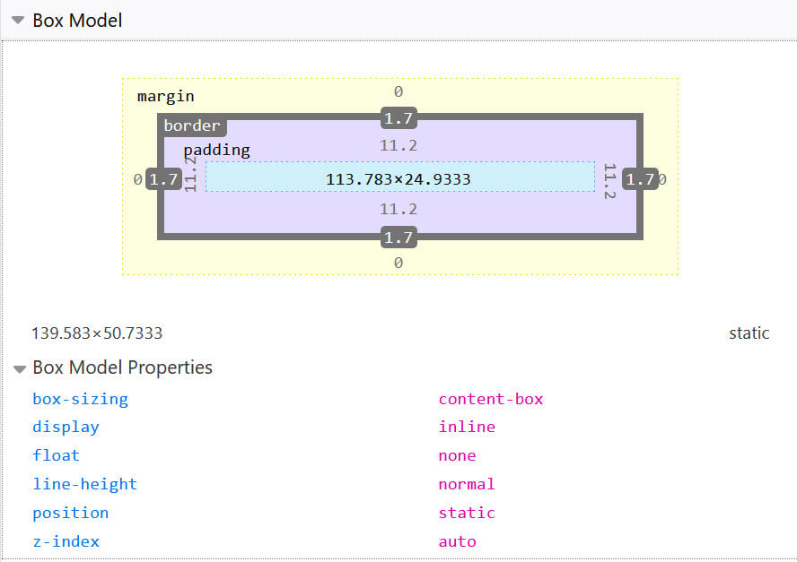
If your target is text and you have used relative values such as em or rem
to size the text and any padding, you can use developer tools
to check that the computed value of that area is large enough.
Inspect the link. In Chrome DevTools switch to the Computed pane where you can inspect the various parts of the box and see what pixel size they resolve to. In Firefox DevTools there is a Layout Panel. In that Panel you get the actual size of the inspected element.
Detect touchscreen with media queries
Instead of testing for viewport dimensions and guessing small dimensions that are likely to be phones or tablets, there are more robust ways to adapt your design based on actual device capabilities.
With media queries, we can detect whether a user's primary input is touchscreen
(pointer) and if any of the detected inputs is a touchscreen (any-pointer).
The pointer and any-pointer features return fine or coarse.
A fine pointer indicates the user has a mouse or trackpad. This is still true if
the mouse is connected by Bluetooth to a phone or tablet. A coarse pointer
indicates a touchscreen, which can be any size or type of device.
If you add a media query to increase the touch target, test for a coarse pointer so you can increase the tap targets for all touchscreen users, no matter what device they're using.
.container a {
  padding: .2em;
}

@media (any-pointer: coarse) {
  .container a {
    padding: .8em;
  }
}
Find out more about interaction media features, such as pointer, in
Responsive web design basics.