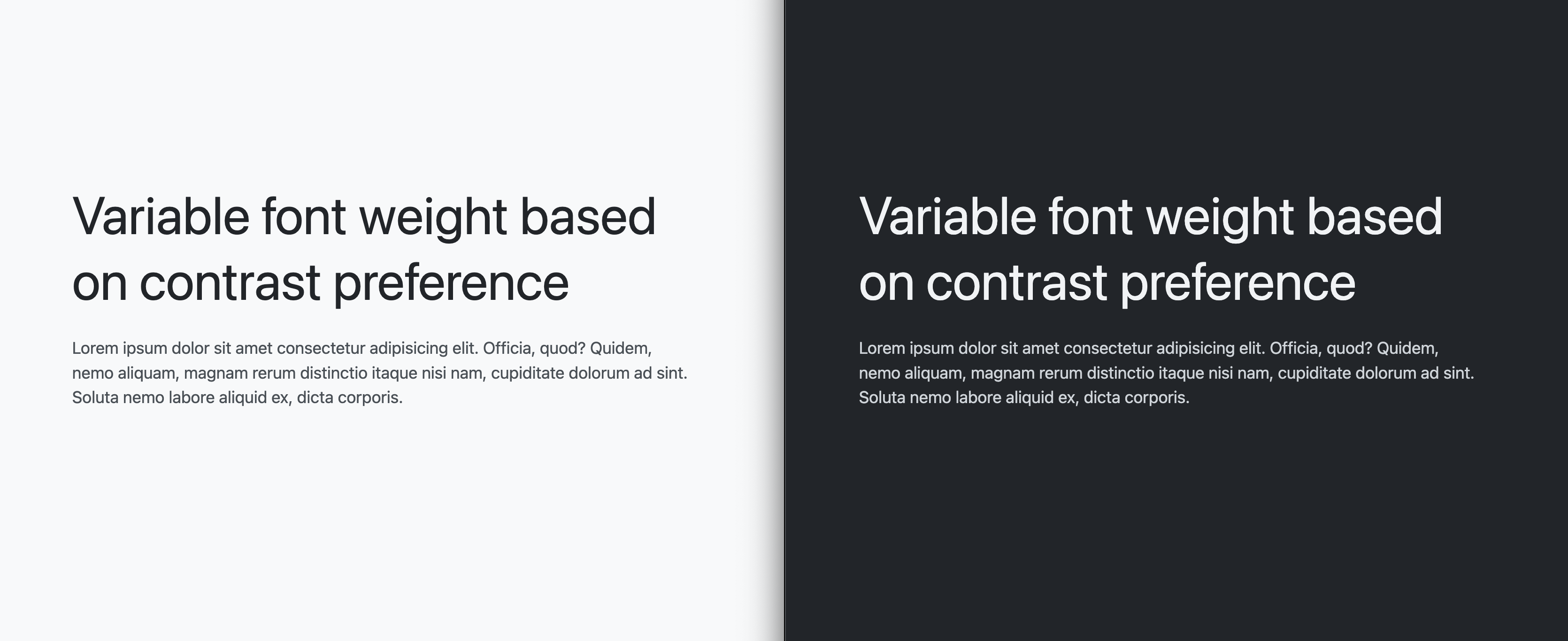
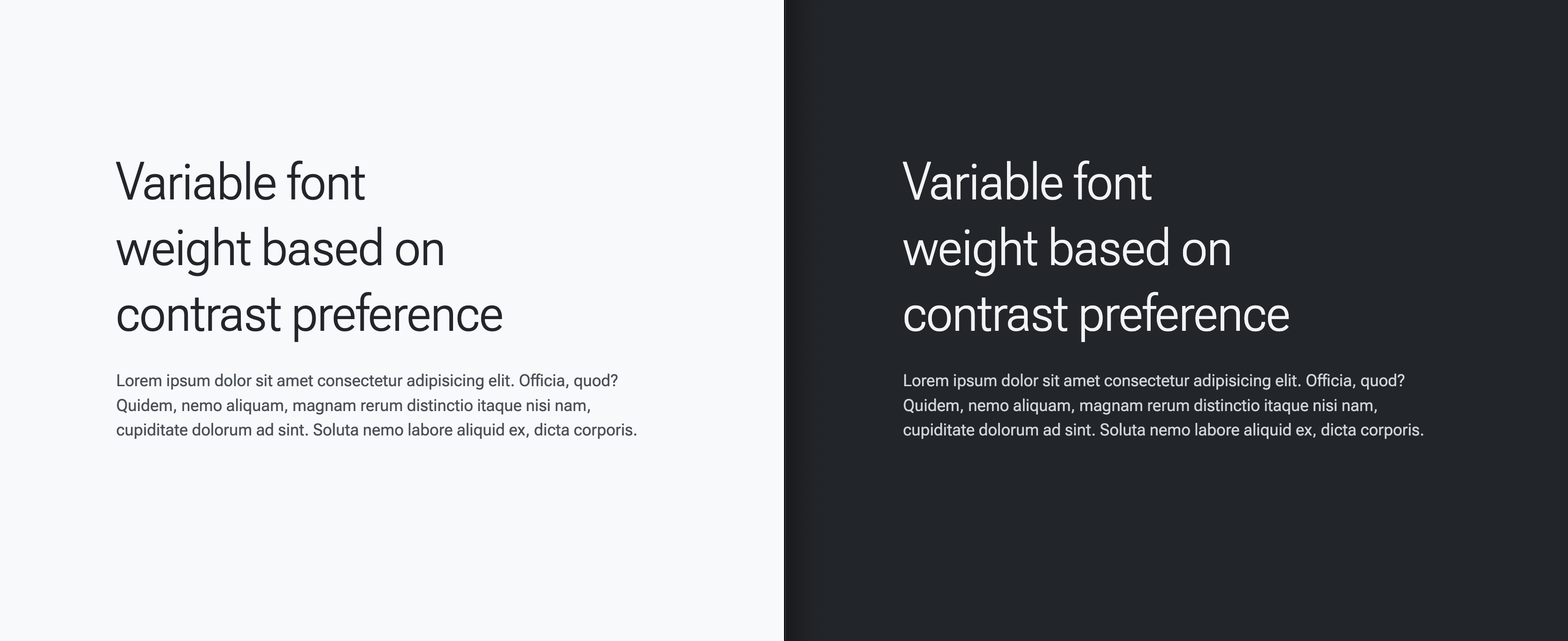
A method to adapt a font to your users' preferences, so they're maximally comfortable reading your content.
Bringing the user into the design process has been an exciting time for users, designers and developers. Users can land on your experience and seamlessly begin consuming content, their preferences richly integrated into the design result.
This blog post explores using CSS media queries with a variable font to tailor
the reading experience even further. Font grade and weight can be customized
with font-variation-settings, allowing microtuning given various preferences
and contexts, like a preference for dark mode or high contrast. We can take
these preferences and tailor a variable font for that user experience.
- Dark mode gets a slightly reduced gradation.
- High contrast gets a bolder font.
- Low contrast gets a thinner font.
Follow along to understand each portion of the CSS and variable font that enable this meaningful moment!
Getting setup
To help focus on the CSS and font variation setting values, but also give us something to read and see, here's the markup you can use to preview the work:
<h1>Variable font weight based on contrast preference</h1>

<p>
  Lorem ipsum dolor sit amet consectetur adipisicing elit.
  Officia, quod? Quidem, nemo aliquam, magnam rerum distinctio
  itaque nisi nam, cupiditate dolorum ad sint. Soluta nemo
  labore aliquid ex, dicta corporis.
</p>
Without adding any CSS, the font size is already adaptive to user preferences.
Here's a video from another demo showing how setting font-size in pixels will
squash any user preferences, and why you should set your font size in rems:
Lastly, to center and support the demo, a little CSS:
@layer demo.support {
  body {
    display: grid;
    place-content: center;
    padding: var(--size-5);
    gap: var(--size-5);
  }

  h1 {
    text-wrap: balance;
  }
}

This demo setup lets you begin testing and implementing this neat typography UX feature.
Loading the Roboto Flex variable font
The adaptive strategy depends on a variable font with meaningful axes for
customization, specifically you need GRAD and wght. The target adaptive user
preferences in this article are for color scheme and contrast, both of which
will tailor these axes to match the user's desired preference.
Load the variable font using the @font-face API of CSS:
@font-face {
  font-family: "Roboto Flex";
  src: url('https://assets.codepen.io/2585/RobotoFlex') format('truetype');
}
Next, apply the font to some content. The following CSS applies it to everything:
@layer demo.support {
  body {
    font-family: Roboto Flex;
  }
}

CSS custom properties and media queries for the win
With the font loaded, you can query for user preferences and adapt the variable font settings to match.
Settings when there's no preferences (default)
The following initial styles will be the default styles, or another way to look at it, the styles for users without any preferences.
@layer demo {
  body {
    --base-weight: 400;
    --base-grade: 0;

    font-variation-settings:
      "wght" var(--base-weight),
      "GRAD" var(--base-grade)
    ;
  }
}
Settings when the preference is for high contrast
For users who have indicated a preference for high contrast in their system
settings, increase the --base-weight value from 400 to 700:
@layer demo {
  @media (prefers-contrast: more) {
    body {
      --base-weight: 700;
    }
  }
}
Now there's more contrast while reading.
Settings when the preference is for low contrast
For users who have indicated a preference for low contrast in their system
settings, decrease the --base-weight value from 400 to 200:
@layer demo {
  @media (prefers-contrast: less) {
    body {
      --base-weight: 200;
    }
  }
}
Now there's less contrast while reading.
Settings when the preference is for dark mode
@layer demo {
  @media (prefers-color-scheme: dark) {
    body {
      --base-grade: -25;
    }
  }
}
Now the perceptual differences of light on dark vs dark on light have been accounted for.
All together now
@layer demo {
  body {
    --base-weight: 400;
    --base-grade: 0;

    font-variation-settings:
      "wght" var(--base-weight),
      "GRAD" var(--base-grade)
    ;
  }

  @media (prefers-contrast: more) {
    body {
      --base-weight: 700;
    }
  }

  @media (prefers-contrast: less) {
    body {
      --base-weight: 200;
    }
  }

  @media (prefers-color-scheme: dark) {
    body {
      --base-grade: -25;
    }
  }
}
Or, for fun, all together with CSS nesting:
@layer demo {
  body {
    --base-weight: 400;
    --base-grade: 0;

    font-variation-settings:
      "wght" var(--base-weight),
      "GRAD" var(--base-grade)
    ;

    @media (prefers-contrast: more)     { --base-weight: 700 }
    @media (prefers-contrast: less)     { --base-weight: 200 }
    @media (prefers-color-scheme: dark) { --base-grade: -25 }
  }
}
The result is a reading experience that adapts the font to match the user's preferences. Full source code is available below in the Codepen.

