

Published: December 16, 2025
Responsive web design is an approach to building websites that look good and function well across a range of different browsers, viewport dimensions, devices, and user preferences. When applied to typography, the central concern is often adjusting font-size based on the browser width—which can also have implications for spacing values like line-height and margin.
As designers, it makes sense to think about what space is available in the browser, and adjust your typography accordingly. It's also important to remember that different users will have different font-size needs across a range of devices, depending on personal circumstances outside your reach or awareness. So it's dangerous to do anything that would take away user control of the final result. There are two primary inputs that people can use to impact font sizing while they browse the web:
- Providing a default
font-sizepreference across all websites. - Zooming in or out on a site-by-site basis.
The goal of this demo is to make typography responsive to both the browser's viewport size, and also the user inputs. But it's important to understand that the more your typography responds to the viewport, the less it will respond to user preferences. If you are going to implement responsive typography, it's important to do so carefully, and test that the results are still accessible.
Negotiate a base font-size based on user preferences
The first step for defining any typography online is to negotiate an initial font size based on the user's font-size preference. This will be used for the majority of the text on the page, and as a basis for other font sizes like headings. The simplest option here is to give the user full control by using 1em, without any adjustments. When you don't set any other font-size value, 1em refers to the user preference. On the other end of the spectrum, setting a font-size in pixels or other absolute units (and even viewport-relative units) will override the user entirely, which should be avoided.
However, different use cases call for different typography. An article might be easier to read in large text, while data-heavy sites might call for a more compact design with smaller text. In either case, you might want to suggest a default that fits the design, while still allowing the user to adjust the result based on their unique situation.
Option one: calculate a multiplier based on assumptions
One common compromise is to define an adjusted font-size in em or % units, relative to the user default font-size. Generally, this approach starts with the assumption that browsers provide a 16px default, and most users will leave that default in place. If you think a 20px font size will work better for your site, then a font-size of 1.25em or 125% will usually give the result you want:
html {
  /* 20px preferred, 16px expected: 20/16 = 1.25 */
  font-size: 1.25em;
}
You could also use a calc() function here to show the math, but you still have to know what the equation is—the target size, divided by the expected size, multiplied by 1em:
html {
  font-size: calc(20 / 16 * 1em);
}
Users with a larger or smaller preference will have some ability to impact the result, since your default is now relative to theirs—1.25 times their preference in this case. But, it can be strange if both you and the user are both requesting 20px defaults, and the result is 25px—their adjusted default times 1.25 again—a size that no one asked for.
Option two: let clamp() do the work
A more nuanced approach involves CSS comparison functions, without any math! Rather than assuming 1em is equal to 16px, and doing unreliable conversions from px to em, you can think of 1em as a variable that refers to the user preference. No matter what pixel value 1em represents, a font-size of max(1em, 20px) will always return the larger of your design preference (20px) and the user's preference (1em). This allows the user to choose larger, but not smaller font sizes.
By switching to a clamp() function, you can allow the user to scale both directions, when their preferred size gets too far from your chosen default. For example, a font-size of clamp(1em, 20px, 1.25em) will default to 20px as long as that is larger than the user default, but not more than 125% of their default.
This allows your design to take priority when it is close to the user preference, but the user still has priority when their preference is outside the specified range. There's no conversion math involved, no assumptions about the user preference size, and no multiplication of designer and user values.
By setting this as the root font-size on the html element, you can now reference 1rem anywhere on the site, as the negotiated base size.
Add responsiveness
To make this font-size responsive to the viewport, one option would be to add media query (or container query) breakpoints. For example, you could change the clamped value depending on the screen size:
html {
  font-size: clamp(1em, var(--base-font-size, 16px), 1.25em);
  @media (width > 30em) { --base-font-size: 18px; }
  @media (width > 45em) { --base-font-size: 20px; }
}
The other option is adding viewport or container units to the static base value:
html {
  font-size: clamp(1em, 16px + 0.25vw, 1.25em);
}
The vw (viewport width) or vi (viewport inline size) units represent 1% of the total viewport—the part of the browser that renders your site. Similarly, the cqw and cqi units represent 1% of an inline-size container on the page. Check out the container queries and units demo for more details.
This approach is often referred to as fluid typography, since the change in font-size is constant over a range of viewport widths, rather than jumping from one value to another at media or container breakpoints. However, don't get distracted by the smoothness of the transition—that distinction is generally only visible in testing, if you smoothly adjust the window size. That effect is rarely (if ever) seen by users. While users may regularly change the size of the browser—or the zoom level—they would have to make those adjustments in a slow and fluid manner to notice the difference between a breakpoint and a viewport unit. It only impacts the transition, not the result after resizing.
The main advantage of fluid font sizing is that it removes any need to calculate or specify breakpoints manually, providing an interpolated result at any given size. You only set the starting point (16px) and the rate of change (0.25vw will provide a 0.25px increase in font-size for every 100px increase in the viewport), and possibly min and max values. When the viewport is 1000px wide, the font-size will be 16px + 2.5px or 18.5px—but that calculation is handled entirely by the browser. This is the approach used in the demo, using cqi units to show container-based responsiveness. When used on the root (html) element, where there is no defined container, cqi units still refer to the viewport size.
If you prefer to think in terms of the specified font-size at a given viewport size, consider using the more direct media query approach, which is a bit more clear. Things get complicated when you try to calculate viewport units based on intended breakpoints. Many people do this by copy and pasting values from third-party tools, but the resulting code is much more difficult to understand or change directly. In general with CSS, the best option is the one that most clearly expresses your intentions.
Warning: Viewport changes don't always mean the same thing!
While media queries and vi units are applied in different ways, both approaches are based on the same measurement of the viewport. If the viewport is 600px wide, then 100vw will be equal to 600px, and styles inside the (width > 500px) media query will be applied.
But what does it mean for the viewport to be 600px wide? In reality, a pixel is not one fixed size with a single meaning in all situations. While it feels natural that a viewport with fewer pixels across is on a smaller screen (like a phone), or in a narrow browser window, that's not a reliable assumption. In fact, zooming in and making the browser window smaller will both have the same impact on the measured viewport width. One action (zooming) changes the size of a pixel, while the other (resizing) changes the size of the browser itself—but both change the number of pixels across the width of the browser. What we get from the viewport measurement is a relationship between the current pixel size and the current browser window.
For the user, zooming and resizing each serve a very different purpose. A user that changes the zoom level is trying to make the contents of the page larger or smaller, but a user that resizes the browser is only managing the space across different screens. Even though the user intent is different, the result on CSS measurements is the same. As the window gets smaller, or the pixel gets larger, there are fewer pixels across the browser's width.
That disconnect makes responsive typography unreliable. If your text is set to resize based only on a viewport or container, then the user zoom will have no effect!
Changing the value of the viewport-relative unit to 1vw or 100vw will change the exact relationship between the font size and viewport. A 1vw font will grow 1px for every 100px of viewport size, while a 100vw font will be exactly the same size as the viewport. You can change that value to make the font grow more slowly or more quickly in relation to the browser. But any viewport-relative value will remain constant as the user zooms in or out—entirely unresponsive to user controls.
Similarly, neither 1vw nor 100vw accounts for the user default font-size.
Using viewport or container-relative units on their own for font-size is always hostile to the user. When a font-size is fully responsive to its container, it cannot also be responsive to user defaults or adjustments. Even with the best intentions and safeguards, taking that final font-size control away from users should be avoided. It's not only a bad user experience, but can also break accessibility guidance that is often required by law. Specifically, section 1.4.4 of the Web Content Accessibility Guidelines requires that "text can be resized without assistive technology up to 200 percent."
How to ensure font-size values are responsive to zoom
To ensure that a viewport-relative font-size is responsive to zoom, the viewport-relative value has to be applied as an adjustment to some other value. That's possible in CSS using the calc() function or any other math function that accepts calculations—such as min(), max(), and clamp(). A font-size of calc(16px + 1vw) is based on both the viewport size, and also the current (zoom-relative) size of a pixel. While the vw unit won't be impacted by zoom, the base value will be.
The result is a font-size that responds to both the viewport size and the user's zoom settings. If the user zooms to 200%, the base value will render twice as large (32px), while the responsive value remains unchanged. A 1000px viewport would initially give you a font-size of 16px + 10px = 26px, but at 200% zoom, the font size would only grow to 42px, just over 160%. That may not seem like an extreme issue, but the more your font-size is based on the viewport, the less effective zoom becomes.
On small screens, the font-size will come primarily from the base pixel value, and will respond well to zoom. But on larger screens, the viewport-sizing becomes a larger fraction of the rendered font size, making zoom less effective. This becomes particularly dangerous at the point where 500% zoom (the max in most browsers) can no longer provide the 200% increase in font-size required by WCAG 1.4.4—but even before that point, it can be frustrating to have zoom become ineffective.
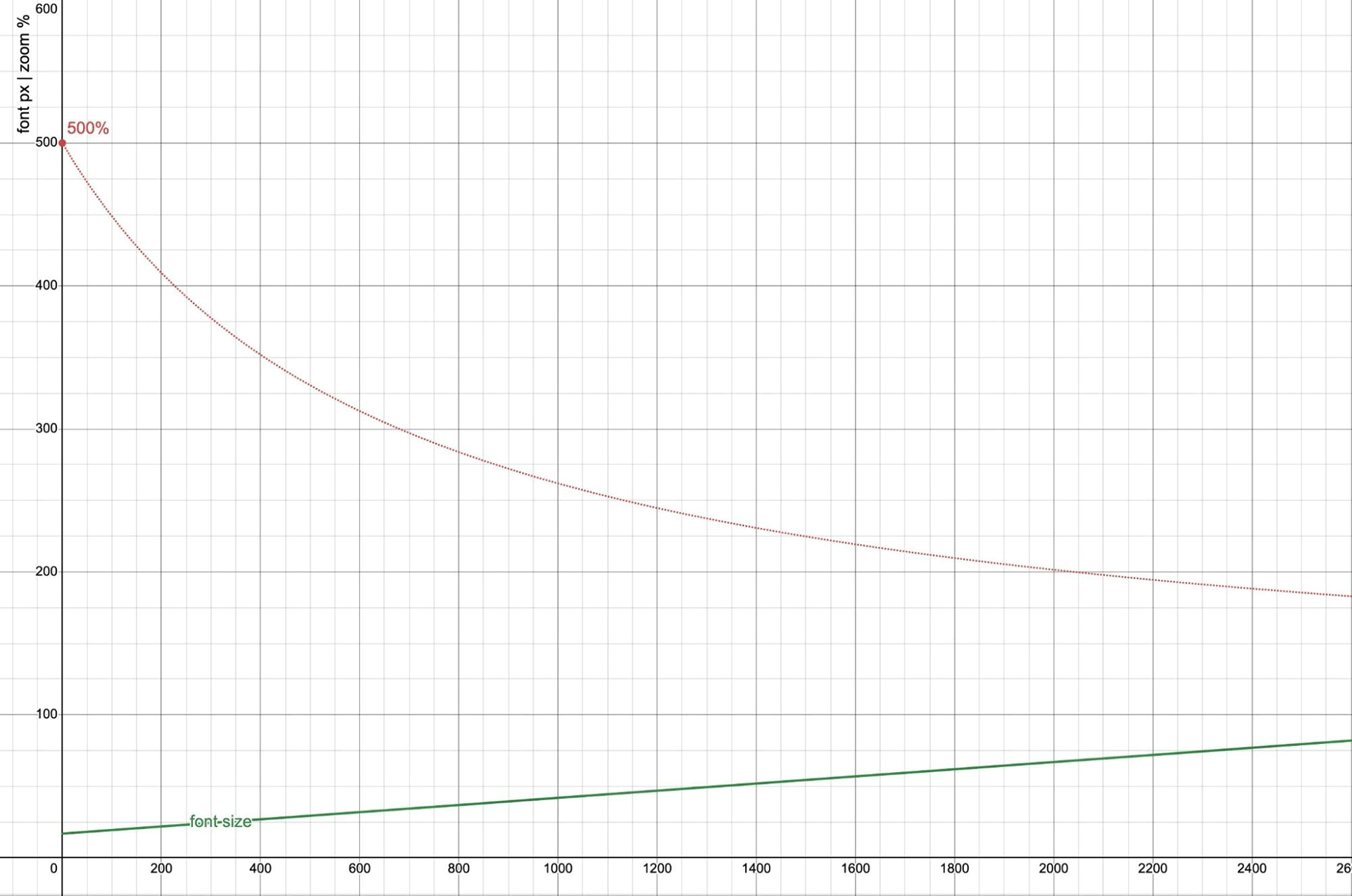
0 to 2600px wide. The vertical axis for font-size is also in pixels, showing the result of calc(17px + 2.5vw). The 500% zoom line uses the same viewport-width horizontal axis, but treats the vertical axis as a percentage.
At the left edge of the graph (0 viewport width), 500% zoom is fully effective. However, that effectiveness drops away quickly as the browser size increases, and (unzoomable) viewport units become a larger factor in the font-size. When the browser is 2040px wide, the maximum 500% zoom is only able to achieve a 200% increase in font-size. Beyond that point, 200% effective font-zoom is no longer possible.
By moving this calculation into a clamp() function, with min and max values, you can enforce boundaries that ensure zoomable text. According to Maxwell Barvian:
If the maximum font size is less than or equal to 2.5 times the minimum font size, then the text will always pass WCAG SC 1.4.4, at least on all modern browsers.
Since @media and @container queries are based on the same measurements as vw and cqw units, the same logic applies when using a breakpoint to change the font size. When the size increase is too dramatic, zoom becomes ineffective. You can experiment with how these values interact in the following visualization:
How to ensure font-size values are responsive to user defaults
But calc(16px + 1vw) is still not responsive to user default font settings. To achieve that, you can set a base—or min and max values—using em or rem units rather than px. Putting it all together, you get a familiar result that matches the linked demo:
html {
  font-size: clamp(1em, 17px + 0.24vw, 1.125em);
}
Note that:
- The minimum and maximum both use
emunits, which are based on the user preference (and responsive to zoom). - The additional
vwvalue is kept minimal, so that zoom isn't too heavily impacted. - The maximum size (
1.125em) is well under 2.5 times the minimum (1em), ensuring that an effectivefont-sizevalue of200%is always possible.
Typographic scales with pow()
Most designs use more than one font size! A typographic scale describes the relationship between multiple font sizes. This can be expressed as a base size and a series of multipliers to calculate the other sizes. CSS provides a built-in typographic scale relative to the medium keyword, which refers to the user's font size preference, or a default of 16px. The full keyword scale is:
xx-small: 3/5 (0.6)x-small: 3/4 (0.75)small: 8/9 (0.89)medium: 1 (the base size that others are multiplied against)large: 6/5 (1.2)x-large: 3/2 (1.5)xx-large: 2/1 (2)xxx-large: 3/1 (3)
This scale is relative to the user default rather than the root font-size, so it doesn't work as well once you change the root font-size of your site. Most authors end up re-creating a similar type scale with custom properties—sometimes using the same t-shirt size names, and sometimes preferring a series of steps up and down a mathematical scale. There are many third-party tools for generating these scales based on common ratios, mostly borrowed from a western musical scale:
html {
  /* musical ratios */
  --minor-second: calc(16/15);
  --major-second: calc(9/8);
  --minor-third: calc(6/5);
  --major-third: calc(5/4);
  --perfect-fourth: calc(4/3);
  --augmented-fourth: sqrt(2);
  --perfect-fifth: calc(3/2);
  --major-sixth: calc(5/3);

  /* the golden ratio*/
  --golden-ratio: calc((1 + sqrt(5)) / 2);
}
But you don't need outside tools to create your own scale in CSS—the new pow() function can generate your scale for you—with 1rem as your own base size!
html {
  /* choose a ratio */
  --scale: 1.2;

  /* generate the scale using pow() */
  --xx-small: calc(1rem * pow(var(--scale), -0.5));
  --x-small: calc(1rem * pow(var(--scale), -0.25));
  --small: calc(1rem * pow(var(--scale), -0.125));
  --medium: 1rem;
  --large: calc(1rem * pow(var(--scale), 1));
  --x-large: calc(1rem * pow(var(--scale), 2));
  --xx-large: calc(1rem * pow(var(--scale), 3));
  --xxx-large: calc(1rem * pow(var(--scale), 4));

  /* change the ratio for different viewport sizes */
  @media (width > 50em) {
    --scale: var(--perfect-fourth);
  }
}
You don't have to use whole steps to keep the scale consistent. In fact, the common 12pt typography scale uses roughly 5 fractions per step. While the large sizes here use whole steps in the scale, the small sizes use fractions to scale at a slower rate.
CSS mixins and functions make it possible to condense that logic even more, while other built-in tools like progress() make it easier to create scales that fluidly adjust from one value to another. But those features are out of scope for this demo.
Respond to the size of in-page containers
You can make all these calculations work in container queries by using the cqi unit in place of vw or vi, but it also helps to leave the user's font-size in place on the html element, so that every type-setting container can refer back to that user preference as 1rem. In the demo, you'll find that the entire type scale is applied to the body rather than the root html element for global type, and then reset based on the container size for every element with the type-set attribute.
This is always a trade-off with container-relative font sizes. You achieve more fluid font sizing for each element in context, but at the expense of a page-wide consistency. Which one is more important to you will depend on the specifics of your use case. And remember that fluid typography itself is a trade-off, making user controls like zoom less effective!
While responsive typography and typographic scales are great tools for designers, there's no need to make things more complicated, if you don't need to. The user default and built-in type scale are a great option as well! But if you do choose responsive (or fluid) typography, make sure to test how the results behave in relation to different user defaults and zoom settings. Enjoy!