The app domain
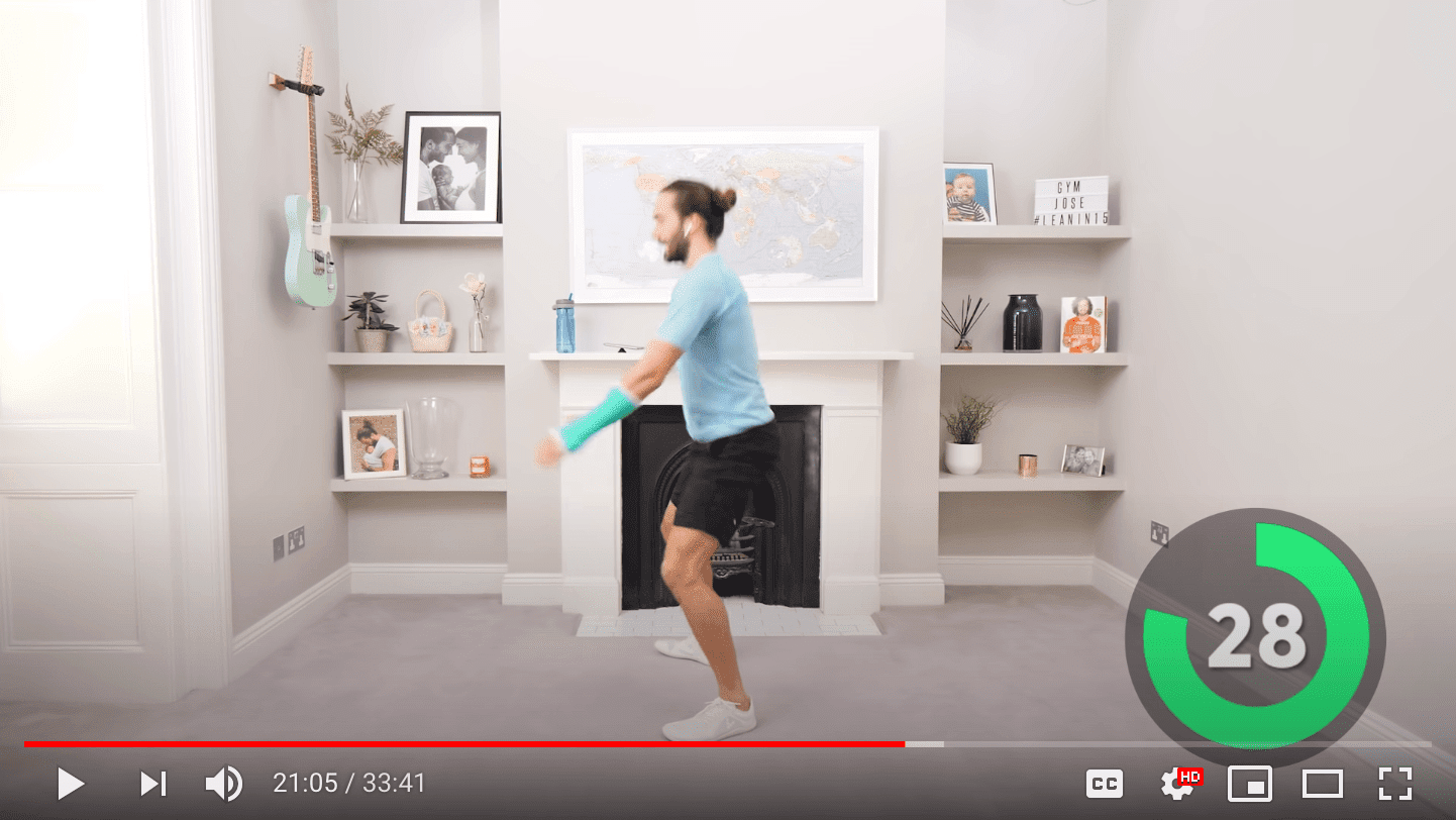
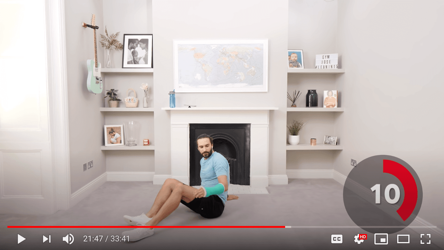
To show the mini app way of programming applied to a web app, I needed a small but complete enough app idea. High-intensity interval training (HIIT) is a cardiovascular exercise strategy of alternating sets of short periods of intense anaerobic exercise with less intense recovery periods. Many HIIT trainings use HIIT timers, for example, this 30 minute online session from The Body Coach TV YouTube channel.
HIIT Time example app
For this chapter, I have built a basic example of such a HIIT timer application aptly named "HIIT Time" that lets the user define and manage various timers, always consisting of a high and a low intensity interval, and then select one of them for a training session. It is a responsive app with a navbar, a tabbar, and three pages:
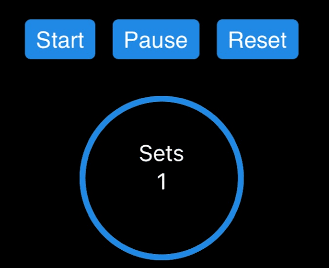
- Workout: The active page during a workout. It lets the user select one of the timers and features three progress rings: the number of sets, the active period, and the resting period.
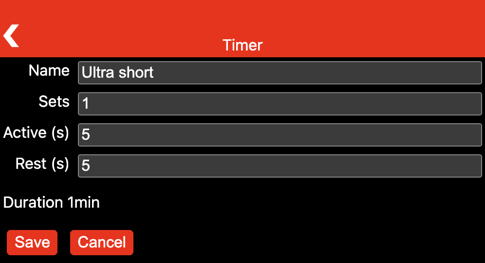
- Timers: Manages existing timers and lets the user create new ones.
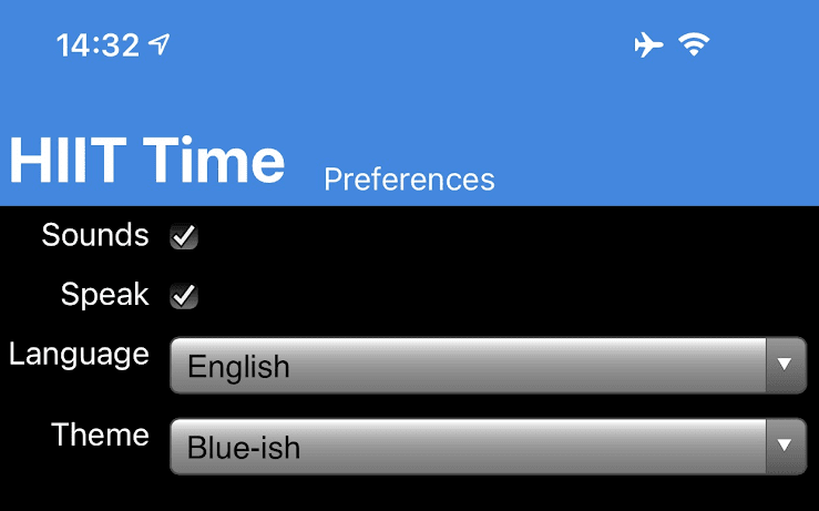
- Preferences: Allows toggling sound effects and speech output and selecting language and theme.
The following screenshots give an impression of the application.


App structure
As outlined above, the app consists of a navbar, a tabbar, and three pages, arranged in a grid.
Navbar and tabbar are realized as iframes with a <div> container in between them with three more iframes
for the pages, out of which one is always visible and dependent on the active selection in the tabbar.
A final iframe pointing to about:blank serves for dynamically created in-app pages, which are needed for modifying existing
timers or creating new ones.
I call this pattern multi-page single-page app (MPSPA).

Components-based lit-html markup
The structure of each page is realized as lit-html scaffold
that gets dynamically evaluated at runtime.
For a background on lit-html, it is an efficient, expressive, extensible HTML templating library for JavaScript.
By using it directly in the HTML files, the mental programming model is directly output-oriented.
As a programmer, you write a template of what the final output will look like,
and lit-html then fills the gaps dynamically based on your data and hooks up the event listeners.
The app makes use of third-party custom elements like Shoelace's <sl-progress-ring> or a self-implemented custom element called <human-duration>.
Since custom elements have a declarative API (for example, the percentage attribute of the progress ring),
they work well together with lit-html, as you can see in the listing below.
<div>
  <button class="start" @click="${eventHandlers.start}" type="button">
    ${strings.START}
  </button>
  <button class="pause" @click="${eventHandlers.pause}" type="button">
    ${strings.PAUSE}
  </button>
  <button class="reset" @click="${eventHandlers.reset}" type="button">
    ${strings.RESET}
  </button>
</div>

<div class="progress-rings">
  <sl-progress-ring
    class="sets"
    percentage="${Math.floor(data.sets/data.activeTimer.sets*100)}"
  >
    <div class="progress-ring-caption">
      <span>${strings.SETS}</span>
      <span>${data.sets}</span>
    </div>
  </sl-progress-ring>
</div>
Programming model
Each page has a corresponding Page class that fills the lit-html markup with life by providing implementations
of the event handlers and providing the data for each page.
This class also supports lifecycle methods like onShow(), onHide(), onLoad(), and onUnload().
Pages have access to a data store that serves for sharing optionally persisted per-page state and global state.
All strings are centrally managed, so internationalization is built in.
Routing is handled by the browser essentially for free, since all the app does is toggle iframe visibility and
for dynamically created pages change the src attribute of the placeholder iframe.
The example below shows the code for closing a dynamically created page.
import Page from '../page.js';

const page = new Page({
  eventHandlers: {
    back: (e) => {
      e.preventDefault();
      window.top.history.back();
    },
  },
});
Styling
Styling of pages happens per-page in its own scoped CSS file.
This means elements can usually just be directly addressed by their element names,
since no clashes with other pages can occur.
Global styles are added to each page, so central settings like the font-family or the box-sizing
do not need to be declared repeatedly.
This is also where the themes and dark mode options are defined.
The listing below shows the rules for the Preferences page that lays out the various form elements
on a grid.
main {
  max-width: 600px;
}

form {
  display: grid;
  grid-template-columns: auto 1fr;
  grid-gap: 0.5rem;
  margin-block-end: 1rem;
}

label {
  text-align: end;
  grid-column: 1 / 2;
}

input,
select {
  grid-column: 2 / 3;
}
Screen wake lock
During a workout, the screen should not turn off. On browsers that support it, HIIT Time realizes this through a screen wake lock. The snippet below shows how it is done.
if ('wakeLock' in navigator) {
  const requestWakeLock = async () => {
    try {
      page.shared.wakeLock = await navigator.wakeLock.request('screen');
      page.shared.wakeLock.addEventListener('release', () => {
        // Nothing.
      });
    } catch (err) {
      console.error(`${err.name}, ${err.message}`);
    }
  };
  // Request a screen wake lock…
  await requestWakeLock();
  // …and re-request it when the page becomes visible.
  document.addEventListener('visibilitychange', async () => {
    if (
      page.shared.wakeLock !== null &&
      document.visibilityState === 'visible'
    ) {
      await requestWakeLock();
    }
  });
}
Testing the application
The HIIT Time application is available on GitHub. You can play with the demo in a new window, or right in the iframe embed below, which simulates a mobile device.
Acknowledgements
This article was reviewed by Joe Medley, Kayce Basques, Milica Mihajlija, Alan Kent, and Keith Gu.

