Media queries are great, but…
Media queries are awesome, a godsend for website developers that want to make small tweaks to their stylesheets to give a better experience for users on devices of various sizes. Media queries essentially let you customize the CSS of your site depending on screen size. Before you dive into this article, learn more about responsive design and check out some fine examples of media queries usage here: mediaqueri.es.
As Brad Frost points out in an earlier article, changing the look is only one of many things to consider when building for the mobile web. If the only thing you do when you build your mobile website is customize your layout with media queries, then we have the following situation:
- All devices get the same JavaScript, CSS, and assets (images, videos), resulting in longer than necessary load times.
- All devices get the same initial DOM, potentially forcing developers to write overly complicated CSS.
- Little flexibility to specify custom interactions tailored to each device.
Webapps need more than media queries
Don't get me wrong. I don't hate responsive design via media queries, and definitely think it has a place in the world. Furthermore, some of the above mentioned issues can be resolved with approaches such as responsive images, dynamic script loading, etc. However, at a certain point, you may find yourself doing too many incremental tweaks, and may be better off serving different versions.
As the UIs you build increase in complexity, and you gravitate toward single-page webapps, you'll want to do more to customize UIs for each type of device. This article will teach you how to do these customizations with a minimal amount of effort. The general approach involves classifying your visitor's device into the right device class, and serving the appropriate version to that device, while maximizing code reuse between versions.
What device classes are you targeting?
There are tons of internet-connected devices out there, and nearly all of them have browsers. The complication lies in their diversity: Mac laptops, Windows workstations, iPhones, iPads, Android phones with touch input, scroll wheels, keyboards, voice input, devices with pressure sensitivity, smart watches, toasters and refrigerators, and many more. Some of these devices are ubiquitous, while others are very rare.

To create a good user experience, you need to know who your users are and what devices they are using. If you build a user interface for a desktop user with a mouse and a keyboard and give it to a smartphone user, your interface will be a frustration because it's designed for another screen size, and another input modality.
There are two extreme ends to the spectrum of approaches:
Build one version that works on all devices. UX will suffer as a result, since different devices have different design considerations.
Build a version for each device you want to support. This will take forever, because you'll be building too many versions of your application. Also, when the next new smartphone arrives (which happens roughly weekly), you will be forced to create yet another version.
There is a fundamental tradeoff here: the more device categories you have, the better a user experience you can deliver, but the more work it will take to design, implement and maintain.
Creating a separate version for each device class you decide on may be a good idea for performance reasons or if the versions you want to serve to different device classes vary hugely. Otherwise, responsive web design is a perfectly reasonable approach.
A potential solution
Here's a compromise: classify devices into categories, and design the best possible experience for each category. What categories you choose depend on your product and target user. Here's a sample classification that nicely spans popular web-capable devices that exist today.
- small screens + touch (mostly phones)
- large screens + touch (mostly tablets)
- large screens + keyboard/mouse (mostly desktops/laptops)
This is only one of many possible breakdowns, but one that makes a lot of sense at the time of writing. Missing from the above list are mobile devices without touch screens (eg. feature phones, some dedicated ebook readers). However, most of these have keyboard navigation or screen reader software installed, which will work fine if you build your site with accessibility in mind.
Examples of form factor-specific web apps
There are many examples of web properties serving entirely different versions for different form factors. Google search does this, as does Facebook. Considerations for this include both performance (fetching assets, rendering pages) and more general user experience.
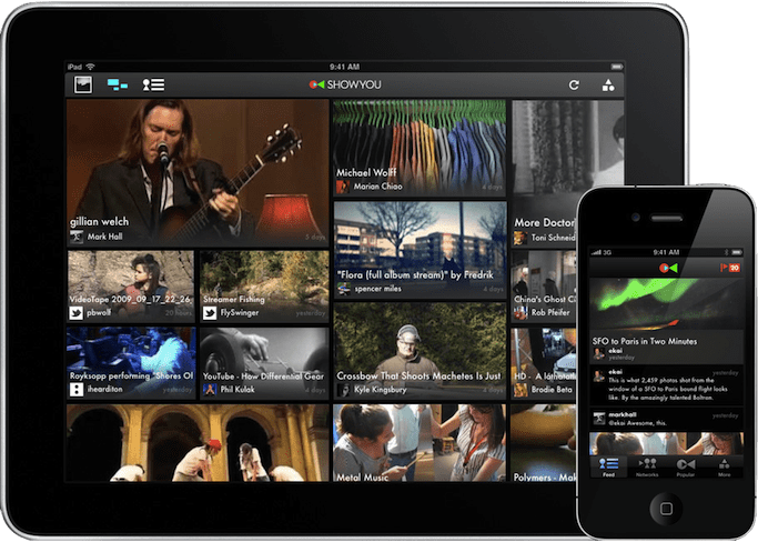
In the world of native apps, many developers choose to tailor their experience to a device class. For example, Flipboard for iPad has a very different UI compared to Flipboard on iPhone. The tablet version is optimized for two hand use and horizontal flipping while the phone version is intended for single hand interaction and a vertical flip. Many other iOS applications also provide significantly different phone and tablet versions, such as Things (todo list), and Showyou (social video), featured below:

Approach #1: Server-side detection
On the server, we have a much more limited understanding of the device that we're dealing with. Probably the most useful clue that's available is the user agent string, which is supplied via the User-Agent header on every request. Because of this, the same UA sniffing approach will work here. In fact, the DeviceAtlas and WURFL projects do this already (and give a whole lot of additional information about the device).
Unfortunately each of these present their own challenges. WURFL is very large, containing 20MB of XML, potentially incurring significant server-side overhead for each request. There are projects that split the XML for performance reasons. DeviceAtlas is not open source, and requires a paid license to use.
There are simpler, free alternatives too, like the Detect Mobile Browsers project. The drawback, of course, is that device detection will inevitably be less comprehensive. Also, it only distinguishes between mobile and non-mobile devices, providing limited tablet support only through an ad-hoc set of tweaks.
Approach #2: Client-side detection
We can learn a lot about the user's browser and device by using feature detection. The main things we need to determine are if the device has touch capability, and if it's a large or small screen.
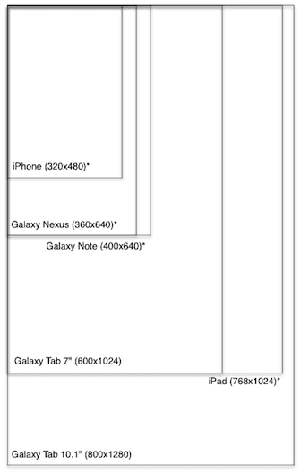
We need to draw the line somewhere to distinguish small and big touch devices. What about edge cases like the 5" Galaxy Note? The following graphic shows a bunch of popular Android and iOS devices overlaid (with corresponding screen resolutions). The asterisk indicates that the device comes or can come in doubled density. Though the pixel density may be doubled, CSS still reports the same sizes.
A quick aside on pixels in CSS: CSS pixels on the mobile web aren't the same as screen pixels. iOS retina devices introduced the practice of doubling pixel density (eg. iPhone 3GS vs 4, iPad 2 vs 3). The retina Mobile Safari UAs still report the same device-width to avoid breaking the web. As other devices (eg. Android) get higher resolution displays, they are doing the same device-width trick.

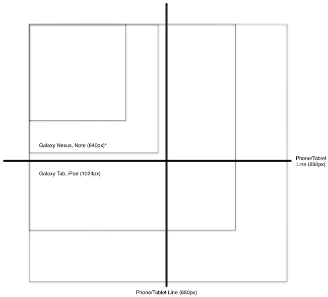
Complicating this decision, however, is the importance of considering both portrait and landscape modes. We don't want to reload the page or load additional scripts every time we re-orient the device, though we may want to render the page differently.
In the following diagram, squares represent the max dimensions of each device, as a result of overlaying the portrait and landscape outlines (and completing the square):

By setting the threshold to 650px, we classify iPhone, Galaxy Nexus as
smalltouch, and iPad, Galaxy Tab as "tablet". The androgynous Galaxy
Note is in this case classified as "phone", and will get the phone
layout.
And so, a reasonable strategy might look like this:
if (hasTouch) {
  if (isSmall) {
    device = PHONE;
  } else {
    device = TABLET;
  }
} else {
  device = DESKTOP;
}
See a minimal sample of the feature-detection approach in action.
The alternative approach here is to use UA sniffing to detect device
type. Basically you create a set of heuristics and match them against
your user's navigator.userAgent. Pseudo code looks something like
this:
var ua = navigator.userAgent;
for (var re in RULES) {
  if (ua.match(re)) {
    device = RULES[re];
    return;
  }
}
See a sample of the UA-detection approach in action.
A note on client-side loading
If you're doing UA detection on your server, you can decide what CSS, JavaScript and DOM to serve when you get a new request. However, if you're doing client-side detection, the situation is more complex. You have several options:
- Redirect to a device-type-specific URL that contains the version for this device type.
- Dynamically load the device type-specific assets.
The first approach is straightforward, requiring a redirect such as
window.location.href = '/tablet'. However, the location will now have
this device type information appended to it, so you may want to use the
History API to clean up your URL. Unfortunately this
approach involves a redirect, which can be slow, especially on mobile
devices.
The second approach is quite a bit more complex to implement. You need a
mechanism to dynamically load CSS and JS, and (browser-depending), you
may not be able to do things like customize <meta viewport>. Also,
since there's no redirect, you're stuck with the original HTML that was
served. Of course, you can manipulate it with JavaScript, but this may
be slow and/or inelegant, depending on your application.
Deciding client or server
These are the tradeoffs between the approaches:
Pro client:
- More future proof since based on screen sizes/capabilities rather than UA.
- No need to constantly update UA list.
Pro server:
- Full control of what version to serve to what devices.
- Better performance: no need for client redirects or dynamic loading.
My personal preference is to start with device.js and client-side detection. As your application evolves, if you find client-side redirect to be a significant performance drawback, you can easily remove the device.js script, and implement UA detection on the server.
Introducing device.js
Device.js is a starting point for doing semantic, media query-based device detection without needing special server-side configuration, saving the time and effort required to do user agent string parsing.
The idea is that you provide search-engine-friendly markup (link
rel=alternate) at the top of your <head> indicating which
versions of your site you want to provide.
<link rel="alternate" href="http://foo.com" id="desktop"
    media="only screen and (touch-enabled: 0)">
Next, you can either do server-side UA detection and handle version redirection on your own, or use the device.js script to do feature-based client-side redirection.
For more information, see the device.js project page, and also a fake application that uses device.js for client-side redirection.
Recommendation: MVC with form-factor specific views
By now you're probably thinking that I'm telling you to build three completely separate apps, one for each device type. No! Code sharing is the key.
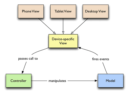
Hopefully you have been using an MVC-like framework, such as Backbone, Ember, etc. If you have been, you are familiar with the principle of separation of concerns, specifically that your UI (view layer) should be decoupled from your logic (model layer). If this is new to you, get started with some of these resources on MVC, and MVC in JavaScript.
The cross-device story fits neatly into your existing MVC framework. You can easily move your views into separate files, creating a custom view for each device type. Then you can serve the same code to all devices, except the view layer.

Your project might have the following structure (of course, you are free to choose the structure that makes the most sense depending on your application):
models/ (shared models) item.js item-collection.js
controllers/ (shared controllers) item-controller.js
versions/ (device-specific stuff) tablet/ desktop/ phone/ (phone-specific code) style.css index.html views/ item.js item-list.js
This sort of structure enables you to fully control what assets each version loads, since you have custom HTML, CSS and JavaScript for each device. This is very powerful, and can lead to the leanest, most performant way of developing for the cross-device web, without relying on tricks such as adaptive images.
Once you run your favorite build tool, you'll concatenate and minify all of your JavaScript and CSS into single files for faster loading, with your production HTML looking something like the following (for phone, using device.js):
<!doctype html>
<head>
  <title>Mobile Web Rocks! (Phone Edition)</title>

  <!-- Every version of your webapp should include a list of all
        versions. -->
  <link rel="alternate" href="http://foo.com" id="desktop"
      media="only screen and (touch-enabled: 0)">
  <link rel="alternate" href="http://m.foo.com" id="phone"
      media="only screen and (max-device-width: 650px)">
  <link rel="alternate" href="http://tablet.foo.com" id="tablet"
      media="only screen and (min-device-width: 650px)">

  <!-- Viewport is very important, since it affects results of media
        query matching. -->
  <meta name="viewport" content="width=device-width">

  <!-- Include device.js in each version for redirection. -->
  <script src="device.js"></script>

  <link rel="style" href="phone.min.css">
</head>
<body>
  <script src="phone.min.js"></script>
</body>
Note that the (touch-enabled: 0) media query is non-standard (only
implemented in Firefox behind a moz vendor prefix), but is handled
correctly (thanks to Modernizr.touch) by device.js.
Version override
Device detection can sometimes go wrong, and in some cases, a user may prefer to look at the tablet layout on their phone (perhaps they are using a Galaxy Note), so it's important to give your users a choice of which version of your site to use if they want to manually override.
The usual approach is to provide a link to the desktop version from your
mobile version. This is easy enough to implement, but device.js supports
this functionality with the device GET parameter.
Concluding
To summarize, when building cross-device single-page UIs, that don't fit neatly into the world of responsive design, do this:
- Pick a set of device classes to support, and criteria by which to classify devices into classes.
- Build your MVC app with strong separation of concerns, splitting views from the rest of the codebase.
- Use device.js to do client side device class detection.
- When you're ready, package your script and stylesheets into one of each per device class.
- If client-side redirection performance is an issue, abandon device.js and switch to serverside UA-detection.

