


Published: November 10, 2016
The quality of a network connection can be affected by a number of factors, such as:
- Poor network provider coverage.
- Extreme weather conditions.
- Power outages.
- Entering permanent "dead zones," such as in buildings with walls that block network connections.
- Entering temporary "dead zones," such as when traveling on a train and going through a tunnel.
- Time-boxed internet connections, like those in airports or hotels.
- Cultural practices that require limited or no internet access at specific times or on specific days.
Your goal as a developer is to provide a good experience that lessens the impact of changes in connectivity.
Decide what to show your users when they have a bad network connection
The first question to ask is what success and failure of a network connection look like for your app. A successful connection is your app's normal online experience. Connection failure includes both how your app behaves offline and on laggy networks.
To determine how to handle connection failure, ask yourself these important UX questions:
- How long do you wait to determine the success or failure of a connection?
- What can you do while success or failure is being determined?
- What should you do if the connection fails?
- How do you tell the user what's going on?
Inform users of state
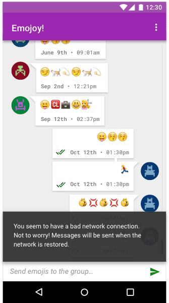
Tell the user both the application's state and the actions they can still take when they have a network failure. For example, a notification might say the following:
You seem to have a bad network connection. Not to worry! Messages will be sent when the network is restored.
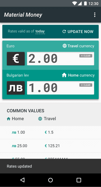
Inform users about connection improvements
How you tell the user their network connection has improved depends on your application. Apps that prioritize current information, such as weather or stock market trackers, should auto-update and tell the user as soon as possible.
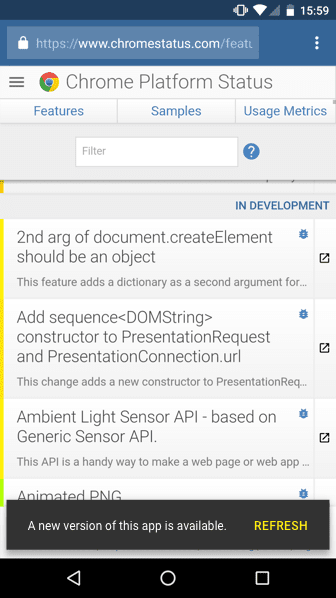
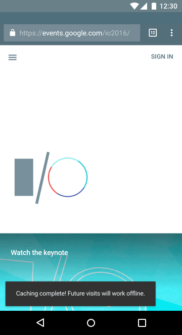
We recommend that you let the user know your web app has updated "in the background" by using a visual cue like a Material Design toast element. This involves detecting both the presence of a service worker and an update to its managed content. You can see a code example of this function at work here.
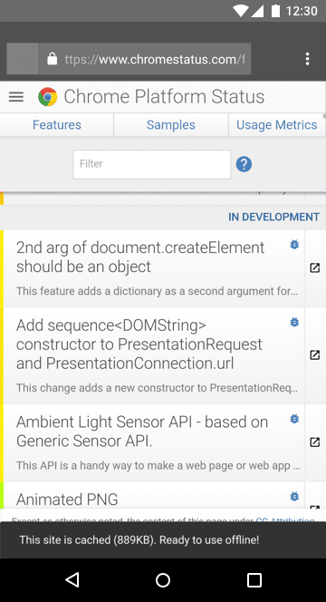
One example of this is Chrome Platform Status, which posts a note to the user when the app has been updated.
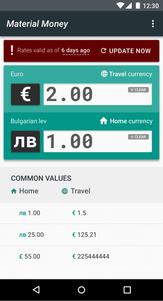
Some apps can always show the last time they were updated. For example, this is especially useful for currency converter apps.
News apps can show a tap-to-update notification informing the user of new content. Auto-updating an article would cause users to lose their place.

Update the UI to reflect the current contextual state
Each UI element can have its own context and behavior that changes depending on if it needs a successful connection. One example would be an ecommerce site that can be browsed offline, but disables pricing and the Buy button until a connection is reestablished.
Other forms of contextual states can include data. For example, the financial app Robinhood uses color and graphics to tell the user when the stock market is open. The whole interface turns white and then grays out when the market closes. When the value of a stock increases or decreases, each individual stock widget turns green or red depending on its state.
Educate the user so they understand what the offline model is
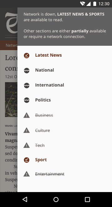
Most users are used to always having a network connection. You need to educate them about what changes in your app when they don't have a connection. Tell them of where large data is saved and give them settings to change the default behavior. Use multiple UI design components (such as informative language, icons, notifications, color, and imagery) together to convey these ideas, instead of relying on a single design choice, such as an icon on its own, to tell the whole story.
Provide an offline experience by default
If your app doesn't require much data, then cache that data by default. Users can become increasingly frustrated if they can only access their data with a network connection.
Try to make the experience as stable as possible. An unstable connection makes your app feel untrustworthy. An app that lessens the impact of a network failure delights its users.
News sites can benefit from auto-downloading and auto-saving the latest news, maybe saving data by downloading only the text, so a user can read today's news without a connection. You can adapt this behavior to the user's behavior by prioritizing downloading the news categories the user views most.
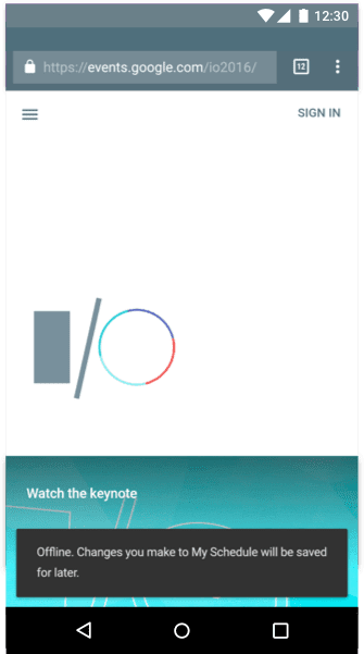
Inform the user when the app offline
When a web app first loads, it must indicate to the user whether it's ready for offline use. Do this with a widget that provides brief feedback about an operation through a message at the bottom of the screen such as, for example, when a section has been synced or a file has downloaded.
Make sure the language you're using fits your audience, and use the same phrasing in all cases where it applies. Non-technical audiences often misunderstand the word "offline," so instead use action-based language that your audience can relate to.
Make 'save for offline' obvious in the interface
If an application uses a lot of data, make sure there's a switch or pin to add an item for offline use. Auto-download files only if a user has specifically asked for this behavior through a settings menu. Make sure the pin or download UI is obvious to the user and not hidden by other UI elements.
One example of this is be a music player that requires large files. The user is aware of the associated data cost, but may also want to use the player offline. Downloading music for later use requires the user to plan ahead, so you probably want to educate the user about it during onboarding.
Clarify what is available offline
Be clear about what options you're providing. You might need to show a tab or setting for an "offline library" or content index so the user can see what they have stored on their device and what needs to be saved. Make sure the settings are concise, and be clear about where the data is stored and who has access to it.
Show the actual cost of an action
Many users equate offline capability with 'downloading'. Users in countries where network connections regularly fail or aren't available often share content with other users, or save content for offline use when they have connectivity.
Users on data plans sometimes avoid downloading large files for fear of cost, so you might also want to display an associated cost so users can make an active comparison for a specific file or task. For example, the aforementioned music app could detect whether the user is on a data plan and show the file size so the user can see the cost of a file.
Help prevent hacked experiences
Users often hack an experience without realizing they're doing it. For example, before cloud-based file-sharing web apps existed, it was common for users to save large files and attach them to emails so they could continue editing those files from a different device. Good UI solves the problem users are trying to solve without getting pulled into the hacked experience. For example, provide a way to share large files across devices, instead of making attaching large files to emails more user-friendly.
Make experiences transferable from one device to another
When building for flaky networks, try to sync as soon as the connection improves so that the experience is transferable. For example, imagine a travel app losing a network connection midway through a booking. When the connection is reestablished, the app syncs with the user's account, letting them continue their booking on their desktop device and making the experience feel seamless.
Tell the user what state their data is in. For example, you can show whether the app has synced. Educate them where possible, but try not to overwhelm them with too much messaging.
Create inclusive design experiences
When designing your UX, seek to be inclusive by providing meaningful design devices, plain language, standard iconography, and meaningful imagery that guide the user to complete the action or task without getting in the way.
Use plain, clear language
Good UX isn't just about designing your interface. It includes the path a user takes through your app, and everything they encounter along the way, including the language the app uses to describe that journey. When explaining UI components or the state of the app, avoid tech jargon. The word "offline" often isn't clear enough to tell the user what your app is doing.
Use multiple design devices to create accessible user experiences
Use language, color, and visual components to show a status or change of state. Using only color to show state can be hard for users to notice, or even completely inaccessible to users with visual disabilities. Also, because web design tends to use gray for disabled elements, using grayed UI to show that your app is offline can cause confusion about what your app can do while offline, especially if you use only color to show state.
To prevent misunderstandings, express app states to the user in multiple ways, for example with color, labels, and UI components.

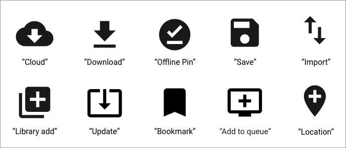
Use icons that convey meaning
Make sure to use meaningful text labels alongside your icons. Icons alone can be confusing, especially because the concept of 'offline' on the web is relatively new. Other cases of confusing icons include using a floppy disk to represent 'save,' which can be meaningless to younger users who have never seen a floppy disk, as well as the 'hamburger' menu icon.
When introducing an offline icon, stay consistent with industry standard visuals when they exist, and provide a text label and description. For example, you can use a download icon to mean saving for offline, a sync icon for an action that involves syncing. Be careful when using icons to demonstrate status that might instead be interpreted as a save or download action.
For more inspiration, refer to the Material Design icon set.
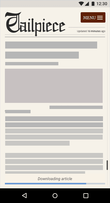
Use skeleton layouts and other feedback mechanisms
While your app is loading content, show the user that it's loading so they don't think it's broken. One way to do this is using a skeleton layout, a wireframe version of your app that displays while content is being loaded. Consider also using a preloader UI with a text label telling the user that the app is loading, or a gently pulsating animation for the wireframe to make it feel like it's alive and loading. This reassures the user that something is happening and helps prevent resubmissions or unnecessary refreshes.
Show the state of an action by giving feedback. For example, if a user is editing a document offline, consider changing the feedback design so it's visibly different from when they're online but still shows that their file was "saved" and will sync when they have a network connection. This educates the user about how your app works and reassures them that their task or action has been stored, which can make them more confident in using your application.
Don't block content
In some apps, a user might trigger an action such as creating a new document. Some apps try to connect to a server to sync the new document, and to demonstrate this they display an intrusive loading modal dialog that covers the entire screen. This might work if the user has a stable network connection, but if the network is unstable, they won't be able to escape from this action, so the UI blocks them from doing anything else.
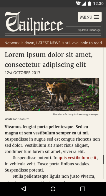
Avoid network requests that block content. Let the user continue to browse your app and queue tasks that will be performed and synced when the connection has improved.
Design for the next billion
In many regions, low-end devices are commonplace, connectivity is unreliable, and for many users, data is extremely expensive. Earn your users' trust by being transparent and frugal with data. Think about ways to help users on poor connections and simplify the interface to help speed up tasks. Always try to ask users before downloading data-heavy content.
Offer low-bandwidth options for users on laggy connections. Provide smaller assets on slower network connections, or offer an option to choose high or low quality assets.
Conclusion
Education is key to offline UX because users are unfamiliar with it. To help them learn, try to create associations with familiar concepts, like explaining that downloading for later use is the same as offlining data.
When designing for unstable network connections, remember these guidelines:
- Design for the success, failure, and instability of a network connection.
- Data can be expensive, so be considerate to the user.
- For most users globally, the tech environment is almost exclusively mobile.
- Low-end devices are commonplace, with limited storage, memory, and processing power, small displays, and lower touchscreen quality. Make sure performance is a part of your design process.
- Allow users to browse your application when they are offline.
- Inform users of their current state and of changes in states.
- Try to provide offline by default if your app doesn't require much data.
- If the app is data-heavy, educate users about how they can download for offline use.
- Make experiences transferable between devices.
- Use language, icons, imagery, typography, and color together to express ideas to the user.
- Provide reassurance and feedback to help the user.