Maximize conversions by helping your users complete address and payment forms as quickly and easily as possible.
Well-designed forms help users and increase conversion rates. One small fix can make a big difference!
Here is an example of a simple payment form that demonstrates all of the best practices:
Here is an example of a simple address form that demonstrates all of the best practices:
Checklist
- Use meaningful HTML elements:
<form>,<input>,<label>, and<button>. - Label each form field with a
<label>. - Use HTML element attributes to access built-in browser features, in particular
typeandautocompletewith appropriate values. - Avoid using
type="number"for numbers that aren't meant to be incremented, such as payment card numbers. Usetype="text"andinputmode="numeric"instead. - If an appropriate autocomplete value is available for an
input,select, ortextarea, you should use it. - To help browsers autofill forms, give input
nameandidattributes stable values that don't change between page loads or website deployments. - Disable submit buttons once they've been tapped or clicked.
- Validate data during entry—not just on form submission.
- Make guest checkout the default and make account creation simple once checkout is complete.
- Show progress through the checkout process in clear steps with clear calls to action.
- Limit potential checkout exit points by removing clutter and distractions.
- Show full order details at checkout and make order adjustments straightforward.
- Don't ask for data you don't need.
- Ask for names with a single input unless you have a good reason not to.
- Don't enforce Latin-only characters for names and usernames.
- Allow for a variety of address formats.
- Consider using a single
textareafor address. - Use autocomplete for billing address.
- Internationalize and localize where necessary.
- Consider avoiding postal code address lookup.
- Use appropriate payment card autocomplete values.
- Use a single input for payment card numbers.
- Avoid using custom elements if they break the autofill experience.
- Test in the field as well as the lab: page analytics, interaction analytics, and real-user performance measurement.
- Test on a range of browsers, devices, and platforms.
Use meaningful HTML
Use the elements and attributes built for the job:
<form>,<input>,<label>, and<button>type,autocomplete, andinputmode
These enable built-in browser functionality, improve accessibility, and add meaning to your markup.
Use HTML elements as intended
Put your form in a <form>
You might be tempted not to bother wrapping your <input> elements in a <form>, and to handle data
submission purely with JavaScript.
Don't do it!
An HTML <form> gives you access to a powerful set of built-in features across all modern browsers,
and can help make your site accessible to screen readers and other assistive devices. A <form>
also makes it simpler to build basic functionality for older browsers with limited JavaScript
support, and to enable form submission even if there's a glitch with your code—and for the
small number of users who actually disable JavaScript.
If you have more than one page component for user input, make sure to put each in its own <form>
element. For example, if you have search and sign-up on the same page, put each in its own <form>.
Use <label> to label elements
To label an <input>, <select>, or <textarea>, use a <label>.
Associate a label with an input by giving the label's for attribute the same value as
the input's id.
<label for="address-line1">Address line 1</label>
<input id="address-line1" …>
Use a single label for a single input: don't try to label multiple inputs with only one label. This works best for browsers, and best for screenreaders. A tap or click on a label moves focus to the input it's associated with, and screenreaders announce label text when the label or the label's input gets focus.
Make buttons helpful
Use <button>
for buttons! You can also use <input type="submit">, but don't use a div or some
other random element acting as a button. Button elements provide accessible behaviour, built-in
form submission functionality, and can easily be styled.
Give each form submit button a value that says what it does. For each step towards checkout, use a descriptive call-to-action that shows progress and makes the next step obvious. For example, label the submit button on your delivery address form Proceed to Payment rather than Continue or Save.
Consider disabling a submit button once the user has tapped or clicked it—especially when the user is making a payment or placing an order. Many users click buttons repeatedly, even if they're working fine. That can mess up checkout and add to server load.
On the other hand, don't disable a submit button waiting on complete and valid user input. For example, don't just leave a Save Address button disabled because something is missing or invalid. That doesn't help the user—they may continue to tap or click the button and assume that it's broken. Instead, if users attempt to submit a form with invalid data, explain to them what's gone wrong and what to do to fix it. This is particularly important on mobile, where data entry is more difficult and missing or invalid form data may not be visible on the user's screen by the time they attempt to submit a form.
Make the most of HTML attributes
Make it easy for users to enter data
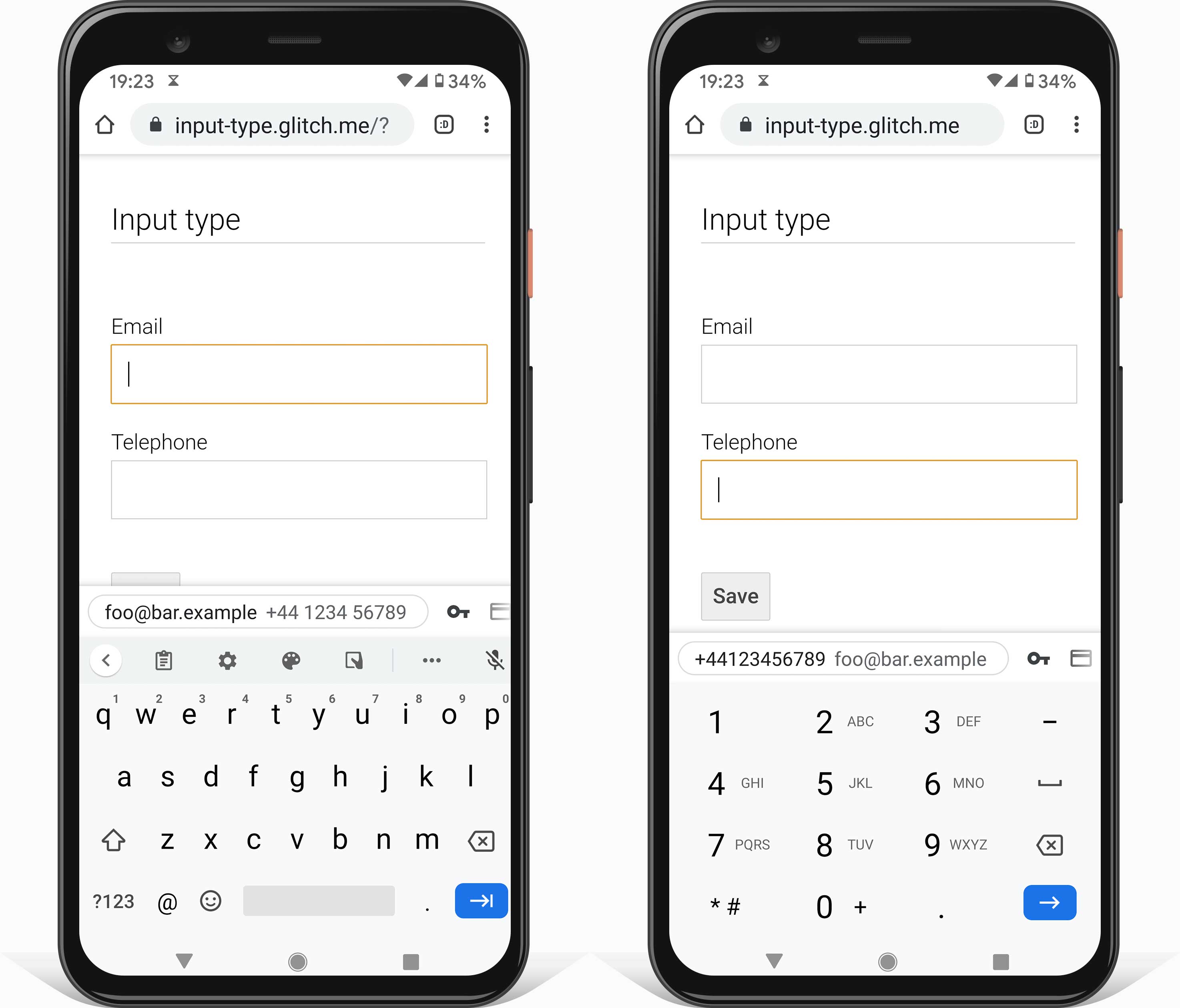
Use the appropriate input type attribute
to provide the right keyboard on mobile and enable basic built-in validation by the browser.
For example, use type="email" for email addresses and type="tel" for phone numbers.
For dates, try to avoid using custom select elements. They break the autofill experience if not
properly implemented and don't work on older browsers. For numbers such as birth year, consider
using an input element rather than a select, since entering digits manually can be easier and less
error prone than selecting from a long drop-down list—especially on mobile. Use inputmode="numeric"
to ensure the right keyboard on mobile and add validation and format hints with text or a
placeholder to make sure the user enters data in the appropriate format.
Use autocomplete to improve accessibility and help users avoid re-entering data
Using appropriate autocomplete values enables browsers to help users by securely storing data and
autofilling input, select, and textarea values. This is particularly important on mobile, and
crucial for avoiding high form abandonment rates. Autocomplete also provides multiple accessibility benefits.
If an appropriate autocomplete value is available for a form field, you should use it. MDN web docs has a full list of values and explanations of how to use them correctly.
Stable values
Billing address
By default, set the billing address to be the same as the delivery address. Reduce visual clutter by
providing a link to edit the billing address (or use summary and details elements)
rather than displaying the billing address in a form.

Use appropriate autocomplete values for the billing address, just as you do for shipping address, so the user doesn't have to enter data more than once. Add a prefix word to autocomplete attributes if you have different values for inputs with the same name in different sections.
<input autocomplete="shipping address-line-1" ...>
...
<input autocomplete="billing address-line-1" ...>
Help users enter the right data
Try to avoid "telling off" customers because they "did something wrong". Instead, help users complete forms more quickly and easily by helping them fix problems as they happen. Through the checkout process, customers are trying to give your company money for a product or service—your job is to assist them, not to punish them!
You can add constraint attributes to form elements to specify acceptable
values, including min, max, and pattern. The validity state
of the element is set automatically depending on whether the element's value is valid, as are the
:valid and :invalid CSS pseudo-classes which can be used to style elements with valid or invalid
values.
For example, the following HTML specifies input for a birth year between
1900 and 2020. Using type="number" constrains input values to numbers only, within the range
specified by min and max. If you attempt to enter a number outside the range, the input will be
set to have an invalid state.
The following example uses pattern="[\d ]{10,30}" to ensure a valid payment card number, while
allowing spaces:
Modern browsers also do basic validation for inputs with type email or url.
On form submission, browsers automatically set focus on fields with problematic or missing required values. No JavaScript required!
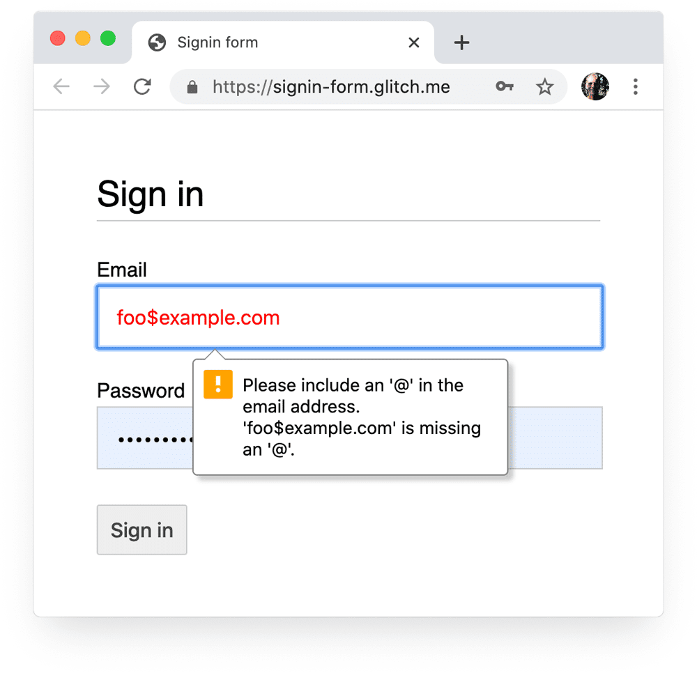
Validate inline and provide feedback to the user as they enter data, rather than providing a list of errors when they click the submit button. If you need to validate data on your server after form submission, list all problems that are found and clearly highlight all form fields with invalid values, as well as displaying a message inline next to each problematic field explaining what needs to be fixed. Check server logs and analytics data for common errors—you may need to redesign your form.
You should also use JavaScript to do more robust validation while users are entering data and on form submission. Use the Constraint Validation API (which is widely supported) to add custom validation using built-in browser UI to set focus and display prompts.
Find out more in Use JavaScript for more complex real-time validation.
Help users avoid missing required data
Use the required attribute
on inputs for mandatory values.
When a form is submitted modern browsers
automatically prompt and set focus on required fields with missing data, and you can use the
:required pseudo-class to highlight required fields. No
JavaScript required!
Add an asterisk to the label for every required field, and add a note at the start of the form to explain what the asterisk means.
Simplify checkout
Mind the mobile commerce gap!
Imagine that your users have a fatigue budget. Use it up, and your users will leave.
You need to reduce friction and maintain focus, especially on mobile. Many sites get more traffic on mobile but more conversions on desktop—a phenomenon known as the mobile commerce gap. Customers may simply prefer to complete a purchase on desktop, but lower mobile conversion rates are also a result of poor user experience. Your job is to minimize lost conversions on mobile and maximize conversions on desktop. Research has shown that there's a huge opportunity to provide a better mobile form experience.
Most of all, users are more likely to abandon forms that look long, that are complex, and without a sense of direction. This is especially true when users are on smaller screens, distracted, or in a rush. Ask for as little data as possible.
Make guest checkout the default
For an online store, the simplest way to reduce form friction is to make guest checkout the default. Don't force users to create an account before making a purchase. Not allowing guest checkout is cited as a major reason for shopping cart abandonment.
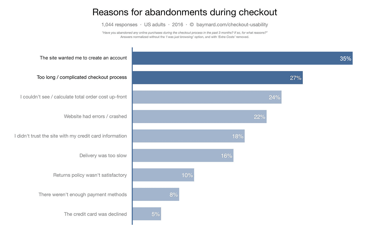
You can offer account sign-up after checkout. At that point, you already have most of the data you need to set up an account, so account creation should be quick and easy for the user.
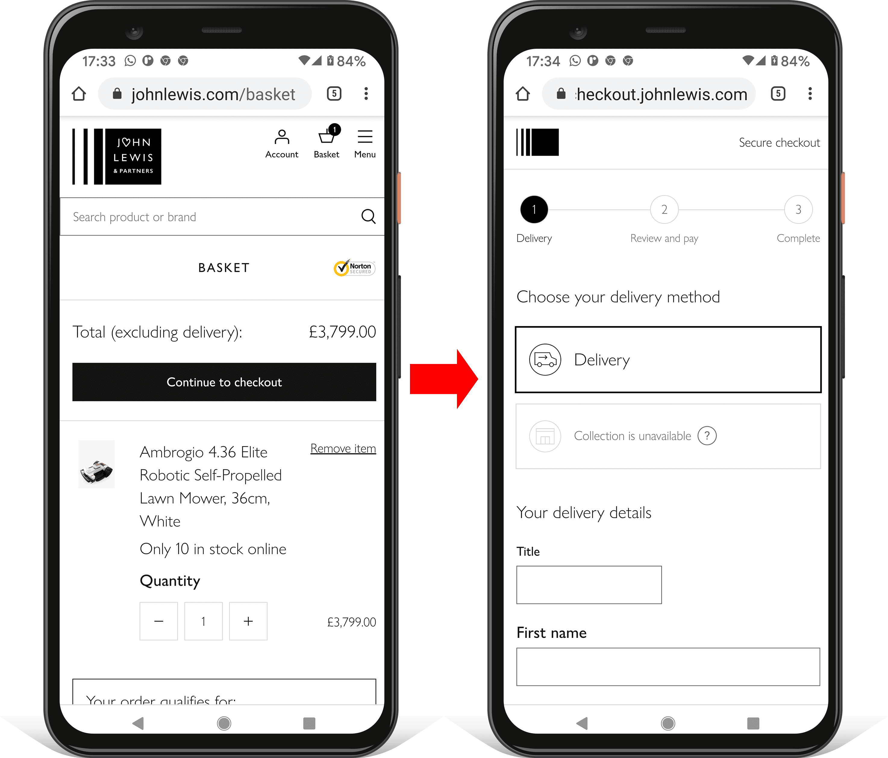
Show checkout progress
You can make your checkout process feel less complex by showing progress and making it clear what needs to be done next. The video that follows shows how UK retailer johnlewis.com achieves this.
You need to maintain momentum! For each step towards payment, use page headings and descriptive button values that make it clear what needs to be done now, and what checkout step is next.
Use the enterkeyhint attribute on form inputs to set the mobile keyboard enter key label. For
example, use enterkeyhint="previous" and enterkeyhint="next" within a multi-page form,
enterkeyhint="done" for the final input in the form, and enterkeyhint="search" for a search
input.
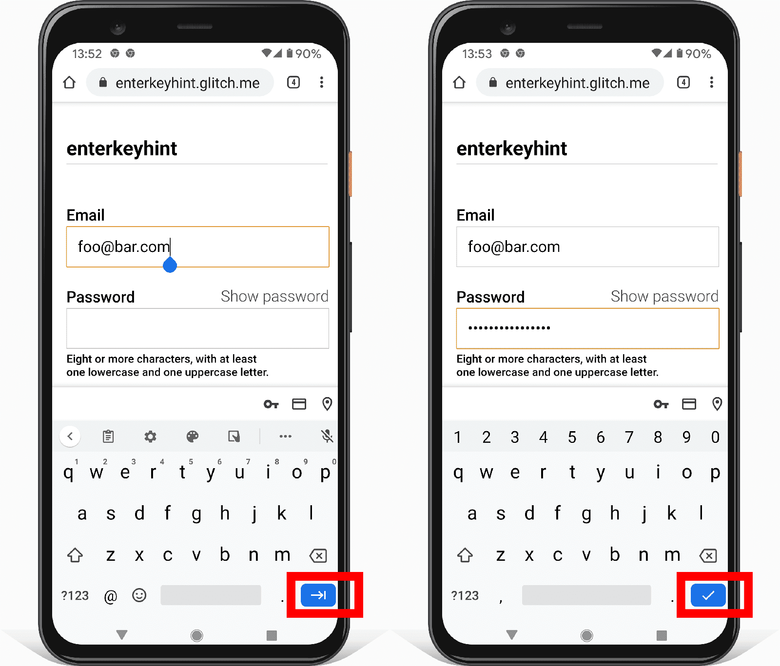
The enterkeyhint attribute is supported on Android and iOS.
You can find out more from the enterkeyhint explainer.
Make it easy for users to go back and forth within the checkout process, to easily adjust their order, even when they're at the final payment step. Show full details of the order, not just a limited summary. Enable users to easily adjust item quantities from the payment page. Your priority at checkout is to avoid interrupting progress towards conversion.
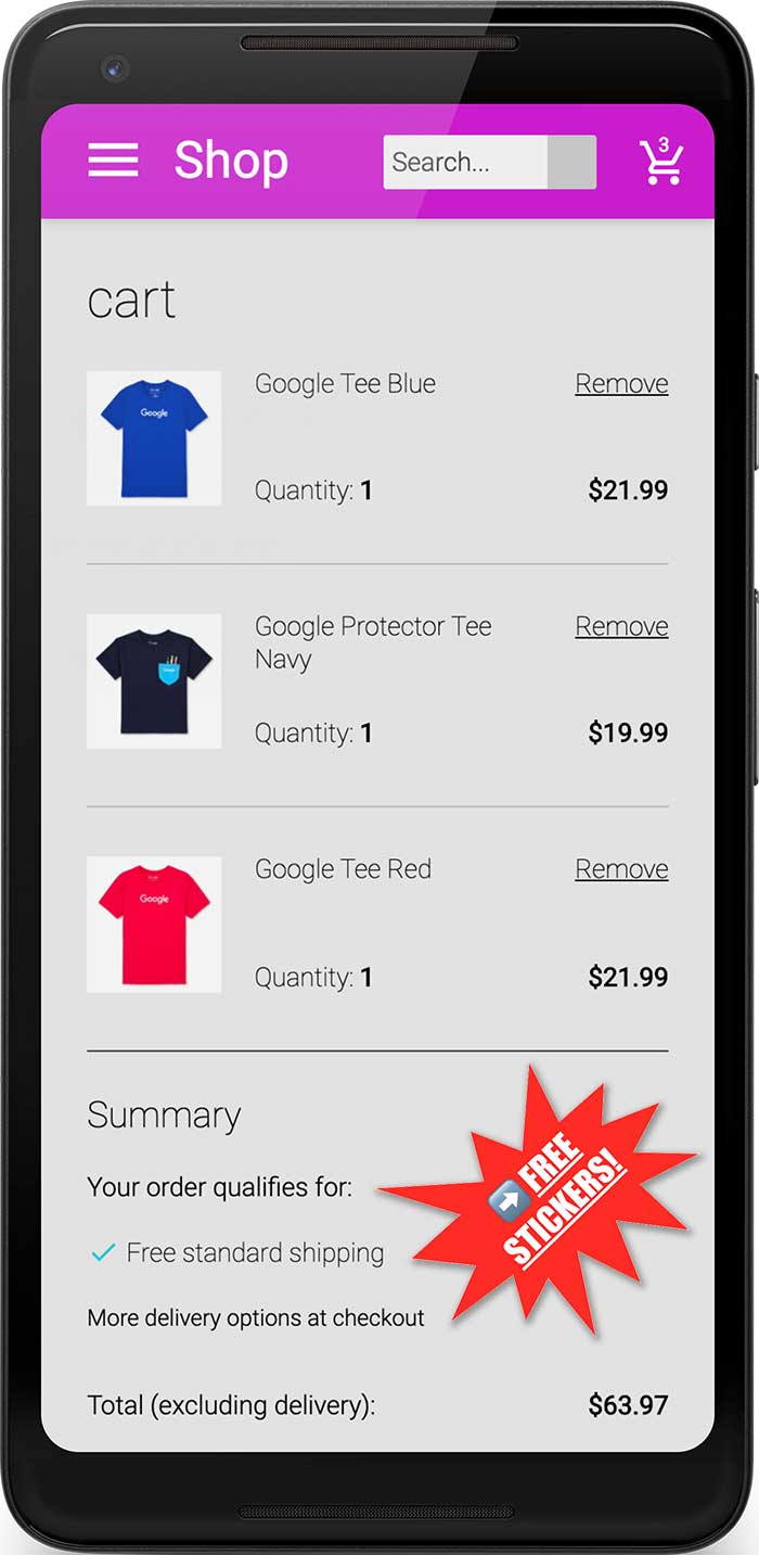
Remove distractions
Limit potential exit points by removing visual clutter and distractions such as product promotions. Many successful retailers even remove navigation and search from checkout.
Keep the journey focused. This is not the time to tempt users to do something else!
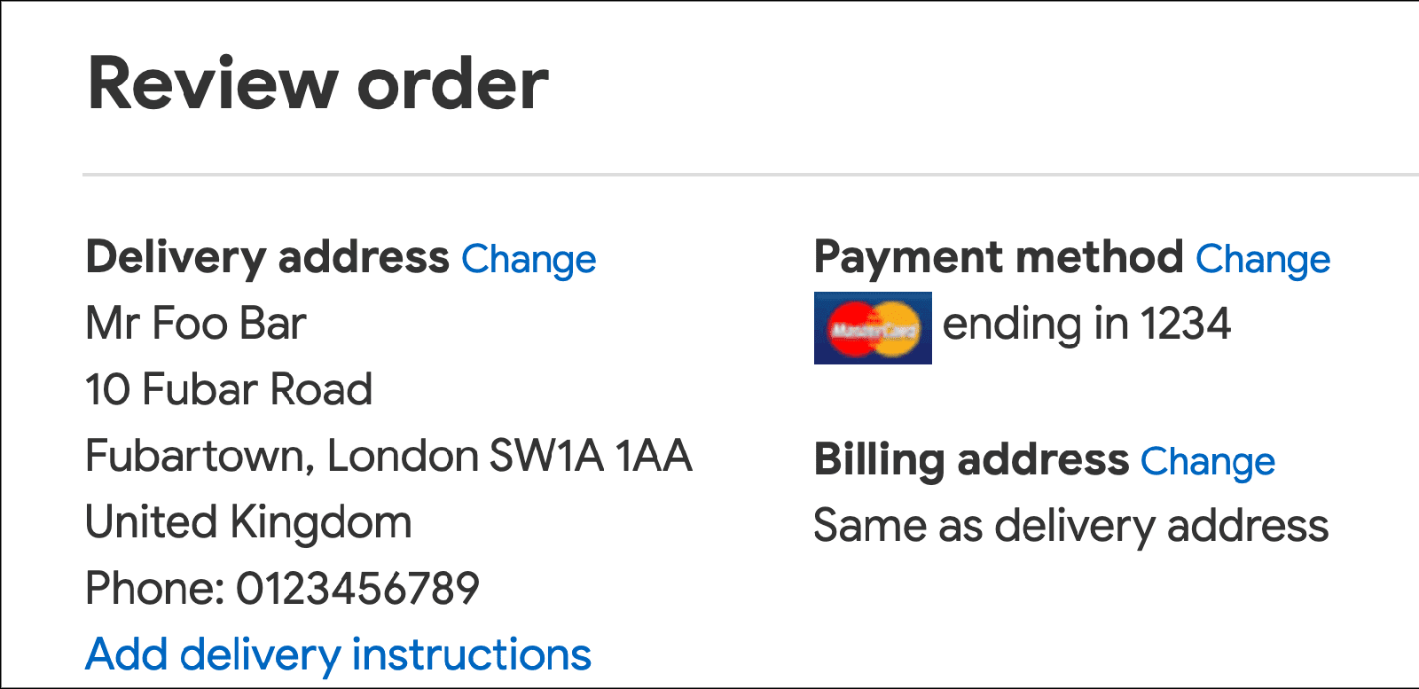
For returning users you can simplify the checkout flow even more, by hiding data they don't need to see. For example: display the delivery address in plain text (not in a form) and allow users to change it by following a link.
Make it easy to enter name and address
Only ask for the data you need
Before you start coding your name and address forms, make sure to understand what data is required. Don't ask for data you don't need! The simplest way to reduce form complexity is to remove unnecessary fields. That's also good for customer privacy and can reduce backend data cost and liability.
Use a single name input
Allow your users to enter their name using a single input, unless you have a good reason for separately storing given names, family names, honorifics, or other name parts. Using a single name input makes forms less complex, enables cut-and-paste, and makes autofill simpler.
In particular, unless you have good reason not to, don't bother adding a separate input for a
prefix or title (like Mrs, Dr or Lord). Users can type that in with their name if they want to. Also,
honorific-prefix autocomplete currently doesn't work in most browsers, and so adding a field for
name prefix or title will break the address form autofill experience for most users.
Enable name autofill
Use name for a full name:
<input autocomplete="name" ...>
If you really do have a good reason to split out name parts, make sure to use appropriate autocomplete values:
honorific-prefixgiven-namenicknameadditional-name-initialadditional-namefamily-namehonorific-suffix
Allow international names
You might want to validate your name inputs, or restrict the characters allowed for name data. However, you need to be as unrestrictive as possible with alphabets. It's rude to be told your name is "invalid"!
For validation, avoid using regular expressions that only match Latin characters. Latin-only excludes users with names or addresses that include characters that aren't in the Latin alphabet. Allow Unicode letter matching instead—and ensure your backend supports Unicode securely as both input and output. Unicode in regular expressions is well supported by modern browsers.
<!-- Names with non-Latin characters (such as Françoise or Jörg) are 'invalid'. -->
<input pattern="[\w \-]+" ...>
<!-- Accepts Unicode letters. -->
<input pattern="[\p{L} \-]+" ...>Allow for a variety of address formats
When you're designing an address form, bear in mind the bewildering variety of address formats, even within a single country. Be careful not to make assumptions about "normal" addresses. (Take a look at UK Address Oddities! if you're not convinced!)
Make address forms flexible
Don't force users to try to squeeze their address into form fields that don't fit.
For example, don't insist on a house number and street name in separate inputs, since many addresses don't use that format, and incomplete data can break browser autofill.
Be especially careful with required address fields. For example, addresses in large cities in the
UK don't have a county, but many sites still force users to enter one.
Using two flexible address lines can work well enough for a variety of address formats.
<input autocomplete="address-line-1" id="address-line1" ...>
<input autocomplete="address-line-2" id="address-line2" ...>
Add labels to match:
<label for="address-line-1">
Address line 1 (or company name)
</label>
<input autocomplete="address-line-1" id="address-line1" ...>

<label for="address-line-2">
Address line 2 (optional)
</label>
<input autocomplete="address-line-2" id="address-line2" ...>
You can try this out by remixing and editing the demo embedded later in this codelab.
Consider using a single textarea for address
The most flexible option for addresses is to provide a single textarea.
The textarea approach fits any address format, and it's great for cutting and pasting—but bear in
mind that it may not fit your data requirements, and users may miss out on autofill if they previously
only used forms with address-line1 and address-line2.
For a textarea, use street-address as the autocomplete value.
Here is an example of a form that demonstrates the use of a single textarea for address:
Internationalize and localize your address forms
It's especially important for address forms to consider internationalization and localization, depending on where your users are located.
Be aware that the naming of address parts varies as well as address formats, even within the same language.
    ZIP code: US
 Postal code: Canada
    Postcode: UK
     Eircode: Ireland
         PIN: India
It can be irritating or puzzling to be presented with a form that doesn't fit your address or that doesn't use the words you expect.
Customizing address forms for multiple locales may be necessary for your site, but using techniques to maximize form flexibility (as described above) may be adequate. If you don't localize your address forms, make sure to understand the key priorities to cope with a range of address formats:
- Avoid being over-specific about address parts, such as insisting on a street name or house number.
- Where possible avoid making fields
required. For example, addresses in many countries don't have a postal code, and rural addresses may not have a street or road name. - Use inclusive naming: 'Country/region' not 'Country'; 'ZIP/postal code' not 'ZIP'.
Keep it flexible! The simple address form example above can be adapted to work 'well enough' for many locales.
Consider avoiding postal code address lookup
Some websites use a service to look up addresses based on postal code or ZIP. This may be sensible for some use cases, but you should be aware of the potential downsides.
Postal code address suggestion doesn't work for all countries—and in some regions, post codes can include a large number of potential addresses.
It's difficult for users to select from a long list of addresses—especially on mobile if they're rushed or stressed. It can be easier and less error prone to let users take advantage of autofill, and enter their complete address filled with a single tap or click.
Simplify payment forms
Payment forms are the single most critical part of the checkout process. Poor payment form design is a common cause of shopping cart abandonment. The devil's in the details: small glitches can tip users towards abandoning a purchase, particularly on mobile. Your job is to design forms to make it as easy as possible for users to enter data.
Help users avoid re-entering payment data
Make sure to add appropriate autocomplete values in payment card forms, including the payment card
number, name on the card, and the expiry month and year:
cc-numbercc-namecc-exp-monthcc-exp-year
This enables browsers to help users by securely storing payment card details and correctly entering form data. Without autocomplete, users may be more likely to keep a physical record of payment card details, or store payment card data insecurely on their device.
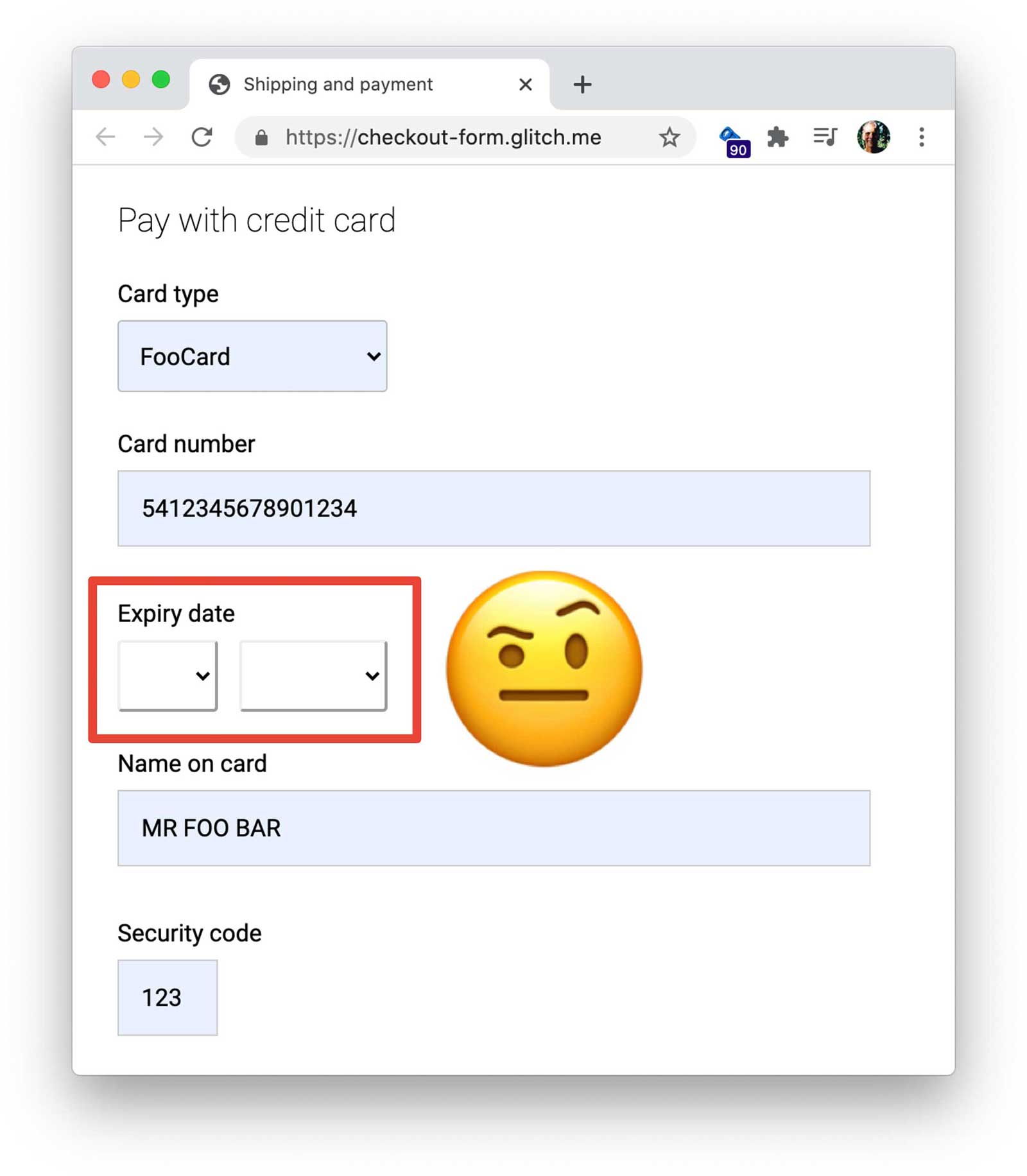
Avoid using custom elements for payment card dates
If not properly designed, custom elements can interrupt payment flow by breaking autofill, and won't work on older browsers. If all other payment card details are available from autocomplete but a user is forced to find their physical payment card to look up an expiry date because autofill didn't work for a custom element, you're likely to lose a sale. Consider using standard HTML elements instead, and style them accordingly.
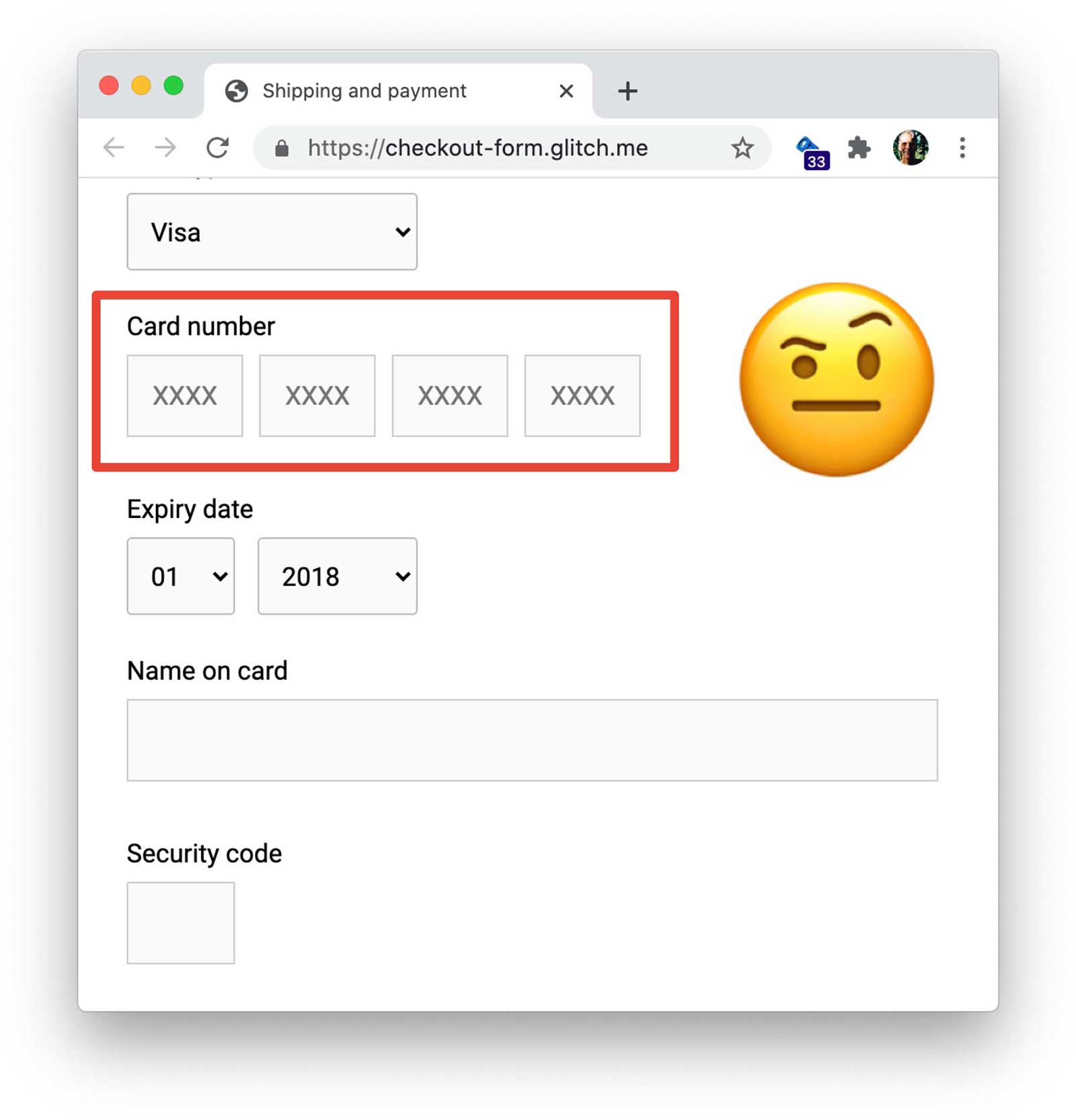
Use a single input for payment card and phone numbers
For payment card and phone numbers use a single input: don't split the number into parts. That makes it easier for users to enter data, makes validation simpler, and enables browsers to autofill. Consider doing the same for other numeric data such as PIN and bank codes.
Validate carefully
You should validate data entry both in realtime and before form submission. One way to do this is by
adding a pattern attribute to a payment card input. If the user attempts to submit the payment form
with an invalid value, the browser displays a warning message and sets focus on the input. No
JavaScript required!
However, your pattern regular expression must be flexible enough to handle the range of payment card
number lengths: from 14
digits (or possibly less) to 20 (or more). You can find out more about payment card number structuring
from LDAPwiki.
Allow users to include spaces when they're entering a new payment card number, since this is how numbers are displayed on physical cards. That's friendlier to the user (you won't have to tell them "they did something wrong"), less likely to interrupt conversion flow, and it's straightforward to remove spaces in numbers before processing.
Test on a range of devices, platforms, browsers and versions
It's particularly important to test address and payment forms on the platforms most common for your users, since form element functionality and appearance may vary, and differences in viewport size can lead to problematic positioning. BrowserStack enables free testing for open source projects on a range of devices and browsers.
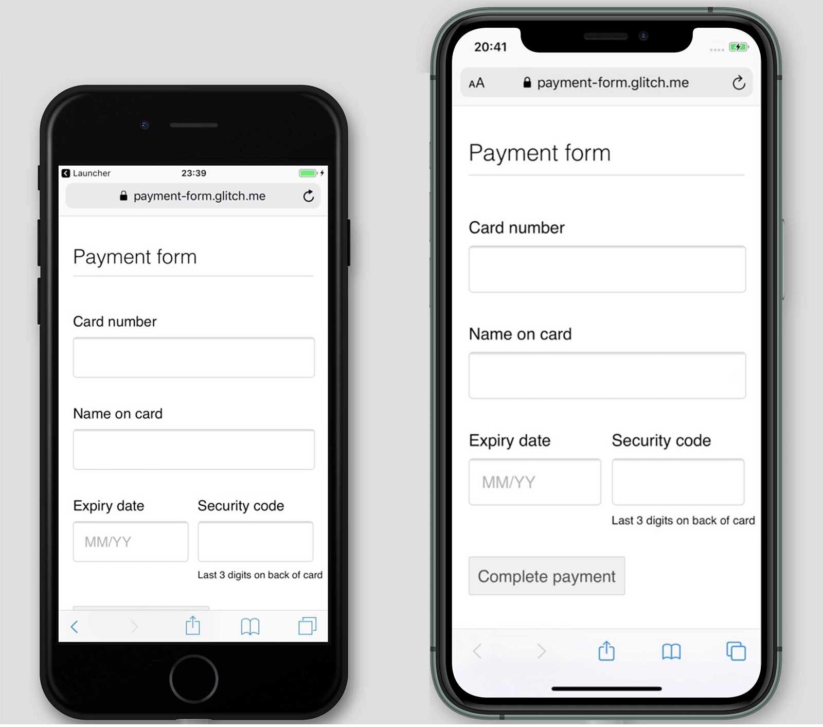
Reduce padding for smaller mobile viewports to ensure the Complete payment button isn't hidden.
Implement analytics and RUM
Testing usability and performance locally can be helpful, but you need real-world data to properly understand how users experience your payment and address forms.
For that you need analytics and Real User Monitoring—data for the experience of actual users, such as how long checkout pages take to load or how long payment takes to complete:
- Page analytics: page views, bounce rates and exits for every page with a form.
- Interaction analytics: goal funnels and events indicate where users abandon your checkout flow and what actions do they take when interacting with your forms.
- Website performance: user-centric metrics can tell you if your checkout pages are slow to load and, if so—what's the cause.
Page analytics, interaction analytics, and real user performance measurement become especially valuable when combined with server logs, conversion data, and A/B testing, enabling you to answer questions such as whether discount codes increase revenue, or whether a change in form layout improves conversions.
That, in turn, gives you a solid basis for prioritizing effort, making changes, and rewarding success.
Keep learning
- Sign-in form best practices
- Sign-up form best practices
- Verify phone numbers on the web with the WebOTP API
- Create Amazing Forms
- Best Practices For Mobile Form Design
- More capable form controls
- Creating Accessible Forms
- Streamlining the Sign-up Flow Using Credential Management API
- Frank's Compulsive Guide to Postal Addresses provides useful links and extensive guidance for address formats in over 200 countries.
- Countries Lists has a tool for downloading country codes and names in multiple languages, in multiple formats.

