The notification options is split into two sections, one that deals with the visual aspects (this section) and one that explains the behavioral aspects of notifications (the next section).
You can play around with various notification options in various browsers on various platforms using Peter Beverloo's Notification Generator.
Visual Options
The API for showing a notification is simple:
<ServiceWorkerRegistration>.showNotification(<title>, <options>);
Both arguments, title and options are optional.
The title is a string and options can be any of the following:
{
  "//": "Visual Options",
  "body": "<String>",
  "icon": "<URL String>",
  "image": "<URL String>",
  "badge": "<URL String>",
  "dir": "<String of 'auto' | 'ltr' | 'rtl'>",
  "timestamp": "<Long>"

  "//": "Both visual & behavioral options",
  "actions": "<Array of Strings>",
  "data": "<Anything>",

  "//": "Behavioral Options",
  "tag": "<String>",
  "requireInteraction": "<boolean>",
  "renotify": "<Boolean>",
  "vibrate": "<Array of Integers>",
  "sound": "<URL String>",
  "silent": "<Boolean>",
}
Let's look at the visual options:
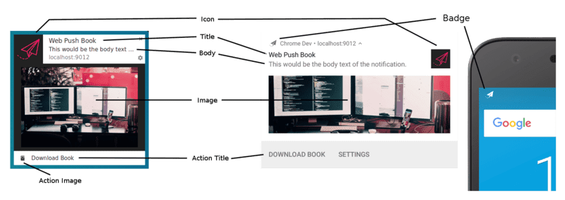
Title and body options
This is what a notification looks like without the title and options in Chrome on Windows:
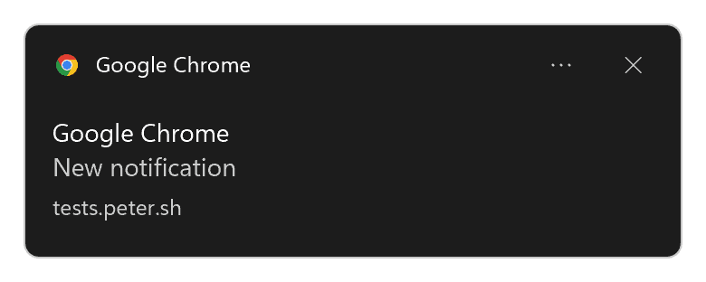
As you can see, the browser name is used as the title and the "New notification" placeholder is used as the notification body.
If a progressive web application is installed on the device, the web app name will be used instead of the browser name:
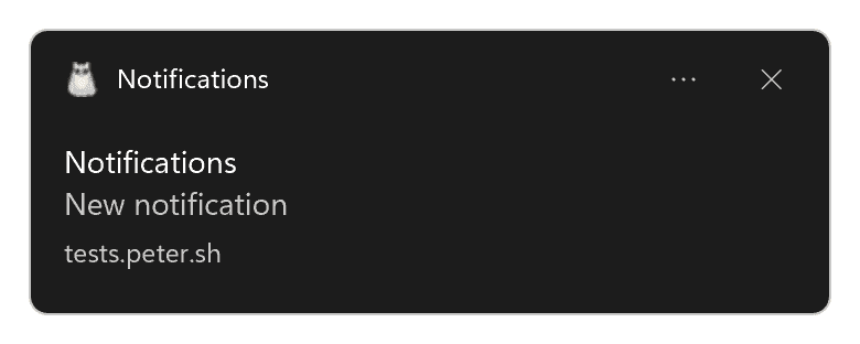
If we ran the following code:
const title = 'Simple Title';

const options = {
  body: 'Simple piece of body text.\nSecond line of body text :)',
};

registration.showNotification(title, options);
we'd get this notification in Chrome on Linux:

In Firefox on Linux it would look like this:

This is what the notification with a lot of text in the title and body looks like in Chrome on Linux:
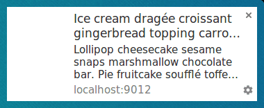
Firefox on Linux collapses the body text until you hover the notification, causing the notification to expand:


The same notifications in Firefox on Windows look like this:
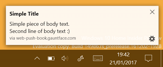
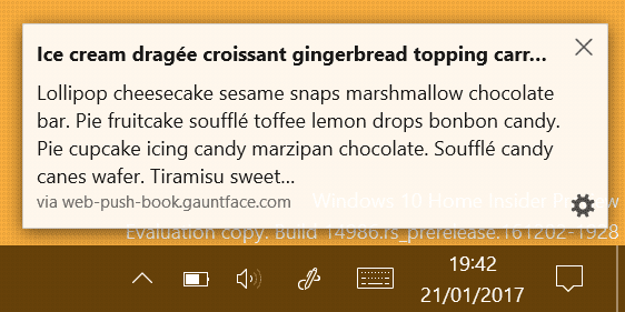
As you can see, the same notification may look different in different browsers. It may also look different in the same browser on different platforms.
Chrome and Firefox use the system notifications and notification center on platforms where these are available.
For example, system notifications on macOS don't support images and actions (buttons and inline replies).
Chrome also has a custom notifications for all desktop platforms. You can enable it by setting the
chrome://flags/#enable-system-notifications flag to the Disabled state.
Icon
The icon option is essentially a small image you can show next to the title and body text.
In your code you need to provide a URL to the image you'd like to load:
const title = 'Icon Notification';

const options = {
  icon: '/images/demos/icon-512x512.png',
};

registration.showNotification(title, options);
You get this notification in Chrome on Linux:
![]()
and in Firefox on Linux:
![]()
Sadly there aren't any solid guidelines for what size image to use for an icon.
Android seems to want a 64dp image (which is 64px multiples by the device pixel ratio).
Assuming the highest pixel ratio for a device is 3, an icon size of 192px or more is a safe bet.
Badge
The badge is a small monochrome icon that is used to portray a little more information to the
user about where the notification is from:
const title = 'Badge Notification';

const options = {
  badge: '/images/demos/badge-128x128.png',
};

registration.showNotification(title, options);
At the time of writing the badge is only used in Chrome on Android.

On other browsers (or Chrome without the badge), you'll see an icon of the browser.

As with the icon option, there are no real guidelines on what size to use.
Digging through Android guidelines the recommended size is 24px multiplied by the device pixel ratio.
Meaning an image of 72px or more should be good (assuming a max device pixel ratio of 3).
Image
The image option can be used to display a larger image to the user. This is particularly
useful to display a preview image to the user.
const title = 'Image Notification';

const options = {
  image: '/images/demos/unsplash-farzad-nazifi-1600x1100.jpg',
};

registration.showNotification(title, options);
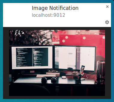
In Chrome on Linux the notification will look like this:
In Chrome on Android the cropping and ratio are different:
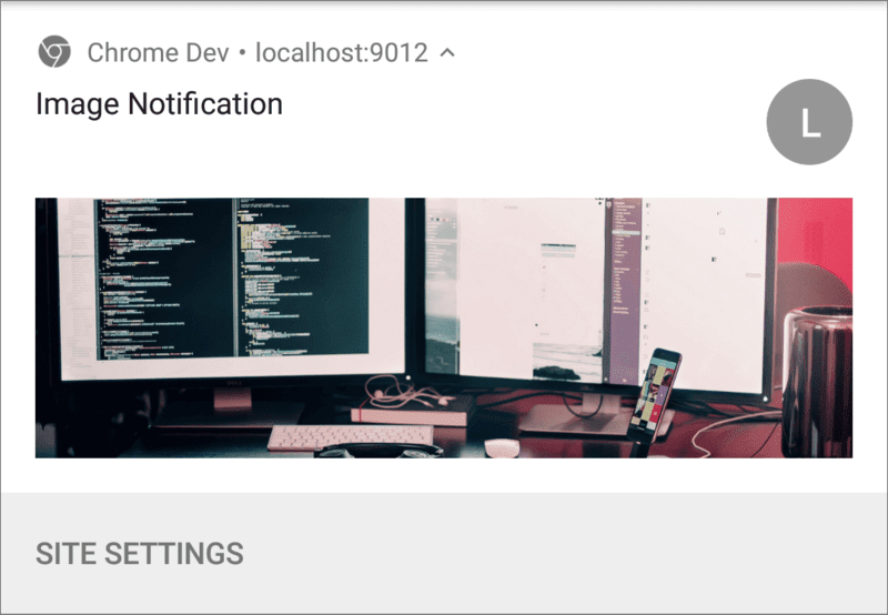
Given the differences in ratio between desktop and mobile, it's extremely hard to suggest guidelines.
Since Chrome on desktop doesn't fill the available space and has a ratio of 4:3, perhaps the best
approach is to serve an image with this ratio and allow Android to crop the image. That being said,
the image option may still change.
On Android, the only guideline is a width of 450dp.
Using this guideline, an image of width 1350px or more would be a good bet.
Actions (Buttons)
You can define actions to display buttons with a notification:
const title = 'Actions Notification';

const options = {
  actions: [
    {
      action: 'coffee-action',
      type: 'button',
      title: 'Coffee',
      icon: '/images/demos/action-1-128x128.png',
    },
    {
      action: 'doughnut-action',
      type: 'button',
      title: 'Doughnut',
      icon: '/images/demos/action-2-128x128.png',
    },
    {
      action: 'gramophone-action',
      type: 'button',
      title: 'Gramophone',
      icon: '/images/demos/action-3-128x128.png',
    },
    {
      action: 'atom-action',
      type: 'button',
      title: 'Atom',
      icon: '/images/demos/action-4-128x128.png',
    },
  ],
};

registration.showNotification(title, options);
For each action you can define a title, an action (which is essentially an ID), an icon, and
a type. The title and icon is what you can see in the notification. The ID is used when detecting
that the action button had been clicked (more about this in the next section). The type
can be omitted because 'button' is the default value.
At the time of writing only Chrome and Opera for Android support actions.
In the example above there are four actions defined to illustrate that you can define more actions than
will be displayed. If you want to know the number of actions that will be displayed by the browser,
you can check window.Notification?.maxActions:
const maxVisibleActions = window.Notification?.maxActions;

if (maxVisibleActions) {
  options.body = `Up to ${maxVisibleActions} notification actions can be displayed.`;
} else {
  options.body = 'Notification actions are not supported.';
}
On desktop, the action button icons display their colors (see the pink doughnut):
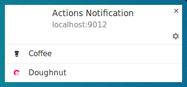
On Android 6 and earlier, the icons are colored to match the system color scheme:
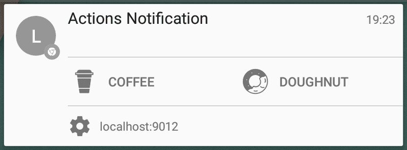
On Android 7 and later, the action icons aren't shown at all.
Chrome will hopefully change it's behavior on desktop to match Android (i.e. apply the
appropriate color scheme to make the icons match the system look and feel). In the meantime, you
can match Chrome's text color by making your icons have a color of #333333.
It's also worth calling out that icons look crisp on Android but not on desktop.
The best size I could get to work on desktop Chrome was 24px x 24px. This sadly looks out of place on Android.
The best practice we can draw from these differences:
- Stick to a consistent color scheme for your icons so at least all your icons are consistently displayed to the user.
- Make sure they work in monochrome as some platforms may display them that way.
- Test the size and see what works for you. 128px × 128px works well on Android for me but was poor quality on desktop.
- Expect your action icons not to be displayed at all.
The Notification spec is exploring a way to define multiple sizes of icons, but it looks like it'll be some time before anything is agreed upon.
Actions (Inline Replies)
You can add an inline reply to the notification by defining an action with the 'text' type:
const title = 'Alexey Rodionov';

const options = {
  body: 'How are you doing? )',
  image: '/images/demos/avatar-512x512.jpg',
  icon: '/images/demos/icon-512x512.png',
  badge: '/images/demos/badge-128x128.png',
  actions: [
    {
      action: 'reply',
      type: 'text',
      title: 'Reply',
      icon: '/images/demos/action-5-128x128.png',
    }
  ],
};

registration.showNotification(title, options);
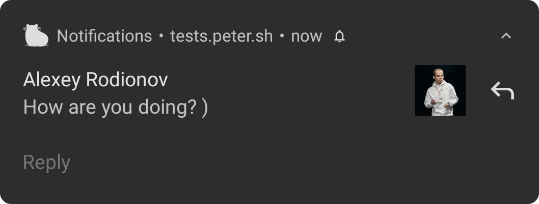
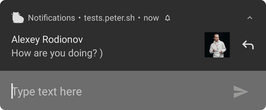
This is what it will look like on Android:
Clicking on the action button opens a text input field:
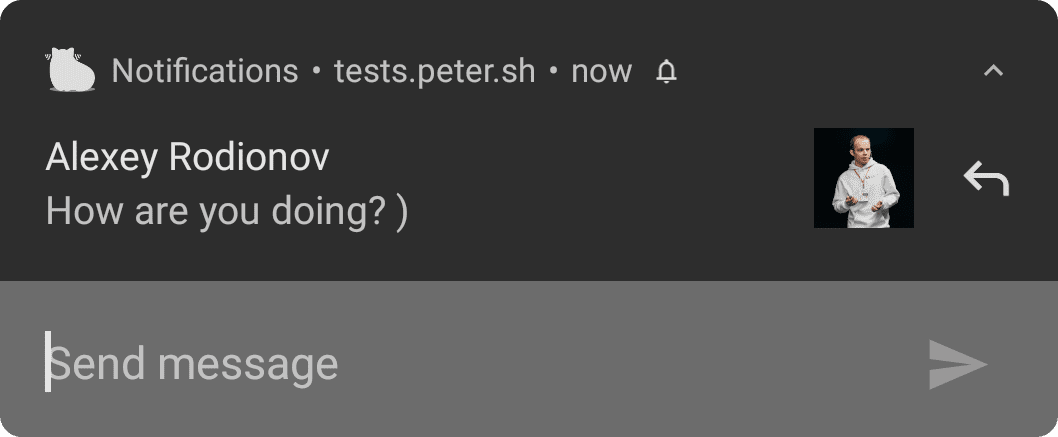
You can customize the placeholder for the text input field:
const title = 'Alexey Rodionov';

const options = {
  body: 'How are you doing? )',
  icon: '/images/demos/avatar-512x512.jpg',
  badge: '/images/demos/badge-128x128.png',
  actions: [
    {
      action: 'reply',
      type: 'text',
      title: 'Reply',
      icon: '/images/demos/action-5-128x128.png',
      placeholder: 'Type text here',
    }
  ],
};

registration.showNotification(title, options);
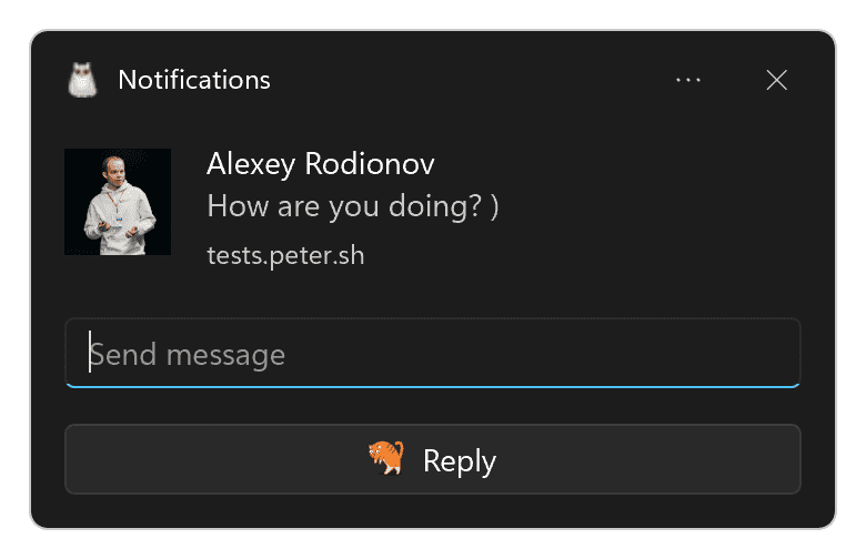
In Chrome on Windows, the text input field is always visible without having to click the action button:
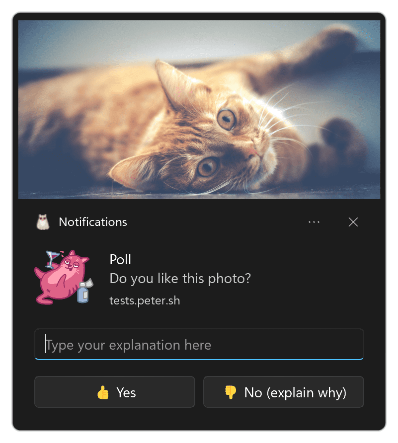
You can add more than one inline reply or combine buttons and inline replies:
const title = 'Poll';

const options = {
  body: 'Do you like this photo?',
  image: '/images/demos/cat-image.jpg',
  icon: '/images/demos/icon-512x512.png',
  badge: '/images/demos/badge-128x128.png',
  actions: [
    {
      action: 'yes',
      type: 'button',
      title: '👍 Yes',
    },
    {
      action: 'no',
      type: 'text',
      title: '👎 No (explain why)',
      placeholder: 'Type your explanation here',
    },
  ],
};

registration.showNotification(title, options);
Direction
The dir parameter allows you to define which direction the text should be displayed,
right-to-left or left-to-right.
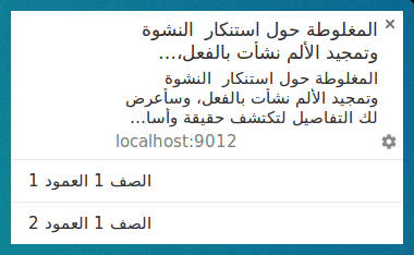
In testing, it seemed that the direction was largely determined by the text rather than this parameter. According to the spec, this is intended to suggest to the browser how to layout options like actions, but I saw no difference.
Probably best to define if you can, otherwise the browser should do the right thing according to the text supplied.
The parameter should be set to either auto, ltr or rtl.
A right-to-left language used on Chrome on Linux looks like this:
In Firefox (while hovering over it) you'll get this:

Vibrate
The vibrate option allows you to define a vibration pattern that'll run when a notification is displayed, assuming the user's current settings allow for vibrations (i.e. the device isn't in silent mode).
The format of the vibrate option should be an array of numbers that describe the number of milliseconds the device should vibrate, followed by the number of milliseconds the device should not vibrate.
const title = 'Vibrate Notification';

const options = {
  // Star Wars shamelessly taken from the awesome Peter Beverloo
  // https://tests.peter.sh/notification-generator/
  vibrate: [
    500, 110, 500, 110, 450, 110, 200, 110, 170, 40, 450, 110, 200, 110, 170,
    40, 500,
  ],
};

registration.showNotification(title, options);
This only affects devices that support vibration.
Sound
The sound parameter allows you to define a sound to play when the notification is received.
At the time of writing, no browser has support for this option.
const title = 'Sound Notification';

const options = {
  sound: '/demos/notification-examples/audio/notification-sound.mp3',
};

registration.showNotification(title, options);
Timestamp
Timestamp allows you to tell the platform the time when an event occurred that resulted in the push notification being sent.
The timestamp should be the number of milliseconds since 00:00:00 UTC, which is 1 January 1970
(which is the UNIX epoch).
const title = 'Timestamp Notification';

const options = {
  body: 'Timestamp is set to "01 Jan 2000 00:00:00".',
  timestamp: Date.parse('01 Jan 2000 00:00:00'),
};

registration.showNotification(title, options);
UX Best Practices
The biggest UX failure I've seen with notifications is a lack of specificity in the information displayed by a notification.
You should consider why you sent the push message in the first place and make sure all of the notification options are used to help users understand why they are reading that notification.
To be honest, it's easy to see examples and think "I'll never make that mistake". But it's easier to fall into that trap than you might think.
Some common pitfalls to avoid:
- Don't put your website in the title or the body. Browsers include your domain in the notification so don't duplicate it.
- Use all the information that you have available. If you send a push message because someone sent a message to a user, rather than using a title of 'New Message' and body of 'Click here to read it.' use a title of 'John just sent a new message' and set the body of the notification to part of the message.
Browsers and feature detection
At the time of writing, there is a pretty big disparity between Chrome and Firefox in terms of feature support for notifications.
Luckily, you can detect support for notification features by looking at the window.Notification
prototype.
Let's say we wanted to know if a notification supports action buttons, we'd do the following:
if ('actions' in window.Notification?.prototype) {
  // Action buttons are supported.
} else {
  // Action buttons are NOT supported.
}
With this, we could change the notification we display to our users.
With the other options, just do the same as above, replacing 'actions' with the desired
parameter name.
Where to go next
- Web Push Notification Overview
- How Push Works
- Subscribing a User
- Permission UX
- Sending Messages with Web Push Libraries
- Web Push Protocol
- Handling Push Events
- Displaying a Notification
- Notification Behavior
- Common Notification Patterns
- Push Notifications FAQ
- Common Issues and Reporting Bugs

