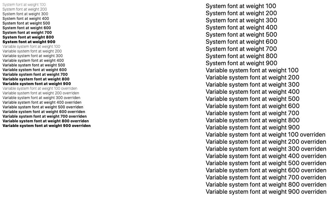
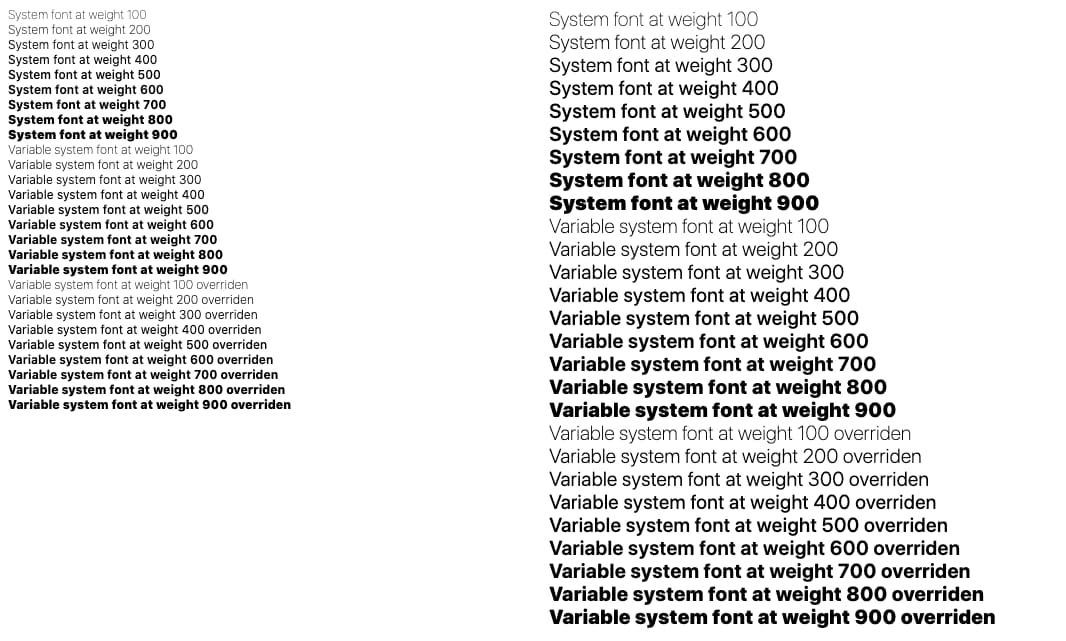
Catalina brings a new united variable system font to macOS.
The 'system-ui' section of the CSS Fonts Module Level 4 spec defines a system-ui font keyword that allows developers to use the built-in, turbo-optimized, localized, mega-high-quality, no-download-needed, default operating system font right in their sites and apps.
body {
  font-family: system-ui;
}
This typography choice is akin to saying "use the default system font for the current locale of this user."
On macOS, the system-ui font is San Francisco, a font that a design team vetted, tested, and… recently upgraded! First we'll cover the new exciting variable font features in Catalina, then we'll cover a couple of bugs and how Chromium engineers resolved them.
This post assumes that you're already familiar with variable fonts. If not, check out Introduction to variable fonts on the web and the video below.
Browser compatibility
At the time of writing, system-ui has support from Chromium (since 56), Edge (since 79), Safari (since 11), and from Firefox (since 43) but with the -apple-system keyword. See Can I use variable fonts? for updates.
New powers
The new abilities that Catalina brought to the system font are now available to web developers as of Chromium 83. The system-ui font now has more variable settings: optical sizing and 2 unique weight adjustments:
h1 {
  font-family: system-ui;
  font-weight: 700;
  font-variation-settings:
    'wght' 750
  ;
}
h1 {
  font-family: system-ui;
  font-weight: 700;
  font-variation-settings:
    'wght' 750,
    'opsz' 20,
    'GRAD' 400,
    'YAXS' 400
  ;
}
On Mojave, system-ui is a variable font with only wght settings. While system-ui on Catalina is a variable font with wght, opsz, GRAD, and YAXS settings.
Looks like some neat progressive enhancement design opportunities to me! Really dig into the subtleties of the system font if you want.
wght
Accepts a font weight between 0 and 900 and is applied equally to all characters.
/* 0-900 */
font-variation-settings: 'wght' 750;
opsz
Optical sizing is similar to kerning or letter-spacing, but the spacing is done by a human eye instead of math. A value of 19 or below is intended for text and body copy spacing, while 20 or above is for spacing display headers and titles.
/* 19 or 20 */
font-variation-settings: 'opsz' 20;
GRAD
Similar to weight, but without touching horizontal spacing. It accepts values between 400 and 1000.
/* 400-1000 */
font-variation-settings: 'GRAD' 500;
YAXS
Stretches the glyph vertically. It accepts values between 400 and 1000.
/* 400-1000 */
font-variation-settings: 'YAXS' 500;
Combining the options
With a few lines of CSS, we can tweak the font settings into a bold of our choice or try out other interesting combinations:
font-weight: 700;
font-weight: bold;
font-variation-settings: 'wght' 750, 'YAXS' 600, 'GRAD' 500, 'opsz' 20;
And just like that, Chromium users on macOS see your upgraded, custom 750 weight with some fun other tweaks 👍
macOS 10.15 added new features to its system font, and in macOS 10.15 a tricky system-ui bug was logged in the Chromium bug tracker. I wonder if they are related!?
Appendix: The system-ui regression
This story starts with a different bug: #1005969. This was reported against macOS 10.15 because the system-ui font spacing looked narrow and crammed.

Background
Did you ever notice on macOS 10.14 how your paragraphs or headers "snapped" to a different looking font when the size went up or down?
On Mojave (macOS 10.14), the system-ui font switched between two fonts depending on the target font size. When text was under 20px, macOS used "San Francisco Text". When text was 20px or over, macOS used "San Francisco Display". Optical sizing was built statically into two separate fonts.
Catalina (macOS 10.15) shipped a new united variable font for San Francisco. No more managing "Text" and "Display". It also gained the new variation setting opsz described earlier.
h1 {
  font-variation-settings: 'opsz' 20;
}
Unfortunately, the default opsz value in the new Catalina font is 20, and Chromium engineers were not prepared to apply opsz to the system font. This led to smaller sizes displaying too narrow.
To fix that, Chromium needed to apply opsz correctly to the system font. This led to Issue #1005969 getting fixed. Victory! Or was it…?
Not done yet
This is where it got tricky: Chromium applied opsz but something did not look right still. System fonts on Mac have an additional font table called trak, which tweaks horizontal spacing. While working on the fix, Chromium engineers noticed that on macOS, when retrieving horizontal metrics from a CTFontRef object, the trak metrics were already getting factored into the metrics results. Chromium's shaping library HarfBuzz needs metrics where the trak values are not yet factored in.

Internally, Skia (the graphics library, not the typeface of the same name) uses both the CGFontRef class from CoreGraphics and the CTFontRef class from CoreText. Due to required internal conversions between those objects (used for keeping backwards compatibility and accessing needed APIs on both classes), Skia would lose weight information in certain circumstances and bold fonts would stop working. This was tracked in Issue #1057654.
Skia still needs to support macOS 10.11 because Chromium still supports it. On 10.11 the "San Francisco Text" and "San Francisco Display" fonts weren't even variable fonts. Rather, each was a family of separate fonts for every weight available. At some point their glyph IDs became out of sync with each other. So if Skia did text shaping (converting text into glyphs that can be drawn) with "San Francisco Text", it would be gibberish if drawn with "San Francisco Display", and vice versa. And even if Skia just asked for a different size macOS might switch to the other. It should be possible to always use one of the fonts and just scale it (using a matrix to scale it up instead of asking for a larger size) but CoreText has an issue where it will not scale sbix (color emoji) glyphs up (only down). It's a bit more complex than that. CoreText actually seems to cap the vertical extent after matrix application, which seems to be related to it not being able to draw emoji at 45 degree angles. In any event, if you want your emoji to be shown big, you need to make a copy of the font to get a big version.
So in order to create copies of CTFont objects at different sizes internally while ensuring that the same underlying font data is used, Chromium pulled the CGFont off the CTFont, then made a new CTFont from the CGFont (CGFont objects are size independent, the magic switching happens at the CoreText level). This worked fine until 10.154. In 10.15 this round trip ended up losing too much information, resulting in the weight issue. Flutter noticed the weight issue and an alternate fix for resizing was made to create the new CTFont directly from the original CTFont while controlling the optical size directly using an old but undocumented attribute in CoreText. This keeps things working on 10.11 and fixes other issues (like explicitly setting the optical size to the default value).
However, this preserves more of the CoreText 'magic' in the font. One of these seems to be that it still tweaks the glyph advances in some way other than just the trak table (the application of which Chromium was already trying to suppress through yet another undocumented attribute).
CGFont doesn't do any of this 'magic' so maybe Chromium could get the CGFont off the CTFont and just use it to get advances? Unfortunately this wouldn't work because CoreText is known to muck with fonts in other ways as well. For example, it makes small emoji slightly bigger than you actually requested (boosting their size a bit). CGFont doesn't know about this, so you'd end up with your sbix-based emoji too close to each other since you'd be measuring at one size but CoreText would draw them bigger by some amount. Chromium does want the CTFont advances, but it wants them without tracking, and preferably without any other mucking about.
Since the fix for the spacing issue required a set of interconnected Blink and Skia fixes, the Chromium engineers could not "just revert" to fix the problem. The Chromium engineers also tried using a different build flag for changing a font-related codepath in Skia, which fixed the bold fonts problem, but regressed the spacing problem.
The fix
In the end, of course Chromium wanted to fix both things. Chromium now resorts to using HarfBuzz built-in font OpenType font metrics functions for retrieving horizontal metrics directly from the binary data in the system font's font tables. Using this, Chromium is sidestepping CoreText and Skia when the font has a trak table (except when it's the emoji font).

In the meantime there's still Skia Issue #10123 to track fixing this fully in Skia, and to go back to using Skia to retrieve the system font metrics from there, instead of the current fix that goes through HarfBuzz.


