A foundational overview of how to build an accessible split-button component.
In this post I want to share thinking on a way to build a split button . Try the demo.
If you prefer video, here's a YouTube version of this post:
Overview
Split buttons are buttons that conceal a primary button and a list of additional buttons. They're useful for exposing a common action while nesting secondary, less frequently used actions until needed. A split button can be crucial to helping a busy design feel minimal. An advanced split button may even remember the last user action and promote it into the primary position.
A common split button can be found in your email application. The primary action is send, but perhaps you can send later or save a draft instead:
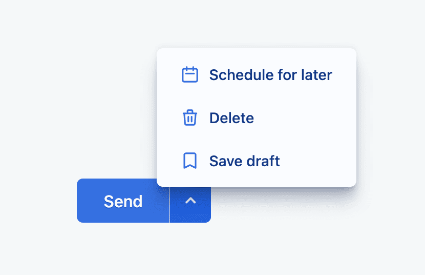
The shared action area is nice, since the user doesn't need to look around. They know that essential email actions are contained in the split button.
Parts
Let's break down the essential parts of a split button before discussing their overall orchestration and final user experience. VisBug's accessibility inspect tool is used here to help show a macro view of the component, surfacing aspects of the HTML, style and accessibility for each major part.
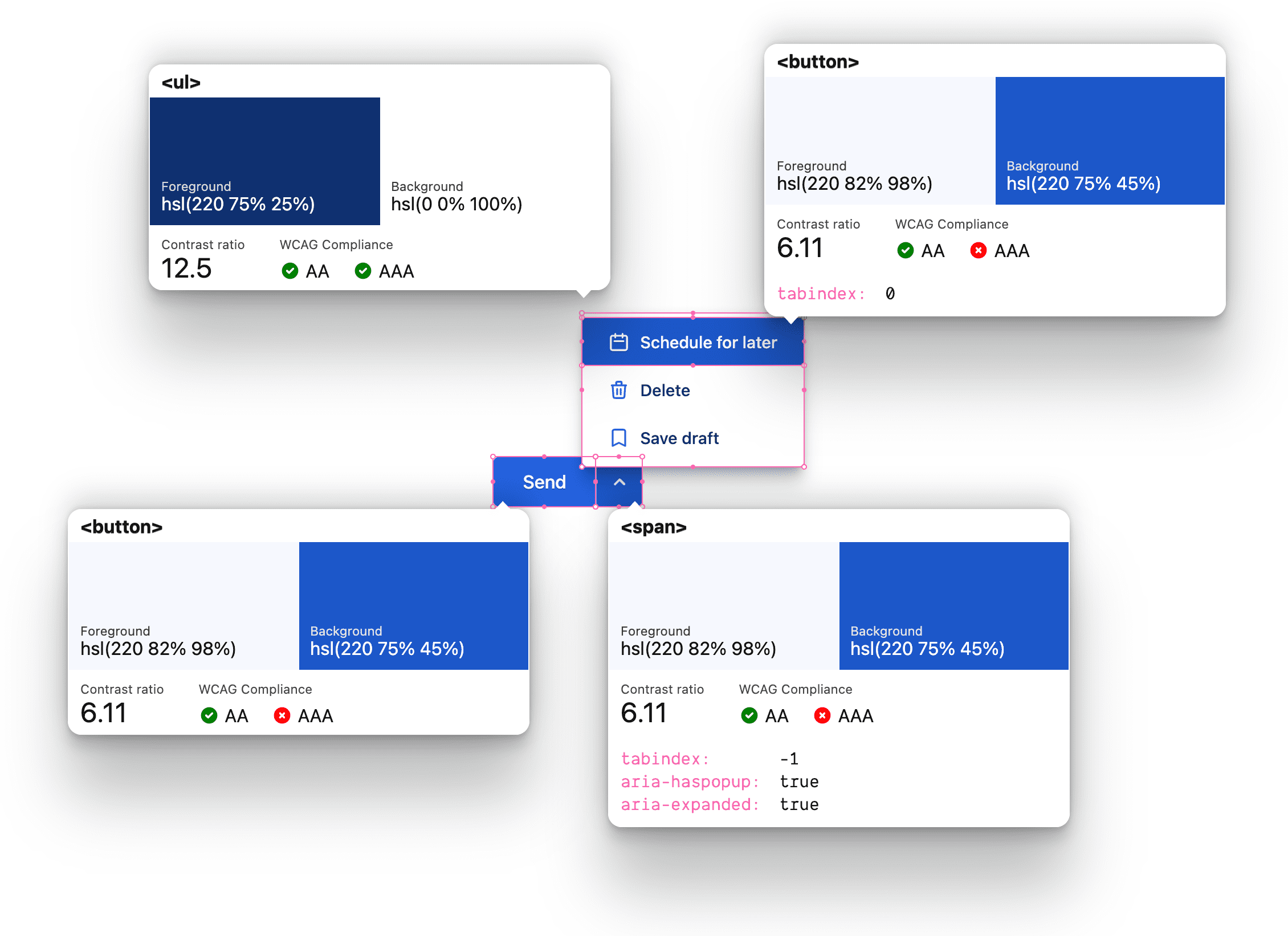
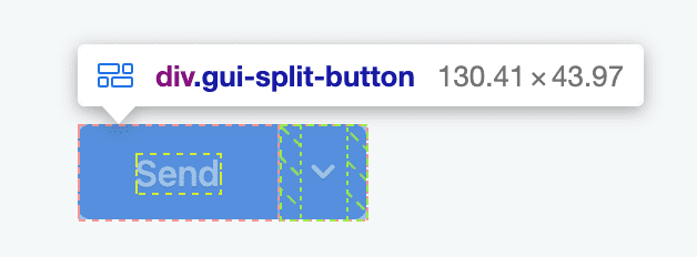
Top level split button container
The highest level component is an inline flexbox, with a class of
gui-split-button, containing the primary action
and the .gui-popup-button.
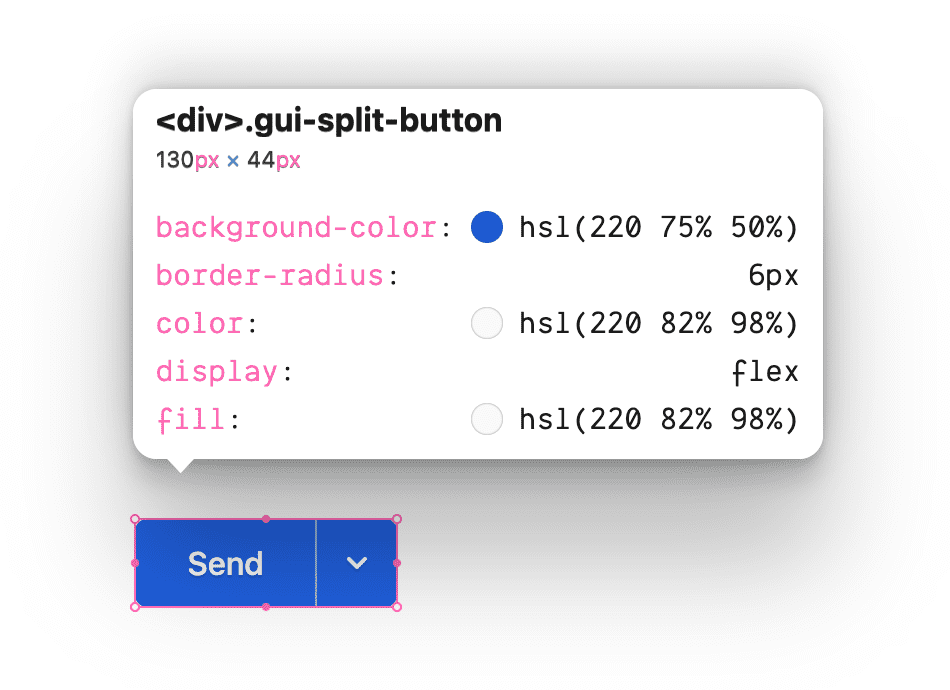
The primary action button
The initially visible and focusable <button> fits within the container with
two matching corner shapes for
focus,
hover and
active interactions to
appear contained within .gui-split-button.
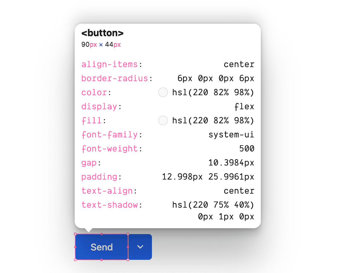
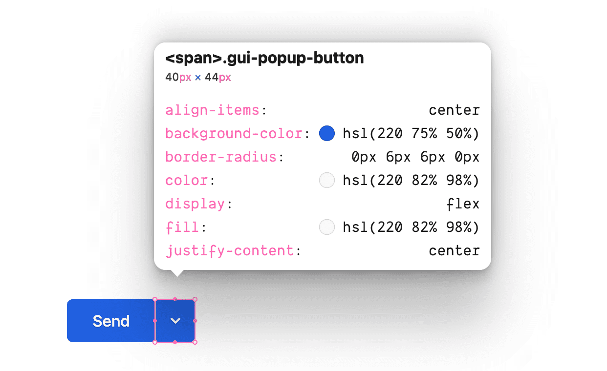
The popup toggle button
The "popup button" support element is for activating and alluding to the list of
secondary buttons. Notice it's not a <button> and it's not focusable. However,
it is the positioning anchor for .gui-popup and host for :focus-within used
to present the popup.
The popup card
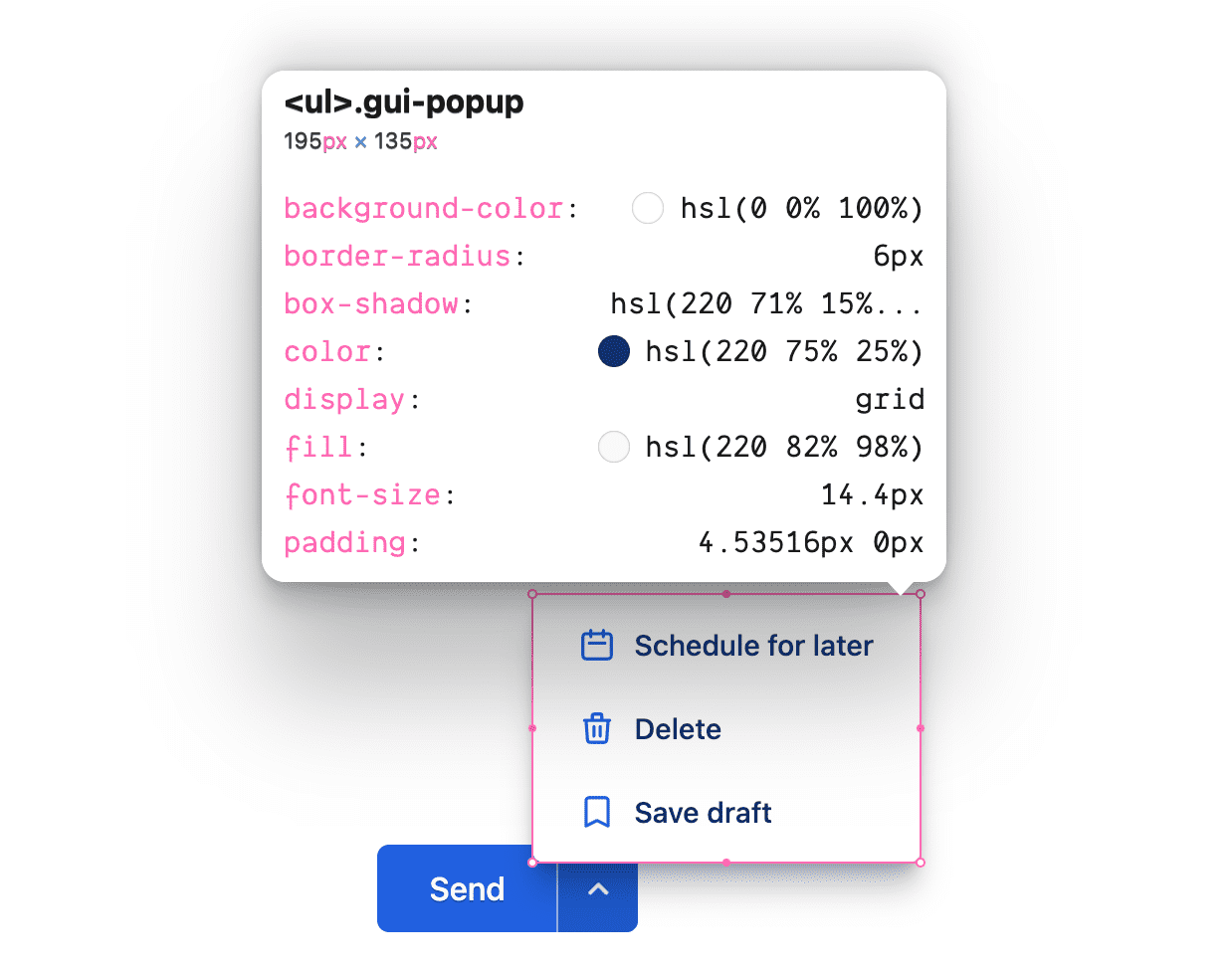
This is a floating card child to its anchor
.gui-popup-button, positioned absolute and
semantically wrapping the button list.
The secondary action(s)
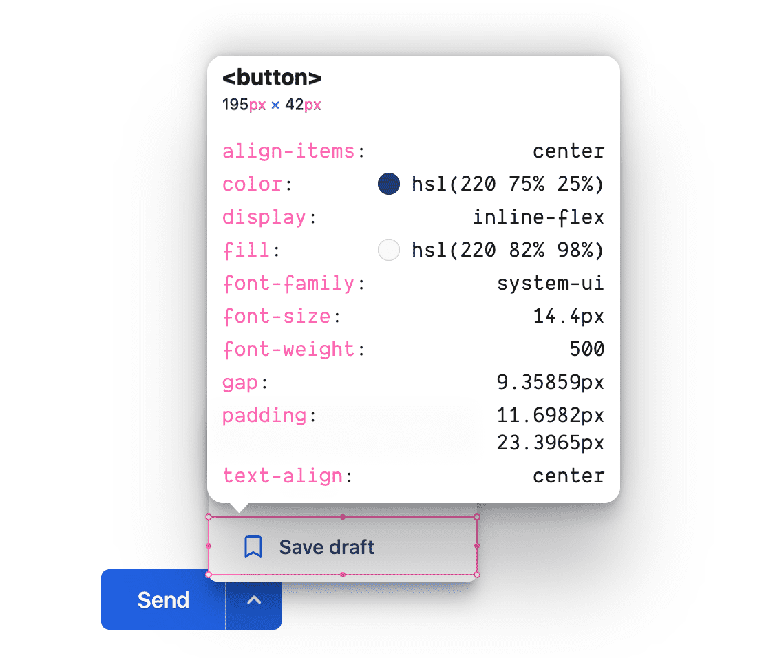
A focusable <button> with a slightly smaller font size than the primary
action button features an icon and a complimentary
style to the primary button.
Custom properties
The following variables assist in creating color harmony and a central place to modify values used throughout the component.
@custom-media --motionOK (prefers-reduced-motion: no-preference);
@custom-media --dark (prefers-color-scheme: dark);
@custom-media --light (prefers-color-scheme: light);

.gui-split-button {
  --theme:             hsl(220 75% 50%);
  --theme-hover:  hsl(220 75% 45%);
  --theme-active:  hsl(220 75% 40%);
  --theme-text:      hsl(220 75% 25%);
  --theme-border: hsl(220 50% 75%);
  --ontheme:         hsl(220 90% 98%);
  --popupbg:         hsl(220 0% 100%);

  --border: 1px solid var(--theme-border);
  --radius: 6px;
  --in-speed: 50ms;
  --out-speed: 300ms;

  @media (--dark) {
    --theme:             hsl(220 50% 60%);
    --theme-hover:  hsl(220 50% 65%);
    --theme-active:  hsl(220 75% 70%);
    --theme-text:      hsl(220 10% 85%);
    --theme-border: hsl(220 20% 70%);
    --ontheme:         hsl(220 90% 5%);
    --popupbg:         hsl(220 10% 30%);
  }
}
Layouts and color
Markup
The element begins as a <div> with a custom class name.
<div class="gui-split-button"></div>
Add the primary button and the .gui-popup-button elements.
<div class="gui-split-button">
  <button>Send</button>
  <span class="gui-popup-button" aria-haspopup="true" aria-expanded="false" title="Open for more actions"></span>
</div>
Notice the aria attributes aria-haspopup and aria-expanded. These cues are
critical for screen readers to be aware of the capability and state of split
button experience. The title attribute is helpful for everyone.
Add an <svg> icon and the .gui-popup container element.
<div class="gui-split-button">
  <button>Send</button>
  <span class="gui-popup-button" aria-haspopup="true" aria-expanded="false" title="Open for more actions">
    <svg aria-hidden="true" viewBox="0 0 20 20">
      <path d="M5.293 7.293a1 1 0 011.414 0L10 10.586l3.293-3.293a1 1 0 111.414 1.414l-4 4a1 1 0 01-1.414 0l-4-4a1 1 0 010-1.414z" />
    </svg>
    <ul class="gui-popup"></ul>
  </span>
</div>
For straightforward popup placement, .gui-popup is a child to the button that
expands it. The only catch with this strategy is the .gui-split-button
container can't use overflow: hidden, as it will clip the popup from being
visually present.
A <ul> filled with <li><button> contents will announce itself as a "button
list" to screen readers, which is precisely the interface being presented.
<div class="gui-split-button">
  <button>Send</button>
  <span class="gui-popup-button" aria-haspopup="true" aria-expanded="false" title="Open for more actions">
    <svg aria-hidden="true" viewBox="0 0 20 20">
      <path d="M5.293 7.293a1 1 0 011.414 0L10 10.586l3.293-3.293a1 1 0 111.414 1.414l-4 4a1 1 0 01-1.414 0l-4-4a1 1 0 010-1.414z" />
    </svg>
    <ul class="gui-popup">
      <li>
        <button>Schedule for later</button>
      </li>
      <li>
        <button>Delete</button>
      </li>
      <li>
        <button>Save draft</button>
      </li>
    </ul>
  </span>
</div>
For flair and to have fun with color, I've added icons to the secondary buttons from https://heroicons.com. Icons are optional for both the primary and secondary buttons.
<div class="gui-split-button">
  <button>Send</button>
  <span class="gui-popup-button" aria-haspopup="true" aria-expanded="false" title="Open for more actions">
    <svg aria-hidden="true" viewBox="0 0 20 20">
      <path d="M5.293 7.293a1 1 0 011.414 0L10 10.586l3.293-3.293a1 1 0 111.414 1.414l-4 4a1 1 0 01-1.414 0l-4-4a1 1 0 010-1.414z" />
    </svg>
    <ul class="gui-popup">
      <li><button>
        <svg aria-hidden="true" viewBox="0 0 24 24">
          <path d="M8 7V3m8 4V3m-9 8h10M5 21h14a2 2 0 002-2V7a2 2 0 00-2-2H5a2 2 0 00-2 2v12a2 2 0 002 2z" />
        </svg>
        Schedule for later
      </button></li>
      <li><button>
        <svg aria-hidden="true" viewBox="0 0 24 24">
          <path d="M19 7l-.867 12.142A2 2 0 0116.138 21H7.862a2 2 0 01-1.995-1.858L5 7m5 4v6m4-6v6m1-10V4a1 1 0 00-1-1h-4a1 1 0 00-1 1v3M4 7h16" />
        </svg>
        Delete
      </button></li>
      <li><button>
        <svg aria-hidden="true" viewBox="0 0 24 24">
          <path d="M5 5a2 2 0 012-2h10a2 2 0 012 2v16l-7-3.5L5 21V5z" />
        </svg>
        Save draft
      </button></li>
    </ul>
  </span>
</div>
Styles
With HTML and content in place, styles are ready to provide color and layout.
Styling the split button container
An inline-flex display type works well for this wrapping component as it
should fit inline with other split buttons, actions or elements.
.gui-split-button {
  display: inline-flex;
  border-radius: var(--radius);
  background: var(--theme);
  color: var(--ontheme);
  fill: var(--ontheme);

  touch-action: manipulation;
  user-select: none;
  -webkit-tap-highlight-color: transparent;
}
The <button> styling
Buttons are very good at disguising how much code is required. You might need to undo or replace browser default styles, but you'll also need to enforce some inheritance, add interaction states and adapt to various user preferences and input types. Button styles add up quickly.
These buttons are different from regular buttons because they share a background with a parent element. Usually, a button owns its background and text color. These, though, share it, and only apply their own background on interaction.
.gui-split-button button {
  cursor: pointer;
  appearance: none;
  background: none;
  border: none;

  display: inline-flex;
  align-items: center;
  gap: 1ch;
  white-space: nowrap;

  font-family: inherit;
  font-size: inherit;
  font-weight: 500;

  padding-block: 1.25ch;
  padding-inline: 2.5ch;

  color: var(--ontheme);
  outline-color: var(--theme);
  outline-offset: -5px;
}
Add interaction states with a few CSS pseudo-classes and use of matching custom properties for the state:
.gui-split-button button {
  …

  &:is(:hover, :focus-visible) {
    background: var(--theme-hover);
    color: var(--ontheme);

    & > svg {
      stroke: currentColor;
      fill: none;
    }
  }

  &:active {
    background: var(--theme-active);
  }
}
The primary button needs a few special styles to complete the design effect:
.gui-split-button > button {
  border-end-start-radius: var(--radius);
  border-start-start-radius: var(--radius);

  & > svg {
    fill: none;
    stroke: var(--ontheme);
  }
}
Lastly, for some flair, the light theme button and icon get a shadow:
.gui-split-button {
  @media (--light) {
    & > button,
    & button:is(:focus-visible, :hover) {
      text-shadow: 0 1px 0 var(--theme-active);
    }
    & > .gui-popup-button > svg,
    & button:is(:focus-visible, :hover) > svg {
      filter: drop-shadow(0 1px 0 var(--theme-active));
    }
  }
}
A great button has paid attention to the microinteractions and tiny details.
A note about :focus-visible
Notice how the button styles use :focus-visible instead of :focus. :focus
is a crucial touch to making an accessible user interface but it does have one
downfall: it's not intelligent about whether or not the user needs to see it or
not, it'll apply for any focus.
The video below attempts to break this microinteraction down, to show how
:focus-visible is an intelligent alternative.
Styling the popup button
A 4ch flexbox for centering an icon and anchoring a popup button list. Like
the primary button, it is transparent until otherwise hovered or interacted
with, and stretched to fill.

.gui-popup-button {
  inline-size: 4ch;
  cursor: pointer;
  position: relative;
  display: inline-flex;
  align-items: center;
  justify-content: center;
  border-inline-start: var(--border);
  border-start-end-radius: var(--radius);
  border-end-end-radius: var(--radius);
}
Layer in hover, focus and active states with CSS
Nesting and the
:is() functional selector:
.gui-popup-button {
  …

  &:is(:hover,:focus-within) {
    background: var(--theme-hover);
  }

  /* fixes iOS trying to be helpful */
  &:focus {
    outline: none;
  }

  &:active {
    background: var(--theme-active);
  }
}
These styles are the primary hook for showing and hiding the popup. When the
.gui-popup-button has focus on any of its children, set opacity, position
and pointer-events, on the icon and popup.
.gui-popup-button {
  …

  &:focus-within {
    & > svg {
      transition-duration: var(--in-speed);
      transform: rotateZ(.5turn);
    }
    & > .gui-popup {
      transition-duration: var(--in-speed);
      opacity: 1;
      transform: translateY(0);
      pointer-events: auto;
    }
  }
}
With the in and out styles complete, the last piece is to conditionally transition transforms depending on the user's motion preference:
.gui-popup-button {
  …

  @media (--motionOK) {
    & > svg {
      transition: transform var(--out-speed) ease;
    }
    & > .gui-popup {
      transform: translateY(5px);

      transition:
        opacity var(--out-speed) ease,
        transform var(--out-speed) ease;
    }
  }
}
A keen eye on the code would notice opacity is still transitioned for users who prefer reduced motion.
Styling the popup
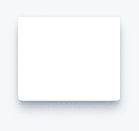
The .gui-popup element is a floating card button list using custom properties
and relative units to be subtly smaller, interactively matched with the primary
button, and on brand with its use of color. Notice the icons have less contrast,
are thinner, and the shadow has a hint of brand blue to it. Like with buttons,
strong UI and UX is a result of these little details stacking up.
.gui-popup {
  --shadow: 220 70% 15%;
  --shadow-strength: 1%;

  opacity: 0;
  pointer-events: none;

  position: absolute;
  bottom: 80%;
  left: -1.5ch;

  list-style-type: none;
  background: var(--popupbg);
  color: var(--theme-text);
  padding-inline: 0;
  padding-block: .5ch;
  border-radius: var(--radius);
  overflow: hidden;
  display: flex;
  flex-direction: column;
  font-size: .9em;
  transition: opacity var(--out-speed) ease;

  box-shadow:
    0 -2px 5px 0 hsl(var(--shadow) / calc(var(--shadow-strength) + 5%)),
    0 1px 1px -2px hsl(var(--shadow) / calc(var(--shadow-strength) + 10%)),
    0 2px 2px -2px hsl(var(--shadow) / calc(var(--shadow-strength) + 12%)),
    0 5px 5px -2px hsl(var(--shadow) / calc(var(--shadow-strength) + 13%)),
    0 9px 9px -2px hsl(var(--shadow) / calc(var(--shadow-strength) + 14%)),
    0 16px 16px -2px hsl(var(--shadow) / calc(var(--shadow-strength) + 20%))
  ;
}
The icons and buttons are given brand colors to style nicely within each dark and light themed card:
![]()
.gui-popup {
  …

  & svg {
    fill: var(--popupbg);
    stroke: var(--theme);

    @media (prefers-color-scheme: dark) {
      stroke: var(--theme-border);
    }
  }

  & button {
    color: var(--theme-text);
    width: 100%;
  }
}
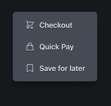
The dark theme popup has text and icon shadow additions, plus a slightly more intense box shadow:
.gui-popup {
  …

  @media (--dark) {
    --shadow-strength: 5%;
    --shadow: 220 3% 2%;

    & button:not(:focus-visible, :hover) {
      text-shadow: 0 1px 0 var(--ontheme);
    }

    & button:not(:focus-visible, :hover) > svg {
      filter: drop-shadow(0 1px 0 var(--ontheme));
    }
  }
}
Generic <svg> icon styles
All icons are relatively sized to the button font-size they're used within by
using the ch unit as the
inline-size. Each is also given some styles to help outline icons soft and
smooth.
.gui-split-button svg {
  inline-size: 2ch;
  box-sizing: content-box;
  stroke-linecap: round;
  stroke-linejoin: round;
  stroke-width: 2px;
}
Right-to-left layout
Logical properties do all the complex work.
Here's the list of logical properties used:
- display: inline-flex creates an inline flex element.
- padding-block and padding-inline as a pair, instead of padding
shorthand, get the benefits of padding the logical sides.
- border-end-start-radius and
friends will
round corners based on document direction.
- inline-size rather than width ensures the size isn't tied to physical dimensions.
- border-inline-start adds a border to the start, which might be on the right or the left depending on script direction.
JavaScript
Nearly all of the following JavaScript is to enhance accessibility. Two of my helper libraries are used to make the tasks a little easier. BlingBlingJS is used for succinct DOM queries and easy event listener setup, while roving-ux helps facilitate accessible keyboard and gamepad interactions for the popup.
import $ from 'blingblingjs'
import {rovingIndex} from 'roving-ux'

const splitButtons = $('.gui-split-button')
const popupButtons = $('.gui-popup-button')
With the above libraries imported and the elements selected and saved into variables, upgrading the experience is a few functions away from being complete.
Roving index
When a keyboard or screen reader focuses the .gui-popup-button, we want to
forward the focus into the first (or most recently focused) button in the
.gui-popup. The library helps us do this with the element and target
parameters.
popupButtons.forEach(element =>
  rovingIndex({
    element,
    target: 'button',
  }))
The element now passes focus to the target <button> children and enables
standard arrow key navigation to browse options.
Toggling aria-expanded
While it's visually apparent that a popup is showing and hiding, a screen reader needs more than visual cues. JavaScript is used here to compliment the CSS driven :focus-within interaction by toggling a screen reader appropriate attribute.
popupButtons.on('focusin', e => {
  e.currentTarget.setAttribute('aria-expanded', true)
})

popupButtons.on('focusout', e => {
  e.currentTarget.setAttribute('aria-expanded', false)
})
Enabling the Escape key
The user's focus has been intentionally sent to a trap, which means we need to
provide a way to leave. The most common way is to allow using the Escape key.
To do so, watch for keypresses on the popup button, since any keyboard events on
children will bubble up to this parent.
popupButtons.on('keyup', e => {
  if (e.code === 'Escape')
    e.target.blur()
})
If the popup button sees any Escape key presses, it removes focus from itself
with
blur().
Split button clicks
Finally, if the user clicks, taps, or keyboard interacts with the buttons, the
application needs to perform the appropriate action. Event bubbling is used
again here, but this time on the .gui-split-button container, to catch button
clicks from a child popup or the primary action.
splitButtons.on('click', event => {
  if (event.target.nodeName !== 'BUTTON') return
  console.info(event.target.innerText)
})
Conclusion
Now that you know how I did it, how would you‽ 🙂
Let's diversify our approaches and learn all the ways to build on the web. Create a demo, tweet me links, and I'll add it to the community remixes section below!

