
Bringing LEGO® bricks to the Multi-Device Web

Build with Chrome, a fun experiment for desktop Chrome users originally launched in Australia, was re-released in 2014 featuring global availability, tie-ins with THE LEGO® MOVIE™, and newly added support for mobile devices. In this article we will share some learnings from the project, especially regarding the move from desktop-only experience to a multi-screen solution that supports both mouse and touch input.
The History of Build with Chrome
The first version of Build with Chrome was launched in Australia in 2012. We wanted to demonstrate the power of the web in a whole new way and bring Chrome to a whole new audience.
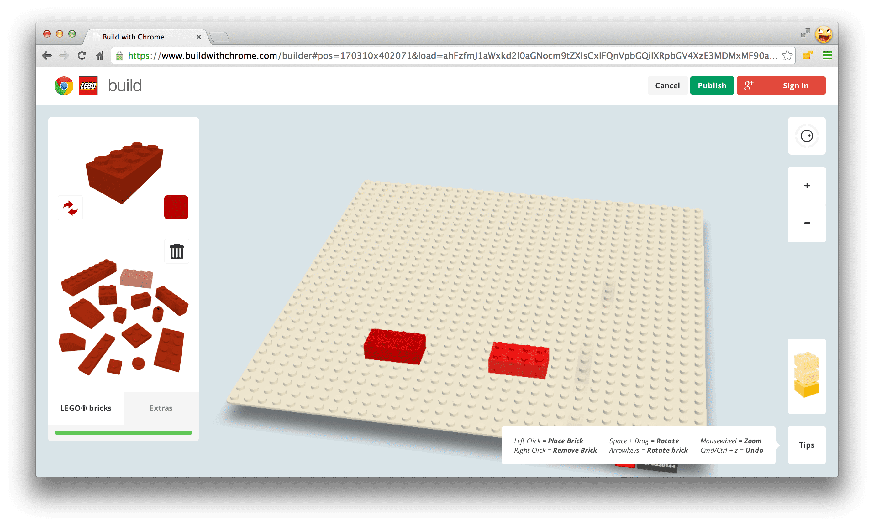
The site had two major parts: "Build" mode where users can build creations using LEGO bricks, and "Explore" mode for browsing the creations on a LEGO-ified version of Google Maps.
Interactive 3D was essential to give users the best LEGO building experience. In 2012, WebGL was only publicly available in desktop browsers, so Build was targeted as a desktop-only experience. Explore used Google Maps to display the creations, but when zooming close enough it switched to a WebGL implementation of the map showing the creations in 3D, still using Google maps as the baseplate texture. We hoped to build an environment where LEGO enthusiasts of all ages could easily and intuitively express their creativity and explore each other's creations.
In 2013, we decided to expand Build with Chrome to new web technologies. Among those technologies was WebGL in Chrome for Android, which naturally would allow Build with Chrome to evolve into a mobile experience. To get started, we first developed touch prototypes before questioning the hardware for the "Builder Tool" to understand the gesture behaviour and tactile responsiveness that we may face through a browser in comparison to a mobile app.
A Responsive Front-end
We needed to support devices with both touch and mouse input. However, using the same UI on small touch screens turned out to a suboptimal solution because of space constraints.
In Build there is a lot of interactivity going on: zooming in and out, changing brick colors, and of course selecting, rotating, and placing bricks. It's a tool where users often spend a lot of time, so it's important that they have quick access to everything they use frequently, and they should feel comfortable interacting with it.
When designing a highly interactive touch application, you will discover that the screen quickly feels small and the user's fingers tend to cover a lot of the screen while interacting. This became obvious for us when working with the Builder. You really have to consider the physical screen size rather than the pixels in the graphics when doing the design. It becomes important to minimize the number of buttons and controls to get as much screen real estate as possible dedicated to the actual content.
Our goal was to make Build feel natural on touch devices, not just adding touch input to the original desktop implementation, but make it feel as it was really intended for touch. We ended up with two variations of the UI, one for desktops and tablets with large screens and one for mobile devices with smaller screens. When possible, it's best to use a single implementation and have a fluid transition between modes. In our case, we determined that there was such a significant difference in experience between these two modes that we decided to rely on a specific breakpoint. The two versions have a lot of features in common and we tried to do most things with just one code implementation, but some aspects of the UI work differently between the two.
We use user-agent data to detect mobile devices and then we check the viewport size to decide if the small screen mobile UI should be used. It's a bit hard to choose a breakpoint for what a "large screen" should be, because it's hard to get a reliable value of the physical screen size. Fortunately, in our case, it doesn't really matter if we display the small screen UI on a touch device with a large screen, because the tool will still work fine, just that some of the buttons may feel a little bit too large. In the end, we set the breakpoint to 1000 pixels; if you load the site from a window wider than 1000 pixels (in landscape mode), you'll get the large screen version.
Let's talk a little bit about the two screen sizes and experiences:
Large screen, with mouse and touch support
The large screen version is served to all desktop computers with mouse support and to touch devices with large screens (such as the Google Nexus 10). This version is close to the original desktop solution in what kind of navigation controls are available, but we added touch support and some gestures. We adjust the UI depending on the window size, so when a user resizes the window, it may remove or resize some of the UI. We do this using CSS media queries.
Example: When the available height is less than 730 pixels, the zoom-slider control in Explore mode is hidden:
@media only screen and (max-height: 730px) {
    .zoom-slider {
        display: none;
    }
}
Small screen, touch support only
This version is served to mobile devices and small tablets (target devices Nexus 4 and Nexus 7). This version requires multi-touch support.
On the small screen devices, we need to give the content as much screen real estate as possible, so we did a few tweaks to maximize space, mostly by moving infrequently-used elements out of sight:
- The Build brick chooser minimizes into a color selector while building.
- We replaced the zoom and orientation controls with multi-touch gestures.
- The Chrome fullscreen functionality is also helpful to get some extra screen real estate.

WebGL Performance and Support
Modern touch devices have quite powerful GPUs, but they are still far from their desktop counterparts, so we knew we would have some challenges with performance, especially in the Explore 3D mode where we need to render a lot of creations at the same time.
Creatively, we wanted to add a couple of new types of bricks with complex shapes and even transparency -- features that are typically very heavy on the GPU. However, we had to be backwards-compatible and continue supporting creations from the first version, so we couldn't set any new restrictions, such as significantly reducing the total number of bricks in the creations.
In the first version of Build we had a maximum limit of bricks that could be used in one creation. There was a "brick-meter" indicating how many bricks that were left. In the new implementation we had some of the new bricks to affect the brick-meter more than the standard bricks, thus slightly reducing the total maximum number of bricks. This was one way to include new bricks while still maintaining decent performance.
In Explore 3D mode there is quite a lot going on at the same time; loading of base plate textures, loading creations, animating and rendering creations, and so on. This requires a lot from both GPU and CPU, so we did a lot of frame profiling in Chrome DevTools to optimize these parts as much as possible. On mobile devices we decided to zoom a bit closer to the creations so that we don't have to render as many creations at the same time.
Some devices had us revisit and simplify some of the WebGL shaders, but we always found a way to solve it and move forward.
Supporting non-WebGL devices
We wanted the site to be somewhat usable even if the visitor's device doesn't support WebGL. Sometimes there are ways to represent the 3D in a simplified way using a canvas solution or CSS3D features. Unfortunately we didn't find a good enough solution to replicate Build and Explore 3D features without using WebGL.
For consistency, the visual style of the creations must be the same across all platforms. We could have potentially tried for a 2.5D solution, but this would ave made the creations look different in some ways. We also had to consider how to make sure creations built with the first version of Build with Chrome would look the same and run as smoothly in the new version of the site as they did in the first one.
Explore 2D mode is still accessible to non-WebGL devices, even though you can't build new creations or explore in 3D. So users can still get an idea of the depth of the project and what they could create using this tool if they were on a WebGL-enabled device. The site might not be as valuable to users without WebGL support, but it should at least act as a teaser and get them involved in trying it out.
Keeping fallback versions for WebGL solutions is sometimes just not possible. There are many possible reasons; performance, visual style, development and maintenance costs, and so on. However, when you decide not to implement a fallback, you should at least take care of the non-WebGL-enabled visitors, explain why they can't access the site fully, and give instructions for how they can solve the problem by using a browser supporting WebGL.
Asset Management
In 2013, Google introduced a new version of Google Maps with the most significant UI changes since its launch. So we decided to redesign Build with Chrome to fit in with the new Google Maps UI, and in doing so took other factors into the redesign. The new design is relatively flat with clean solid colors and simple shapes. This enabled us to use pure CSS on a lot of the UI elements, minimizing the use of images.
In Explore we need to load a lot of images; thumbnail images for the creations, map textures for the baseplates and finally the actual 3d creations. We take extra care to make sure that there is no memory leakage when we're constantly loading new images.
The 3D creations are stored in a custom file format packaged as a PNG image. Keeping the 3D creations data stored as an image enabled us to basically pass the data directly to the shaders rendering the creations.
For all user generated images the design allowed us to use the same image sizes to all platforms, thus minimizing storage and bandwidth usage.
Managing Screen Orientation
It is easy to forget how much the screen aspect ratio changes when moving from portrait to landscape mode or the other way around. You need to consider this from the start when adapting for mobile devices.
On a traditional website with scroll enabled, you may apply CSS rules to get a responsive site that re-arranges content and menus. As long as you may use scroll functionality this is fairly manageable.
We used this method with Build too, but we were a bit limited in how we could solve the layout, because we needed to have the content visible at all time and still have quick access to a number of controls and buttons. For pure content sites like news sites, a fluid layout makes a lot of sense, but for a game app like ours it was a struggle. It became a challenge to find a layout that worked in both landscape and portrait orientation while still keeping a good overview of the content and a comfortable way of interacting. In the end we decided to keep Build in landscape only and we tell the user to rotate their device.
Explore was a lot easier to solve in both orientations. We just needed to adjust the zoom level of the 3D depending of orientation to get a consistent experience.
Most of the content layout is controlled by CSS, but some orientation-related stuff needed to be implemented in JavaScript. We found that there was no good cross-device solution to use window.orientation to identify the orientation, so in the end we were just comparing window.innerWidth and window.innerHeight to identify the orientation of the device.
if( window.innerWidth > window.innerHeight ){
  //landscape
} else {
  //portrait
}
Adding Touch Support
Adding touch support to web content is reasonably straightforward. Basic interactivity, such as the click event, works the same on desktop and touch-enabled devices, but when it comes to more advanced interactions you also need to handle the touch events: touchstart, touchmove and touchend. This article covers the basics of how to use these events. Internet Explorer does not support touch events, but instead uses Pointer Events (pointerdown, pointermove, pointerup). Pointer Events have been submitted to W3C for standardization but for now are only implemented in Internet Explorer.
In the Explore 3D mode we wanted the same navigation as the standard Google Maps implementation; using one finger to pan around the map and two finger pinch to zoom. Because the creations are in 3D we also added the two finger rotate gesture. This is typically something that will require the use of touch-events.
A good practice is to avoid heavy computing, such as updating or rendering the 3D in the event handlers. Instead, store the touch input in a variable and react on the input in the requestAnimationFrame render loop. This also makes it easier to have a mouse implementation at the same time, you just store the corresponding mouse values in the same variables.
Start by initializing an object to store the input in and add the touchstart event listener. In each event handler we call event.preventDefault(). This is to keep the browser from continuing to process the touch event, which could cause some unexpected behaviour such as scrolling or scaling the entire page.
var input = {dragStartX:0, dragStartY:0, dragX:0, dragY:0, dragDX:0, dragDY:0, dragging:false};
plateContainer.addEventListener('touchstart', onTouchStart);

function onTouchStart(event) {
  event.preventDefault();
  if( event.touches.length === 1){
    handleDragStart(event.touches[0].clientX , event.touches[0].clientY);
    //start listening to all needed touchevents to implement the dragging
    document.addEventListener('touchmove', onTouchMove);
    document.addEventListener('touchend', onTouchEnd);
    document.addEventListener('touchcancel', onTouchEnd);
  }
}

function onTouchMove(event) {
  event.preventDefault();
  if( event.touches.length === 1){
    handleDragging(event.touches[0].clientX, event.touches[0].clientY);
  }
}

function onTouchEnd(event) {
  event.preventDefault();
  if( event.touches.length === 0){
    handleDragStop();
    //remove all eventlisteners but touchstart to minimize number of eventlisteners
    document.removeEventListener('touchmove', onTouchMove);
    document.removeEventListener('touchend', onTouchEnd);
    //also listen to touchcancel event to avoid unexpected behavior when switching tabs and some other situations
    document.removeEventListener('touchcancel', onTouchEnd);
  }
}
We are not doing the actual storage of the input in the event handlers but instead in separate handlers: handleDragStart, handleDragging and handleDragStop. This is because we want to be able to call these from the mouse event handlers too. Keep in mind that although unlikely, the user may use touch and mouse at the same time. Rather than handle that case directly, we just make sure nothing blows up.
function handleDragStart(x ,y ){
  input.dragging = true;
  input.dragStartX = input.dragX = x;
  input.dragStartY = input.dragY = y;
}

function handleDragging(x ,y ){
  if(input.dragging) {
    input.dragDX = x - input.dragX;
    input.dragDY = y - input.dragY;
    input.dragX = x;
    input.dragY = y;
  }
}

function handleDragStop(){
  if(input.dragging) {
    input.dragging = false;
    input.dragDX = 0;
    input.dragDY = 0;
  }
}
When doing animations based on touchmove it is often useful to also store the delta move since last event. For example, we used this as a parameter for the velocity of the camera when moving across all the base plates in Explore, since you are not dragging the base plates but instead you are actually moving the camera.
function onAnimationFrame() {
  requestAnimationFrame( onAnimationFrame );

  //execute animation based on input.dragDX, input.dragDY, input.dragX or input.dragY
 /*
  /
  */

  //because touchmove is only fired when finger is actually moving we need to reset the delta values each frame
  input.dragDX=0;
  input.dragDY=0;
}
Embedded example: Dragging an object using touch events. Similar implementation as when dragging the Explore 3D map in Build with Chrome: http://cdpn.io/qDxvo
Multi-touch Gestures
There are several frameworks or libraries, such as Hammer or QuoJS, that can take care of simplifying the management of multi-touch gestures, but if you want to combine several gestures and get full control, it is sometimes best to do it from scratch.
To manage the pinch and rotate gestures we store the distance and angle between two fingers when the second finger is put on screen:
//variables representing the actual scale/rotation of the object we are affecting
var currentScale = 1;
var currentRotation = 0;

function onTouchStart(event) {
  event.preventDefault();
  if( event.touches.length === 1){
    handleDragStart(event.touches[0].clientX , event.touches[0].clientY);
  }else if( event.touches.length === 2 ){
    handleGestureStart(event.touches[0].clientX, event.touches[0].clientY, event.touches[1].clientX, event.touches[1].clientY );
  }
}

function handleGestureStart(x1, y1, x2, y2){
  input.isGesture = true;
  //calculate distance and angle between fingers
  var dx = x2 - x1;
  var dy = y2 - y1;
  input.touchStartDistance=Math.sqrt(dx*dx+dy*dy);
  input.touchStartAngle=Math.atan2(dy,dx);
  //we also store the current scale and rotation of the actual object we are affecting. This is needed to support incremental rotation/scaling. We can't assume that an object is always the same scale when gesture starts.
  input.startScale=currentScale;
  input.startAngle=currentRotation;
}
In the touchmove event, we then continuously measure the distance and angle between those two fingers. The difference between the start distance and the current distance is then used to set the scale, and the difference between the start angle and the current angle is used to set the angle.
function onTouchMove(event) {
  event.preventDefault();
  if( event.touches.length  === 1){
    handleDragging(event.touches[0].clientX, event.touches[0].clientY);
  }else if( event.touches.length === 2 ){
    handleGesture(event.touches[0].clientX, event.touches[0].clientY, event.touches[1].clientX, event.touches[1].clientY );
  }
}

function handleGesture(x1, y1, x2, y2){
  if(input.isGesture){
    //calculate distance and angle between fingers
    var dx = x2 - x1;
    var dy = y2 - y1;
    var touchDistance = Math.sqrt(dx*dx+dy*dy);
    var touchAngle = Math.atan2(dy,dx);
    //calculate the difference between current touch values and the start values
    var scalePixelChange = touchDistance - input.touchStartDistance;
    var angleChange = touchAngle - input.touchStartAngle;
    //calculate how much this should affect the actual object
    currentScale = input.startScale + scalePixelChange*0.01;
    currentRotation = input.startAngle+(angleChange*180/Math.PI);
    //upper and lower limit of scaling
    if(currentScale<0.5) currentScale = 0.5;
    if(currentScale>3) currentScale = 3;
  }
}
You could potentially use the distance change between each touchmove event in a similar way as the example with dragging, but that approach is often more useful when you want a continuous movement.
function onAnimationFrame() {
  requestAnimationFrame( onAnimationFrame );
  //execute transform based on currentScale and currentRotation
  /*
  /
  */

  //because touchmove is only fired when finger is actually moving we need to reset the delta values each frame
  input.dragDX=0;
  input.dragDY=0;
}
You could also enable dragging of the object while doing the pinch and rotate gestures if you want to. In that case you would use the center point between the two fingers as the input to the dragging handler.
Embedded example: Rotating and scaling an object in 2D. Similar to how the map in Explore is implemented: http://cdpn.io/izloq
Mouse and Touch Support on the Same Hardware
Today there are several laptop computers, like the Chromebook Pixel, that support both mouse and touch input. This may cause some unexpected behaviors if you are not careful.
One important thing is that you should not just detect touch support and then ignore mouse input, but instead support both at the same time.
If you are not using event.preventDefault() in your touch event handlers there will also be some emulated mouse events fired, in order to keep most non-touch optimized sites still working. As an example, for a single tap on the screen these events may be fired in a rapid sequence and in this order:
- touchstart
- touchmove
- touchend
- mouseover
- mousemove
- mousedown
- mouseup
- click
If you have a bit more complex interactions, these mouse events may cause some unexpected behavior, and mess up your implementation. It is often best to use event.preventDefault() in the touch event handlers and manage the mouse input in separate event handlers. You need to be aware that using event.preventDefault() in touch event handlers will also prevent some default behavior, such as scrolling and the click event.
"In Build with Chrome we didn't want zooming to occur when someone double-taps on the site, even though that is standard in most browsers. So we use the viewport meta tag to tell the browser not to zoom when a user double-taps. This also removes the 300ms click delay, which improves the site's responsiveness. (The click delay is there to make the distinction between a single tap and a double tap when double-tap zooming is enabled.)
<meta name="viewport" content="width=device-width,user-scalable=no">
Remember that when using this feature it is up to you to make the site readable on all screen sizes, because the user will not be able to zoom closer.
Mouse, Touch and Keyboard Input
In Explore 3D mode we wanted there to be three ways to navigate the map: mouse (dragging), touch (dragging, pinch to zoom and rotate) and keyboard (navigate with arrow keys). All of these navigation methods work slightly differently, but we used the same approach on all of them; setting variables in event handlers and act on that in the requestAnimationFrame loop. The requestAnimationFrame loop doesn't have to know which method is used to navigate.
As an example, we could set the movement of the map (dragDX and dragDY) with all three input methods. Here is the keyboard implementation:
document.addEventListener('keydown', onKeyDown );
document.addEventListener('keyup', onKeyUp );

function onKeyDown( event ) {
  input.keyCodes[ "k" + event.keyCode ] = true;
  input.shiftKey = event.shiftKey;
}

function onKeyUp( event ) {
  input.keyCodes[ "k" + event.keyCode ] = false;
  input.shiftKey = event.shiftKey;
}

//this needs to be called every frame before animation is executed
function handleKeyInput(){
  if(input.keyCodes.k37){
    input.dragDX = -5; //37 arrow left
  } else if(input.keyCodes.k39){
    input.dragDX = 5; //39 arrow right
  }
  if(input.keyCodes.k38){
    input.dragDY = -5; //38 arrow up
  } else if(input.keyCodes.k40){
    input.dragDY = 5; //40 arrow down
  }
}

function onAnimationFrame() {
  requestAnimationFrame( onAnimationFrame );
  //because keydown events are not fired every frame we need to process the keyboard state first
  handleKeyInput();
  //implement animations based on what is stored in input
   /*
  /
  */

  //because touchmove is only fired when finger is actually moving we need to reset the delta values each frame
  input.dragDX = 0;
  input.dragDY = 0;
}
Embedded example: Using mouse, touch and keyboard to navigate: http://cdpn.io/catlf
Summary
Adapting Build with Chrome to support touch devices with many different screen sizes has been a learning experience. The team didn't have very much experience doing this level of interactivity on touch devices and we learned a lot along the way.
The biggest challenge turned out to be how to solve the user experience and design. The technical challenges were to manage many screen sizes, touch events and performance issues.
Even though there were some challenges with the WebGL shaders on touch devices, this is something that worked almost better than expected. Devices are becoming more and more powerful and WebGL implementations are improving rapidly. We feel that we will be using WebGL on devices a lot more in the near future.
Now, if you haven't already, go and build something awesome!