How Blibli achieved a 42% reduction in bounce rate, an 8x improvement in mobile conversion rate, and 2.5x more pages per session.
Blibli is a well known ecommerce marketplace in Indonesia. The company had over 29 million average monthly website visits in 2019. In a recent study, Blibli's web team found that their mobile web platform is a significant visitor and user acquisition platform, with 70% of web users landing on mobile and 30% of web users landing on desktop.
With that insight, Blibli embarked on a journey to develop a better web experience and improve conversions. As a result, they were able to achieve some exceptional results:
42%
Reduction in bounce rates
8x
Better mCVR in installed PWA compared to browser mobile web
2.5x
More pages/sessions on installed PWA
Highlight the opportunity
Blibli identified the following areas of opportunities:
- For Blibli, the mobile web platform was important for user acquisition with many users on mid- to low-tier devices.
- Indonesia's internet economy was expanding rapidly beyond tier 1 cities. Hence, PWA and fast pages were a good investment to support user needs like limited storage and slow networks.
- 50% of users that are coming to the Blibli web platform are returning users.
The approach they used
The team took a staged strategy of short- to medium-term improvements on the mobile web platform. This included:
- A performance optimized website including a UX revamped home page.
- A lite version of the home page for new users with a service worker to cache critical assets for subsequent navigation.
- A Progressive Web App (PWA) for returning users.
User flow
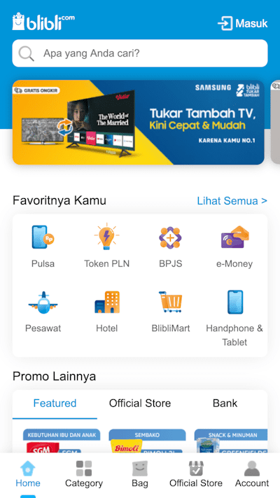
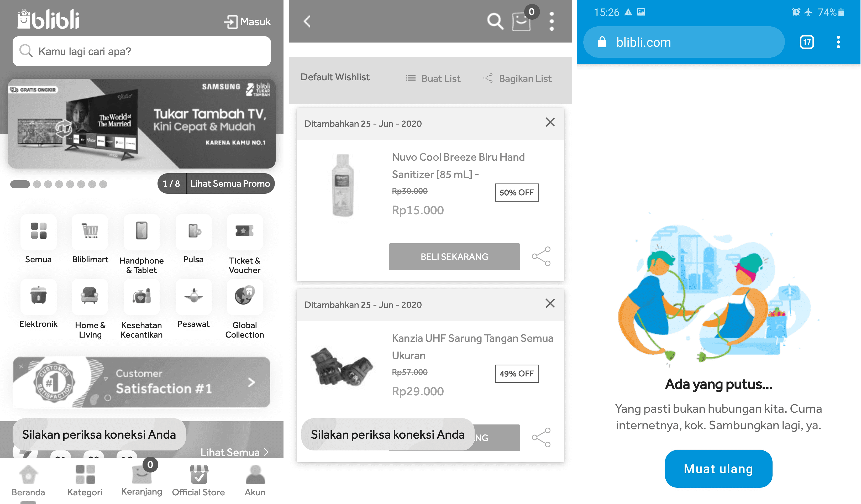
New visitors are presented with a lightweight page which is three times faster when compared to the old home page.

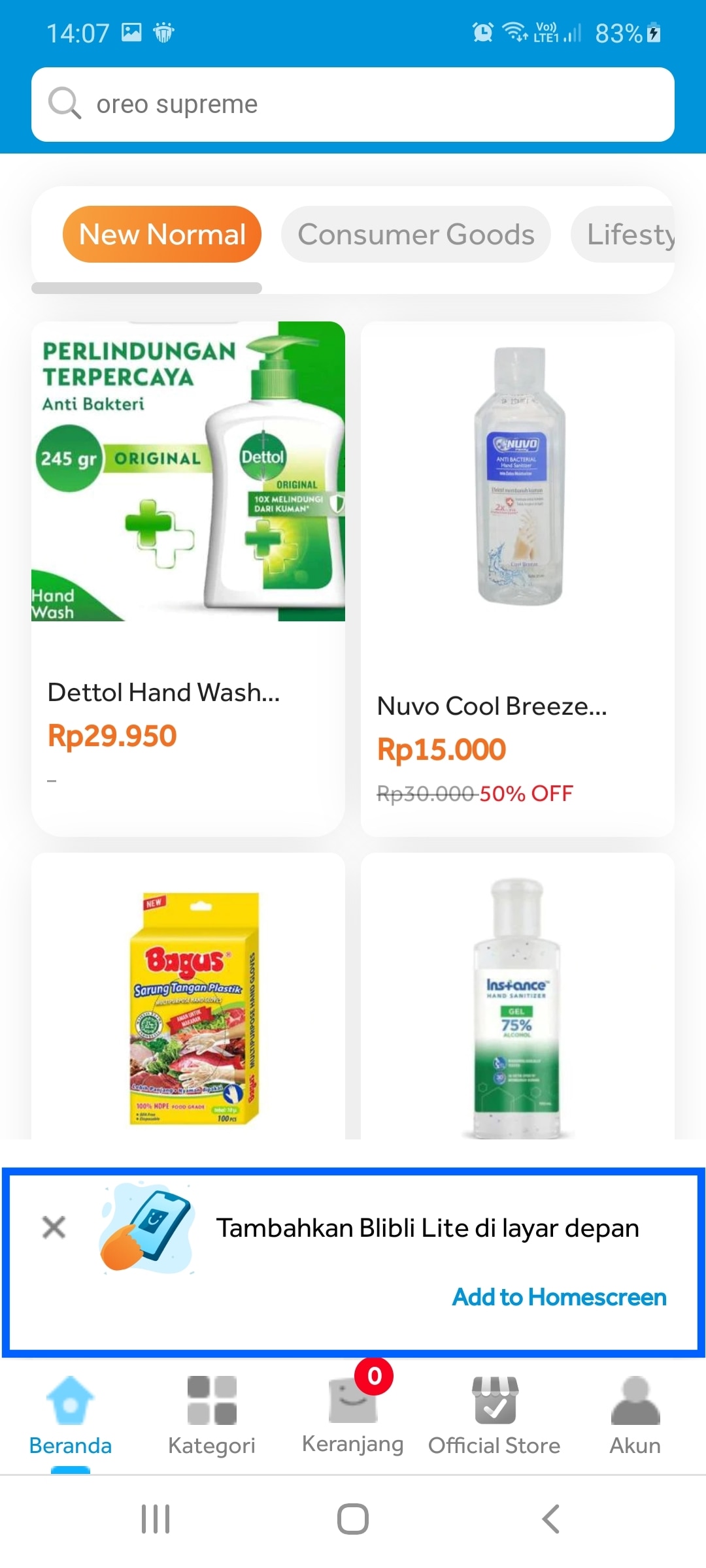
On subsequent pages, Blibli prompts users to add the PWA shortcut to their home screen.
If users lose the network connection, they are presented with an elegant offline fallback page.

Blibli's lite page created a first impression that Blibli.com is fast and responsive. Moreover, the lite page streamlined the number of features by only focusing on those that deliver the value proposition of Blibli.
Blibli's PWA is installable, giving it an app-like look and feel. It is also fast and reliable which was achieved using service worker caching and graceful offline fallback.

This comes as a delight for web users, a large proportion of whom use mid-tier devices. Since Blibli's PWA is less than 1MB in size (that's a whopping 24 times lighter than their Android app!), there is much less friction for users to install it. It also makes it easier for Blibli to retain users while providing them with a seamless app-like experience.
Set performance budgets
Blibli made performance budgeting a performance standard within the tech development and management, where the standard was reviewed on a regular basis. It's set as the KPI of internal tech development, with the guidance of top management to ensure the best platform for all of our users.
Overall business results
- 3x reduction in page load times.
- 42% reduction in bounce rates.
- 8x Better mobile conversion rates in installed PWA compared to browser mobile web.
- 2.5x more sessions on installed PWA.
- 10x more revenue per user compared to the previous mobile website.
"Speed and PWA were a valuable investment for us to provide the best mobile experience and representing our mission, to deliver the best platform for our users" —Collin Dion Agata, Lead Product Manager, Blibli


