Displays with high pixel density are quickly becoming the norm. Content creators need to adapt to this fact. This is a short guide on how to serve high quality images on the web today, without polyfills, JavaScript, CSS hacks, and browser features that aren't quite implemented yet. In a word: without drastic changes to your workflow.
There are many responsive image proposals today, many of which involve
significant changes for the web developer. The standards-track srcset
<img> attribute is difficult to implement, especially with the
complexity of srcset's additional viewport-based selection:
banner-HD.jpeg 2x, banner-phone.jpeg 100w, banner-phone-HD.jpeg 100w 2x
Even though the image-set CSS property only uses devicePixelRatio to
decide which image to load, it still forces developers to write a lot
of extra markup for every image.
Other proposals, like the <picture> element are even more verbose.
Furthermore, they are not standards-track, so their ubiquitous
availability is even further out than the srcset attribute. JavaScript
and server side solutions are the only other alternative, but these
approaches have their own drawbacks as covered in other
articles.
This article will go through several uses of images commonly found on
the web and propose simple solutions that work on screens with high
pixel densities as well as ordinary ones. For the purposes of this
discussion, any device that reports window.devicePixelRatio greater
than 1 can be considered high DPI, since that means that CSS pixels
aren't the same as device pixels, and that images are being scaled up.
Here's a summary:
- Use CSS/SVG rather than raster imagery if possible.
- Use images optimized for high density displays by default.
- Use PNGs for simple drawings and pixel art (eg. logos).
- Use compressed JPEGs for images with a variety of colors (eg. photos).
- Always set explicit sizes (using CSS or HTML) on all image elements.
Simple drawings and pixel art
Small images can often be avoided entirely by using CSS features or SVG.
There is no need to use images for rounded corners, for example, since
the border-radius CSS property is widely supported. Similarly, custom
fonts are widely supported, so using "imaged" text is unadvisable.
However, in some cases, like logos, an image may be the only way forward. For example, this Chrome logo has a natural size of 256x256. On a Retina display, you can see the line aliasing at diagonals and curves, which looks chunky and bad, especially when compared to crisply rendered text:


Natural dimensions: 256x256px, asset size: 31 kB, format: PNG
Convinced? Good. Now let's use a high density image. You might be tempted to save space by storing your logo as a JPEG, but this may not be a good idea, since saving logos and other graphics in a lossy format tends to introduce artifacts. In this case, I've exaggerated the problem by using a very high compression, but notice the banding on the gradients, the speckles on white backgrounds and the messy lines:


Natural dimensions: 512x512px, asset size: 13 kB, format: JPEG
The thing to do for relatively small images is to use 2x PNGs. Be aware that the difference in size between a 1x and 2x PNG is generally quite high (52 kB in this case). However, in the case of a logo, it is your website's face and the first thing your visitors will see. By skimping too much on quality in exchange for size, it will also be the last thing your visitors will see!
Here is the Chrome logo in all its glory, sized down to half its natural dimensions for 2x displays:


Natural dimensions: 512x512px, asset size: 83 kB, format: PNG
The markup to make the above render is the following:
<img src="chrome2x.png" style="width: 256px; height: 256px;"/>
Note that I have specified a width and height on the image. This is necessary because the natural size of the image is 512px. It's also good for performance because the rendering engine has a good grasp on the size of the element and won't need to work too hard to compute it.
One possible optimization that might work is to reduce the 24-bit PNG to a paletted 8-bit one. This works for images with a small number of colors, the Chrome logo included. To do this optimization, you can use a tool such as http://pngquant.org/. You can see a bit of banding here, but this file is just 13 kB, which is a whopping 6x size saving compared to the original 512x512 PNG.


Natural dimensions: 512x512px, asset size: 13 kB, format: PNG,
8-bit palette
Images with a variety of colors
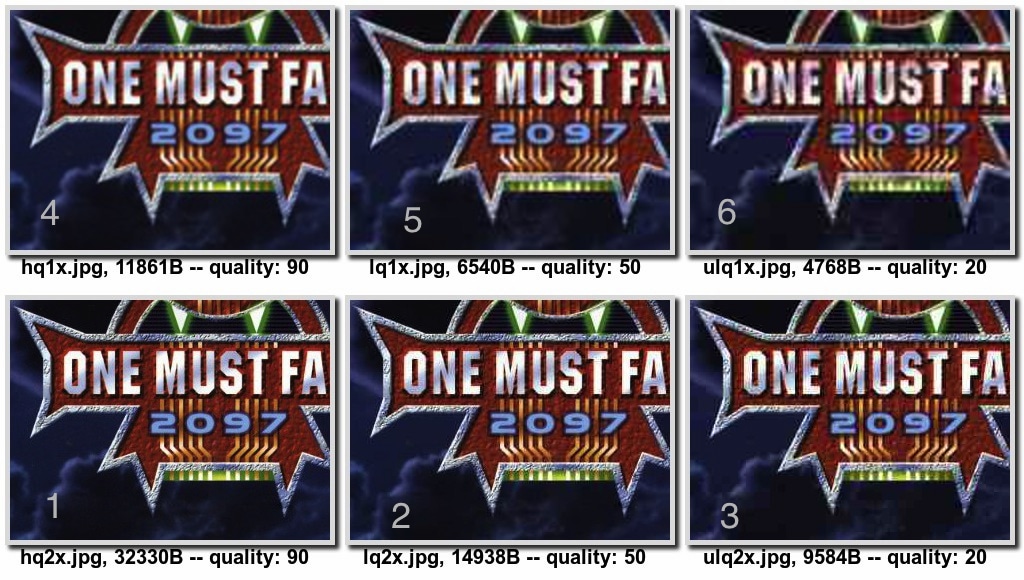
I wrote an HTML5Rocks article surveying a number of different responsive image techniques, and did some research around compressing 1x and 2x JPEG and comparing resulting sizes and visual quality. Here's one such tile from the above article:

I've labeled the images with their compression level (indicated by JPEG quality), their size (in bytes), and my subjective opinion on their comparative visual fidelity (ranked by numbers). The interesting bit here is that the highly compressed 2x image (labeled 3) is smaller in size and looks better than the uncompressed 1x image (labeled 4). In other words, between images 4 and 3, we've managed to improve the quality of the image by doubling each dimension and significantly increasing the compression, while at the same time, reducing the size by 2 kB.
Compression, dimensions and visual quality
I wanted to get a bit more insight into tradeoffs between compression level, image dimensions, visual quality and image size. I ran a study with the following hypothesis based on the study above:
Hypothesis
With enough compression, a 2x image will look equivalent to the same image in 1x size at some other (lower) compression. However, in this case, the highly compressed 2x image will be smaller in size than the 1x image.
Process
- Given a 2x image, generate the 1x one.
- Compress both images at various levels.
- Create a test page that shows both image sets side-by-side.
- Find the place in the two sets where the images are equivalent.
- Note equivalent image sizes and compression levels.
- Try it on both a 1x and a 2x display.
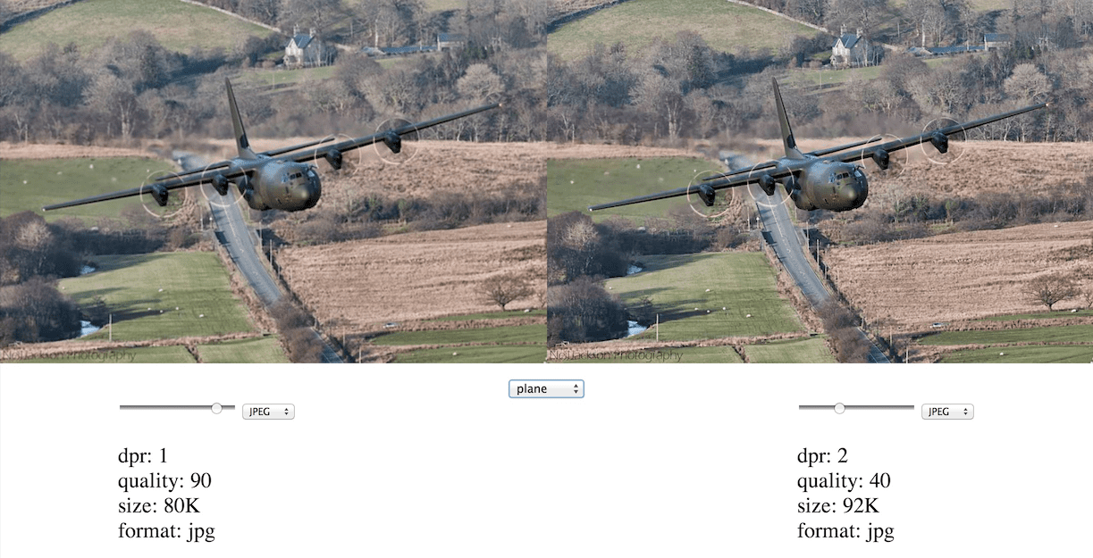
I built a side-by-side image comparison app similar to Lightroom's compare view. The intention is to show a 1x and a 2x images side-by-side, but also allow you to zoom into any section of the image to get more detail. You can also select between JPEG and WebP formats and change compression quality to see file size and image quality comparisons. The idea is to tweak settings over several images, figure out what compression quality, scaling and format vs. image quality tradeoff you are comfortable with, and use that setting for all of your images.

The tool itself is available for you to play with. You can zoom into the image by selecting a sub-area to zoom into.
Analysis
I'll say up front that image quality is a subjective thing. Also, your particular use case will likely dictate where your priorities lie in the visual fidelity vs. filesize spectrum. Additionally, different kinds of image features react differently to scaling and compression quality, so a one-size-fits-all solution may not necessarily work here. The point of the tool is to help you build up an intuition for image quality compressions, scales and formats.
From playing with the image zoomer, a few things quickly became apparent
to me. Firstly, I prefer quality=30 dpr=2x images to quality=90
dpr=1x images for the increase in detail. These images are comparable
in file size as well (in the plane case, the compressed 2x image is 76
kB whereas the uncompressed 1x is 80 kB).
Exceptions to this rule are highly compressed (quality<30) images with
gradients. These tend to suffer from color banding, which is equally bad
regardless of image scale. The bird and car samples found in the tool
are examples of this.
WebP images look way cleaner than JPEG, especially at low compression levels. This color banding seems to be much less of an issue. Lastly, WebP images are much more compact.
Caveats and fin
Making images look good on high density displays is only half of the image related problems caused by a huge variation in screens. In some cases, you might want to serve entirely different images depending on viewport size. For example, Obama's headshot might be appropriate for a phone-sized screen, but the stand in front of him and flag behind him and some might be a better fit for a laptop display.
I deliberately avoided this "art direction" topic to focus on high DPI
images only. This problem can be solved by a number of different
approaches: using media queries and background images, via JavaScript,
via some new features like image-set, or on the server. This topic is
covered in High DPI Images for Variable Pixel Densities.
I'll sign off with a few open issues:
- Effects of high compression on performance. What are the penalties of decoding highly compressed images?
- What are the performance penalties of having to resize the image down when a 2x image is loaded on a 1x display?
To summarize, opt for CSS and SVG instead of using raster images. If raster images are strictly required, use PNGs for images with a limited palettes and many solid colors, and use JPEGs for images with many colors and gradients. The great thing about this approach is that your markup is virtually unchanged. All that is required of the web developer is to generate 2x assets and size your images properly in the DOM.
For further reading, check out Scott Jehl's article on a similar topic. May your images look sharp and your cell data usage be low!

