
This chapter focuses on some critical aspects of rendering content outside of the browser tab.
The window
Different operating systems have different ideas about what an application window is. For example, on iPhones, an application always takes up 100% of the screen. On Android and iPads applications usually run fullscreen but it is possible to share the screen between two apps, however there is only one app instance open at a time. In contrast, on a desktop device, an application can have more than one instance open at a time. It shares the available screen real estate with all other open applications. Each application instance can be resized and positioned anywhere on the screen, even overlapping other applications.
The icon
We recognize apps by their icon. That icon appears when you search for apps, in settings, wherever you launch apps, and where you see running apps.
These include:
- Home screen (iOS, iPadOS, Android).
- App Launcher (macOS, Android).
- Start Menu or App Menu (Windows, ChromeOS, Linux).
- Dock, TaskBar, or Multi-task panels (all operating systems).
When creating the icon for your Progressive Web App make sure its icon is platform-agnostic, as each operating system can render icons and apply different shape masks to them, like the ones in the image below.
Theming your app
There are a number of ways you can customize app styling in your PWA's, including:
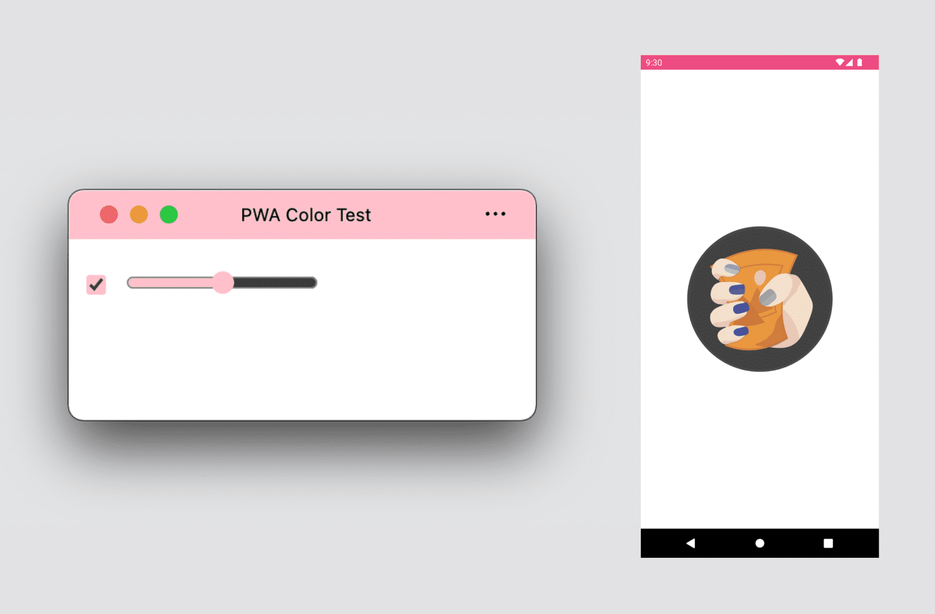
- Theme color: defines the color of the window's title bar on the desktop and the color of the status bar on mobile devices. Using a meta tag, you can have options for different schemes, such as dark or light mode and they will be used based on the user's preference.
- Background color: defines the color of the window before the app and its CSS are loaded.
- Accent color: defines the color of built-in browser components, such as form controls.
Display modes
You can define what kind of window experience you'd like for your Progressive Web App. There are three options to choose from:
- Fullscreen
- Standalone
- Minimal User Interface
You can also use the title bar area next to the window controls to make your PWA feel more like an app with the advanced display mode called Window Controls Overlay. Checkout Customize the window controls overlay of your PWA's title bar.
Fullscreen experience
A fullscreen experience is suitable for immersive experiences, such as games, VR, or AR experiences. It's currently only available on Android devices, and it hides the status bar and the navigation bar, giving your PWA 100% of the screen for your content.
On desktop and iPadOS, fullscreen PWAs are not supported; however, you can use the Fullscreen API from within your PWA to display your app fullscreen at a user's request.
Standalone experience
The most common option for a Progressive Web App, standalone mode displays your PWA in an OS-standard window without any browser navigation UI. The window may also include a browser-controlled menu where the user can:
- Copy the current URL.
- See, apply, or disable browser extensions.
- See and change permissions.
- Check current origin and the SSL certificate.
The title bar may also show permissions and hardware usage replacing the omnibox or URL bar when the PWA renders in the tab.


On mobile devices, a standalone PWA experience will create a standard screen that keeps the status bar visible, so the user can still see notifications, time, and battery level. It often does not have any browser-controlled menu like desktop standalone experiences may include.

Some browsers on Android create a fixed and silent notification while the PWA is in the foreground that lets the user copy the current URL or other options.

Minimal user interface
This mode is available for Progressive Web Apps on Android and desktop operating systems. When you use it, the browser rendering your PWA will show a minimal user interface to help the user navigate within the application.
On Android, you will get a title bar that renders the current <title> element and the origin with a small drop-down menu available. On desktop, you will get a set of buttons in the title bar to help with navigation, including a back button and a control that swaps between a stop and a reload action, based on the current loading status.


Optimizing design for desktop
When you design a Progressive Web App to work on a desktop, you need to think about the endless possibilities for window size as compared to being in the browser's tab or as an app in a mobile operating system.
In Chapter 3, we mentioned mini-mode: a desktop app can be as small as 200 by 100 pixels. This window will use the <title> element's content in your HTML as the title of the window. That content is also rendered when you alt-tab between apps and in other places.
Pay attention to your HTML's <title> element and rethink how you use it. The <title> isn't just for SEO or to render just the first characters in a browser's tab; it will be part of the user experience of your standalone desktop window.
CSS best practices
All your experience with CSS layout, design, and animation is valid when your content is rendered in its standalone experience. However, there are a couple of tips and tricks to making the experience better for a standalone window.
Media Queries
The first media query that you can take advantage of in your PWA is the display-mode property accepting the values browser, standalone, minimal-ui, or fullscreen.
This media query applies different styles to each mode. For example, you could render an installation invitation only when in browser mode, or render one particular piece of information only when the user uses your app from the system icon. This might include adding a back button to use when your app launches in standalone mode.
/* It targets only the app used within the browser */
@media (display-mode: browser) {
}
/* It targets only the app used with a system icon in standalone mode */
@media (display-mode: standalone) {
}
/* It targets only the app used with a system icon in all mode */
@media (display-mode: standalone), (display-mode: fullscreen), (display-mode: minimal-ui) {
}
The app experience
When the users are using an installed PWA, they expect app behavior. While it's not simple to define what it means, the default web behavior doesn't give the best experience in some situations.
User selection
Content is generally selectable with a mouse or pointer, or a press and hold touch gesture. While helpful for content, it doesn't provide the best experience for navigation items, menus, and buttons within your PWA.

Therefore, it's a good idea to disable user selection on these elements using user-select: none and it's -webkit- prefix version:
.unselectable {
   user-select: none;
}
Accent color
In your PWA, you can define a color to match your brand within HTML form controls using the property accent-color.
System fonts
If you want an element, like dialogs or messages, to match the user's default platform font, you can use the following font family:
selector {
  font-family: -apple-system, BlinkMacSystemFont,
    "Segoe UI", system-ui, Roboto, Oxygen-Sans, Ubuntu, Cantarell,
    "Helvetica Neue", sans-serif;
}
Pull to refresh
Modern mobile browsers, such as Google Chrome and Safari, have a feature that refreshes the page when it is pulled down. On some browsers, such as Chrome on Android, that behavior is also enabled on standalone PWAs.
You may want to disable this action. For example when providing your own gesture management or refresh action, or if there is a possibility that your user will trigger the action unintentionally.
It's possible to disable this behavior by using overscroll-behavior-y: contain:.
  body {
    overscroll-behavior-y: contain;
  }
Safe areas
Some devices do not have unobstructed rectangular screens; instead, their screen may be a different shape, like a circle, or have portions of the screen that can't be used, like the iPhone 13's notch. In these cases, some browsers will expose environment variables with safe areas that can display content.

If you want full access to the screen, even the invisible area, to render your color or image, include viewport-fit=cover in the content of your <meta name="viewport"> tag. Then use the safe-area-inset-* environment variables to extend your content safely into those areas.