
The web app manifest is a file you create that tells the browser how you want your web content to display as an app in the operating system. The manifest can include basic information such as the app's name, icon, and theme color; advanced preferences, such as desired orientation and app shortcuts; and catalog metadata, such as screenshots.
Each PWA should include a single manifest per application, typically hosted in the root folder, and linked on all HTML pages your PWA can be installed from. Its official extension is .webmanifest, so you could name your manifest something like app.webmanifest.
Adding a web app manifest to your PWA
To create a web app manifest, first make a text file with a JSON object that contains at least a name field with a string value:
app.webmanifest:
{
   "name": "My First Application"
}
But creating the file is not enough, the browser needs to know it exists, too.
Linking to your manifest
To make the browser aware of your web app manifest, you need to link it to your PWA using a <link> HTML element and the rel attribute set to manifest on all of your PWA's HTML pages. This is similar to how you link a CSS stylesheet to a document.
index.html:
<html lang="en">
  <title>This is my first PWA</title>
  <link rel="manifest" href="/app.webmanifest">
Debugging the manifest
To ensure the manifest is set up correctly, you can use Inspector in Firefox and DevTools in every Chromium-based browser.
For Chromium browsers
In DevTools
- In the left pane, under Application, select Manifest.
- Check the fields of the manifest as parsed by the browser.
For Firefox
- Open the Inspector.
- Go to the Application tab.
- Select the Manifest option in the left panel.
- Check the fields of the manifest as parsed by the browser.
Designing your PWA experience
With your PWA now connected to its manifest, it's time to fill out the rest of the fields to define the experience for your users.
Basic fields
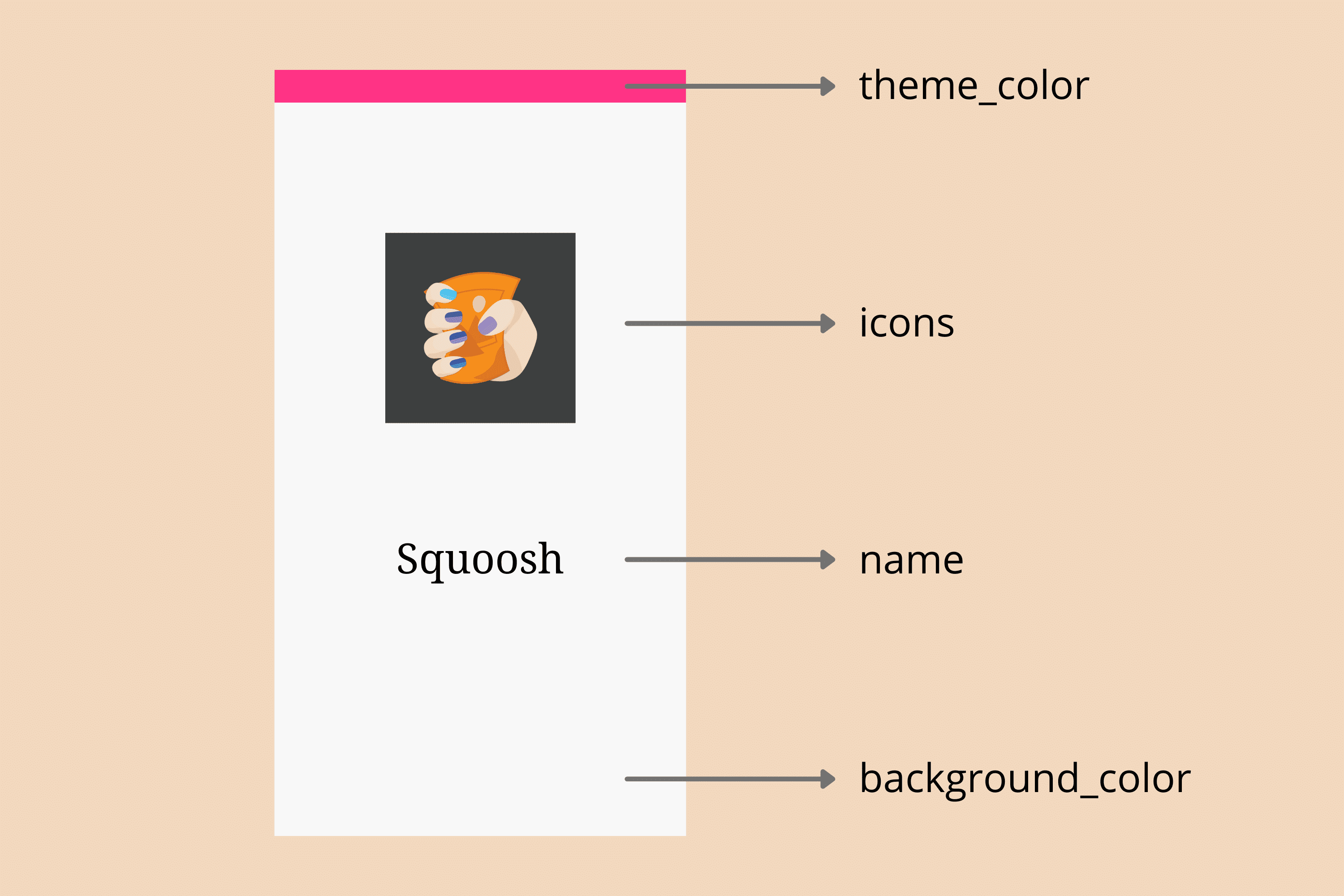
The first set of fields represents the core information about your PWA. They are used to build the installed PWA's icon and window and determine how it starts up. They are:
name- Full name of your PWA. It will appear along with the icon in the operating system's home screen, launcher, dock, or menu.
short_name- Optional, a shorter name of your PWA, used when there is not enough room to display the full value of the
namefield. Keep it under 12 characters to minimize the possibility of truncation. icons- Array of icon objects with
src,type,sizes, and optionalpurposefields, describing what images should represent the PWA. start_url- The URL the PWA should load when the user starts it from the installed icon. An absolute path is recommended, so if your PWA's home page is the root of your site, you could set this to ‘/' to open it when your app starts. If you don't provide a start URL, the browser can use the URL the PWA was installed from as a start. It can be a deep link, such as the details of a product instead of your home screen.
display- One of
fullscreen,standalone,minimal-ui, orbrowser, describing how the OS should draw the PWA window. You can read more about the different display modes in the App Design chapter. Most use cases implementstandalone. id- A string that uniquely identifies this PWA against others that may be hosted on the same origin. If it's not set, the
start_urlwill be used as a fallback value. Keep in mind that by changing thestart_urlin the future (such as when changing a query string value) you may be removing the browser's ability to detect that a PWA is already installed.
Icons
Your PWA's icon is its visual identity across your users' devices when installed, so it's important to define at least one. Because the icons property is a collection of icon objects, you can define several icons in different formats to provide the best icon experience for your users. Each browser will pick one or more icons based on its needs and the operating system it's installed on, the icons closer to the specifications needed.
If you need to pick only one icon size, it should be 512 by 512 pixels. However, providing more sizes is recommended including 192 by 192, 384 by 384, and 1024 by 1024 pixel-sized images, too.
"icons": [
   {
      "src": "icons/512.png",
      "type": "image/png",
      "sizes": "512x512"
   },
   {
      "src": "icons/1024.png",
      "type": "image/png",
      "sizes": "1024x1024"
   }
]
If you don't provide an icon or the icons are not in the recommended sizes, on some platforms you won't pass installation criteria. On other platforms, the icon will be automatically generated, for instance from a screenshot of the PWA or by using a generic icon.
Maskable icons
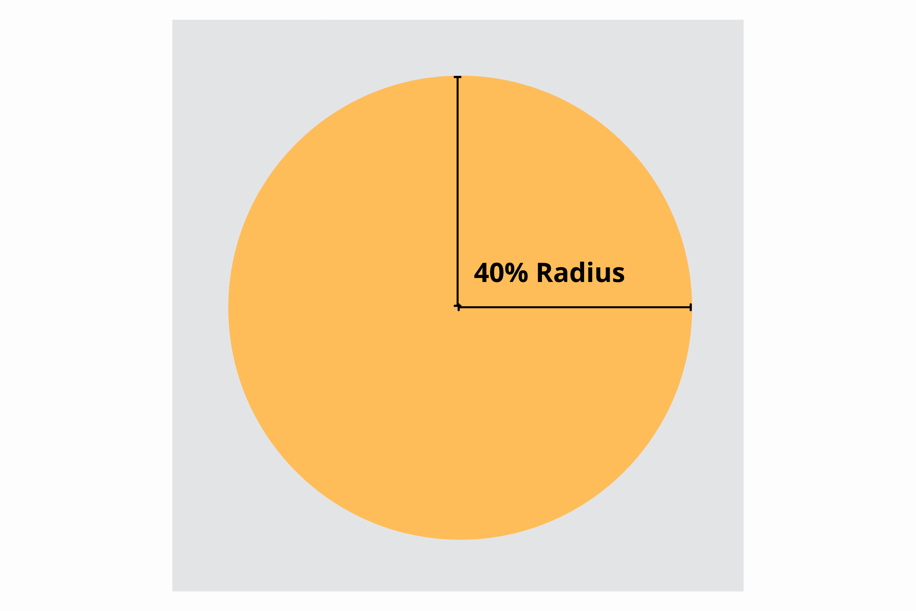
Some operating systems, such as Android, adapt icons to different sizes and shapes. For example, on Android 12, different manufacturers or settings can change the shape of icons from circles to squares to rounded-corner squares. To support these kinds of adaptive icons, you can provide a maskable icon using the purpose field.
To do so, provide a square image file that has its main icon contained within a “safe zone”, a circle centered in the icon with a radius of 40 percent of the width of the icon. (See the image below.) Devices that support maskable icons will mask your icon as needed.
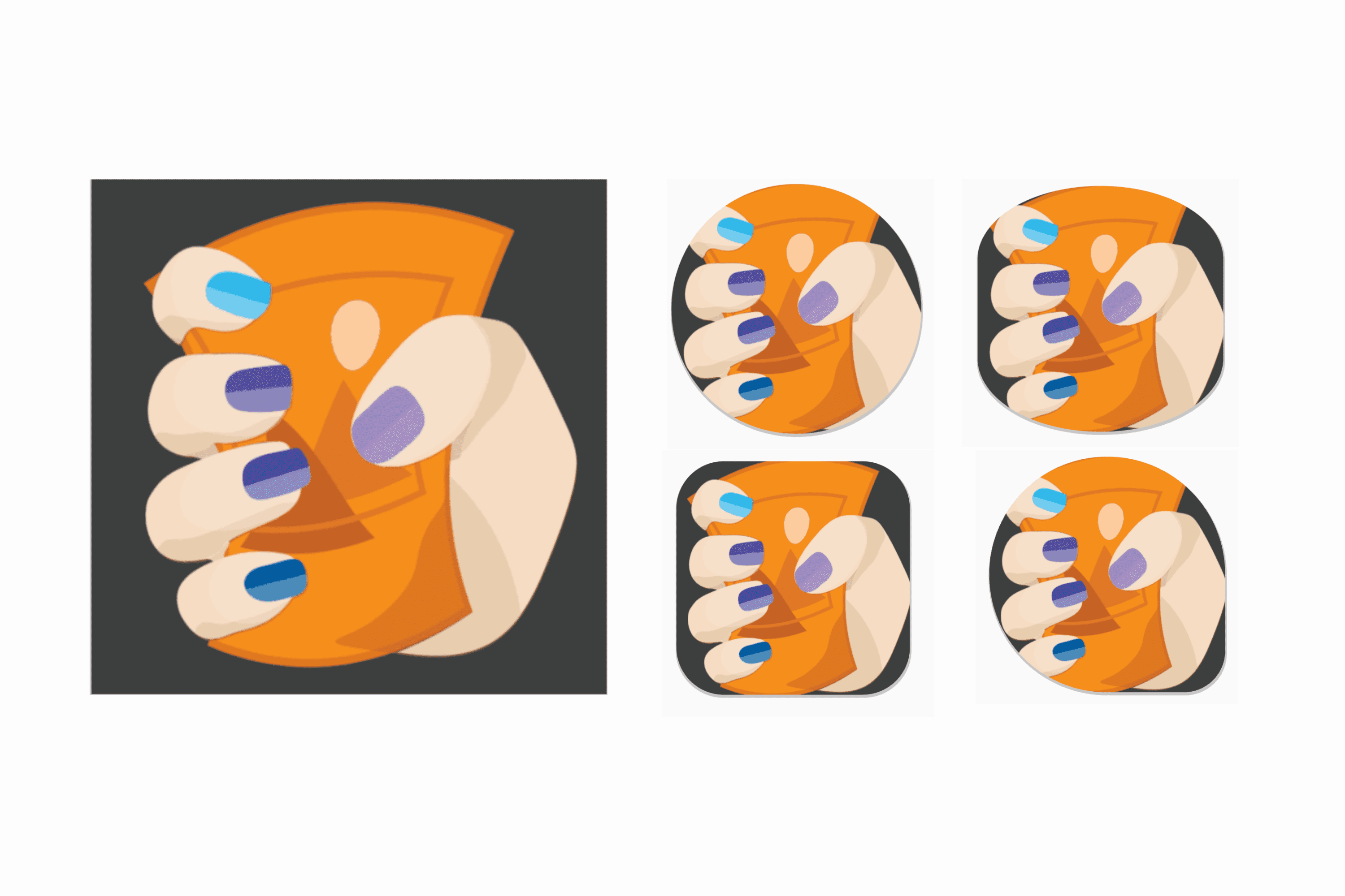
Here's an example of a maskable icon rendered in a number of commonly used shapes:
In the following image, if you use the icon at the left as a maskable icon, you will end up with poor results on devices when a shape mask is applied.
This image could be made usable with more padding.
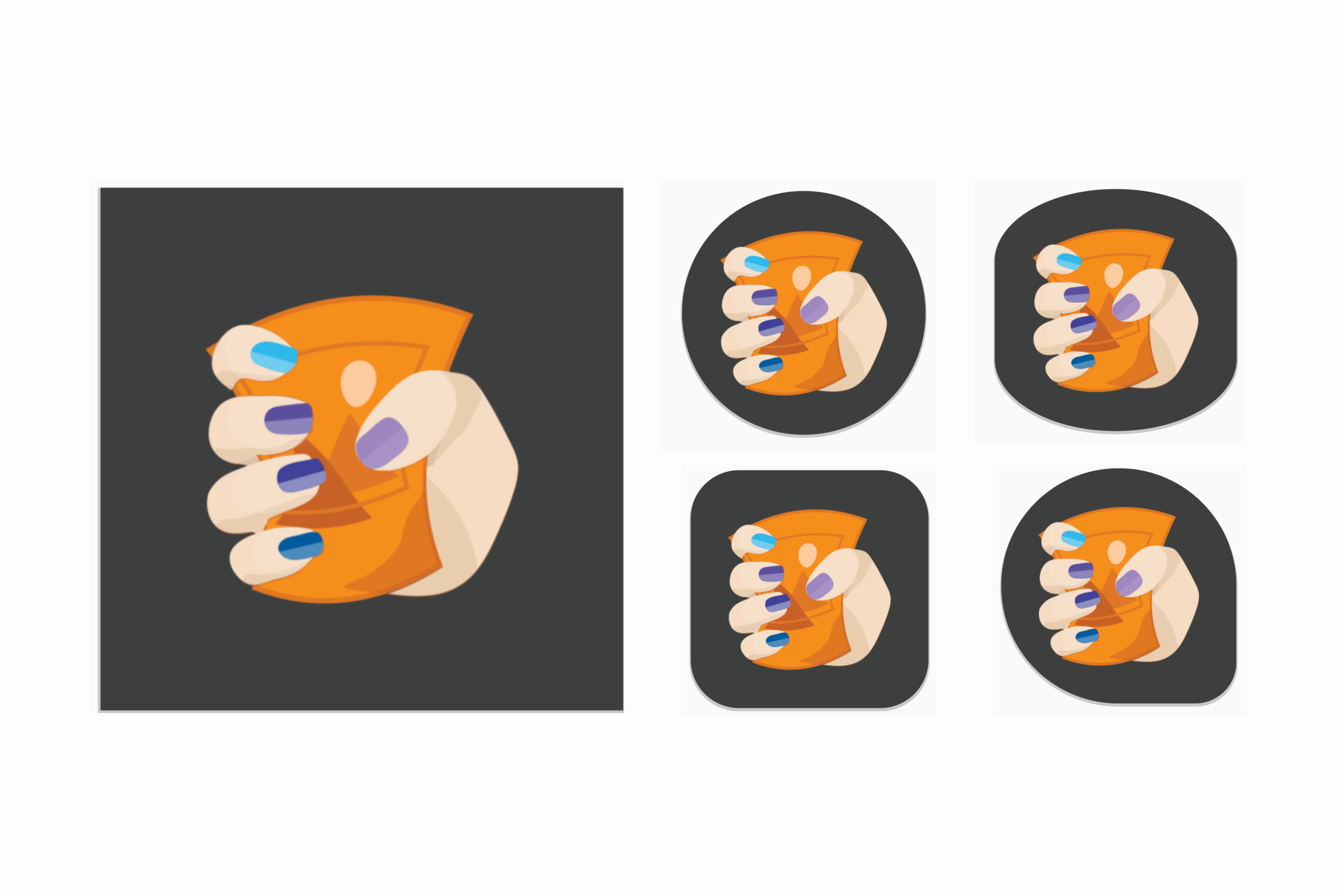
Maskable icons should be 512 by 512 at least. With one created, you can add it to your icons collection to improve the experience for supported devices:
"icons": [
   {
      "src": "/icons/512.png",
      "type": "image/png",
      "sizes": "512x512"
   },
   {
      "src": "/icons/1024.png",
      "type": "image/png",
      "sizes": "1024x1024"
   },
   {
      "src": "/icons/512-maskable.png",
      "type": "image/png",
      "sizes": "512x512",
      "purpose": "maskable"
   },
]
In most cases, if your maskable icon isn't displaying well, you can improve it by adding more padding. Maskable.app is a free online tool to test and create a maskable version of your icon.
If your icon serves general and maskable purposes, you can set the purpose field to "any maskable". Refer to the MDN Web App Manifest documentation for details.
Recommended fields
The next set of fields to include are ones that will improve your user's experience, even though they're not required for installability.
theme_color- Default color for the application, sometimes affecting how the OS displays the site (for instance, the window and title bar color on desktop, or the status bar color on mobile devices). This color can be overridden by the HTML
theme-color<meta>element. background_color- Placeholder color to display in the application's background before its stylesheet is loaded. Safari on iOS and iPadOS and most desktop browsers currently ignore this field.
scope- Changes the navigation scope of the PWA, allowing you to define what is and isn't displayed within the installed app's window. For example, if you link to a page outside of the scope, it will be rendered in an in-app browser instead of within your PWA window. This will not, however, change the scope of your service worker.
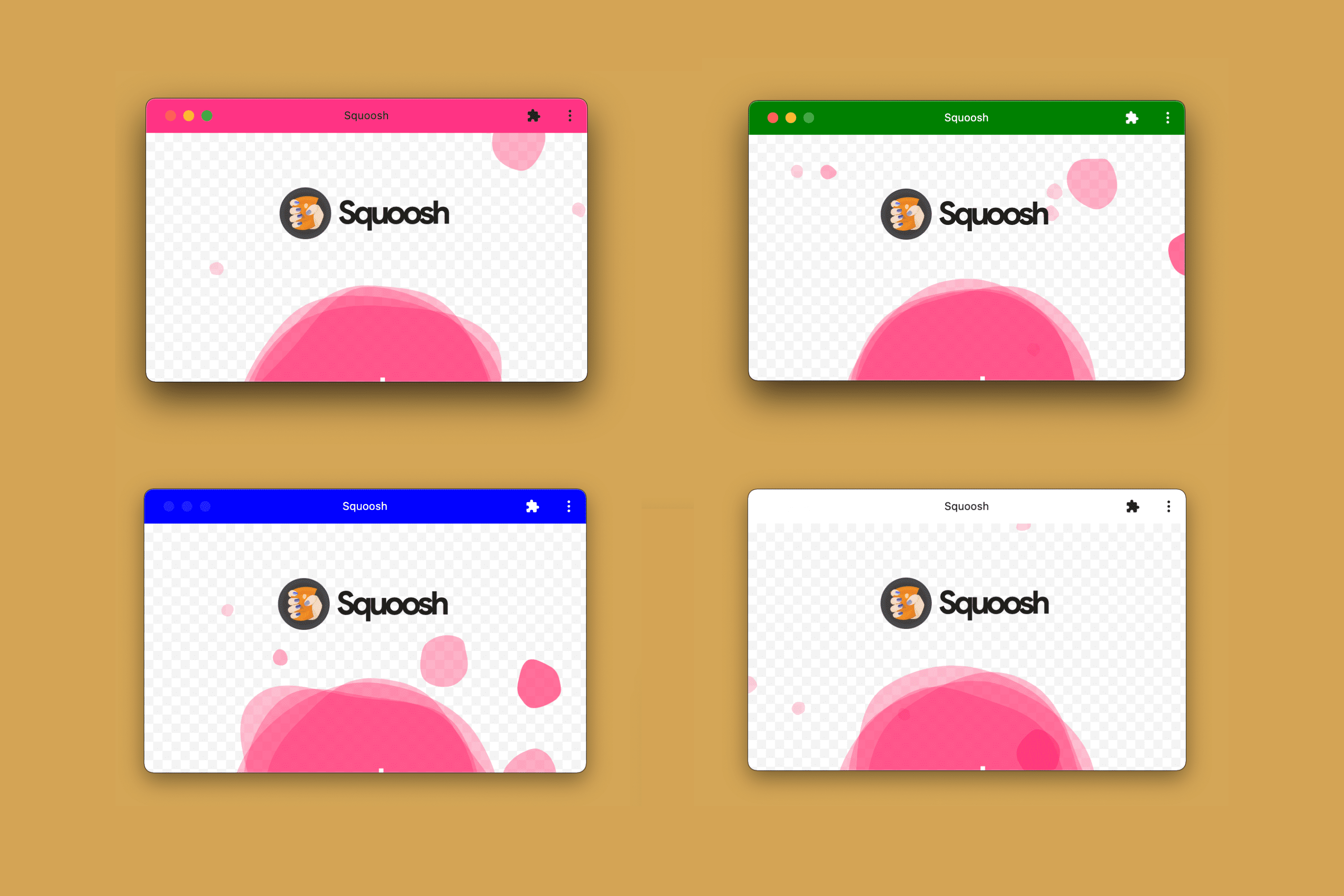
The next image shows how the theme_color field is used for the title bar on a desktop device when you install a PWA.
When defining colors in the manifest, such as within theme_color and background_color, you should use CSS named colors, such as salmon or orange, RGB colors such as #FF5500, or color functions without transparency such as rgb() or hsl(). Check the App design chapter for more information.
Splash screens
On some devices, a static image is rendered while your PWA is being loaded to provide immediate feedback to the user.
Android uses the theme_color, background_color, and icon values to generate the splash screen.
When you install a PWA on Android, the device will generate a splash screen with the information that comes from your manifest as seen in the following diagram.
Safari on iOS and iPadOS, on the other hand, doesn't use the web app manifest to generate splash screens. Instead, they use an image linked from a proprietary <link> element similar to how they handle icons. Check the Enhancement chapter for more details.
Extended fields
The next set of fields offers additional information about your PWA. They are all optional.
lang- A language tag specifying the primary language of the manifest's values, such as
enfor English,pt-BRfor Brazilian Portuguese, orinfor Hindi. dir- The direction to display direction-capable manifest fields (such as
name,short_name, anddescription). Valid values areauto,ltr(left-to-right), andrtl(right-to-left). orientation- Desired orientation for the app once installed. A game may set this to request a landscape-only orientation. Several values are accepted, but if included it's typically
portraitorlandscapeexplicitly.
Promotional fields
The fourth set of fields lets you provide promotional information about your PWA, for instance, in install flows, listings, and search results.
description- An explanation of what the PWA does.
screenshots- Array of screenshot objects with
src,type, andsizes(similar to theiconsobject) intended to showcase the PWA. There are no size restrictions. categories- Array of categories the PWA should belong to be used as hints for listings, optionally from the list of known categories. These values are typically lowercase.
iarc_rating_id- The International Age Rating Coalition certification code for the PWA, if you have one. It is intended to be used to determine which ages your PWA is appropriate for.
You can see these promotional fields in action today. On Android, for example, if your PWA is installable and you provide values for at least the description and screenshots fields, the installation dialog experience transforms from a simple "Add to the home screen" info bar, to a richer installation dialog similar to the one from an app store.
On Android, you can get a nicer installation UI if you provide values for the promotional fields, as you can see in the next video
Capabilities Fields
Finally, there are a number of fields related to different capabilities that your PWA can use in supported browsers, such as the shortcuts, share_target, display_override fields as we cover in the Capabilities chapter. There are also fields, like related_apps and prefer_related_apps (see the Detection chapter for more information), to connect your PWA to installed apps, often from an app store.
Many new fields may appear in the future while browsers add more capabilities to Progressive Web Apps.