

This codelab teaches you how to build a sign-in form that's secure, accessible, and easier to use.
You can build the form in Codepen or create local files. You'll learn:
- How to update semantic form elements to enable browser built-in functionality, such as autofill.
- Responsive form design.
- Advice on form usability.
1. Use meaningful HTML
Use these elements built for the job:
<form><section><label><button>
These elements enable built-in browser functionality, improve accessibility, and add meaning to your markup.
Copy and paste the following into the HTML Editor.
<form action="#" method="post">
  <h1>Sign in</h1>
  <section>
    <label>Email</label>
    <input>
  </section>
  <section>
    <label>Password</label>
    <input>
  </section>
  <button>Sign in</button>
</form>
Click in the preview to view your sign-in form.
The HTML that you added is valid and correct, but the default browser styling makes it looks terrible and hard to use, especially on mobile devices.
2. Design for touchscreen
Adjust padding, margins, and font sizes to ensure that your inputs work well on touchscreen devices, such as mobile phones.
Copy the following CSS and paste it into your CSS editor.
Click the preview to see your freshly styled sign-in form.
That's quite a lot of code! The main things to be aware of are the changes to sizes:
paddingandmarginare added to inputs.font-sizeis different for mobile and desktop.
The :invalid selector is used to indicate when an input has an invalid value.
This doesn't work yet.
The CSS layout is mobile-first:
- The default CSS is for viewports less than 450 pixels wide.
- The media query section sets overrides for viewports that are at least 450 pixels wide.
When building your own form like this, it's very important at this point in the process to test your code on real devices on desktop and mobile:
- Is label and input text readable, especially for people with low vision?
- Are the inputs and Sign in button large enough to use as touch targets for thumbs?
3. Add input attributes to enable built-in browser features
Enable the browser to store and autofill input values, and provide access to built-in password-management features.
Update the HTML in your editor with the following:
<form action="#" method="post">
  <h1>Sign in</h1>
  <section>
    <label for="email">Email</label>
    <input id="email" name="email" type="email" autocomplete="username" required autofocus>
  </section>
  <section id="password">
    <label for="password">Password</label>
    <input id="password" name="password" type="password" autocomplete="current-password" required>
  </section>
  <button id="sign-in">Sign in</button>
</form>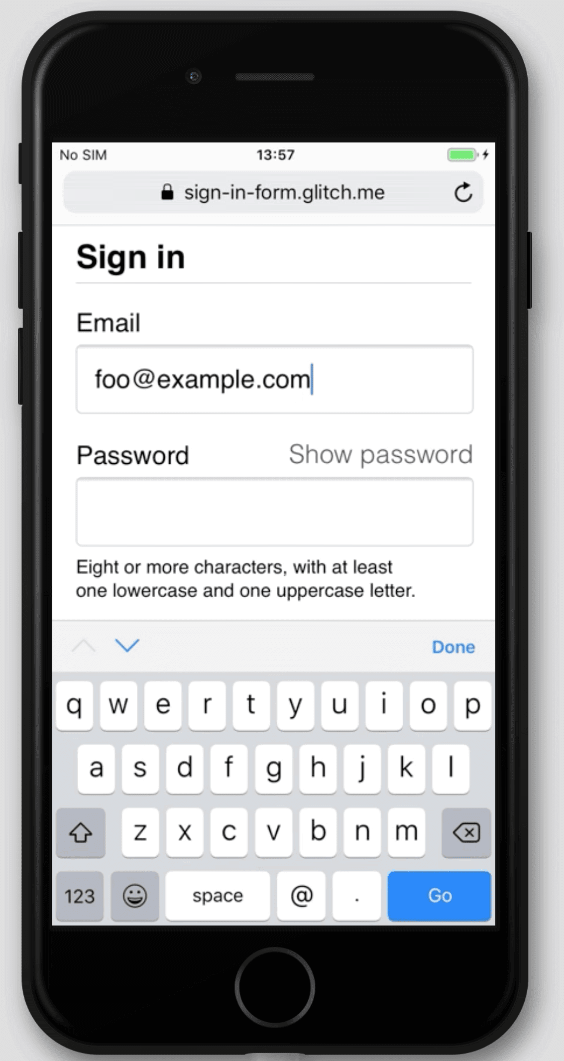
View your app again and then click Email. You'll notice that focus moves to the Email input. The label is now associated with this input, per the
for="email"attribute. Screen readers announce the label text when the label or the label's associated input gets focus.Focus the email input on a mobile device.
Notice how the keyboard is optimized for typing an email address. For example, the
@and.characters might be shown on the primary keyboard, and the operating system might show stored emails above the keyboard. This happens because thetype="email"attribute is applied to an<input>element.Type some text into the password input. The text is hidden by default because the
type="password"attribute has been applied to the element.- The
autocomplete,name,id, andtypeattributes help browsers understand the role of inputs to store data that can be used later for autofill and password managers.
- The
Focus the email input on a desktop device and type some text. If you stored any email addresses in your browser or a password manager, you probably see a dialog that lets you select from those stored emails. The
autocomplete="username"attribute applied to the email input.
autocomplete="username"andautocomplete="current-password"help browsers use stored values to autofill the inputs.
Different browsers use different techniques to work out the role of form inputs and provide autofill for a range of different websites. Add and remove attributes to try this yourself.
It's extremely important to test behavior across platforms. You should enter values and submit the form in different browsers on different devices.
Here's how your CodePen should look at this point:
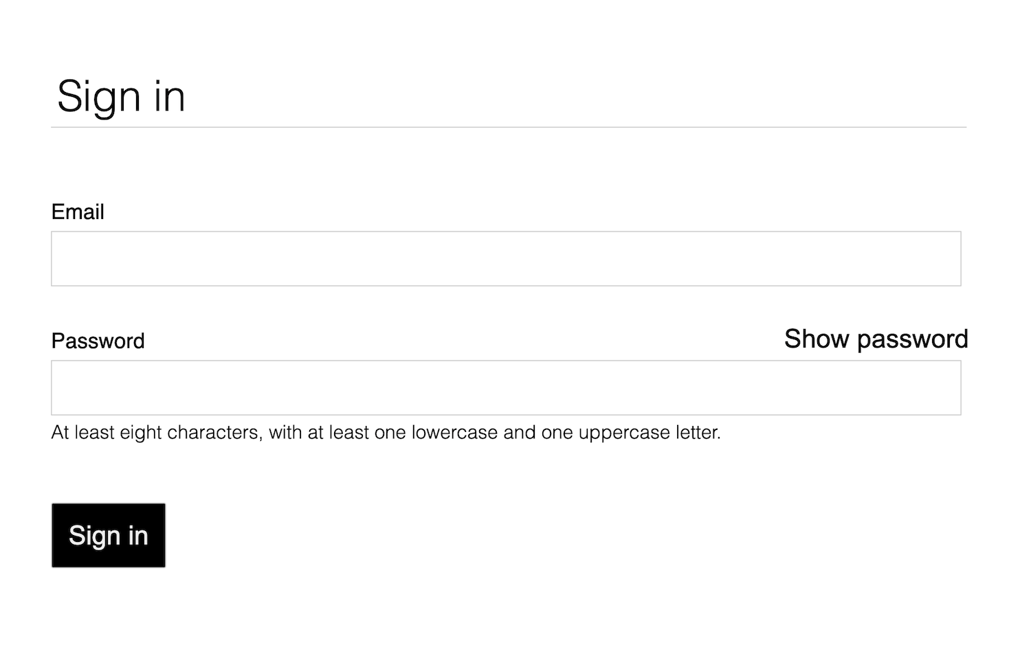
4. Add toggle for password display
Usability experts strongly recommend an addition of an icon or button that lets users see the text entered in the Password field. There's no built-in way to do this, so you need to add it with JavaScript.
The code to add this functionality is straightforward. This example uses text, not an icon.
Update your CodePen as follows:
Replace the password section with the following HTML:
<section id="password">
  <label for="password">Password</label>
  <button id="toggle-password" type="button"
  aria-label="Show password as plain text. Warning: This displays your password on the screen.">
  Show password</button>
  <input id="password" name="password" type="password"
  autocomplete="current-password" required>
</section>
Add the following CSS to the bottom of the
style.cssfile:button#toggle-password { background: none; border: none; cursor: pointer; font-weight: 300; padding: 0; position: absolute; top: -4px; right: -2px; }This makes the Show password button look like plain text and displays it in the top-right corner of the password section.
Add the following to the JavaScript editor to toggle password display and set the appropriate
aria-label:const passwordInput = document.getElementById('password'); const togglePasswordButton = document.getElementById('toggle-password'); togglePasswordButton.addEventListener('click', togglePassword); function togglePassword() { if (passwordInput.type === 'password') { passwordInput.type = 'text'; togglePasswordButton.textContent = 'Hide password'; togglePasswordButton.setAttribute('aria-label', 'Hide password.'); } else { passwordInput.type = 'password'; togglePasswordButton.textContent = 'Show password'; togglePasswordButton.setAttribute('aria-label', 'Show password as plain text. ' + 'Warning: this will display your password on the screen.'); } }
Try the show password logic, and repeat the fourth step on multiple browsers, on different operating systems.
Think about user experience. Will users notice Show password and understand it? Is there a better way to provide this functionality? This is a good moment to try discount usability testing with a small group of friends or colleagues.
To understand how this functionality works for screen readers, install the
ChromeVox Classic Extension
and navigate through the form. Do the aria-label values work as intended?
Some websites, such as Gmail, use icons instead of text to toggle password display. When you're done with this codelab, you can implement this with SVG images. Take a look at the Material Design icons.
Here's how your code should look at this point:
5. Add form validation
You can help users enter their data correctly when you let them validate their data before form submission and show them what they need to change.
HTML form elements and attributes have built-in features for basic validation, but you should also use JavaScript to do more robust validation while users enter data and when they attempt to submit the form.
This step uses the Constraint Validation API (which is widely supported) to add custom validation with built-in browser UI that sets focus and displays prompts.
Tell users the constraints for passwords and any other inputs. Don't make them guess!
Update the password section of the
index.htmlfile:<section id="password"> <label for="password">Password</label> <button id="toggle-password" type="button" aria-label="Show password as plain text. Warning: this will display your password on the screen."> Show password</button> <input id="password" name="password" type="password" autocomplete="current-password" aria-describedby="password-constraints" required> <div id="password-constraints"> At least eight characters, with at least one lowercase and one uppercase letter. </div> </section>This adds two new features:
- Information about password constraints
- An
aria-describedbyattribute for the password input. Screen readers read the label text, the input type (password), and then the description.
Add the following CSS to the bottom of the CSS editor.
div#password-constraints {
  margin: 5px 0 0 0;
  font-size: 16px;
}
Add the following JavaScript:
passwordInput.addEventListener('input', resetCustomValidity);
function resetCustomValidity() {
  passwordInput.setCustomValidity('');
}

// A production site would use more stringent password testing.
function validatePassword() {
  let message= '';
  if (!/.{8,}/.test(passwordInput.value)) {
    message = 'At least eight characters. ';
  }
  if (!/.*[A-Z].*/.test(passwordInput.value)) {
    message += 'At least one uppercase letter. ';
  }
  if (!/.*[a-z].*/.test(passwordInput.value)) {
    message += 'At least one lowercase letter.';
  }
  passwordInput.setCustomValidity(message);
}

const form = document.querySelector('form');
const signinButton = document.querySelector('button#sign-in');

form.addEventListener('submit', handleFormSubmission);

function handleFormSubmission(event) {
  event.preventDefault();
  validatePassword();
  form.reportValidity();
  if (form.checkValidity() === false) {
  } else {
    // On a production site do form submission.
    alert('Logging in!')
    signinButton.disabled = 'true';
  }
}
Try using your form.
- Enter an invalid email address and click Sign in. The browser displays a warning, with no JavaScript required.
- Enter a valid email address, but then click Sign in without a password value. The browser warns that you missed a required value and sets focus on the password input.
- Enter an invalid password and click Sign in. Now you see different depending on what's wrong.
Try different ways to help users enter email addresses and passwords. Better password form fields offers some clever suggestions.
Here's how your code should look at this point:
Go further
Now that you've completed this codelab, you're ready to add other critical sign-in form features:
- Add Forgot your password?, a button that makes it easier for users to reset their passwords.
- Link to your terms of service and privacy policy documents so that your users know how you safeguard their data.
- Consider style and branding, and ensure that these additional features match the rest of your website.
- Add Analytics and RUM so that you can test and monitor the performance and usability of your form design.