


If you have good vision, you might assume that everyone perceives colors, or text legibility, the same way you do. Of course, that's not the case. As you might imagine, some color combinations that some people can read well are difficult or impossible for others. This is usually caused by color contrast, the relationship between the foreground and background colors' luminance. When the colors are similar, the contrast ratio is low; when they're more different, the contrast ratio is higher.
The WebAIM guidelines recommend an AA (minimum) contrast ratio of 4.5:1 for all text. There are exceptions for very large text (120-150% larger than the default body text), for which the ratio can go down to 3:1. Notice the difference in the contrast ratios shown here:
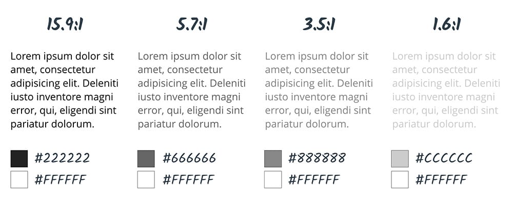
The contrast ratio of 4.5:1 was chosen for level AA because it compensates for the loss in contrast sensitivity usually experienced by users with vision loss equivalent to approximately 20/40 vision. 20/40 is commonly reported as the typical visual acuity of people at about age 80. For users with low vision impairments or color deficiencies, we can increase the contrast up to 7:1 for body text.
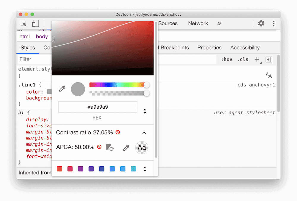
You can use the Accessibility Audit in Lighthouse to check your color contrast. To run the report:
- Open DevTools.
- Click Audits.
- Select Accessibility.
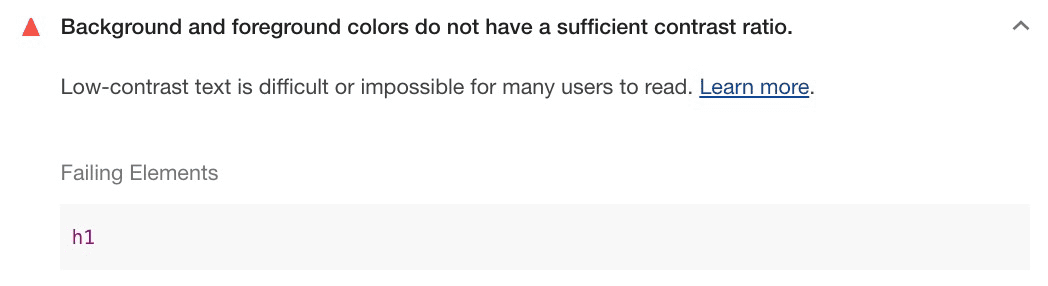
Chrome also includes an experimental feature to help you detect all the low contrast text on your page. You can also use accessible color suggestions to fix the low contrast text.
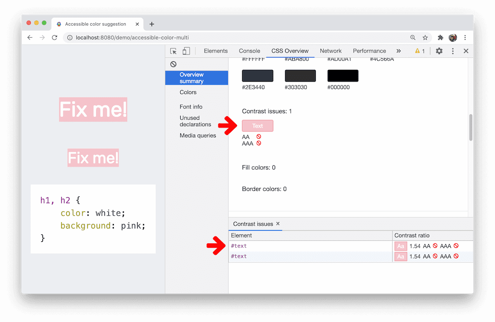
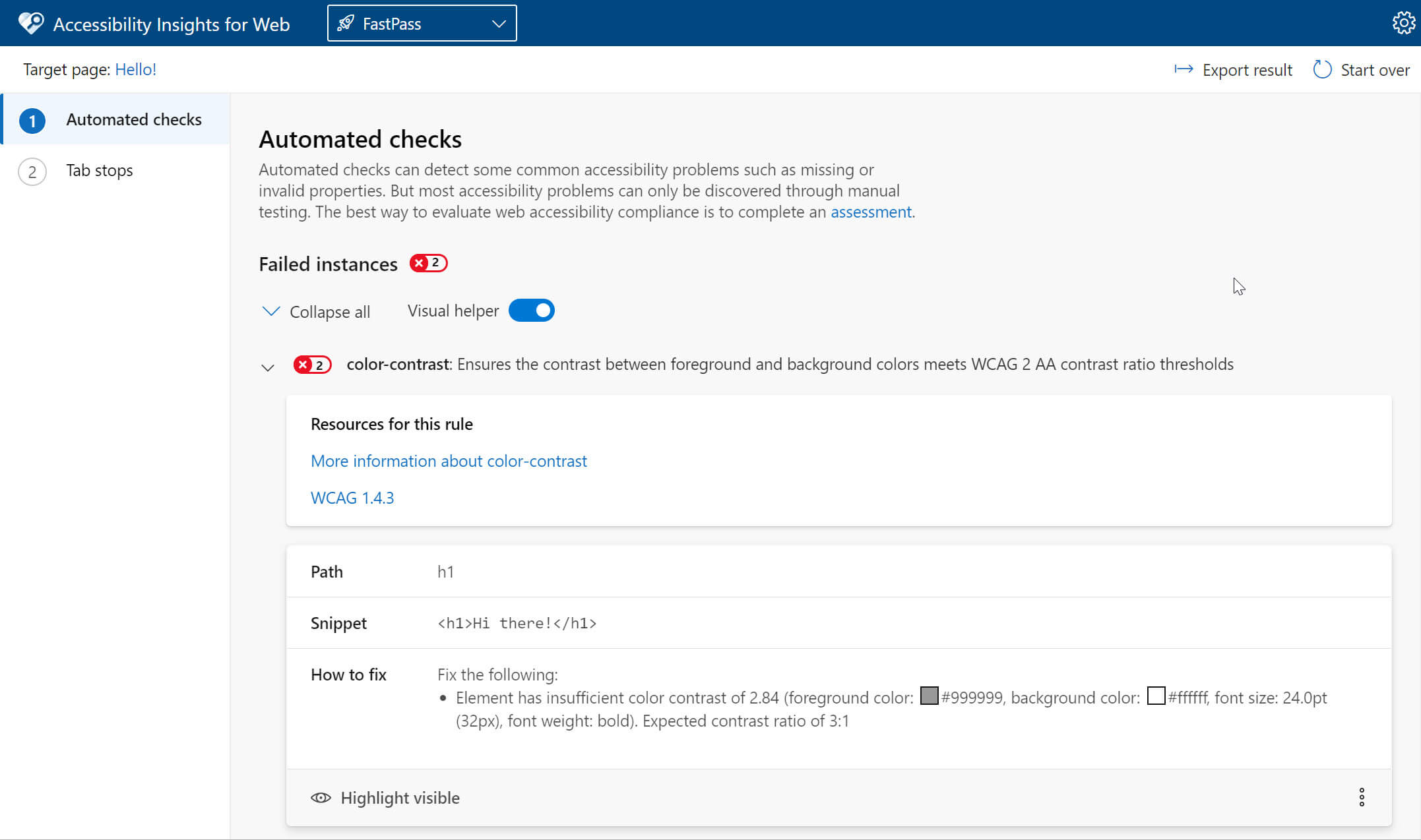
For a more complete report, install the Accessibility Insights Extension. Its Fastpass reports include details on any elements that fail color contrast checks.
Advanced Perceptual Contrast Algorithm (APCA)
The Advanced Perceptual Contrast Algorithm (APCA) is a new way to compute contrast based on modern research on color perception.
Compared to AA and AAA guidelines, APCA is more context-dependent.
The contrast is calculated based on the following features:
- Spatial properties (font weight and text size)
- Text color (perceived lightness difference between text and background)
- Context (ambient light, surroundings, and intended purpose of the text)
Chrome includes an experimental feature to replace the AA/AAA contrast ratio guidelines with APCA.
Don't convey information with color alone
There are roughly 320 million people worldwide with color vision deficiency. About 1 in 12 men and 1 in 200 women have some form of colorblindness, which means that about five percent of your users won't experience your site in the way you intended. Relying on color to convey information pushes that number to unacceptable levels.
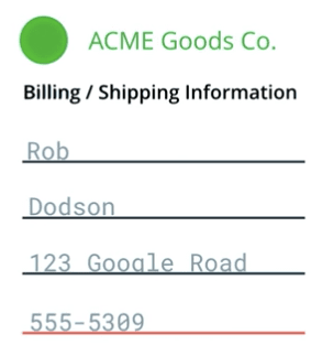
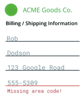
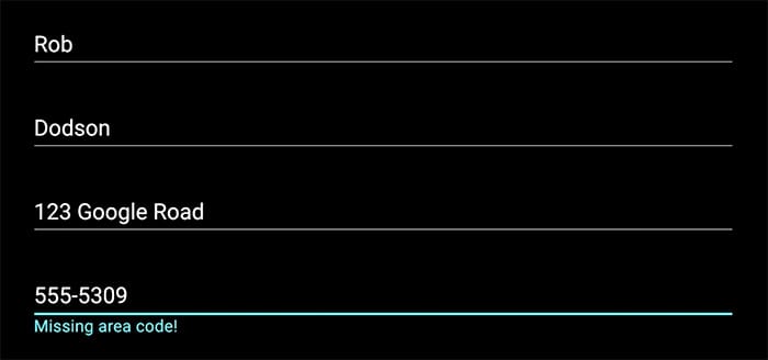
For example, in an input form, a telephone number might be underlined in red to show that it is invalid. To a color-deficient or screen reader user, that information is conveyed badly or not at all. Because of this, you should always try to provide multiple avenues for the user to access critical information.
The WebAIM checklist states in section 1.4.1
that "color should not be used as the sole method of conveying content or
distinguishing visual elements." It also notes that "color alone should not be
used to distinguish links from surrounding text" unless they meet certain
contrast requirements. Instead, the checklist recommends adding an additional
indicator such as an underscore (using the CSS text-decoration property) to
indicate when the link is active.
A basic way to fix the previous example is to add an additional message to the field, announcing that it is invalid and why.
When you're building an app, keep these sorts of things in mind and watch out for areas where you might be relying too heavily on color to convey important information.
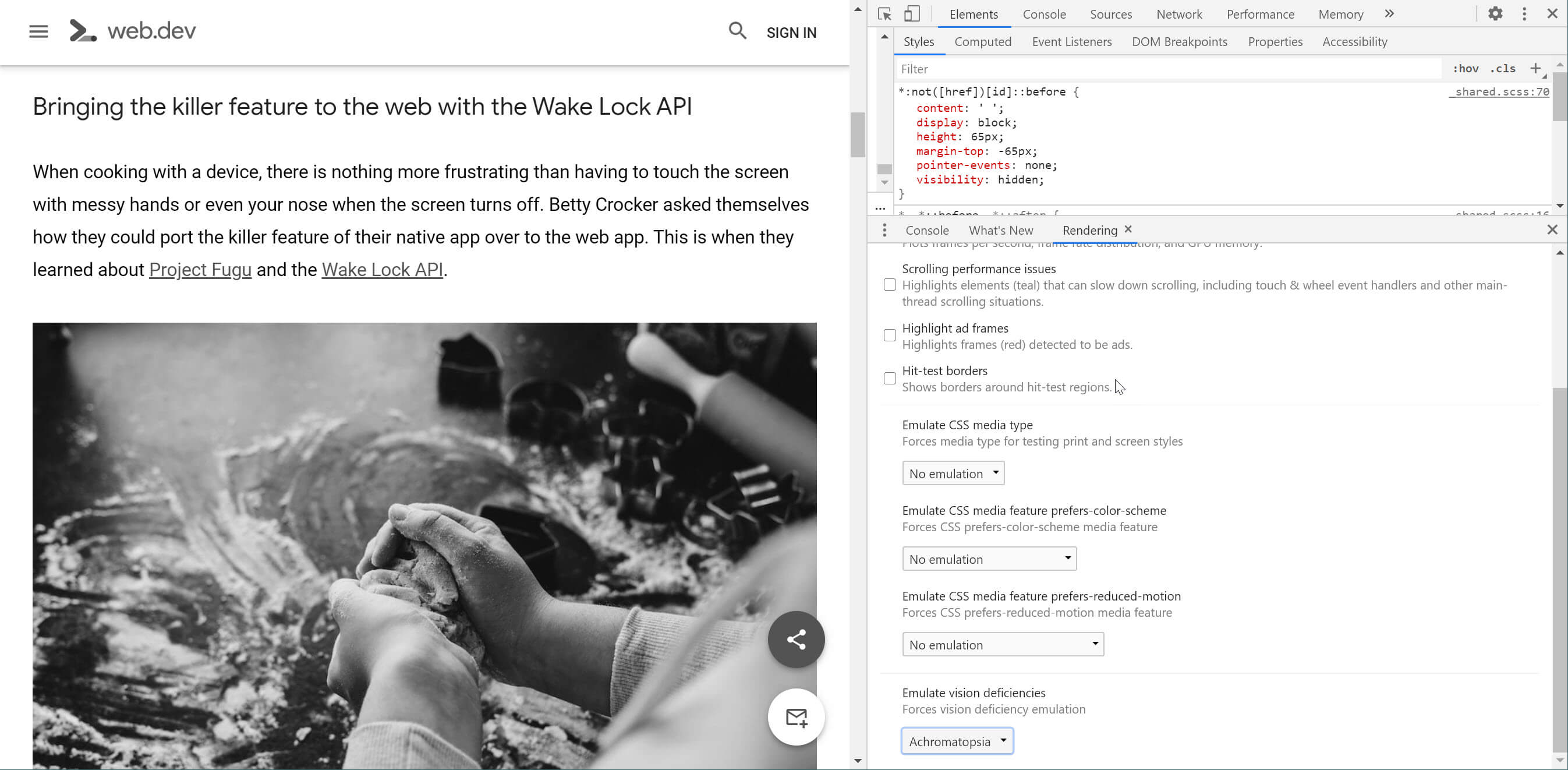
If you're curious about how your site looks to different people, or if you rely heavily on the use of color in your UI, you can use DevTools to simulate various forms of visual impairment. Chrome includes an Emulate Vision Deficiencies feature. To access it, open DevTools, then open the Rendering tab in the Drawer. From there, you can emulate the following color deficiencies:
- Protanopia: the inability to perceive any red light.
- Deuteranopia: the inability to perceive any green light.
- Tritanopia: the inability to perceive any blue light.
- Achromatopsia: the inability to perceive any color except for shades of grey (extremely rare).
High contrast mode
High-contrast mode lets a user invert foreground and background colors, which often helps text stand out better. For someone with a low vision impairment, high-contrast mode can make it much easier to navigate the content on the page. There are a few ways to get a high-contrast setup on your machine:
Operating systems like Mac OSX and Windows offer high-contrast modes that can be enabled for everything at the system level.
A useful exercise is to turn on high-contrast settings and verify that all the UI in your app is still visible and usable.
For example, a navigation bar might use a subtle background color to indicate which page is selected. If you view it in a high-contrast extension, that subtlety completely disappears, and with it goes the reader's understanding of which page is active.

Similarly, in the example from earlier, the red underline on the invalid phone number field might be displayed in a hard-to-distinguish blue-green color.
If you're meeting the contrast ratios covered earlier, you should be fine when it comes to supporting high-contrast mode. But for added peace of mind, consider installing the High Contrast Chrome Extension and giving your page a once-over to check that everything works, and looks, as expected.