Introduction
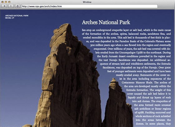
The web is an extremely powerful platform for text, an area where Adobe has a great deal of experience and expertise. When Adobe was looking for ways to help move the web forward, therefore, advancing the web's text capabilities even further seemed like an obvious place for us to start. The web generally assumes a single column, vertical orientation for text. Although it's possible to flow text around graphics, and even to format text into multiple columns with CSS, it's still very difficult to achieve true magazine-like layout on the web. With CSS Regions and CSS Exclusions, Adobe is spearheading the effort to bring the power of desktop publishing to modern browsers. For instance, in the screenshot below, CSS Exclusions is being used to flow text along the contour of the mountain:
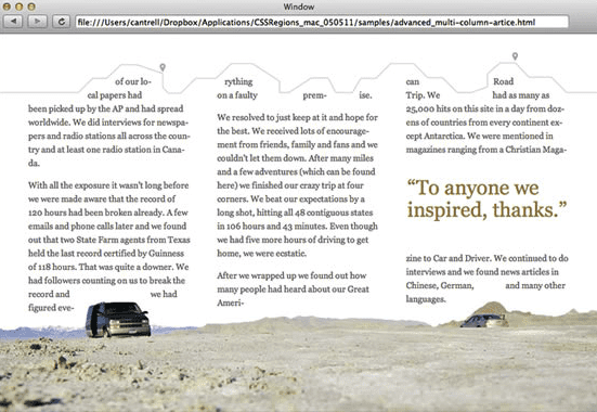
The document in the screenshot below also uses CSS Exclusions to allow the text to wrap around shapes in the images, as well as CSS Regions to format text into columns and around a pull quote:
CSS Regions
Before getting into the details of CSS Regions, I'd like to cover how regions can be enabled in Google Chrome. Once you have CSS Regions enabled, you can try out some of the samples referenced in this article, and create your own.
Enabling CSS Regions in Google Chrome
As of version 20 of Chrome (version 20.0.1132.57, to be exact), CSS Regions is enabled through the chrome://flags interface. To enable CSS Regions, follow these steps:
- Open a new tab or window in Chrome.
- Type
chrome://flagsin the location bar. - Use find in page (control/command + f) and search for the "experimental Web Platform features" section.
- Click on the Enable link.
- Click on the Relaunch Now button at the bottom.
For more information on Chrome's flags, see my blog post on All About Chrome Flags.
Once you've relaunched your browser, you're free to start experimenting with CSS Regions.
An Overview of CSS Regions
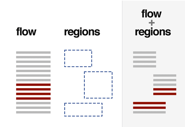
CSS Regions allows a block of semantically marked-up text to automatically flow into "boxes" (currently elements). The diagram below demonstrates the separation of text (the flow) and boxes (the regions the text flows into):
Let's take a look at an actual CSS Regions use case. In addition to being a developer at Adobe, I'm also a science fiction writer. I frequently publish my work online under a Creative Commons license, and in order to allow it to work across the maximum number of devices and browsers, I frequently use an extremely simple format similar to this:
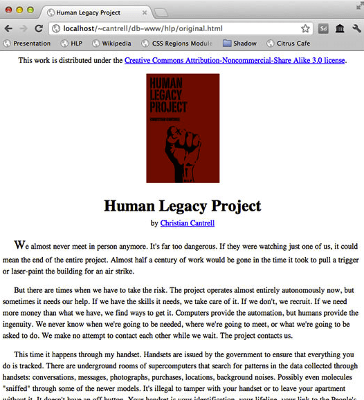
Using CSS Regions, I was able to create an experience that is both more visually interesting, and much more functional since it's easier to navigate and more comfortable to read:
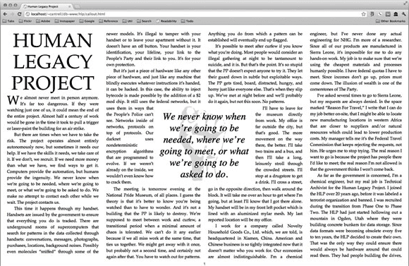
For demonstration purposes, I added the ability to reveal CSS Regions in this prototype. The screenshot below shows how the regions are arranged such that they give the impression of being columns that wrap around a graphic and a pull-quote in the center:
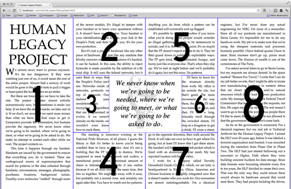
You can experiment with this prototype (as well as view the source code) here. Use your arrow keys to navigate, and press the Esc key to reveal regions. Earlier prototypes are also available here.
Creating a Named Flow
The CSS required to get a block of text to flow through regions is extremely simple. The snippet below assigns a named flow called "article" to a div with the id "content," and assigns that same "article" named flow to any element with the class "region." The result is that text contained inside the "content" element will automatically flow through any element with the class "region."
<!DOCTYPE html>
<html>
<head>
    <style>
    #content {
        { % mixin flow-into: article; % }
    }

    .region {
        { % mixin flow-from: article; % }
        box-sizing: border-box;
        position: absolute;
        width: 200px;
        height: 200px;
        padding: 10px;
    }

    #box-a {
        border: 1px solid red;
        top: 10px;
        left: 10px;
    }

    #box-b {
        border: 1px solid green;
        top: 210px;
        left: 210px;
    }

    #box-c {
        border: 1px solid blue;
        top: 410px;
        left: 410px;
    }
    </style>
</head>
<body>
    <div id="box-a" class="region"></div>
    <div id="box-b" class="region"></div>
    <div id="box-c" class="region"></div>
    <div id="content">
    Lorem ipsum dolor sit amet, consectetur adipiscing elit. Praesent eleifend dapibus felis, a consectetur nisl aliquam at. Aliquam quam augue, molestie a scelerisque nec, accumsan non metus. Lorem ipsum dolor sit amet, consectetur adipiscing elit. Proin cursus euismod nisi, a egestas sem rhoncus eget. Mauris non tortor arcu. Pellentesque in odio at leo volutpat consequat....
    </div>
</body>
</html>
The result looks like this:
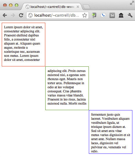
Note that the text inside the "content" div doesn't have any knowledge of its presentation. In other words, it can remain entirely semantically intact even as it's flowing through various regions. Additionally, since regions are just elements, they are positioned and sized using CSS just as any other element, and are therefore perfectly compatible with responsive design principles. Designating elements as part of a named flow simply means that the specified text automatically flows through them.
The CSS Object Model
The CSS Object Model, or CSSOM, defines JavaScript APIs for working with CSS. Below is a list of the new APIs related to CSS Regions:
document.webkitGetNamedFlows(): A function that returns the collection of named flows available in the document.document.webkitGetNamedFlows().namedItem("article"): A function that returns a reference to a specific named flow. The argument corresponds to the name specified as the value of theflow-intoandfrom-fromCSS properties. To get a reference to the named flow specified in the code snippet above, you would pass in the string "article."WebKitNamedFlow: An object representation of a named floe with the following properties and functions:firstEmptyRegionIndex: An integer value that points to the index of the first empty region associated to the named flow. SeegetRegions()below to learn how to get the collection of regions.name: A string value with the name of the flow.overset: A boolean property that is:falsewhen the content of the named flow fits in the associated regionstruewhen the content does not fit and more regions are required to contain all the content.
getContent(): A function that returns a collection with references to the nodes that flow into the named flow.getRegions(): A function that returns a collection with references to regions that hold the content of the named flow.getRegionsByContentNode(node): A function that returns a reference to the region containing the specified node. This is especially useful for finding regions containing things like named anchors.
webkitregionoversetchangeevent. This event is triggered on aWebkitNamedFlowwhenever the layout of the associated content changes for any reason (content is added or removed, the font size changes, the shape of the region changes, etc.) and causes thewebkitRegionOversetproperty of a region to change. This event is useful for listening to coarse layout changes. It is an indicator that something important happened and the layout might need attention, such as: more regions are required, some regions might be empty, etc.webkitregionfragmentchangeevent. Not implemented at the time of this edit. This event is triggered on aWebkitNamedFlowwhenever the layout of the associated content changes for any reason, similar towebkitregionoversetchange, but regardless of any change inwebkitRegionOversetproperties. This event is useful for listening for fine-grained layout changes which don't necessarily impact the whole layout of the named flow, for example: content moves from one region to another, but the overall content still fits in all the regions.Element.webkitRegionOverset: Elements become regions when they have theflow-fromCSS property assigned. These elements have awebkitRegionOversetproperty which, if they are part of a named flow, indicates whether or not content from a flow is overflowing the region. The possible of values webkitRegionOverset are:- "overflow" if there is more content than the region can hold
- "fit" if the content stops before the end of the region
- "empty" if the content has not reached the region
One of the primary uses for the CSSOM is listening for webkitregionoversetchange events and dynamically adding or removing regions in order to accommodate varying amounts of text. For instance, if the amount of text to be formatted is unpredictable (perhaps user-generated), if the browser window is resized, or if the font size changes, it might be necessary to add or remove regions to accommodate the change in the flow. Additionally, if you want to organize your content into pages, you will need a mechanism for dynamically modifying the DOM as well as your regions.
The following snippet of JavaScript code demonstrates the use of the CSSOM to dynamically add regions as necessary. Note that for the sake of simplicity, it does not handle removing regions or defining the size and positions of regions; it is for demonstration purposes only.
var flow = document.webkitGetNamedFlows().namedItem("article")
flow.addEventListener("webkitregionoversetchange", onLayoutUpdate);

function onLayoutUpdate(event) {
    var flow = event.target;

    // The content does not fit
    if (flow.overset === true) {
    addRegion();
    } else {
    regionLayoutComplete();
    }
}

function addRegion() {
    var region = document.createElement("div");
    region.style = "flow-from: article";
    document.body.appendChild(region);
}

function regionLayoutComplete() {
    // Finish up your layout.
}
More demos are available on the CSS Regions samples page.
CSS Page Templates
Leveraging the CSSOM is probably the most powerful and flexible way of implementing things like paging and responsive layout, but Adobe has been working with text and desktop publishing tools long enough to know that designers and developers are also going to want an easier way to get relatively generic paging capabilities. Therefore we are working on a proposal called CSS Page Templates which allows paging behavior to be defined entirely declaratively.
Let's take a look at a common use case for CSS Page Templates. The code snippet below shows the use of CSS to create two named flows: "article-flow" and "timeline-flow." Additionally it defines a third selector called "combined-articles" inside of which the two flows will be contained. The simple inclusion of the overflow-style property inside the "combined-articles" selector indicates that the content should automatically be paged along the x axis, or horizontally:
<style>
    #article {
    { % mixin flow-into: article-flow; % }
    }

    #timeline {
    { % mixin flow-into: timeline-flow; % }
    }

    #combined-articles {
    overflow-style: paged-x;
    }
</style>
Now that the flows have been defined and the desired overflow behavior has been specified, we can create the page template itself:
@template {
    @slot left {
    width: 35%;
    float: left;
    { % mixin flow-from: article-flow; % }
    }

    @slot time {
    width: 25%;
    float: left;
    { % mixin flow-from: timeline-flow; % }
    }

    @slot right {
    width: 35%;
    float: left;
    { % mixin flow-from: article-flow; % }
    }
}
Page templates are defined using the new "at" syntax. In the code snippet above, we define three slots, each corresponding to a column. The text from the "article-flow" will flow through the columns on the left and right, and text from the "timeline-flow" will populate the column in the middle. The result might look something like this:
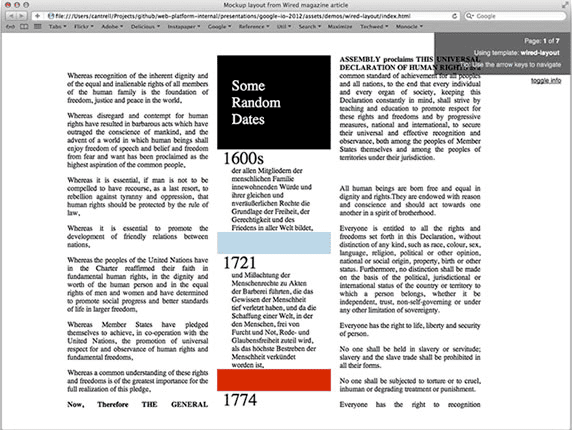
Note that the article text -- the text in the left- and right-hand columns -- is English, and the timeline in the center is German. Additionally, the document pages horizontally without the need for any JavaScript code. Everything was done entirely declaratively in CSS.
CSS Page Templates are still a proposal, however we have a prototype which uses a JavaScript "shim" (a.k.a polyfill) in order to allow you to experiment with them now.
To learn more about CSS Regions in general, check out the CSS Regions page on html.adobe.com.
CSS Exclusions
In order to achieve true magazine-like layout, it's not enough to be able to flow text through regions. A critical element of high-quality and visually interesting desktop publishing is the ability to make text flow either around or inside of irregular graphics and shapes. CSS Exclusions is bringing this level of production quality to the web.
The screenshot below is from a CSS Exclusions prototype, and shows text dynamically flowing around a path that matches the contour of a large rock formation:

The inverse is illustrated in the next screenshot: text flowing inside of irregularly shaped polygons:
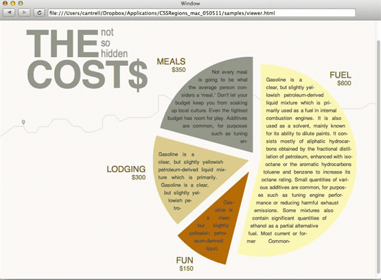
The first step to being able to flow text around or inside of arbitrary shapes is to develop and optimize the required algorithms. Adobe is currently working on implementations which will be contributed directly to WebKit. Once these algorithms have been optimized, they will become the foundations on top of which the remainder of CSS Exclusions are built.
For more information on CSS Exclusions, see the CSS Exclusions page on html.adobe.com, and for a more detailed look at Adobe's work on the underlying technology for CSS Exclusions, see Hans Muller's blog post entitled Horizontal Box: Polygon Intersection for CSS Exclusions.
The Current State of CSS Regions and CSS Exclusions
The first time I talked about CSS Regions and CSS Exclusions publicly was at the Adobe Developer Pod at Google I/O 2011. At the time, I was showing demos in our own custom prototype browser. The reception was extremely enthusiastic, however there was a palpable sense of disappointment when onlookers discovered that none of the functionality I was showing was available in any of the major browsers yet.
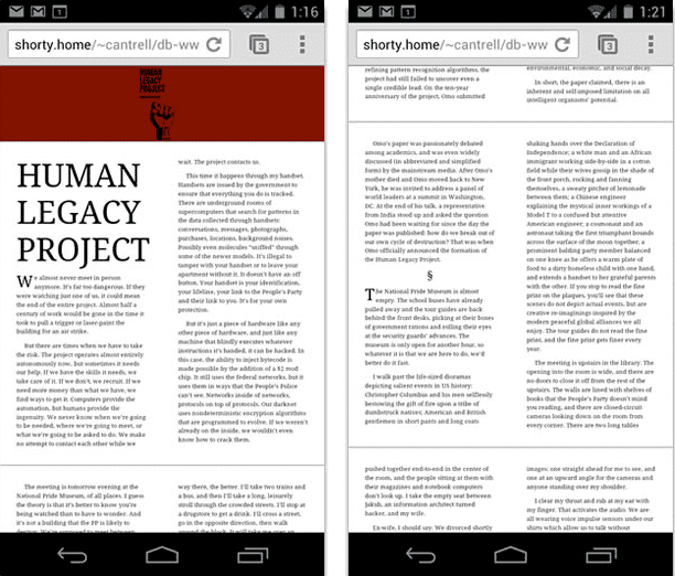
I was at Google I/O again this year (2012), this time as a presenter along with my coworker Vincent Hardy and Alex Danilo from Google (you can watch the presentation here). Just one year later, about 80% of the CSS Regions specification has been implemented in WebKit, and is already in the most recent version of Google Chrome (note that CSS Regions currently has to be enabled through chrome://flags). Preliminary support for CSS Regions has even landed in Chrome for Android:
Additionally, both CSS Regions and CSS Exclusions are implemented in the Internet Explorer 10 preview, and are currently on Mozilla's 2012 roadmap for Firefox. The next major version of Safari should support the majority of the CSS Regions specification, and subsequent updates should include the remainder.
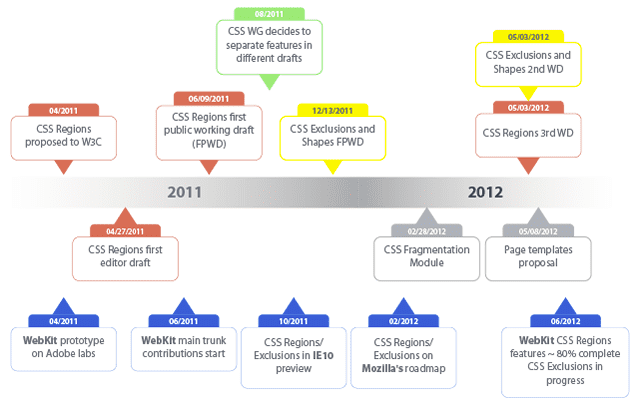
Below is a detailed timeline of the progress we've made with CSS Regions and CSS Exclusions since our initial proposal to the W3C in April of 2011:
Conclusion
Adobe has a huge amount of experience with text, fonts, and with desktop publishing in general through tools like InDesign. Although the web is already a very powerful platform for text, we want to use our knowledge and experience to push text presentation even further. CSS Regions and CSS Exclusions are allowing content to remain semantically structured while also enabling true magazine-like layout, and ultimately a much more expressive web.

