You've properly prepared a video file for the web. You've given it correct dimensions and the correct resolution. You've even created separate WebM and MP4 files for different browsers.
For anyone to see your video, you still need to add it to a web page. Doing so
properly requires adding two HTML elements: the <video> element and the
<source> element. In addition to basics about these tags, this
article explains attributes you should add to those tags to craft a good
user experience.
Specify a single file
Although it's not recommended, you can use the video element by itself. Always
use the type attribute as shown below. The browser uses this to determine if
it can play the provided video file. If it can't, the enclosed text displays.
<video src="chrome.webm" type="video/webm">
    <p>Your browser cannot play the provided video file.</p>
</video>
Specify multiple file formats
Recall from Media file basics that not all browsers support the same video
formats. The <source> element lets you specify multiple formats as a fallback
in case the user's browser doesn't support one of them.
The example below produces the embedded video that is used as an example later in this article.
<video controls>
  <source src="chrome.webm" type="video/webm">
  <source src="chrome.mp4" type="video/mp4">
  <p>Your browser cannot play the provided video file.</p>
</video>
You should always add a type attribute to the <source> tags event though it
is optional. This ensures that the browser only downloads the file that it is
capable of playing.
This approach has several advantages over serving different HTML or server-side scripting, especially on mobile:
- You can list formats in order of preference.
- Client-side switching reduces latency; only one request is made to get content.
- Letting the browser choose a format is simpler, quicker, and potentially more reliable than using a server-side support database with user-agent detection.
- Specifying each file source's type improves network performance; the browser can select a video source without having to download part of the video to "sniff" the format.
These issues are especially important in mobile contexts, where bandwidth and
latency are at a premium, and the user's patience is likely limited. Omitting
the type attribute can affect performance when there are multiple sources
with unsupported types.
There are a few ways you can dig into the details. Check out A Digital Media Primer for Geeks to find out more about how video and audio work on the web. You can also use remote debugging in DevTools to compare network activity with type attributes and without type attributes.
Specify start and end times
Save bandwidth and make your site feel more responsive: use media fragments to add start and end times to the video element.
To use a media fragment, add #t=[start_time][,end_time] to the media URL. For
example, to play the video from seconds 5 to 10, specify:
<source src="chrome.webm#t=5,10" type="video/webm">
You can also specify the times in <hours>:<minutes>:<seconds>. For example,
#t=00:01:05 starts the video at one minute, five seconds. To play only the
first minute of video, specify #t=,00:01:00.
You can use this feature to deliver multiple views on the same video—like cue points in a DVD–without having to encode and serve multiple files.
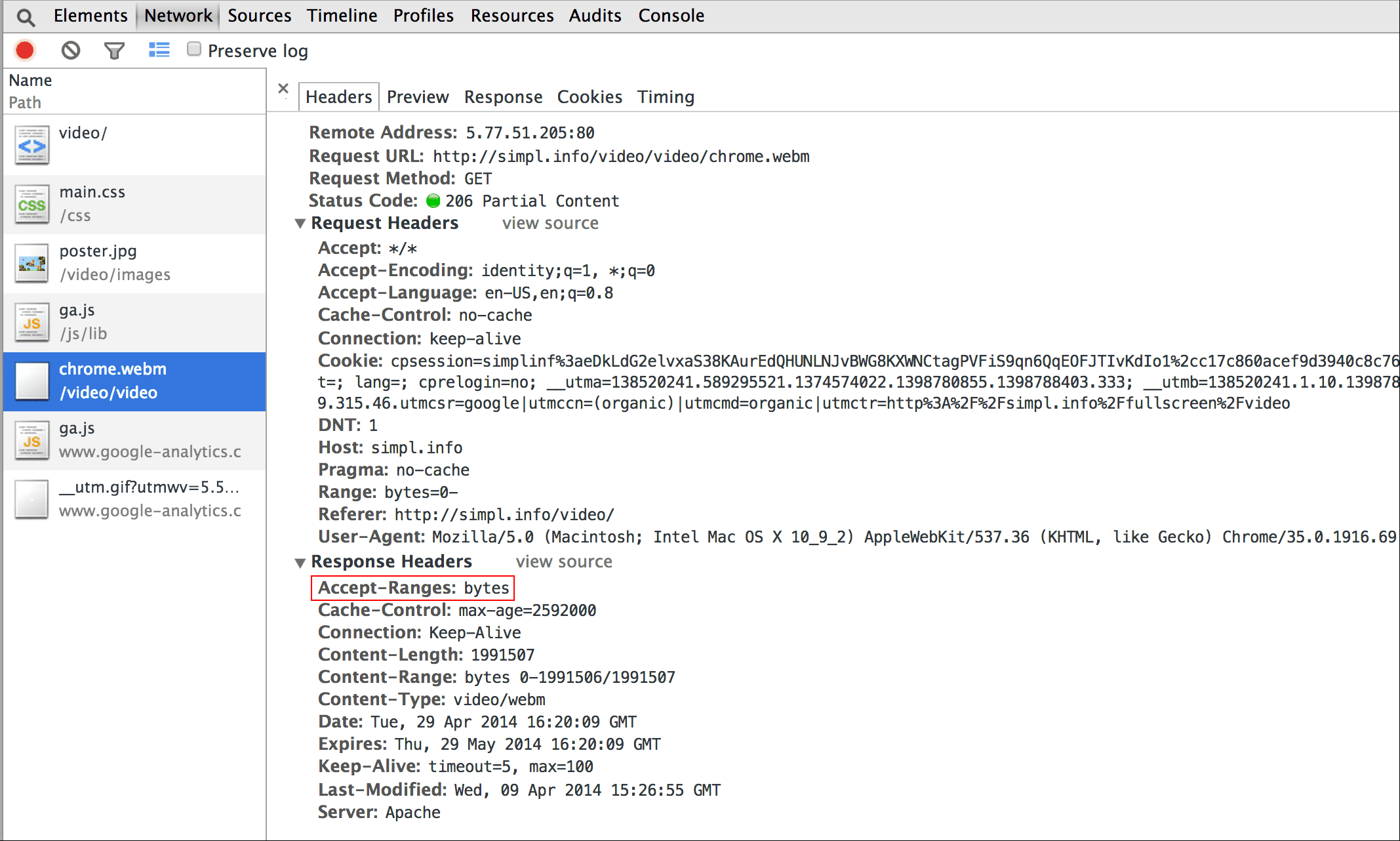
For this feature to work, your server must support range requests and that capability must be enabled. Most servers enable range requests by default. Because some hosting services turn them off, you should confirm that range requests are available for using fragments on your site.
Fortunately, you can do this in your browser developer tools. In Chrome, for
instance, it's in the Network panel. Look for the Accept-Ranges header and
verify that it says bytes. In the image, I've drawn a red box around this
header. If you do not see bytes as the value, you'll need to contact your
hosting provider.

Include a poster image
Add a poster attribute to the video element so that viewers have an idea of
the content as soon as the element loads, without needing to download the video
or start playback.
<video poster="poster.jpg" ...>
  …
</video>
A poster can also be a fallback if the video src is broken or if none of the
supplied video formats are supported. The only downside to a poster images is an
additional file request, which consumes some bandwidth and requires rendering.
For more information see Efficiently encode images.


Ensure videos don't overflow containers
When video elements are too big for the viewport, they may overflow their container, making it impossible for the user to see the content or use the controls.


You can control video dimensions using CSS. If CSS does not meet all of your needs, JavaScript libraries and plugins such as FitVids can help, even for videos from YouTube and other sources. Unfortunately, these resources can increase your network payload sizes with negative consequences for your revenues and your users' wallets.
For simple uses like the ones I'm describing here, use CSS media queries to
specify the size of elements depending on the viewport dimensions; max-width:
100% is your friend.
For media content in iframes (such as YouTube videos), try a responsive approach (like the one proposed by John Surdakowski).
CSS
.video-container {
    position: relative;
    padding-bottom: 56.25%;
    padding-top: 0;
    height: 0;
    overflow: hidden;
}

.video-container iframe,
.video-container object,
.video-container embed {
    position: absolute;
    top: 0;
    left: 0;
    width: 100%;
    height: 100%;
}
HTML
<div class="video-container">
  <iframe
    src="//www.youtube.com/embed/l-BA9Ee2XuM"
    frameborder="0"
    width="560"
    height="315"
  ></iframe>
</div>
Compare the responsive sample to the unresponsive version. As you can see, the unresponsive version isn't a great user experience.
Device orientation
Device orientation isn't an issue for desktop monitors or laptops, but it's hugely important when considering web page design for mobile devices and tablets.
Safari on iPhone does a good job of switching between portrait and landscape orientation:


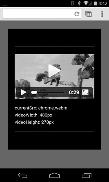
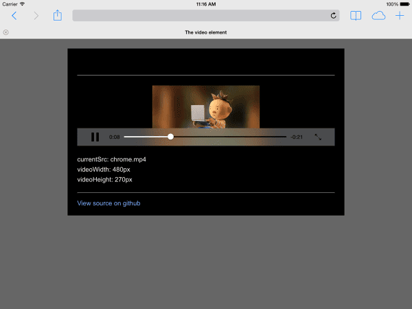
Device orientation on an iPad and Chrome on Android can be problematic. For example, without any customization a video playing on an iPad in landscape orientation looks like this:

Setting the video width: 100% or max-width: 100% with CSS can resolve
many device orientation layout problems.
Autoplay
The autoplay attribute controls whether the browser downloads and plays a
video immediately. The precise way it works depends on the platform and browser.
Chrome: Depends on multiple factors including but not limited to whether the viewing is on desktop and whether the mobile user has added your site or app to their homescreen. For details, see Autoplay best practices.
Firefox: Blocks all video and sound, but gives users the ability to relax these restrictions for either all sites or particular sites. For details, see Allow or block media autoplay in Firefox
Safari: Has historically required a user gesture, but has been relaxing that requirement in recent versions. For details, see New <video> Policies for iOS.
Even on platforms where autoplay is possible, you need to consider whether it's a good idea to enable it:
- Data usage can be expensive.
- Playing media before the user wants it can hog bandwidth and CPU, and thereby delay page rendering.
- Users may be in a context where playing video or audio is intrusive.
Preload
The preload attribute provides a hint to the browser as to how much
information or content to preload.
| Value | Description |
|---|---|
none |
The user might chose not to watch the video, so don't preload anything. |
metadata |
Metadata (duration, dimensions, text tracks) should be preloaded, but with minimal video. |
auto |
Downloading the entire video right away is considered desirable. An empty string produces the same result. |
The preload attribute has different effects on different platforms.
For example, Chrome buffers 25 seconds of video on desktop but none on iOS or
Android. This means that on mobile, there may be playback startup delays
that don't happen on desktop. See Fast playback with audio and video preload or
Steve Souders' blog for more details.
Now that you know how to add media to your web page it's time to learn about Media accessibility where you will add captions to your video for hearing impaired, or when playing the audio is not a viable option.


