

How can you design a form that works well for a variety of names and address formats? Minor form glitches irritate users and can cause them to leave your site or give up on completing a purchase or sign-up.
This codelab shows you how to build an easy-to-use, accessible form that works well for most users.
Step 1: Make the most of HTML elements and attributes
You'll start this part of the codelab with an empty form, just a heading and a button all on their own.
Then you'll begin adding inputs. (CSS and a little bit of JavaScript are already included.)
Click EDIT ON CODEPEN to edit the project.
Add a name field to your
<form>element with the following code:
<section>
  <label for="name">Name</label>
  <input id="name" name="name">
</section>
That may look complicated and repetitive for just one name field, but it already does a lot.
You associated the label with the input by matching the label's for attribute with the
input's name or id. A tap or click on a label moves focus to its input, making a much bigger
target than the input on its own—which is good for fingers, thumbs and mouse clicks! Screenreaders
announce label text when the label or the label's input gets focus.
What about name="name"? This is the name (which happens to be 'name'!) associated with the data
from this input which is sent to the server when the form is submitted. Including a name attribute
also means that the data from this element can be accessed by the FormData API.
Step 2: Add attributes to help users enter data
What happens when you tap or click in the Name input in Chrome? You should see autofill
suggestions that the browser has stored and guesses are appropriate for this input, given its
name and id values.
Now add autocomplete="name" to your input code so it looks like this:
<section>
  <label for="name">Name</label>
  <input id="name" name="name" autocomplete="name">
</section>
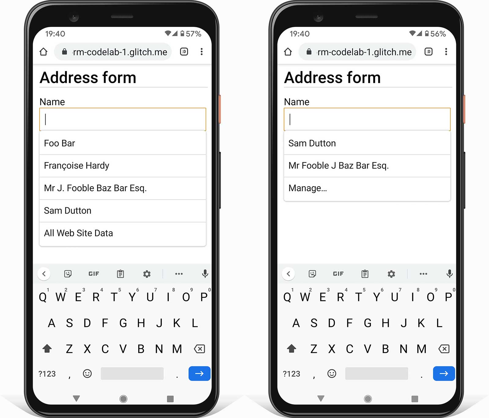
Reload the page in Chrome and tap or click in the Name input. What differences do you see?
You should notice a subtle change: with autocomplete="name", the suggestions are now specific
values that were used previously in form inputs that also had autocomplete="name". The browser
isn't just guessing what might be appropriate: you have control. You'll also see the Manage…
option to view and edit the names and addresses stored by your browser.
Now add constraint validation attributes
maxlength, pattern and required so your input code looks like this:
<section>
  <label for="name">Name</label>
  <input id="name" name="name" autocomplete="name"
    maxlength="100" pattern="[\p{L} \-\.]+" required>
</section>
maxlength="100"means the browser won't allow any input longer than 100 characters.pattern="[\p{L} \-\.]+"uses a regular expression that allows Unicode letter characters, hyphens and periods (full stops). That means names such as Françoise or Jörg aren't classed as 'invalid'. That isn't the case if you use the value\wwhich [only allows characters from the Latin alphabet.requiredmeans… required! The browser won't allow the form to be submitted without data for this field, and will warn and highlight the input if you attempt to submit it. No extra code required!
To test how the form works with and without these attributes, try entering data:
- Try entering values that don't fit the
patternattribute. - Try submitting the form with an empty input. You'll see built-in browser functionality warning of the empty required field and setting focus on it.
Step 3: Add a flexible address field to your form
To add an address field, add the following code to your form:
<section>
  <label for="address">Address</label>
  <textarea id="address" name="address" autocomplete="address"
    maxlength="300" required></textarea>
</section>
A textarea is the most flexible way for your users to enter their address, and it's great for
cutting and pasting.
You should avoid splitting your address form into components such as street name and number unless you really need to. Don't force users to try to fit their address into fields that don't make sense.
Now add fields for ZIP or postal code, and Country or region. For simplicity, only the first five countries are included here. A full list is included in the completed address form.
<section>
  <label for="postal-code">ZIP or postal code (optional)</label>
  <input id="postal-code" name="postal-code"
    autocomplete="postal-code" maxlength="20">
</section>

<section id="country-region">
  <label for="">Country or region</label>
  <select id="country" name="country" autocomplete="country"
    required>
      <option selected value="SPACER"> </option>
      <option value="AF">Afghanistan</option>
      <option value="AX">Åland Islands</option>
      <option value="AL">Albania</option>
      <option value="DZ">Algeria</option>
      <option value="AS">American Samoa</option>
  </select>
</section>
You'll see that Postal code is optional: that's because many countries don't use postal codes.
(Global Sourcebook provides information about
address formats for 194 different countries, including sample addresses.) The label Country or
region is used instead of Country, because some options from the full list (such as the
United Kingdom) are not single countries (despite the autocomplete value).
Step 4: Enable customers to easily enter shipping and billing addresses
You've built a highly functional address form, but what if your site requires more than one
address, for shipping and billing, for example? Try updating your form to enable customers to enter
shipping and billing addresses. How can you make data entry as quick and easy as possible,
especially if the two addresses are the same? The article that goes with this codelab explains
techniques for handling multiple addresses.
Whatever you do, make sure to use the correct autocomplete values!
Step 5: Add a telephone number field
To add a telephone number input, add the following code to the form:
<section>
  <label for="tel">Telephone</label>
  <input id="tel" name="tel" autocomplete="tel" type="tel"
    maxlength="30" pattern="[\d \-\+]+" enterkeyhint="done"
    required>
</section>
For phone numbers use a single input: don't split the number into parts. That makes it easier for users to enter data or copy and paste, makes validation simpler, and enables browsers to autofill.
There are two attributes that can improve the user experience of entering a telephone number:
type="tel"ensures mobile users get the right keyboard.enterkeyhint="done"sets the mobile keyboard enter key label to show that this is the last field and the form can now be submitted (the default isnext).

Your complete address form should now look like this:
- Try out your form on different devices. What devices and browsers are you targeting? How could the form be improved?
There are several ways to test your form on different devices:
- Use Chrome DevTools Device Mode to simulate mobile devices.
- Send the URL from your computer to your phone.
- Use a service such as BrowserStack to test on a range of devices and browsers.
Learn more
Analytics and Real User Monitoring: enable the performance and usability of your form design to be tested and monitored for real users, and to check if changes are successful. You should monitor load performance and other Web Vitals, as well as page analytics (what proportion of users bounce from your address form without completing it? how long do users spend on your address form pages?) and interaction analytics (which page components do users interact with, or not?)
Where are your users located? How do they format their address? What names do they use for address components, such as ZIP or postal code? Frank's Compulsive Guide to Postal Addresses provides useful links and extensive guidance detailing address formats in over 200 countries.
Country selectors are notorious for poor usability. It's best to avoid select elements for a long list of items and the ISO 3166 country-code standard currently lists 249 countries! Instead of a
<select>you may want to consider an alternative such as the Baymard Institute country selector.Can you design a better selector for lists with a lot of items? How would you ensure your design is accessible across a range of devices and platforms? (The
<select>element doesn't work well for a large number of items, but at least it's usable on virtually all browsers and assistive devices!)The blog post <input type="country" /> discusses the complexity of standardizing a country selector. Localization of country names can also be problematic. Countries Lists has a tool for downloading country codes and names in multiple languages, in multiple formats.