
How many pixels are there really in a canvas?

Since Chrome 84, ResizeObserver supports a new box measurement called devicePixelContentBox, that measures the element's dimension in physical pixels. This enables rendering pixel-perfect graphics, especially in the context of high-density screens.
' d='M96 183a64 64 0 0 1-23-23L17 64a128 128 0 0 0 111 192l55-96a64 64 0 0 1-87 23Z'/%3E%3Cpath fill='url(%23b)' d='M192 128a64 64 0 0 1-9 32l-55 96A128 128 0 0 0 239 64H128a64 64 0 0 1 64 64Z'/%3E%3Ccircle cx='128' cy='128' r='52' fill='%231a73e8'/%3E%3Cpath fill='url(%23c)' d='M96 73a64 64 0 0 1 32-9h111a128 128 0 0 0-222 0l56 96a64 64 0 0 1 23-87Z'/%3E%3C/svg%3E)
' xlink:href='%23A'%3E%3Cstop offset='.76' stop-opacity='0'/%3E%3Cstop offset='.95' stop-opacity='.5'/%3E%3Cstop offset='1'/%3E%3C/radialGradient%3E%3CradialGradient id='F' cx='2523' cy='4680' r='20243' gradientTransform='matrix(-.03715 .99931 -2.12836 -.07913 13579 3530)' xlink:href='%23A'%3E%3Cstop offset='0' stop-color='%2335c1f1'/%3E%3Cstop offset='.11' stop-color='%2334c1ed'/%3E%3Cstop offset='.23' stop-color='%232fc2df'/%3E%3Cstop offset='.31' stop-color='%232bc3d2'/%3E%3Cstop offset='.67' stop-color='%2336c752'/%3E%3C/radialGradient%3E%3CradialGradient id='G' cx='24247' cy='7758' r='9734' gradientTransform='matrix(.28109 .95968 -.78353 .22949 24510 -16292)' xlink:href='%23A'%3E%3Cstop offset='0' stop-color='%2366eb6e'/%3E%3Cstop offset='1' stop-color='%2366eb6e' stop-opacity='0'/%3E%3C/radialGradient%3E%3Cpath id='H' d='M24105 20053a9345 9345 0 01-1053 472 10202 10202 0 01-3590 646c-4732 0-8855-3255-8855-7432 0-1175 680-2193 1643-2729-4280 180-5380 4640-5380 7253 0 7387 6810 8137 8276 8137 791 0 1984-230 2704-456l130-44a12834 12834 0 006660-5282c220-350-168-757-535-565z'/%3E%3Cpath id='I' d='M11571 25141a7913 7913 0 01-2273-2137 8145 8145 0 01-1514-4740 8093 8093 0 013093-6395 8082 8082 0 011373-859c312-148 846-414 1554-404a3236 3236 0 012569 1297 3184 3184 0 01636 1866c0-21 2446-7960-8005-7960-4390 0-8004 4166-8004 7820 0 2319 538 4170 1212 5604a12833 12833 0 007684 6757 12795 12795 0 003908 610c1414 0 2774-233 4045-656a7575 7575 0 01-6278-803z'/%3E%3Cpath id='J' d='M16231 15886c-80 105-330 250-330 566 0 260 170 512 472 723 1438 1003 4149 868 4156 868a5954 5954 0 003027-839 6147 6147 0 001133-850 6180 6180 0 001910-4437c26-2242-796-3732-1133-4392-2120-4141-6694-6525-11668-6525-7011 0-12703 5635-12798 12620 47-3654 3679-6605 7996-6605 350 0 2346 34 4200 1007 1634 858 2490 1894 3086 2921 618 1067 728 2415 728 2952s-271 1333-780 1990z'/%3E%3Cuse fill='url(%23B)' xlink:href='%23H'/%3E%3Cuse fill='url(%23D)' opacity='.35' xlink:href='%23H'/%3E%3Cuse fill='url(%23C)' xlink:href='%23I'/%3E%3Cuse fill='url(%23E)' opacity='.4' xlink:href='%23I'/%3E%3Cuse fill='url(%23F)' xlink:href='%23J'/%3E%3Cuse fill='url(%23G)' xlink:href='%23J'/%3E%3C/svg%3E)
' gradientUnits='userSpaceOnUse'%3E%3Cstop offset='.2' stop-color='%239059ff' stop-opacity='0'/%3E%3Cstop offset='.3' stop-color='%238c4ff3' stop-opacity='.1'/%3E%3Cstop offset='.8' stop-color='%237716a8' stop-opacity='.5'/%3E%3Cstop offset='1' stop-color='%236e008b' stop-opacity='.6'/%3E%3C/radialGradient%3E%3CradialGradient id='ff-g' cx='239.1' cy='34.6' r='171.6' gradientUnits='userSpaceOnUse'%3E%3Cstop offset='0' stop-color='%23ffe226'/%3E%3Cstop offset='.1' stop-color='%23ffdb27'/%3E%3Cstop offset='.3' stop-color='%23ffc82a'/%3E%3Cstop offset='.5' stop-color='%23ffa930'/%3E%3Cstop offset='.7' stop-color='%23ff7e37'/%3E%3Cstop offset='.8' stop-color='%23ff7139'/%3E%3C/radialGradient%3E%3CradialGradient id='ff-h' cx='374' cy='-74.3' r='732.2' gradientUnits='userSpaceOnUse'%3E%3Cstop offset='.1' stop-color='%23fff44f'/%3E%3Cstop offset='.5' stop-color='%23ff980e'/%3E%3Cstop offset='.6' stop-color='%23ff5634'/%3E%3Cstop offset='.7' stop-color='%23ff3647'/%3E%3Cstop offset='.9' stop-color='%23e31587'/%3E%3C/radialGradient%3E%3CradialGradient id='ff-i' cx='304.6' cy='7.1' r='536.4' gradientTransform='rotate(84 303 4)' gradientUnits='userSpaceOnUse'%3E%3Cstop offset='0' stop-color='%23fff44f'/%3E%3Cstop offset='.1' stop-color='%23ffe847'/%3E%3Cstop offset='.2' stop-color='%23ffc830'/%3E%3Cstop offset='.3' stop-color='%23ff980e'/%3E%3Cstop offset='.4' stop-color='%23ff8b16'/%3E%3Cstop offset='.5' stop-color='%23ff672a'/%3E%3Cstop offset='.6' stop-color='%23ff3647'/%3E%3Cstop offset='.7' stop-color='%23e31587'/%3E%3C/radialGradient%3E%3CradialGradient id='ff-j' cx='235' cy='98.1' r='457.1' gradientUnits='userSpaceOnUse'%3E%3Cstop offset='.1' stop-color='%23fff44f'/%3E%3Cstop offset='.5' stop-color='%23ff980e'/%3E%3Cstop offset='.6' stop-color='%23ff5634'/%3E%3Cstop offset='.7' stop-color='%23ff3647'/%3E%3Cstop offset='.9' stop-color='%23e31587'/%3E%3C/radialGradient%3E%3CradialGradient id='ff-k' cx='355.7' cy='124.9' r='500.3' gradientUnits='userSpaceOnUse'%3E%3Cstop offset='.1' stop-color='%23fff44f'/%3E%3Cstop offset='.2' stop-color='%23ffe141'/%3E%3Cstop offset='.5' stop-color='%23ffaf1e'/%3E%3Cstop offset='.6' stop-color='%23ff980e'/%3E%3C/radialGradient%3E%3ClinearGradient id='ff-a' x1='446.9' y1='76.8' x2='47.9' y2='461.8' gradientUnits='userSpaceOnUse'%3E%3Cstop offset='.1' stop-color='%23fff44f'/%3E%3Cstop offset='.1' stop-color='%23ffe847'/%3E%3Cstop offset='.2' stop-color='%23ffc830'/%3E%3Cstop offset='.4' stop-color='%23ff980e'/%3E%3Cstop offset='.4' stop-color='%23ff8b16'/%3E%3Cstop offset='.5' stop-color='%23ff672a'/%3E%3Cstop offset='.5' stop-color='%23ff3647'/%3E%3Cstop offset='.7' stop-color='%23e31587'/%3E%3C/linearGradient%3E%3ClinearGradient id='ff-l' x1='442.1' y1='74.8' x2='102.6' y2='414.3' gradientUnits='userSpaceOnUse'%3E%3Cstop offset='.2' stop-color='%23fff44f' stop-opacity='.8'/%3E%3Cstop offset='.3' stop-color='%23fff44f' stop-opacity='.6'/%3E%3Cstop offset='.5' stop-color='%23fff44f' stop-opacity='.2'/%3E%3Cstop offset='.6' stop-color='%23fff44f' stop-opacity='0'/%3E%3C/linearGradient%3E%3C/defs%3E%3Cpath d='M479 166c-11-25-32-52-49-60a249 249 0 0 1 25 73c-27-68-73-95-111-155a255 255 0 0 1-8-14 44 44 0 0 1-4-9 1 1 0 0 0 0-1 1 1 0 0 0-1 0c-60 35-81 101-83 134a120 120 0 0 0-66 25 71 71 0 0 0-6-5 111 111 0 0 1-1-58c-25 11-44 29-58 44-9-12-9-52-8-60l-8 4a175 175 0 0 0-24 21 210 210 0 0 0-22 26 203 203 0 0 0-32 73l-1 2-2 15a229 229 0 0 0-4 34v1a240 240 0 0 0 477 40l1-9c5-41 0-84-15-121zM202 355l3 1-3-1zm55-145zm198-31z' fill='url(%23ff-a)'/%3E%3Cpath d='M479 166c-11-25-32-52-49-60 14 26 22 53 25 72v1a207 207 0 0 1-206 279c-113-3-212-87-231-197-3-17 0-26 2-40-2 11-3 14-4 34v1a240 240 0 0 0 477 40l1-9c5-41 0-84-15-121z' fill='url(%23ff-b)'/%3E%3Cpath d='M479 166c-11-25-32-52-49-60 14 26 22 53 25 72v1a207 207 0 0 1-206 279c-113-3-212-87-231-197-3-17 0-26 2-40-2 11-3 14-4 34v1a240 240 0 0 0 477 40l1-9c5-41 0-84-15-121z' fill='url(%23ff-c)'/%3E%3Cpath d='m362 195 1 1a130 130 0 0 0-22-29C266 92 322 5 331 0c-60 35-81 101-83 134l9-1c45 0 84 25 105 62z' fill='url(%23ff-d)'/%3E%3Cpath d='M257 210c-1 6-22 26-29 26-68 0-80 41-80 41 3 35 28 64 57 79l4 2 7 3a107 107 0 0 0 31 6c120 6 143-143 57-186 22-4 45 5 58 14-21-37-60-62-105-62l-9 1a120 120 0 0 0-66 25l17 16c16 16 58 33 58 35z' fill='url(%23ff-e)'/%3E%3Cpath d='M257 210c-1 6-22 26-29 26-68 0-80 41-80 41 3 35 28 64 57 79l4 2 7 3a107 107 0 0 0 31 6c120 6 143-143 57-186 22-4 45 5 58 14-21-37-60-62-105-62l-9 1a120 120 0 0 0-66 25l17 16c16 16 58 33 58 35z' fill='url(%23ff-f)'/%3E%3Cpath d='m171 151 5 3a111 111 0 0 1-1-58c-25 11-44 29-58 44 1 0 36 0 54 11z' fill='url(%23ff-g)'/%3E%3Cpath d='M18 261a242 242 0 0 0 231 197 207 207 0 0 0 206-279c8 56-20 110-64 146-86 71-169 43-186 31l-3-1c-50-24-71-70-67-110-42 0-57-35-57-35s38-28 89-4c46 22 90 4 90 4 0-2-42-19-58-35l-17-16a71 71 0 0 0-6-5l-5-3c-18-11-52-11-54-11-9-12-9-51-8-60l-8 4a175 175 0 0 0-24 21 210 210 0 0 0-22 26 203 203 0 0 0-32 73c0 1-9 38-5 57z' fill='url(%23ff-h)'/%3E%3Cpath d='M341 167a130 130 0 0 1 22 29 46 46 0 0 1 4 3c55 50 26 121 24 126 44-36 72-90 64-146-27-68-73-95-111-155a255 255 0 0 1-8-14 44 44 0 0 1-4-9 1 1 0 0 0 0-1 1 1 0 0 0-1 0c-9 5-65 92 10 167z' fill='url(%23ff-i)'/%3E%3Cpath d='M367 199a46 46 0 0 0-4-3l-1-1c-13-9-36-18-58-15 86 44 63 193-57 187a107 107 0 0 1-31-6 131 131 0 0 1-11-5c17 12 99 39 186-31 2-5 31-76-24-126z' fill='url(%23ff-j)'/%3E%3Cpath d='M148 277s12-41 80-41c7 0 28-20 29-26s-44 18-90-4c-51-24-89 4-89 4s15 35 57 35c-4 40 16 85 67 110l3 1c-29-15-54-44-57-79z' fill='url(%23ff-k)'/%3E%3Cpath d='M479 166c-11-25-32-52-49-60a249 249 0 0 1 25 73c-27-68-73-95-111-155a255 255 0 0 1-8-14 44 44 0 0 1-4-9 1 1 0 0 0 0-1 1 1 0 0 0-1 0c-60 35-81 101-83 134l9-1c45 0 84 25 105 62-13-9-36-18-58-14 86 43 63 192-57 186a107 107 0 0 1-31-6 131 131 0 0 1-11-5l-3-1 3 1c-29-15-54-44-57-79 0 0 12-41 80-41 7 0 28-20 29-26 0-2-42-19-58-35l-17-16a71 71 0 0 0-6-5 111 111 0 0 1-1-58c-25 11-44 29-58 44-9-12-9-52-8-60l-8 4a175 175 0 0 0-24 21 210 210 0 0 0-22 26 203 203 0 0 0-32 73l-1 2-2 15a279 279 0 0 0-4 34v1a240 240 0 0 0 477 40l1-9c5-41 0-84-15-121zm-24 13z' fill='url(%23ff-l)'/%3E%3C/svg%3E)
' xlink:href='%23s-b'%3E%3Cstop offset='0' stop-color='%2324a5f3' stop-opacity='0' /%3E%3Cstop offset='1' stop-color='%231e8ceb' /%3E%3C/radialGradient%3E%3CradialGradient id='s-j' cx='109.3' cy='13.8' r='93.1' gradientTransform='matrix(-.02 1.1 -1.04 -.02 137 -115)' xlink:href='%23s-b'%3E%3Cstop offset='0' stop-opacity='0' /%3E%3Cstop offset='1' stop-color='%235488d6' stop-opacity='0' /%3E%3Cstop offset='1' stop-color='%235d96eb' /%3E%3C/radialGradient%3E%3C/defs%3E%3Crect width='220' height='220' x='22' y='-107' fill='url(%23s-a)' ry='49' transform='matrix(.57 0 0 .57 187 256)' /%3E%3Cg transform='translate(194 190)'%3E%3Ccircle cx='67.8' cy='67.7' fill='url(%23s-c)' paint-order='stroke fill markers' r='54' /%3E%3Ccircle cx='-69.9' cy='69.3' fill='url(%23s-i)' transform='translate(138 -2)' r='54' /%3E%3C/g%3E%3Cellipse cx='120' cy='14.2' fill='url(%23s-j)' rx='93.1' ry='93.7' transform='matrix(.58 0 0 .58 192 250)' /%3E%3Cg transform='matrix(.58 0 0 .57 197 182)'%3E%3Cpath fill='%23cac7c8' d='M46 192h1l72-48-7-9-66 57Z' /%3E%3Cpath fill='%23fbfffc' d='M46 191v1l66-57-7-9-59 65Z' /%3E%3Cpath fill='url(%23s-d)' d='m119 144-7-9 66-57-59 66Z' /%3E%3Cpath fill='%23fb645c' d='m105 126 7 9 66-57-1-1-72 49Z' /%3E%3C/g%3E%3Cpath stroke='%23fff' stroke-linecap='round' stroke-miterlimit='1' stroke-width='1.3' d='m287 278 3-2m-12-17 8-2m-8-3h4m-4-13 8 2m-8 3h4m-1-13 7 3m-4-11 7 4m-2-11 6 6m0-12 6 7m1-11 4 6m4-10 3 7m5-9 2 7m15-7-1 7m10-5-3 7m11-4-4 7m11-2-5 6m16 7-7 4m10 4-7 3m10 6-8 1m8 16-8-2m5 10-7-3m4 11-7-4m2 11-6-5m0 11-5-6m-2 11-4-7m-4 11-3-8m-6 10-1-8m-16 8 2-8m-10 5 3-7m-11 4 4-7m-11 2 5-6m-8 3 3-3m4 8 2-3m5 8 2-4m6 7 1-4m8 5v-4m8 4v-4m9 3-1-4m9 1-2-4m9 0-2-4m9-2-3-3m8-4-3-2m8-5-4-2m7-6-4-1m5-8h-4m4-8h-4m3-9-4 1m1-9-4 2m-1-9-3 2m-2-9-3 3m-4-8-2 3m-5-8-2 4m-6-6-1 3m-8-5v4m-8-4v4m-9-2 1 3m-9 0 2 3m-9 1 2 3m-9 2 3 3m-8 4 3 2m-8 5 4 2m-7 6 4 1m-4 25 4-1m-2 5 7-3m-6 7 4-2m-2 6 7-4m-13-21h8m41-41v-8m0 99v-8m49-42h-8' transform='translate(-65 8)' /%3E%3C/svg%3E)
Background: CSS pixels, canvas pixels, and physical pixels
While we often work with abstract units of length like em, % or vh, it all boils down to pixels. Whenever we specify the size or position of an element in CSS, the browser's layout engine will eventually convert that value to pixels (px). These are "CSS Pixels", which have a lot of history and only have a loose relationship with the pixels you have on your screen.
For a long time, it was fairly reasonable to estimate anyone's screen pixel density with 96DPI ("dots per inch"), meaning any given monitor would have roughly 38 pixels per cm. Over time, monitors grew and/or shrunk or started to have more pixels on the same surface area. Combine that with the fact that lots of content on the web define their dimensions, including font sizes, in px, and we end up with illegible text on these high-density ("HiDPI") screens. As a counter-measure, browsers hide the monitor's actual pixel density and instead pretend that the user has a 96 DPI display. The px unit in CSS represents the size of one pixel on this virtual 96 DPI display, hence the name "CSS Pixel". This unit is only used for measurement and positioning. Before any actual rendering happens, a conversion to physical pixels happens.
How do we go from this virtual display to the user's real display? Enter devicePixelRatio. This global value tells you how many physical pixels you need to form a single CSS pixel. If devicePixelRatio (dPR) is 1, you are working on a monitor with roughly 96DPI. If you have a retina screen, your dPR is probably 2. On phones it is not uncommon to encounter higher (and weirder) dPR values like 2, 3 or even 2.65. It is essential to note that this value is exact, but doesn't let you derive the monitor's actual DPI value. A dPR of 2 means that 1 CSS pixel will map to exactly 2 physical pixels.
1 according to Chrome…It has 3440 pixels in width and the display area is 79cm wide.
That leads to a resolution of 110 DPI. Close to 96, but not quite.
That is also the reason why a <div style="width: 1cm; height: 1cm">
will not exactly measure 1cm in size on most displays.
Finally, dPR can also be affected by your browser's zoom feature. If you zoom in, the browser increases the reported dPR, causing everything to render bigger. If you check devicePixelRatio in a DevTools Console while zooming, you can see fractional values appear.

devicePixelRatio due to zooming.Let's add the <canvas> element to the mix. You can specify how many pixels you want the canvas to have using the width and height attributes. So <canvas width=40 height=30> would be a canvas with 40 by 30 pixels. However, this does not mean that it will be displayed at 40 by 30 pixels. By default, the canvas will use the width and height attribute to define its intrinsic size, but you can arbitrarily resize the canvas using all the CSS properties you know and love. With everything we have learned so far, it might occur to you that this will not be ideal in every scenario. One pixel on the canvas might end up covering multiple physical pixels, or just a fraction of a physical pixel. This can lead to unpleasing visual artifacts.
To summarize: Canvas elements have a given size to define the area that you can draw on. The number of canvas pixels is completely independent from the canvas' display size, specified in CSS pixels. The number of CSS pixels is not the same as the number of physical pixels.
Pixel perfection
In some scenarios, it is desirable to have an exact mapping from canvas pixels to physical pixels. If this mapping is achieved, it's called "pixel-perfect". Pixel-perfect rendering is crucial for legible rendering of text, especially when using subpixel rendering or when displaying graphics with tightly aligned lines of alternating brightness.
To achieve something as close to a pixel-perfect canvas as possible on the web, this has been more or less the go-to approach:
<style>
  /* … styles that affect the canvas' size … */
</style>
<canvas id="myCanvas"></canvas>
<script>
  const cvs = document.querySelector('#myCanvas');
  // Get the canvas' size in CSS pixels
  const rectangle = cvs.getBoundingClientRect();
  // Convert it to real pixels. Ish.
  cvs.width = rectangle.width * devicePixelRatio;
  cvs.height = rectangle.height * devicePixelRatio;
  // Start drawing…
</script>
The astute reader might be wondering what happens when dPR is not an integer value. That is a good question and exactly where the crux of this entire problem lies. In addition, if you specify an element's position or size using percentages, vh, or other indirect values, it is possible that they will resolve to fractional CSS pixel values. An element with margin-left: 33% can end up with a rectangle like this:
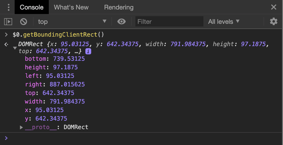
getBoundingClientRect() call.CSS pixels are purely virtual, so having fractions of a pixel is okay in theory, but how does the browser figure out the mapping to physical pixels? Because fractional physical pixels are not a thing.
Pixel snapping
The part of the unit conversion process that takes care of aligning elements with physical pixels is called "pixel snapping", and it does what it says on the tin: It snaps fractional pixel values to integer, physical pixel values. How exactly this happens is different from browser to browser. If we have an element with a width of 791.984px on a display where dPR is 1, one browser might render the element at 792px physical pixels, while another browser might render it at 791px. That's just a single pixel off, but a single pixel can be detrimental to renderings that need to be pixel-perfect. This can lead to blurriness or even more visible artifacts like the Moiré effect.
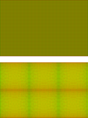
(You might have to open this image in a new tab to see it without any scaling applied to it.)
devicePixelContentBox
devicePixelContentBox gives you an element's content box in device pixel (i.e. physical pixel) units. It's part of ResizeObserver. While ResizeObserver is now supported in all major browsers since Safari 13.1, the devicePixelContentBox property is only in Chrome 84+ for now.
As mentioned in ResizeObserver: it's like document.onresize for elements, the callback function of a ResizeObserver will be called before paint and after layout. That means that the entries parameter to the callback will contain the sizes of all observed elements just before they are being painted. In the context of our canvas problem outlined above, we can use this opportunity to adjust the number of pixels on our canvas, ensuring that we end up with an exact one-to-one mapping between canvas pixels and physical pixels.
const observer = new ResizeObserver((entries) => {
  const entry = entries.find((entry) => entry.target === canvas);
  canvas.width = entry.devicePixelContentBoxSize[0].inlineSize;
  canvas.height = entry.devicePixelContentBoxSize[0].blockSize;

  /* … render to canvas … */
});
observer.observe(canvas, {box: ['device-pixel-content-box']});
The box property in the options object for observer.observe() lets you define which sizes you wish to observe. So while each ResizeObserverEntry will always provide borderBoxSize, contentBoxSize and devicePixelContentBoxSize (provided the browser supports it), the callback will only be invoked if any of the observed box metrics change.
With this new property, we can even animate our canvas' size and position (effectively guaranteeing fractional pixel values), and not see any Moiré effects on the rendering. If you would like to see the Moiré effect on the approach using getBoundingClientRect(), and how the new ResizeObserver property allows you to avoid it, take a look at the demo in Chrome 84 or later!
Feature detection
To check if a user's browser has support for devicePixelContentBox, we can observe any element, and check if the property is present on the ResizeObserverEntry:
function hasDevicePixelContentBox() {
  return new Promise((resolve) => {
    const ro = new ResizeObserver((entries) => {
      resolve(entries.every((entry) => 'devicePixelContentBoxSize' in entry));
      ro.disconnect();
    });
    ro.observe(document.body, {box: ['device-pixel-content-box']});
  }).catch(() => false);
}

if (!(await hasDevicePixelContentBox())) {
  // The browser does NOT support devicePixelContentBox
}
Conclusion
Pixels are a surprisingly complex topic on the web and up until now there was no way for you to know the exact number of physical pixels an element occupies on the user's screen. The new devicePixelContentBox property on a ResizeObserverEntry gives you that piece of information and allows you to do pixel-perfect renderings with <canvas>. devicePixelContentBox is supported in Chrome 84+.