Digital accessibility means designing and building your digital offerings so that, regardless of a person's mental or physical ability, they can still interact with your website, app, or other digital product in a meaningful and equal way.
But how do you measure the accessibility of a digital product? How do you know when something is accessible?
Introduction to accessibility testing
There are many ways to test a digital product for accessibility. One fundamental approach is to evaluate it against a set of accessibility standards.
There are many types of accessibility standards. Typically, your industry, product type, local and country laws and policies, or overall accessibility goals dictate which set of guidelines to follow and levels to meet. If no specific standard is required for your project, the standard recommendation is to follow the latest version of the Web Content Accessibility Guidelines (WCAG).
Testing your digital product against an accessibility standard and conformance level is commonly referred to as an accessibility audit. An accessibility audit uses various methodologies, techniques, and tools, including design, automated, manual, and assistive technology (AT) testing.
Perform an accessibility audit to capture the baseline accessibility compliance of a digital product. But, running it once at the start of a project is not enough to determine if a product is accessible. You should run this audit multiple times throughout the software product lifecycle to check for changes in the level of conformance, against a set of pre-determined accessibility checkpoints or guidelines.
Web Content Accessibility Guidelines (WCAG)
The Web Content Accessibility Guidelines (WCAG) are an international set of accessibility standards developed through the W3C, in cooperation with individuals and organizations. The goal of WCAG is to provide a single shared standard for digital accessibility that meets the needs of individuals, organizations, and governments worldwide.
WCAG is primarily intended for web-based and mobile app designers and developers. However, many others, including software developers, content creators/editors, and all levels of management, benefit from understanding and applying WCAG-based techniques to their process. Additional W3C standards may apply to your role, including the Authoring Tool Accessibility Guidelines (ATAG) and User Agent Accessibility Guidelines (UAAG), so make sure you review the W3C list of standards and use the one(s) most applicable to your role and project.
In terms of accessibility, WCAG is considered the "gold standard" for conformance testing. The first draft of WCAG was released in 1999. The current version is WCAG 2.2. WCAG 3.0 has an exploratory draft as of May 2024, but is not expected to be a completed W3C standard for a few more years.
The WCAG guidelines have three levels of success criteria: A, AA, and AAA. The success criteria determine conformance to WCAG. To meet WCAG conformance, the digital product you are testing needs to meet the success criteria for your target level.
30
A success criteria
20
AA success criteria
28
AAA success criteria
For the current standard (WCAG 2.2), there are 78 success criteria in total, split across each level. It is important to note that each level is progressive, meaning if your accessibility goal is AA, you must pass the success criteria for both A and AA to achieve this level of conformance.
30
Pass A level
50
Pass A + AA level
78
Pass A + AA + AAA level
Accessibility principles
The WCAG success criteria are a very important set of detailed guidelines that inform designers and developers how to create accessible websites and apps. Understanding these guidelines is critical to address issues that arise in accessibility compliance testing, but the guidelines quickly become very technical.
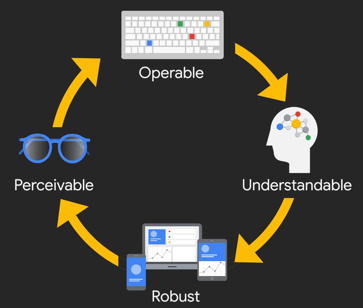
If you are new to this field, start with the principles of WCAG—Perceivable, Operable, Understandable, and Robust (POUR). By applying POUR principles to your digital products, you can focus on how your products are used by real humans, including people with disabilities.

Perceivable

The first category in POUR is Perceivable. This principle states that users must be able to perceive all essential information on the screen, and it must be conveyed to multiple senses.
Ask yourself: Is there any content or function in your digital product that a person with a specific disability wouldn't be able to perceive? Be sure to consider all the different types of disabilities—visual, mobility, hearing, cognitive, and speech impairments, vestibular and seizure disorders, and more.
Examples
- Adding text alternatives to all non-decorative images and essential icons.
- Adding captions, transcripts, and audio descriptions to videos.
- Ensuring color is not the only method of conveying meaning.
Operable

The second category is Operable. For this principle, users must be able to operate the digital product's interface. The interface cannot require interaction that a user cannot perform.
Ask yourself: Can users control the interactive elements of your digital product? Are there any focus order issues or keyboard traps? How are touch interfaces handled?
Examples of Operable
- Adding keyboard and touchscreen support to all active elements.
- Ensuring slideshows and videos have all of the necessary controls available.
- Giving users enough time to fill out a form or a method to extend the time.
Understandable

The third category of POUR is Understandable. For this principle, users must understand the information and the operation of the user interface.
Ask yourself:: Is all of the content clearly written? Are all of the interactions easy to understand? Does the order of the page make sense—to sighted users, keyboard-only users, screen reader users?
Examples
- Write clear, concise, and unambiguous language. When possible, use a simpler word instead of a more complex word.
- Ensure your digital product has predictable navigation.
- Ensure error messages are clear, so the user knows what steps to take next.
Robust

The last category is Robust. This principle focuses on supporting assistive technologies and ensuring that, as devices and user agents evolve, the digital product remains accessible.
Ask yourself:: What types of assistive technology are you supporting? Does your digital product only work on the newest browsers or operating systems? Does it work at all breakpoints and in different device orientations?
Examples
- Test keyboard-only navigation.
- Test with different screen reader technologies.
- Ensure all of the content and functions can be accessed, regardless of device size or orientation.
Conclusion
Remember, the whole point of POUR is not about rigidly adhering to hard and fast rules. Instead, it is a way to help you understand and meet the diverse needs of your users.
