
Introduction to ARIA and non-native HTML semantics


So far, we've encouraged using native HTML elements because they give you focus, keyboard support, and built-in semantics, but there are times when a simple layout and native HTML won't do the job. For example, currently there's no standardized HTML element for a very common UI construct, the pop-up menu. Nor is there an HTML element that provides a semantic characteristic such as "the user needs to know about this as soon as possible".
In this lesson, then, we'll explore how to express semantics that HTML can't express on its own.
The Web Accessibility Initiative's Accessible Rich Internet Applications specification (WAI-ARIA, or just ARIA) is good for bridging areas with accessibility issues that can't be managed with native HTML. It works by allowing you to specify attributes that modify the way an element is translated into the accessibility tree. Let's look at an example.
In the following snippet, we use a list item as a kind of custom checkbox. The CSS "checkbox" class gives the element the required visual characteristics.
<li tabindex="0" class="checkbox" checked>
    Receive promotional offers
</li>
While this works fine for sighted users, a screen reader will give no indication that the element is meant to be a checkbox, so low-vision users may miss the element entirely.
Using ARIA attributes, however, we can give the element the missing information
so the screen reader can properly interpret it. Here, we've added the role and
aria-checked attributes to explicitly identify the element as a checkbox and
to specify that it is checked by default. The list item will now be added to the
accessibility tree and a screen reader will correctly report it as a checkbox.
<li tabindex="0" class="checkbox" role="checkbox" checked aria-checked="true">
    Receive promotional offers
</li>
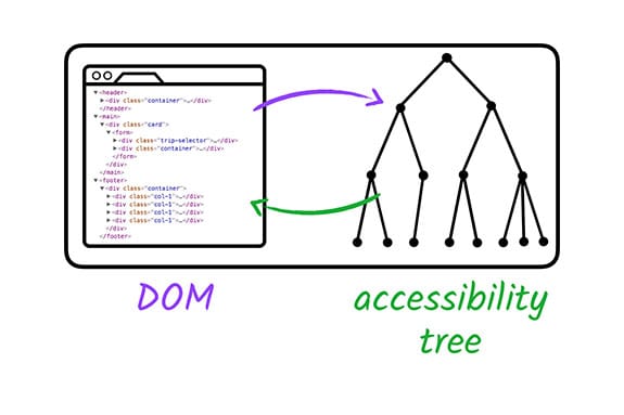
ARIA works by changing and augmenting the standard DOM accessibility tree.
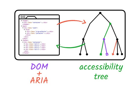
Although ARIA allows us to subtly (or even radically) modify the accessibility tree for any element on the page, that is the only thing it changes. ARIA doesn't augment any of the element's inherent behavior; it won't make the element focusable or give it keyboard event listeners. That is still part of our development task.
It's important to understand that there is no need to redefine default
semantics. Regardless of its use, a standard HTML <input type="checkbox">
element doesn't need an additional role="checkbox" ARIA attribute to be
correctly announced.
It's also worth noting that certain HTML elements have restrictions on what ARIA
roles and attributes can be used on them. For example, a standard <input
type="text"> element may not have any additional role/attribute applied to it.
See the ARIA in HTML spec for more information.
Let's see what other capabilities ARIA has to offer.
What can ARIA do?
As you saw with the checkbox example, ARIA can modify existing element semantics or add semantics to elements where no native semantics exist. It can also express semantic patterns that don't exist at all in HTML, like a menu or a tab panel. Often, ARIA lets us create widget-type elements that wouldn't be possible with plain HTML.
- For example, ARIA can add extra label and description text that is only
exposed to assistive technology APIs.
<button aria-label="screen reader only label"></button>
- ARIA can express semantic relationships between elements that extend the standard parent/child connection, such as a custom scrollbar that controls a specific region.
    <div role="scrollbar" aria-controls="main"></div>
    <div id="main">
    . . .
    </div>
- And ARIA can make parts of the page "live," so they immediately inform assistive technology when they change.
    <div aria-live="polite">
      <span>GOOG: $400</span>
    </div>
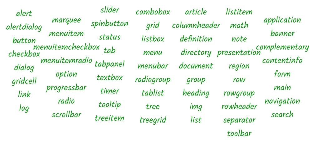
One of the core aspects of the ARIA system is its collection of roles. A role
in accessibility terms amounts to a shorthand indicator for a particular UI
pattern. ARIA provides a vocabulary of patterns we can use via the role
attribute on any HTML element.
When we applied role="checkbox" in the previous example, we were telling
assistive technology that the element should follow the "checkbox" pattern. That
is, we're guaranteeing that it will have a checked state (either checked or not
checked), and that the state may be toggled using the mouse or the spacebar,
just like a standard HTML checkbox element.
In fact, because keyboard interactions feature so prominently in screen reader
usage, it's very important to make sure that, when creating a custom widget, the
role attribute is always applied in the same place as the tabindex
attribute; this ensures that keyboard events go to the right place and that when
focus lands on an element its role is conveyed accurately.
The ARIA spec describes a
taxonomy of possible values for the role attribute and associated ARIA
attributes that may be used in conjunction with those roles. This is the best
source of definitive information about how the ARIA roles and attributes work
together and how they can be used in a way that is supported by browsers and
assistive technologies.
However, the spec is very dense; a more approachable place to start is the ARIA Authoring Practices document , which explores best practices for using the available ARIA roles and properties.
ARIA also offers landmark roles that extend the options available in HTML5. See the Landmark Roles Design Patterns spec for more information.