
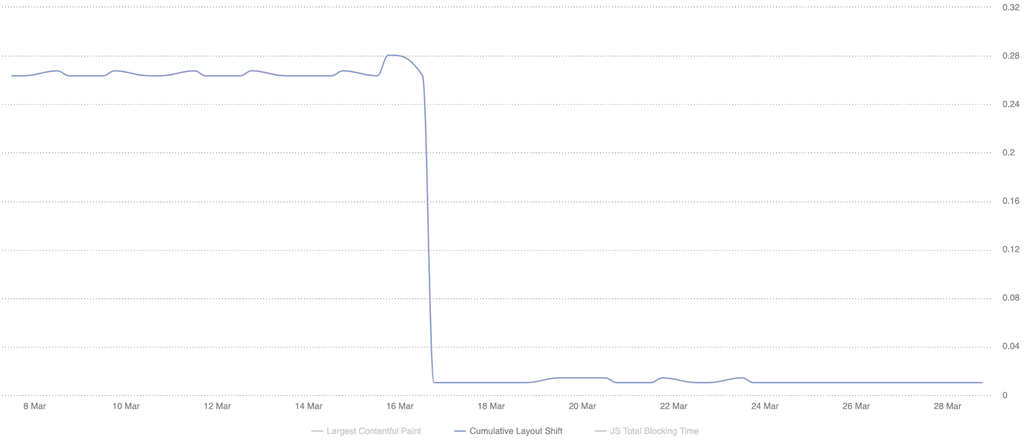
Within a couple of months the leading UK news website managed to improve their 75th percentile CLS by 250% from 0.25 to 0.1.

The visual stability challenge
Layout shifts can be very disruptive. At Telegraph Media Group (TMG) visual stability is particularly important because readers predominantly use our applications to consume the news. If the layout shifts while reading an article, the reader will likely lose their place. This can be a frustrating and distracting experience.
From an engineering perspective, ensuring the pages don't shift and interrupt the reader can be challenging, especially when areas of your application are loaded asynchronously and added to the page dynamically.
At TMG, we have multiple teams contributing code client-side:
- Core engineering. Implementing third-party solutions to power areas such as content recommendations and commenting.
- Marketing. Running A/B tests to assess how our readers interact with new features or changes.
- Advertising. Managing advert requests and advert pre-bidding.
- Editorial. Embedding code within articles such as tweets or videos, as well as custom widgets (for example, Coronavirus case tracker).
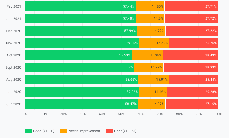
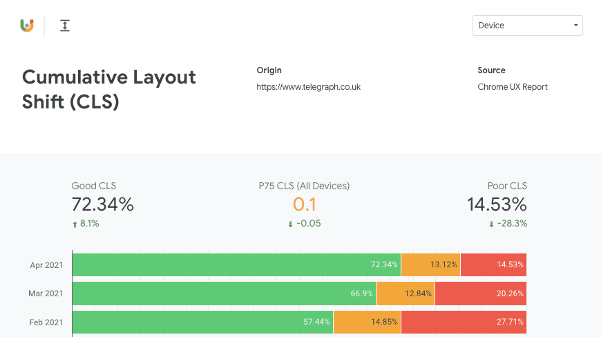
Ensuring each of these teams do not cause the layout of the page to jolt can be difficult. Using the Cumulative Layout Shift metric to measure how often it's occurring for our readers, the teams got more insight into the real user experience and a clear goal to strive to. This resulted in our 75th percentile CLS improving from 0.25 to 0.1 and our passing bucket growing from 57% to 72%.
250%
75th percentile CLS improvement
15%
More users with good CLS score
Where we started
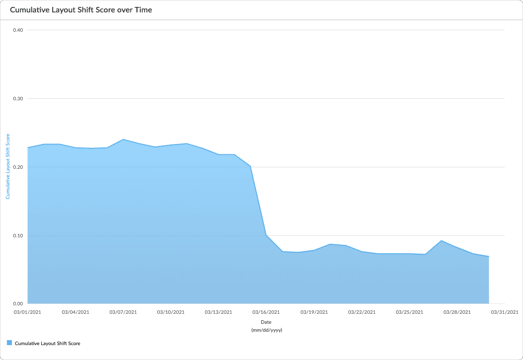
Using CrUX dashboards we were able to establish that our pages were shifting more than we'd like.
We ideally wanted at least 75% of our readers to have a "good" experience so we started identifying the causes of the layout instability.
How we measured the layout shifts
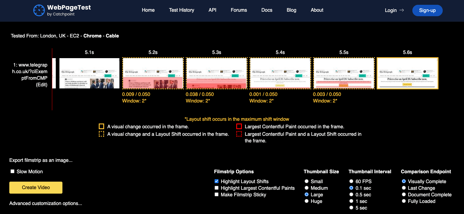
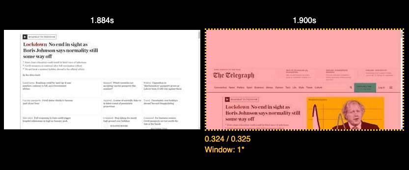
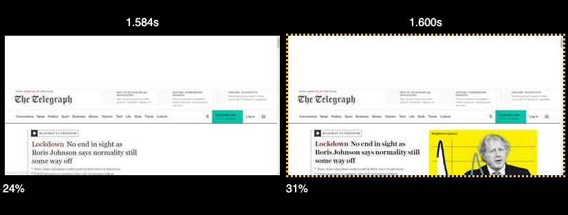
We used a combination of Chrome DevTools and WebPageTest to help recognize what was causing the layout to shift. In DevTools, we used the Experience section of the Performance tab to highlight individual instances of shifting layout and how they contributed to the overall score.
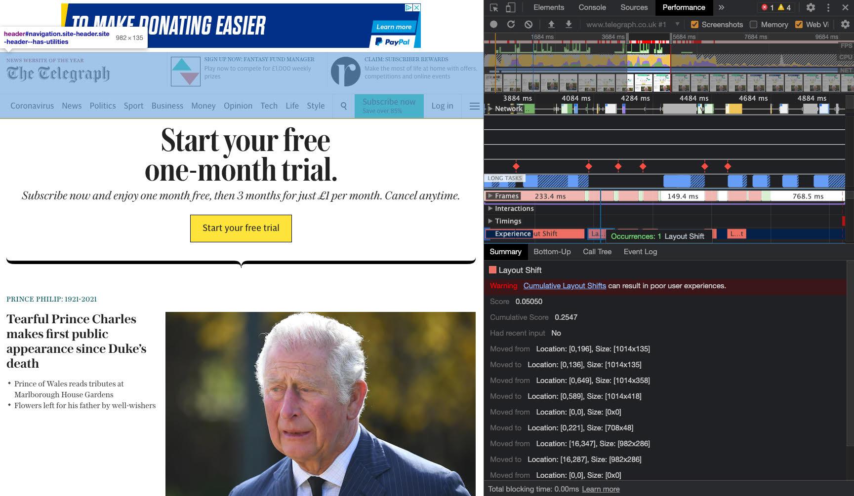
WebPageTest helpfully highlights where the
layout shift occurs in the timeline view when "Highlight Layout Shifts" is
selected.
After reviewing each shift across our most visited templates we came up with a list of ideas as to how we could improve.
Reducing layout shifts
We focused on four areas where we could reduce layout shifts: - adverts - images - headers - embeds
Adverts
The adverts load after the initial paint via JavaScript. Some of the containers they loaded in did not have any reserved height on them.
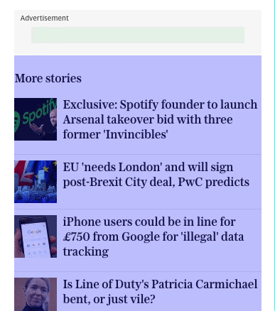
Although we don't know the exact height, we're able to reserve space by using
the most common advert size loaded in the slot.
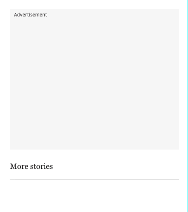
We had misjudged the average height of the advert in some cases. For tablet
readers, the slot was collapsing.
We revisited the slot and adjusted the height to use the most common size.

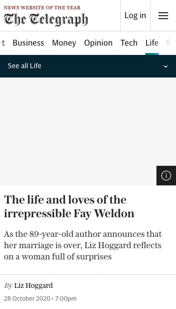
Images
A lot of the images across the website are lazy loaded and have their space
reserved for them.
However the inline images at the top of the articles did not have any space
reserved on the container, nor did they have width and height attributes
associated with the tags. This caused the layout to shift as they loaded in.
Simply adding the width and height attributes to the images ensured the layout
did not shift.
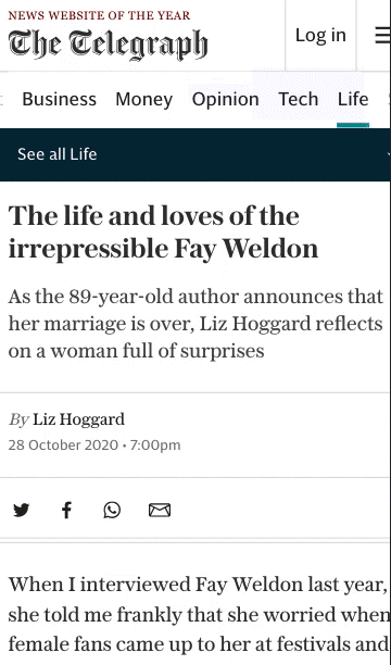
Header
The header was below the content in the markup and was positioned at the top
using CSS. The original idea was to prioritise the content loading before the
navigation however this caused the page to momentarily shift.
Moving the header to the top of the markup allowed the page to render without
this shift.
Embeds
Some of the frequently used embeds have a defined aspect ratio. For example,
YouTube videos. While the player is loading, we pull the thumbnail from YouTube
and use it as a placeholder while the video loads.

Measuring the impact
We were able to measure the impact at a feature level quite easily using the
tooling mentioned towards the start of the article. However we wanted to measure
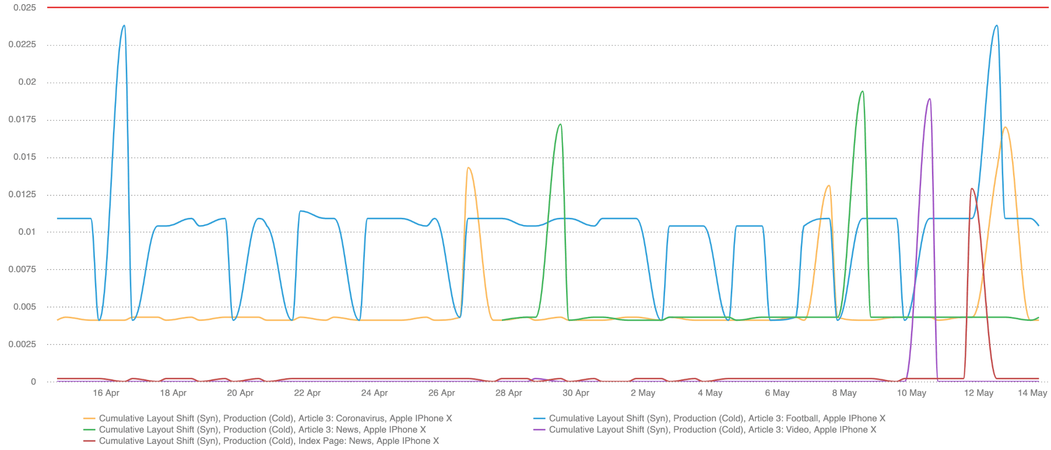
CLS both at a template level and at a site level. Synthetically, we used
SpeedCurve to validate changes both in pre-production
and production.
We're able to then validate the results in our RUM data (provided by
mPulse)
once the code reached production.
Checking the RUM data provides us with a good level of confidence that the changes we're making are having a positive impact for our readers.
The final numbers we looked at are for the RUM data Google collects. This is especially relevant now as they will soon have an impact on page ranking. For starters we used the Chrome UX Report, both in the monthly origin level data available through the CrUX dashboard, as well as by querying BigQuery to retrieve historic p75 data. This way we were easily able to see that for all of the traffic measured by CrUX, our 75th percentile CLS improved by 250% from 0.25 to 0.1 and our passing bucket grew from 57% to 72%.
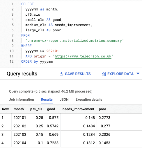
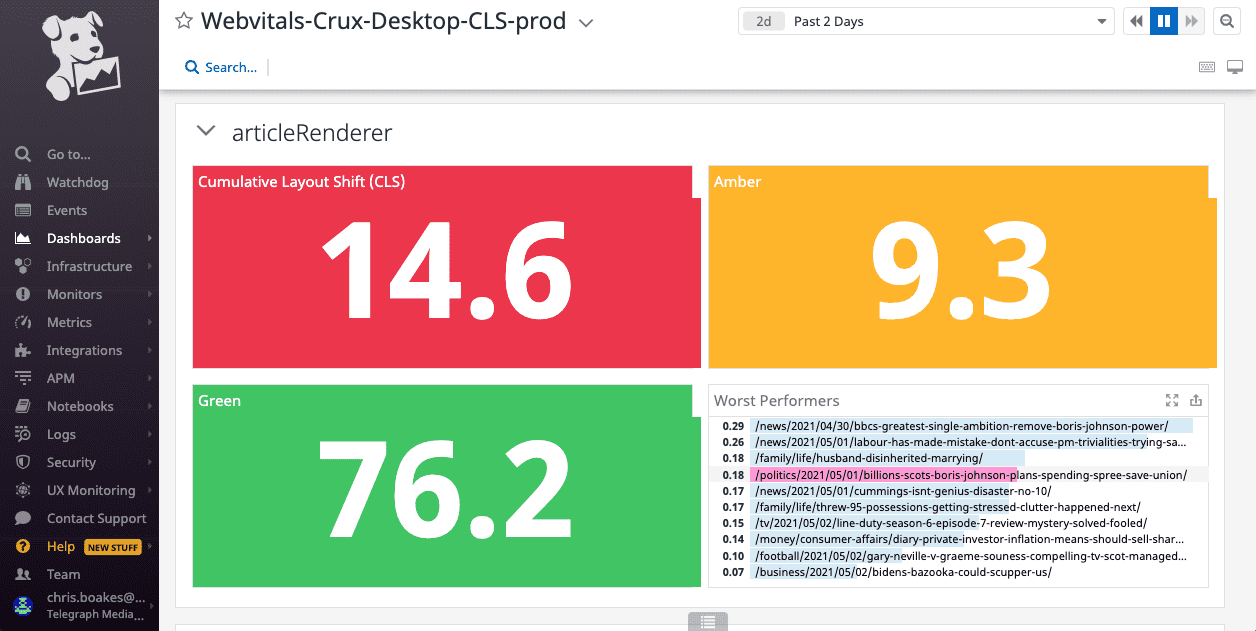
In addition, we were able to make use of the Chrome UX Report
API
and create some internal dashboards split into templates.
Avoiding CLS regressions
An important aspect of making performance improvements is avoiding regressions.
We've set up some basic performance budgets for our
key metrics and included CLS in those.
If the test exceeds the budget it'll send a message to a Slack channel so we can investigate the cause. We've also set up weekly reports, so that even if the templates remain in budget we're aware of any changes that have had a negative impact.
We're also planning to expand our budgets to use RUM data as well as synthetic data, using mPulse to set both static alerts and potentially anomaly detection which would make us aware of any changes that are out of the ordinary.
It's important for us to approach new features with CLS in mind. A lot of the changes I've mentioned are those we've had to fix after they've been released to our readers. Layout stability will be a consideration for the solution design of any new feature going forward so that we can avoid any unexpected layout shifts from the start.
Conclusion
The improvements we've made so far were quite easy to implement and have had a significant impact. A lot of changes I've outlined in this article didn't take much time to deliver and they were applied to all of the most commonly used templates which means they've had a widespread positive impact for our readers.
There are still areas of the site we need to improve. We're exploring ways we might be able to do more of our client-side logic server-side which will improve CLS even more. We will keep tracking and monitoring our metrics with an aim to constantly improve them and provide our readers with the best user experience possible.