
An overview of three tools and techniques for testing and verifying accessible color contrast of your design.


Say you have some text on a light background, like this:
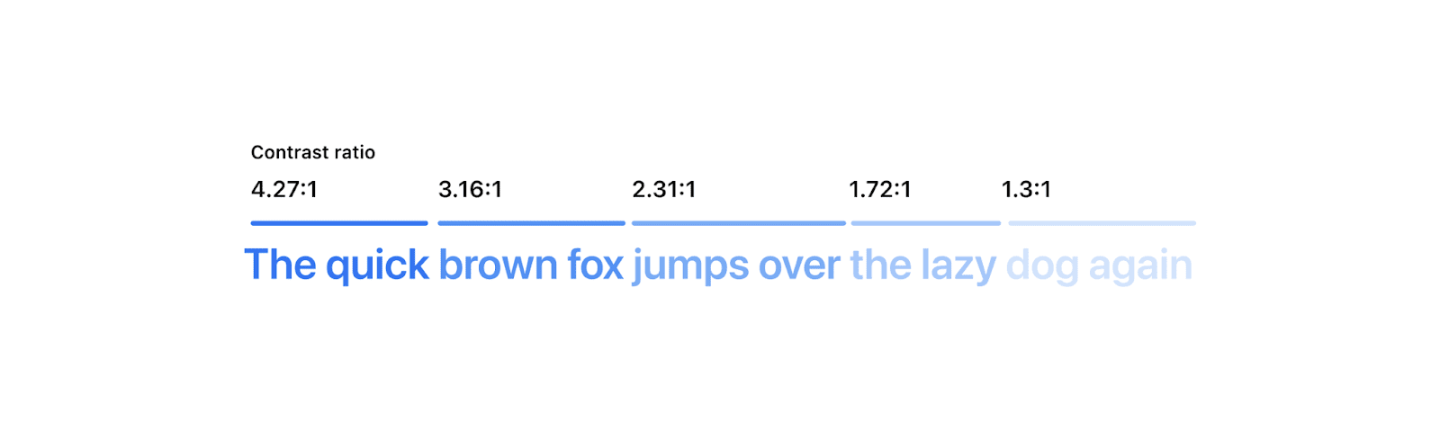
While all of the examples may be readable to you, this isn't the case for everyone.
Accessible color contrast is a practice that ensures text is readable for everyone. Sometimes testing contrast is easy and sometimes it's really hard. By the end of this post you'll have three new tools and techniques for inspecting, correcting, and verifying your web design contrast so you can tackle the hardest scenarios.
WCAG and color contrast
W3C’s Web Accessibility Initiative provides strategies, standards, and resources to ensure that the internet is accessible for as many people as possible. The guidelines that underpin these standards are called the Web Content Accessibility Guidelines, or WCAG. The latest stable version, WCAG 2.1, covers an important accessibility requirement: minimum contrast.
The relationship between two colors in WCAG 2.1 is described by their contrast ratio—that is, the number you get when you compare the luminance of two colors. Luminance is a way of describing how close a color is to black (0%) or white (100%). WCAG defines some rules and calculation algorithms around what that contrast ratio needs to be in order for the web to be accessible. There are known issues with this calculation, though. Eventually an even more reliable way will be adopted, but, currently, WCAG is the best we have.
What are the rules?
A higher contrast ratio is scored with a higher number, like 4.5 or 7 instead of 3. To get more familiar with the scoring table, check out Polypane's Contrast Checker.
Testing contrast between colors
So, now that we know what we’re looking for, how do we test this? Here are three free tools to assist you in inspecting, correcting and measuring your web site's contrast. The strengths and weaknesses of each will be outlined so you can confidently test the accessibility of your site’s colors and content in a multitude of ways.
- Pika
A MacOS app, uniquely capable of showing the contrast of any colors on the entire screen, colors on gradients, colors with transparency, and more. Intent is explicit, users manually choose the pixels to compare. A tiny bit less automated with a huge feature gain. - VisBug
A cross browser extension, uniquely able to show more than one contrast overlay at a time, but like DevTools, sometimes isn't able to detect intent. - Chrome DevTools
DevTools is built into Chrome and is packed with various ways to inspect, correct, and debug color issues, but has shortcomings when inspecting gradients and semi-transparent colors, and sometimes isn't able to detect intent.
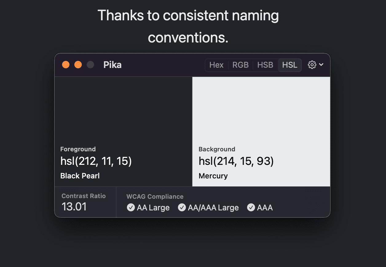
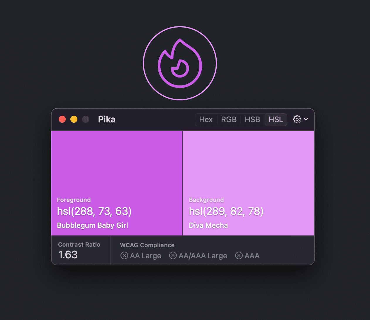
Pika (macOS application)
If DevTools or VisBug can't assess the contrast properly, like when you need to test a color outside the browser, or when transparency or gradients are involved, then Pika is here to save the day. Pika has access to every pixel on the screen because it's a system tool and not a web tool.
This also means the UX for using Pika is different to DevTools or VisBug. DevTools and VisBug do their best to show the text and background colors from the browser DOM, while the colors Pika compares are chosen manually from any point on screen. This gives Pika more control, and opens up some additional use cases:
- Comparing any two colors regardless of whether or not they’re in the browser—if you can see it on your screen, you can test it.
- Comparing colors with transparency.
- Comparing colors within gradients.
- Comparing colors that are using blend modes, like mix-blend-mode in CSS.
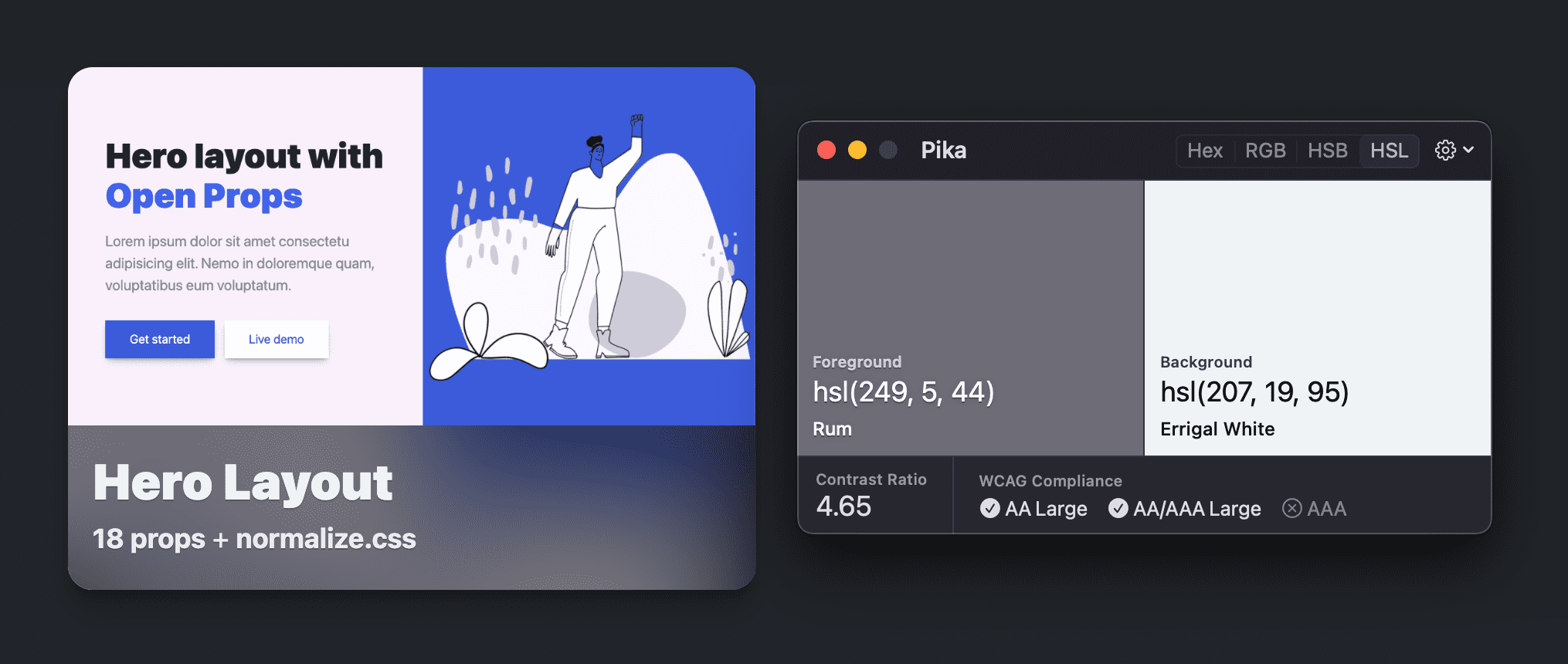
Comparing any two colors
Compare text to a background color:
Compare stroke and fill colors of vector graphics:
Comparing colors with transparency
Compare text color to a variety of background sample pixels. Here, the lightest gray from the frosted glass effect is used as the background comparison color.
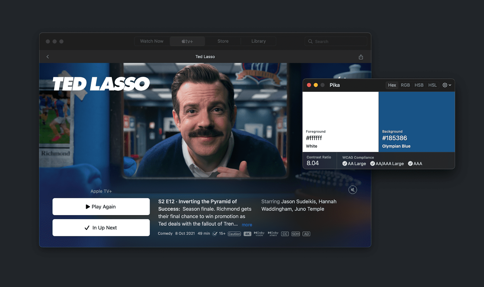
Comparing colors with gradients
Compare text on a gradient or on an image. Here the L from "Lasso" is compared against the light blue of the image:
VisBug
VisBug is a FireBug inspired tool for designers and developers to visually inspect, debug, and play with their website design. It's meant to have a lower barrier to entry than the Chrome DevTools by emulating the UI and UX of the design tools that folks have come to know and love to use.
Try VisBug or install on Chrome, Firefox, Edge, Brave or Safari.
One of its tool offerings is the Accessibility Inspect tool.
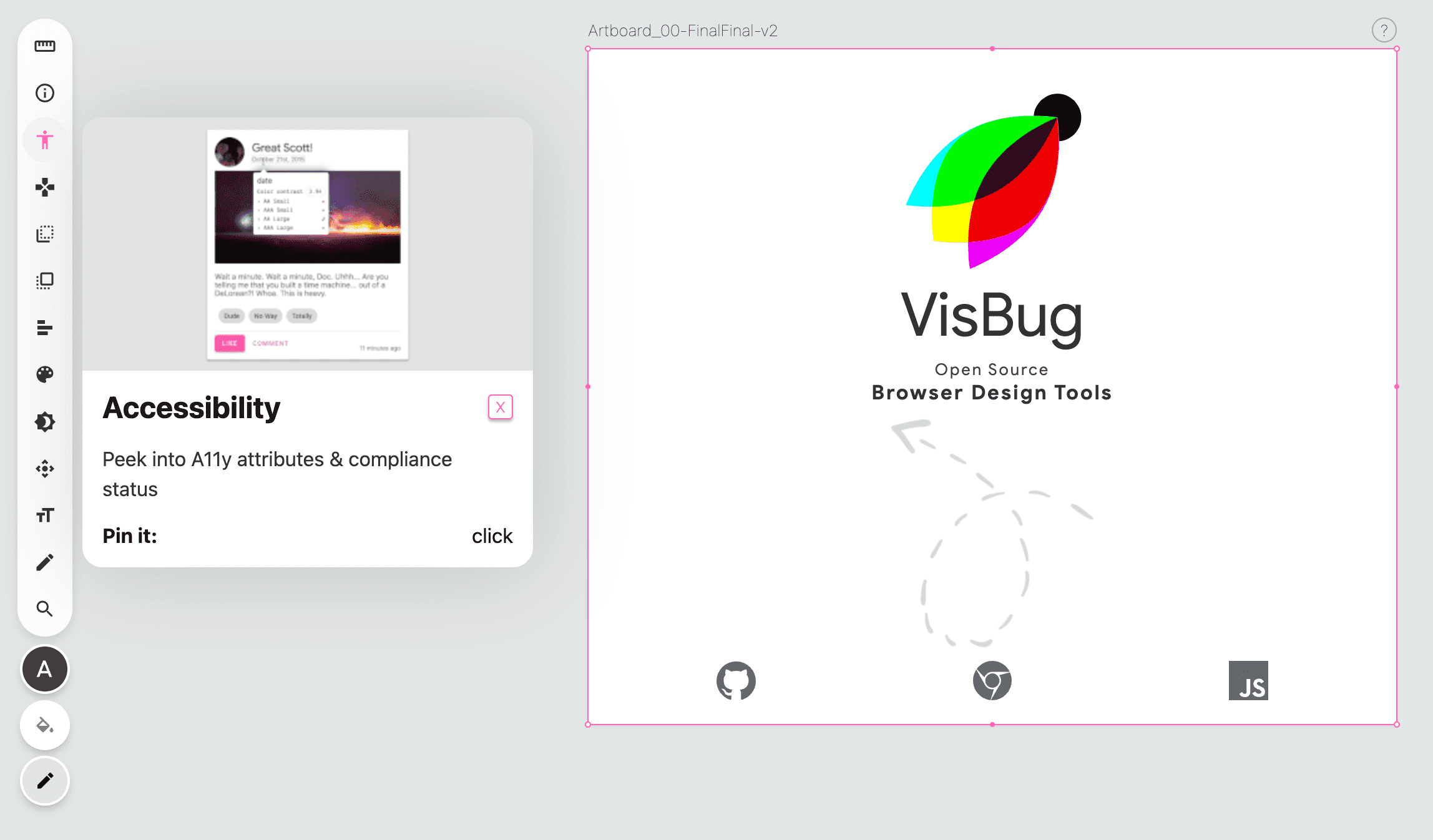
Inspect across browsers (and even on mobile)
Once the Accessibility Inspect tool has been clicked, anything the user points to, or keyboard navigates to, will have its accessibility information reported in the tooltip. This tooltip includes color comparisons between discovered foreground and background colors.
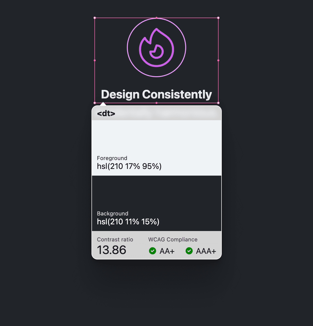
Inspect one or many
DevTools can either look at a single color pairing or get a report of all of your color pairings in the page, but VisBug offers a nice middle ground by allowing multiple color pairings. Click an element and the tooltip will stay put. Hold Shift and continue clicking other elements and all of the tooltips will stay put:
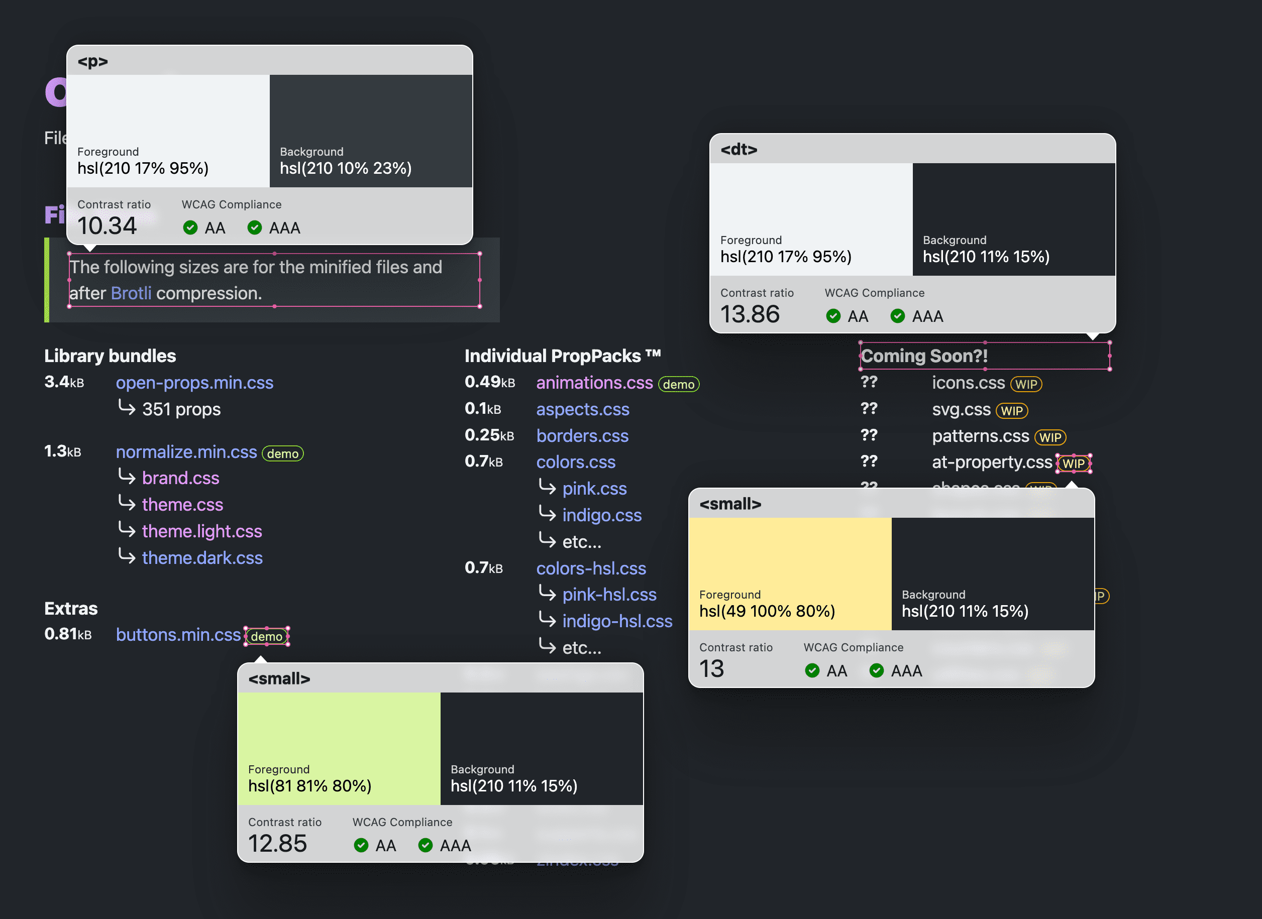
This is especially important for component based design, where multiple parts of a component need to pass contrast ratio scores. This method allows seeing all of those component parts at once. Also great for design reviews.
Chrome DevTools
If you have Chrome installed then you're already equipped with many contrast testing tools:
- The color picker
- Inspection tooltip
- CSS Overview
- Lighthouse
- The JS console
- Colorblind emulation tools
- System color contrast preference emulation
- WCAG 3.0 APCA experiment
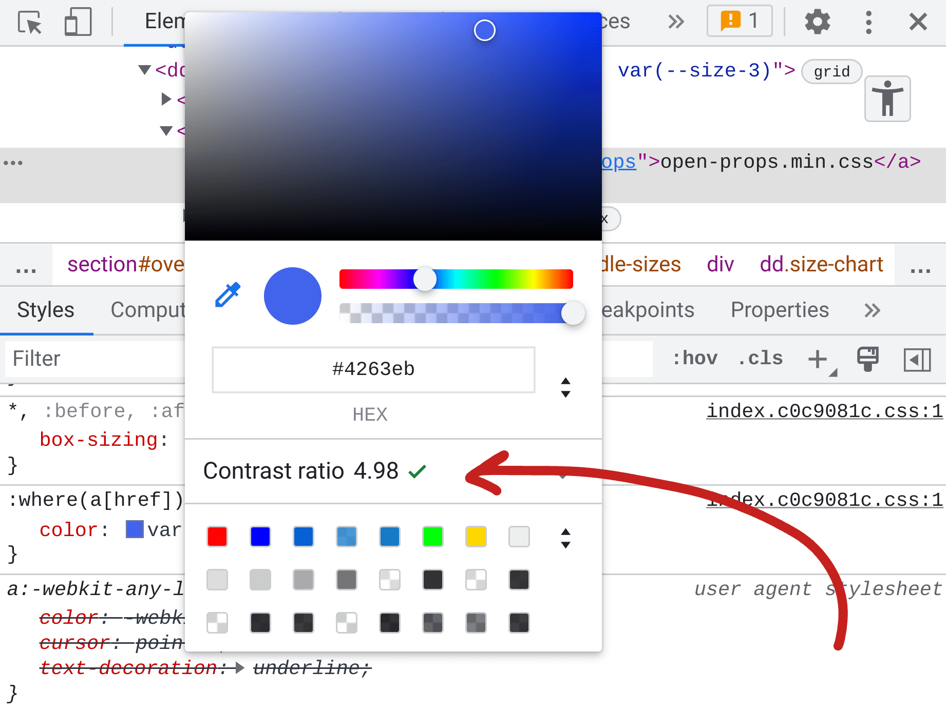
The Chrome DevTools color picker
In the Chrome DevTools Styles pane of the Elements panel, color values will have a little visual square color swatch next to them. When this swatch is clicked you'll see the color picker tool. If possible, the middle of the tool will show the contrast of the color against a foreground or background.
In the following example, the color picker is opened for a custom property color value. The contrast ratio score is reported as 15.79 and has two green check marks, indicating the score passes AA and AAA WCAG 2.1 requirements:
Color Picker autocorrection
Seeing the score while picking colors is handy, but Chrome DevTools has an additional feature for autocorrection. When the color picker reports a failed accessible color contrast score it can be expanded to reveal the AA and AAA score targets, plus an eye dropper tool. Next to AA and AAA are swatches and a refresh icon that when clicked will find the nearest passing color for you:
If you're not picky about colors, the auto correction feature is a great way to meet accessibility guidelines and not work too hard to get the task done.
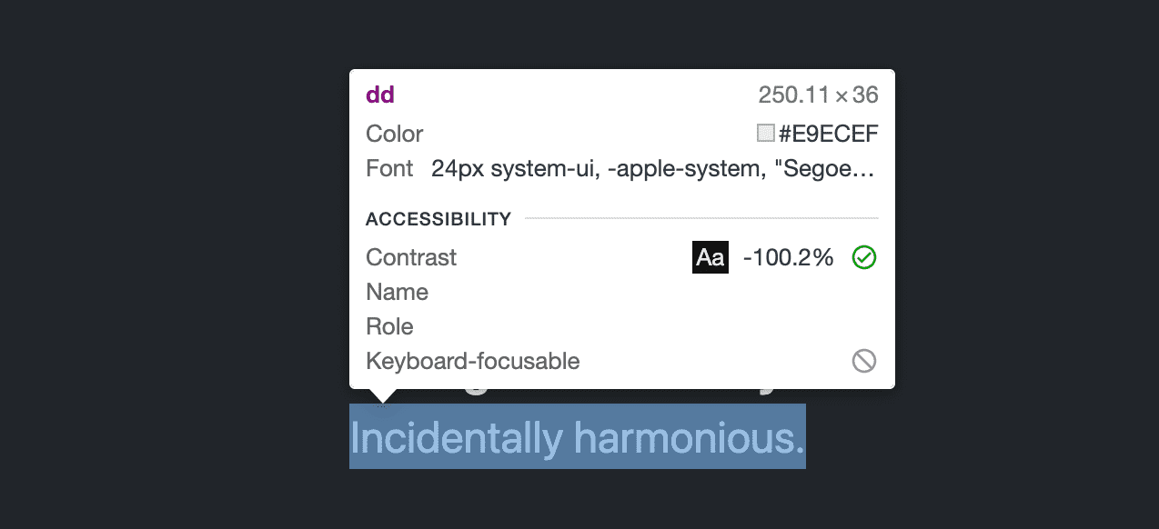
Inspection tooltip
The element selection tool has a special feature during page hover that reports
general font, color, and accessibility information. The element selection tool
is the icon on the left in the following screenshot. It’s the box with an arrow
cursor over the bottom right corner. It can also be selected using the hotkey
Control+Shift+C (or Command+Shift+C on MacOS).
Once activated, the icon will turn blue, and pointing to anything in the page will show the following quick inspect tooltip:
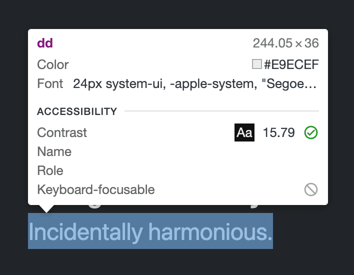
Instead of the color picker tool, which requires you to find the color swatch in the Styles pane, this tool lets you simply point around the page to see contrast scores. Like the color picker, it can only show one contrast score at a time.
Bump bump 'til you pass 🎶
I often inspect a color pairing with this quick inspect tool and find it just short of passing the required ratio. Instead of using the autocorrection feature of the color picker (because I'm picky) I nudge color channels in the CSS and watch until I pass the ratio I need. I call this process "bump bump til you pass" because I'm bumping color channel numbers until they pass WCAG 2.1.
The steps are as follows, and must be done in the exact order:
- Set keyboard focus inside a color in the Styles panel.
- Activate the inspect element tool with the keyboard shortcut
Control+Shift+C(orCommand+Shift+Con MacOS). - Point over a target.
- Press up/down on the keyboard to change the numbers in the color value.
This works because the CSS style value still has your keyboard focus, while the mouse is allowing you to point over a target. Make sure not to click your target or focus will move from the color value area and not let you nudge values anymore until refocused.
CSS overview
Up to this point, Chrome DevTools has provided ways to look at one color pairing at a time, but the CSS Overview can crawl your entire page and present all the inaccessible pairings at once:
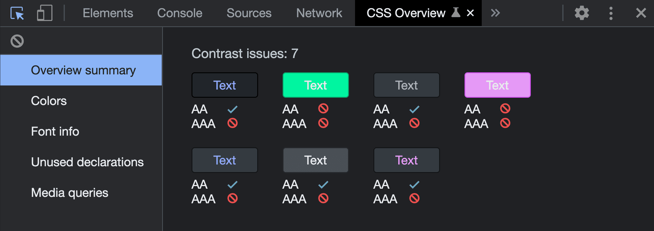
Read more about this feature in this post CSS Overview: Identify potential CSS improvements or watch Jecelyn Yeen on YouTube in their series DevTools Tips teach you how to Identify potential CSS improvements with the CSS Overview panel.
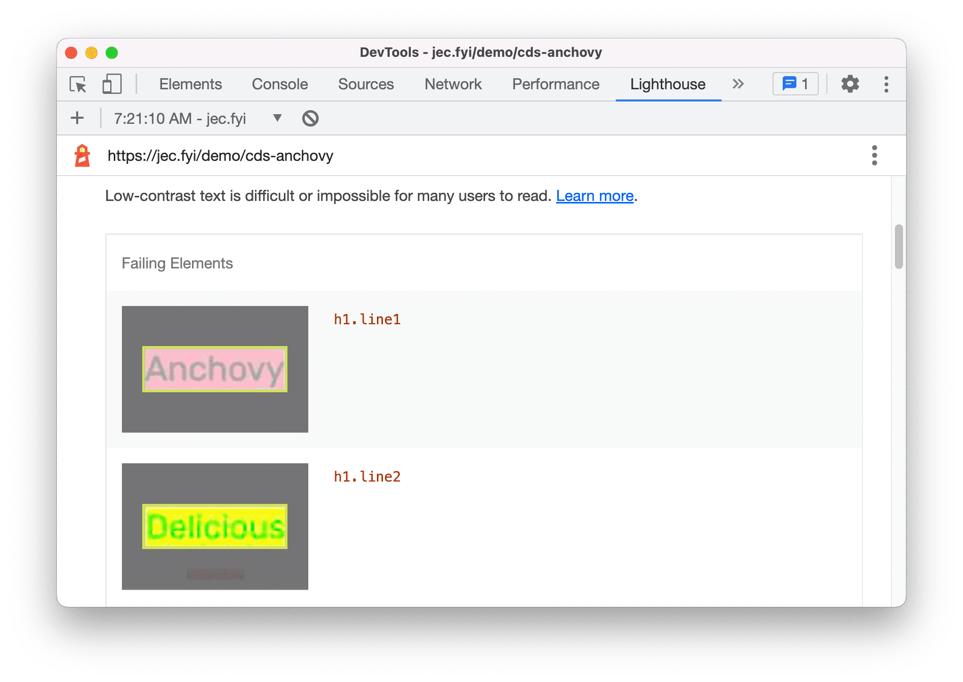
Lighthouse
Lighthouse is another auditing tool in Chrome DevTools. It can crawl your page and report inaccessible color pairings. It features tiny screenshots of each color pairing for you to review, passing and failing. Any failing combinations will negatively impact your Lighthouse score.
Here's what those results can look like:
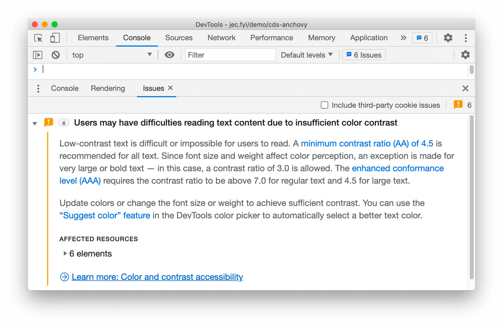
The JS console
Maybe all the tools listed so far just aren’t where you are. Maybe where you are (all day) is JavaScript. Here's an experiment to try. The Issues pane of the console can constantly report any color contrast accessibility issues as you build. Enable the feature in Settings > Experiments, as shown in the following:
Then open the Issue pane and see if it's made any discoveries. If it does, they can look like this:
Colorblind emulation
While on the topic of color contrast and ensuring accessible color pairings, it's worth pointing out the vision deficiencies emulation tool. This will change the colors or appearance of your design to demonstrate the results of different varieties of color blindness, giving you the opportunity to modify your design so that color isn't the only way the UX is communicating to a user.
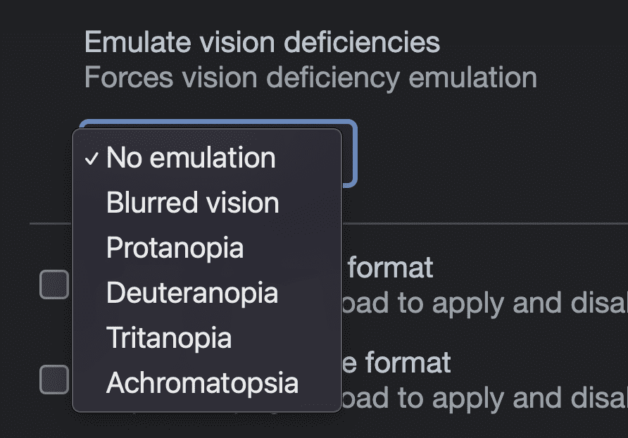
It's not a safe accessibility practice to exclusively use color to depict information, like red for bad and green for good. Some folks don't see greens or reds the same and this emulation tool will help you experience and remember that.
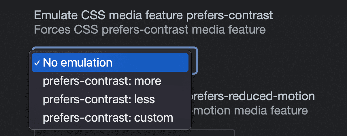
Color contrast system preference emulation
More and more, users are changing their contrast settings in their operating system, giving them the ability to ask for less or more contrast personalization in their UI. CSS can tap into this setting, just as it can with light or dark theme preferences. Chrome DevTools offers the ability to emulate this preference so designs can test and adapt to the user request without toggling the setting from the system.
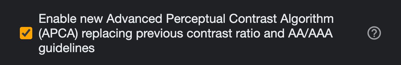
Try WCAG 3.0 APCA
Another experiment to try is testing your color pairings with the experimental APCA color ratio scoring system. Enabled through Settings > Experiments, it replaces the WCAG 2.1 ratio system with a newer and improved contrast checker algorithm, letting you preview its results as the proposal works towards a standard.
Once enabled, use the point inspect tooltip or the color picker to see the color pairing score and see if it passes:
Conclusion
Color contrast is an important piece of the puzzle for accessibility on the web, and adhering to it makes the web more usable for the greatest number of people in the most varied situations. Hopefully these three tools help you feel empowered to make great color choices.