Improving accessibility makes your site more useable for everyone.
It's important to build sites that are inclusive and accessible to everyone. There are at least six key areas of disability you can optimize for: visual, hearing, mobility, cognition, speech, and neural. Many tools and resources can help here, even if you're totally new to web accessibility.
Over one billion people live with some form of disability.
To be accessible, sites need to work across multiple devices with varying screen sizes and different kinds of input, such as screen readers. Moreover, sites should be usable by the broadest group of users, including those with disabilities.
Here are a few disabilities your users may have:
| Vision | Hearing | Mobility |
|---|---|---|
|
|
|
| Cognitive | Speech | Neural |
|
|
|
Visual issues range from an inability to distinguish colors to no vision at all.
- Ensure text content meets a minimum contrast ratio threshold.
- Avoid communicating information using solely color and ensure that all text is resizable.
- Ensure all user interface components can be used with assistive technologies such as screen readers, magnifiers, and braille displays. This entails ensuring that UI components are marked up such that accessibility APIs can programmatically determine the role, state, value, and title of any element.
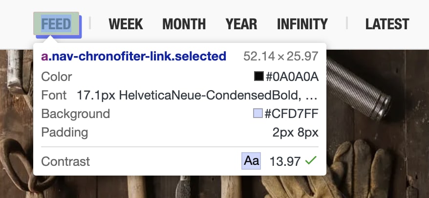
I personally live with low vision, and I often find myself zooming in on sites, their DevTools, and the terminal. While supporting zoom is almost never at the top of developers' to-do lists, it can make a world of difference to users like me.
Hearing issues mean a user may have issues hearing sound emitted from a page.
- Provide text alternatives for all content that is not strictly text.
- Test that your UI components are still functional without sound.
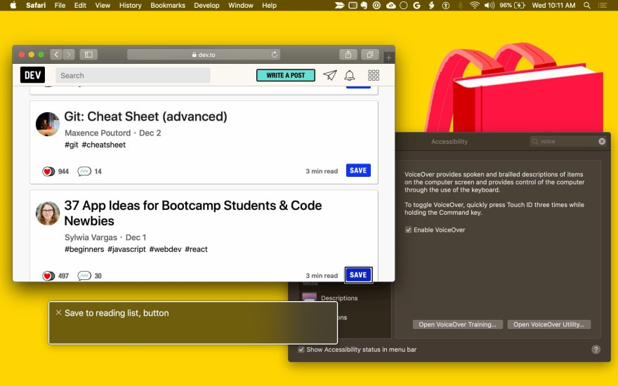
Mobility issues can include the inability to operate a mouse, a keyboard, or a touchscreen.
- Make the content of your UI components functionally accessible from a keyboard for any actions one would otherwise use a mouse for.
- Ensure pages are correctly marked up for assistive technologies—including screen readers, voice control software, and physical switch controls—which tend to use the same APIs.
Cognitive issues mean a user may require assistive technologies to help them with reading text, so it's important to ensure text alternatives exist.
Be mindful when using animations. Avoid video and animation that repeat or flash, which can cause issues for some users.
The
prefers-reduced-motionCSS media query lets you limit animations and autoplaying videos for users who prefer reduced motion:/* If the user expresses a preference for reduced motion, don't use animations on buttons. */ @media (prefers-reduced-motion: reduce) { button { animation: none; } }Avoid interactions that are timing-based.
This may seem like a lot of bases to cover, but we'll walk through the process for assessing and then improving the accessibility of your UI components.
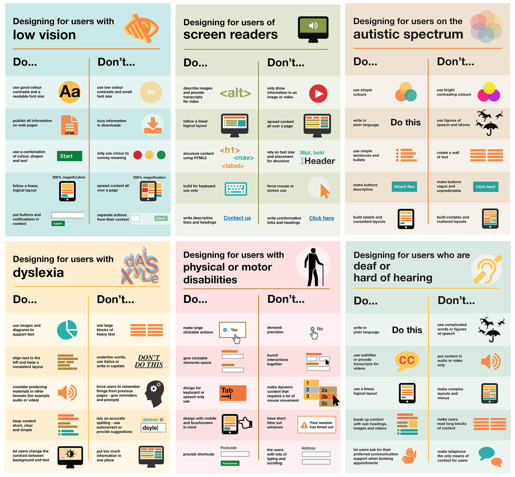
For extra visual support, the GOV.UK accessibility team has created a series of accessibility dos and don'ts digital posters, which you can use to share best practices with your team.
Measure UI component accessibility
When auditing your page's UI components for accessibility, ask yourself:
Can you use your UI component with the keyboard only?
Does the component manage focus and avoid focus traps? Can it respond to the appropriate keyboard events?
Can you use your UI component with a screen reader?
Have you provided text alternatives for any information presented visually? Have you added semantic information using ARIA?
Can your UI component work without sound?
Turn off your speakers and go through your use cases.
Can your UI component work without color?
Ensure your UI component can be used by someone who cannot see colors. A helpful tool for simulating color blindness is a Chrome extension called Colorblindly. (Try all four forms of color blindness simulation available.) You may also be interested in the Daltonize extension, which is similarly useful.
Can your UI component work with high-contrast mode enabled?
All modern operating systems support a high contrast mode. High Contrast is a Chrome extension that can help here.
Standardized controls (such as <button> and <select>) have accessibility
built into the browser. They are focusable using the Tab key;
they respond to keyboard events (like the Enter, Space, and arrow keys);
and they have semantic roles, states, and properties used by accessibility tools.
Their default styling should also meet the accessibility requirements listed.
Custom UI components (with the exception of components that extend standard
elements like <button>) don't have any built-in capabilities, including
accessibility, so you need to provide it. A good place to start when
implementing accessibility is to compare your component to an analogous standard
element (or a combination of several standard elements, depending on how complex
your component is).
Most browser developer tools support inspecting the accessibility tree of a page. In Chrome DevTools, this is available in the Accessibility tab in the Elements panel.
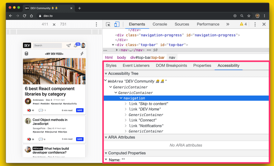
Firefox also has an Accessibility panel.
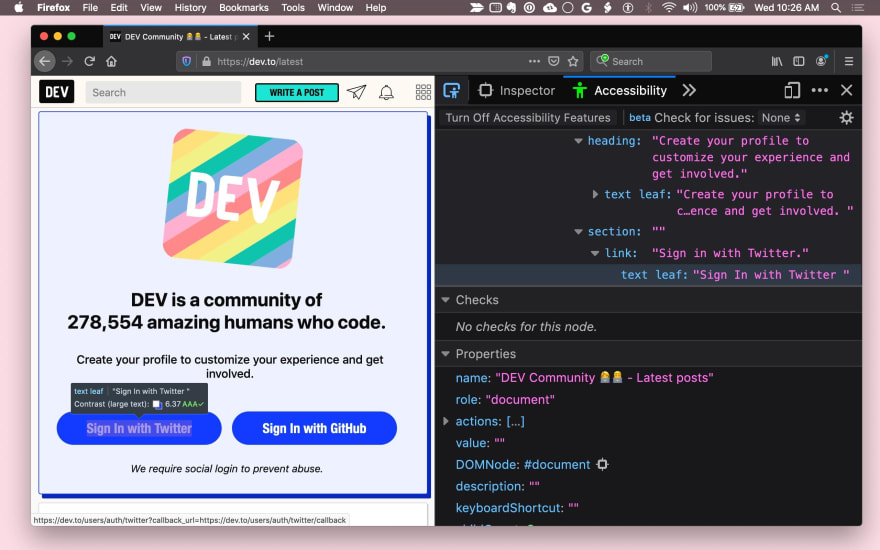
Safari exposes accessibility information in the Elements panel's Node tab.
The following is a list of questions you can ask yourself when attempting to make your UI components more accessible.
Improve keyboard focus
Ideally, ensure that all functionality in your UI component can be accessed with a keyboard. When designing your user experience, think about how you would use your element with the keyboard alone and figure out a consistent set of keyboard interactions.
First, ensure that you have a sensible focus target for each component. For example, a complex component like a menu may be one focus target within a page but should then manage focus within itself so that the active menu item always takes focus.
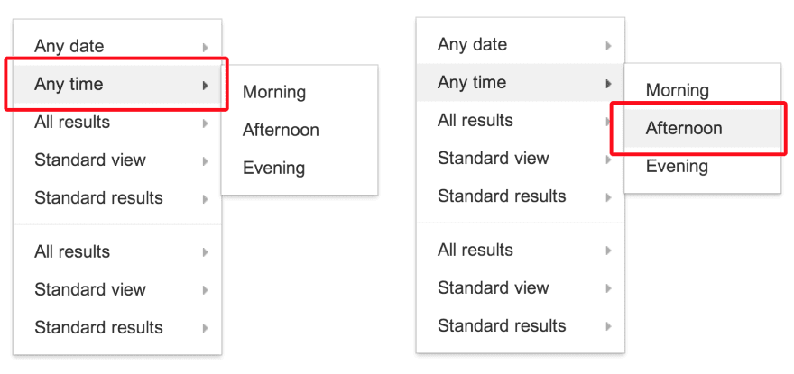
Use tabindex
You can add keyboard focus for elements and UI components with the tabindex
attribute. Keyboard-only and assistive technology users need to be able to place
keyboard focus on elements to interact with them.
Built-in interactive elements (like <button>) are implicitly focusable, so
they don't need a tabindex, attribute unless you need to change their position
in the tab order.
There are three types of tabindex values:
tabindex="0"is the most common and places the element in the natural tab order (defined by the DOM order).- A
tabindexvalue equal to -1 causes the element to be programmatically focusable, but not in the tab order. - A
tabindexvalue greater than 0 places the element in a manual tab order. All elements in the page with a positivetabindexvalue are visited in numerical order, before elements in the natural tab order.
Find some use cases for tabindex in the article
Using tabindex.
Ensure that focus is always visible, whether by using the default focus ring style or by applying a discernible custom focus style. Remember not to trap keyboard users—they should be able to move focus away from an element using only the keyboard.
Use autofocus
The HTML autofocus attribute lets an author to specify that a particular
element should automatically take focus
when the page is loaded.
autofocus is already supported on
all web form controls,
including buttons.
To autofocus elements in your own custom UI components,
call the focus() method,
supported on all HTML elements that can be focused
(for example, document.querySelector('myButton').focus()).
Add keyboard interaction
Once your UI component is focusable, provide a good keyboard interaction story
when a component is focused by handling appropriate keyboard events.
For example, allow the user to use arrow keys to select menu options
and Space or Enter to activate buttons.
The ARIA design patterns guide
provides some guidance here.
Finally, ensure that your keyboard shortcuts are discoverable. A common practice is to have a keyboard shortcut legend (on-screen text) to inform the user that shortcuts exist. For example, "Press ? for keyboard shortcuts." Alternatively, a hint such a tooltip can be used to inform the user about a shortcut.
The importance of managing focus cannot be overstated. An important example is a navigation drawer. If you add a UI component to the page, you need to direct focus to an element inside of it; otherwise, users may have to tab through the entire page to get there. This can be a frustrating experience, so be sure to test focus for all keyboard navigable components in your page.
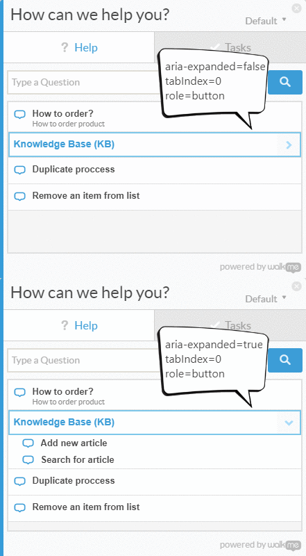
// Example for expanding and collapsing a category with the Space key
const category = await page.$(`.category`);

// verify tabIndex, role and focus
expect(await page.evaluate(elem => elem.getAttribute(`role`), category)).toEqual(`button`);
expect(await page.evaluate(elem => elem.getAttribute(`tabindex`), category)).toEqual(`0`);
expect(await page.evaluate(elem => window.document.activeElement === elem, category)).toEqual(true);

// verify aria-expanded = false
expect(await page.evaluate(elem => elem.getAttribute(`aria-expanded`), category)).toEqual(`false`);

// toggle category by pressing Space
await page.keyboard.press('Space');

// verify aria-expanded = true
expect(await page.evaluate(elem => elem.getAttribute(`aria-expanded`), category)).toEqual(`true`);
Ensure successful screen reader usage
Around 1% to 2% of people use a screen reader. Can you understand all important information and interact with the component using the screen reader and keyboard alone?
The following questions should help you address screen reader accessibility.
Do all components and images have meaningful text alternatives?
Wherever information about the name or purpose of an interactive component is conveyed visually, provide an accessible text alternative.
For example, if your <fancy-menu> UI component only displays a gear icon
to indicate that it's a settings menu,
it needs an accessible text alternative, such as "settings,"
that conveys the same information.
Depending on context,
you can provide a text alternative using an alt attribute,
an aria-label attribute, an aria-labelledby attribute,
or plain text in the Shadow DOM.
You can find general technical tips in WebAIM Quick Reference.
Any UI component that displays an image should provide a mechanism
for providing alternative text for that image, analogous to the alt attribute.
Do your components provide semantic information?
Assistive technology conveys semantic information that is otherwise expressed to sighted users with visual cues, such as formatting, cursor style, or position. Standardized elements have this semantic information built-in by the browser, but for custom components you need to use ARIA to add the information.
In general, any component that listens to a mouse click or hover event should have some kind of keyboard event listener and an ARIA role, possibly ARIA states and attributes as well.
For example, a custom <fancy-slider> UI component might take an ARIA role of slider,
which has some related ARIA attributes: aria-valuenow, aria-valuemin and aria-valuemax.
By binding these attributes to the relevant properties on your custom component,
you can allow users of assistive technology to interact with the element,
change its value, and even cause the element's visual presentation to change accordingly.

<fancy-slider role="slider" aria-valuemin="1" aria-valuemax="5" aria-valuenow="2.5">
</fancy-slider>
Can users understand everything without relying on color?
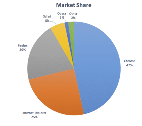
Color shouldn't be used as the only means of conveying information, such as indicating a status, prompting the user for a response, or visualizing data. For example, if you have a pie chart, provide labels and values for each slice so users who have visual impairments can understand the information, even if they can't see where the slices begin and end:
Is there sufficient contrast?
Any text content displayed in your component should meet the minimum WCAG AA-level contrast threshold. Consider providing a high-contrast theme that meets the higher AAA threshold, and ensure that user agent style sheets can be applied if users require custom contrast or different colors. You can use this Color Contrast Checker as an aid when designing your component.
Is moving or flashing content stoppable and safe?
Users should be able to pause, stop, or hide content that moves, scrolls, or blinks for more than five seconds. In general, avoid flashing content.
If something must flash, make sure it flashes no more than three times per second.
Accessibility tools and testing
There are over 100 tools available to evaluate the accessibility of your site and its components. Some tools are automated while others require manual testing.
Here are a few for your consideration:
- Axe provides automated accessibility testing for your framework or browser of choice. Axe Puppeteer can be used for writing automated accessibility tests.
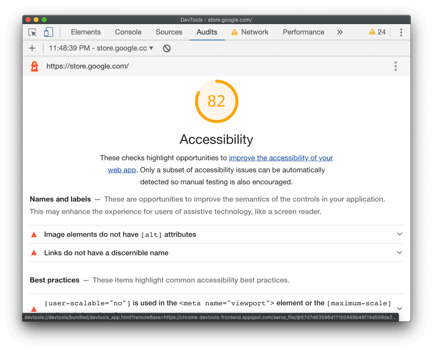
A Lighthouse Accessibility audit provides helpful insights for discovering common accessibility issues. The accessibility score is a weighted average of all accessibility audits based on Axe user impact assessments. For monitoring accessibility with continuous integration, see Lighthouse CI.
Tenon.io is useful for testing common accessibility problems. Tenon has strong integration support across build tools, browsers (through extensions), and even text editors.
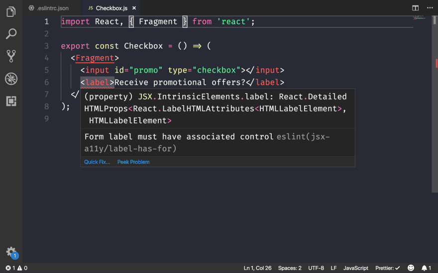
There are many library- and framework-specific tools for highlighting accessibility issues with components. For example use eslint-plugin-jsx-a11y to highlight accessibility issues for React components in your editor.
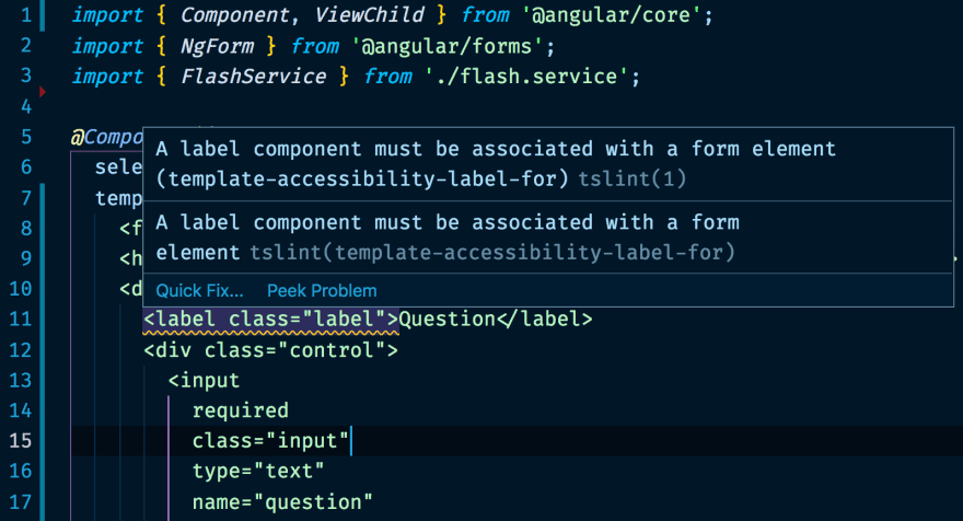
If you use Angular, codelyzer provides in-editor accessibility audits too:
Work with assistive technologies
- You can examine the way that assistive technologies see web content by using
Accessibility Inspector (Mac)
or Windows Automation API Testing Tools
and AccProbe (Windows).
You can also see the full accessibility tree that Chrome creates
by navigating to
about://accessibility. - The best way to test for screen reader support on a Mac is using the VoiceOver
utility. Use
⌘F5to enable or disable it,Ctrl+Option ←→to move through the page, andCtrl+Shift+Option + ↑↓to move up and down the accessibility tree. For more detailed instructions, see the full list of VoiceOver commands and the list of VoiceOver Web commands. On Windows, NVDA is a free, open source screen reader. However, it has a steep learning curve for sighted users.
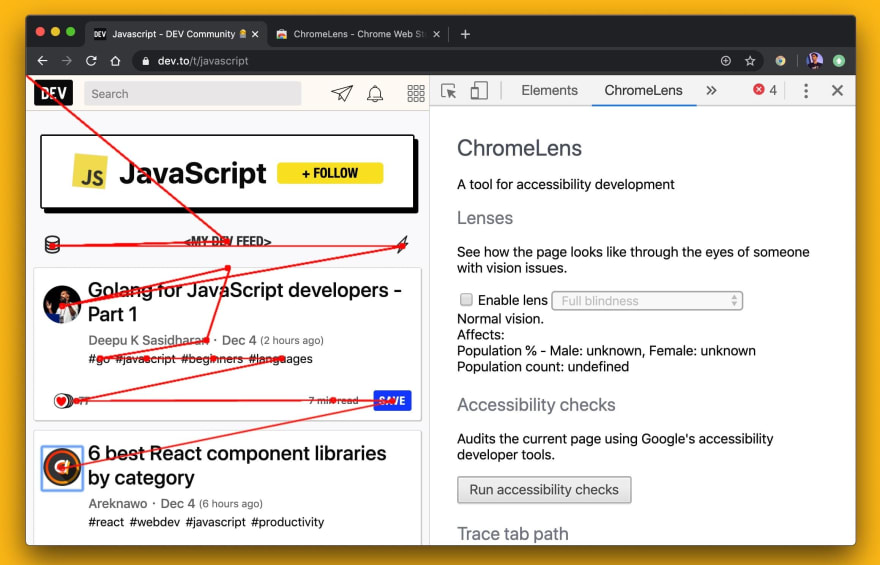
ChromeOS has a built-in screenreader.
We have a long way to go to improve accessibility on the web. Per the Web Almanac:
- 4 out of every 5 sites have text that blends into the background, making them unreadable.
- 49.91% of pages still fail to provide
altattributes for some of their images. - Only 24% of pages that use buttons or links include labels.
- Only 22.33% of pages provide labels for all their form inputs.
There's much we can do to build experiences that are more accessible for everyone.

