Published: September 28, 2023
CSS grid is a very powerful layout engine, but the row and
column tracks created on a parent grid can only be used to position direct
children of the grid container. Any author defined named grid areas and
lines were lost on any other element than a
direct child. With subgrid, track sizing, templates and names can be shared
with nested grids. This article explains how it works.
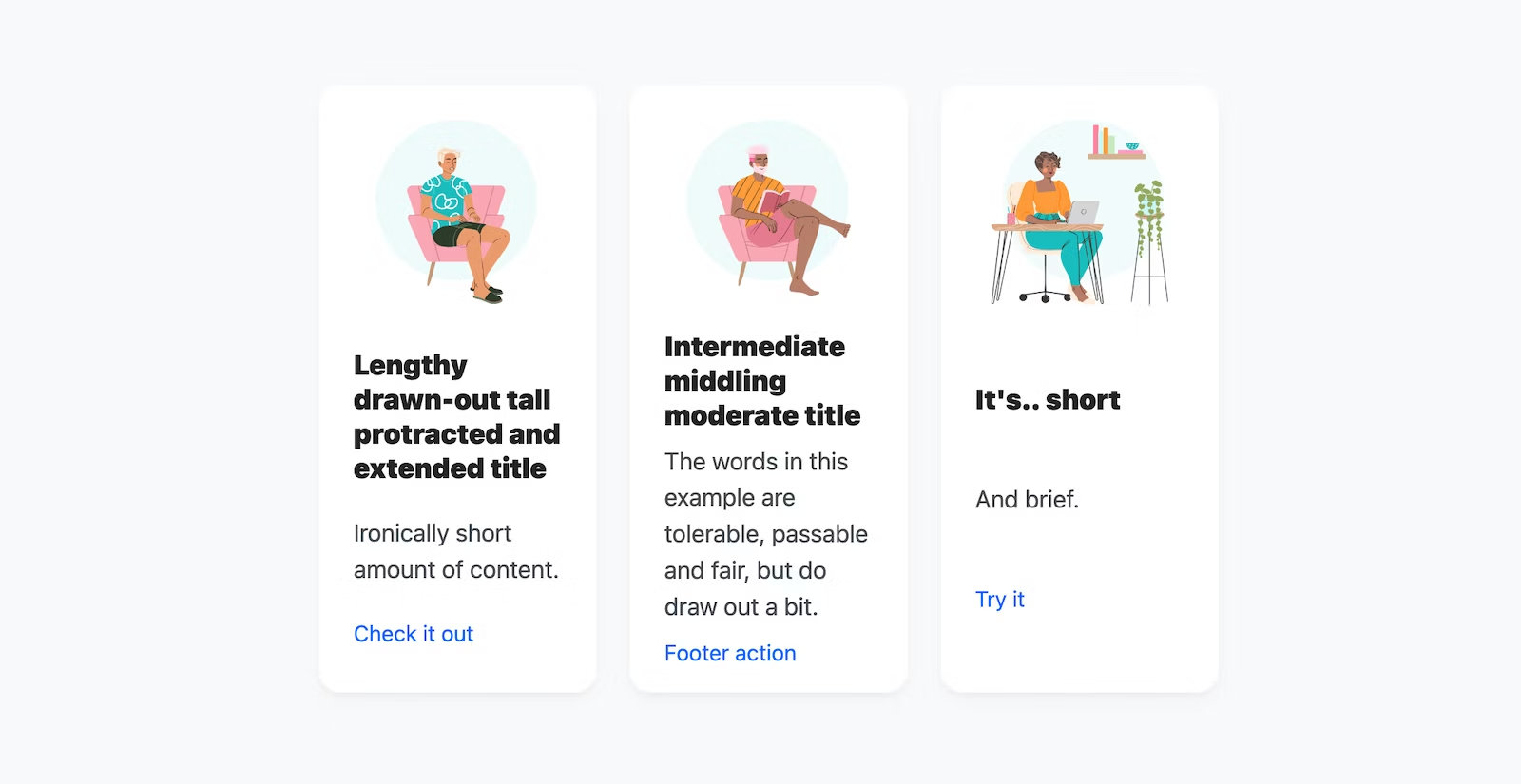
Before subgrid, content was often hand tailored to avoid ragged layouts like this one.
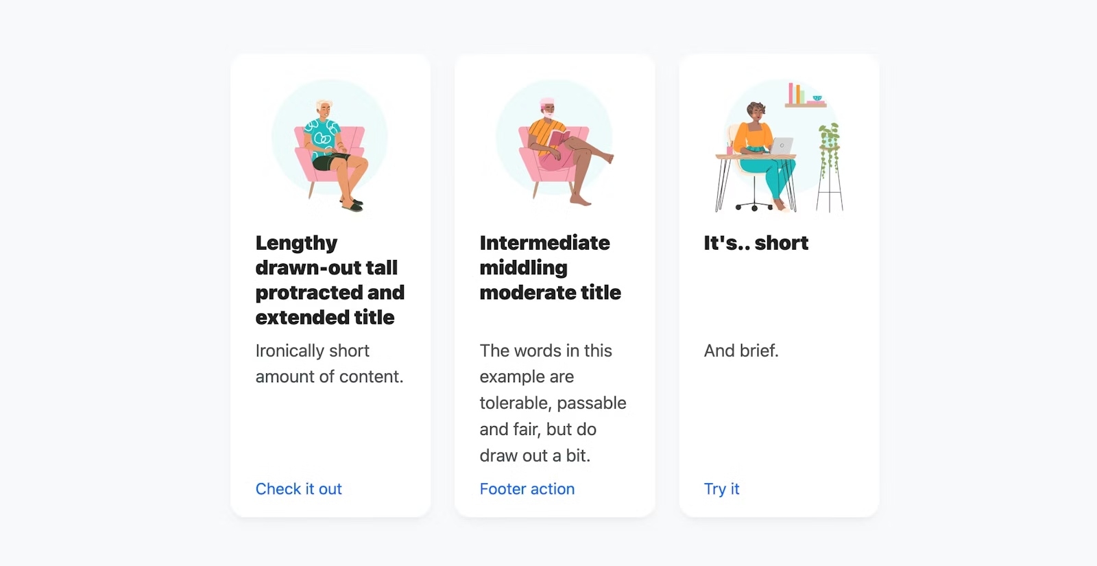
After subgrid, aligning the variably sized content is possible.
Subgrid basics
Here is a straightforward use case introducing the basics of CSS subgrid. A
grid is defined with two named columns, the first is 20ch wide and the second
is "the rest" of the space 1fr. The column names aren't required but they're
great for illustrative and educational purposes.
.grid {
  display: grid;
  gap: 1rem;
  grid-template-columns: [column-1] 20ch [column-2] 1fr;
}
Then, a child of that grid, spans those two columns, is set as a grid container,
and adopts the columns of its parent by setting grid-template-columns to
subgrid.
.grid > .subgrid {
  grid-column: span 2;

  display: grid;
  grid-template-columns: subgrid; /* 20ch 1fr */
}
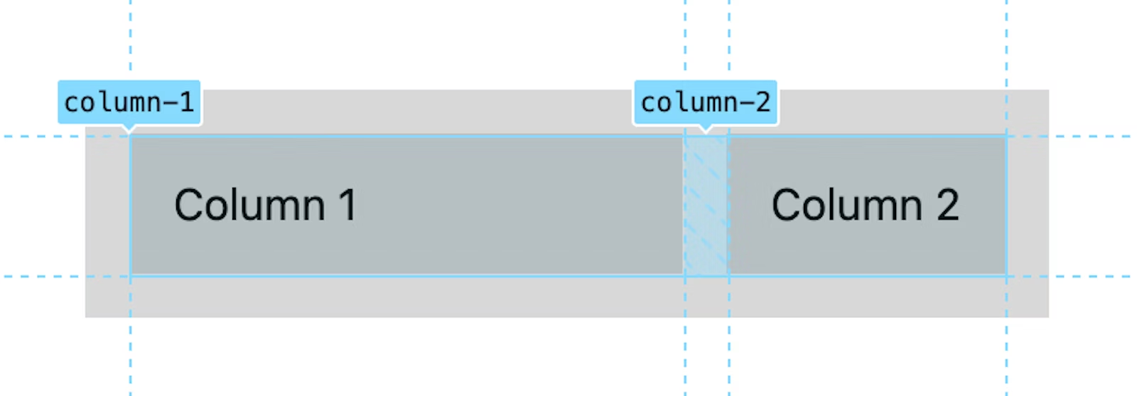
That's it, a parent grid's columns have been effectively passed down a level to a subgrid. This subgrid can now assign children to either of those columns.
Challenge! Repeat the same demo but do it for grid-template-rows.
Share a page level "macro" grid
Designers often work with shared grids, drawing lines over an entire design, aligning any element they want to it. Now web developers can too! This exact workflow can now be achieved, plus many more.
Implementing the most common designer grid workflow can provide excellent
insights into the capabilities, workflows, and potentials of subgrid.
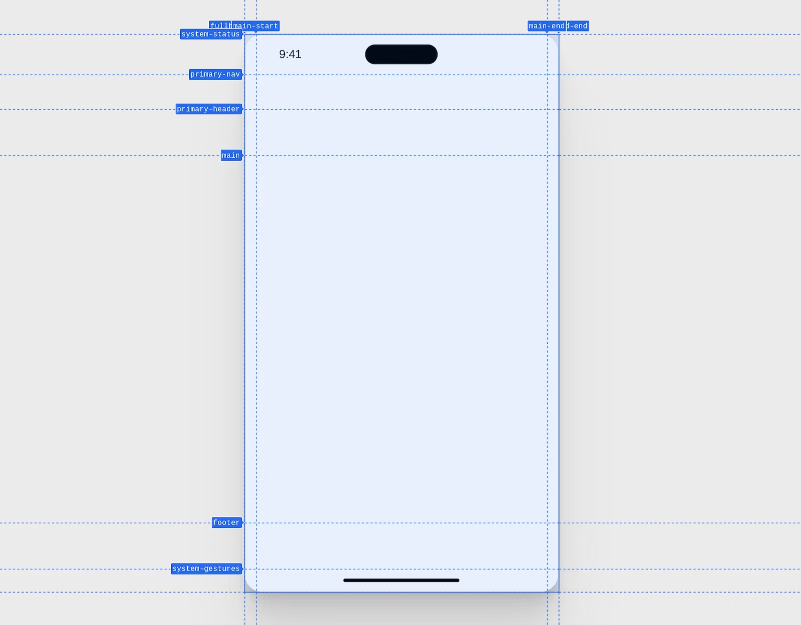
Here's a screenshot taken from Chrome DevTools of a mobile page layout macro grid. The lines have names and there are clear areas for component placement.
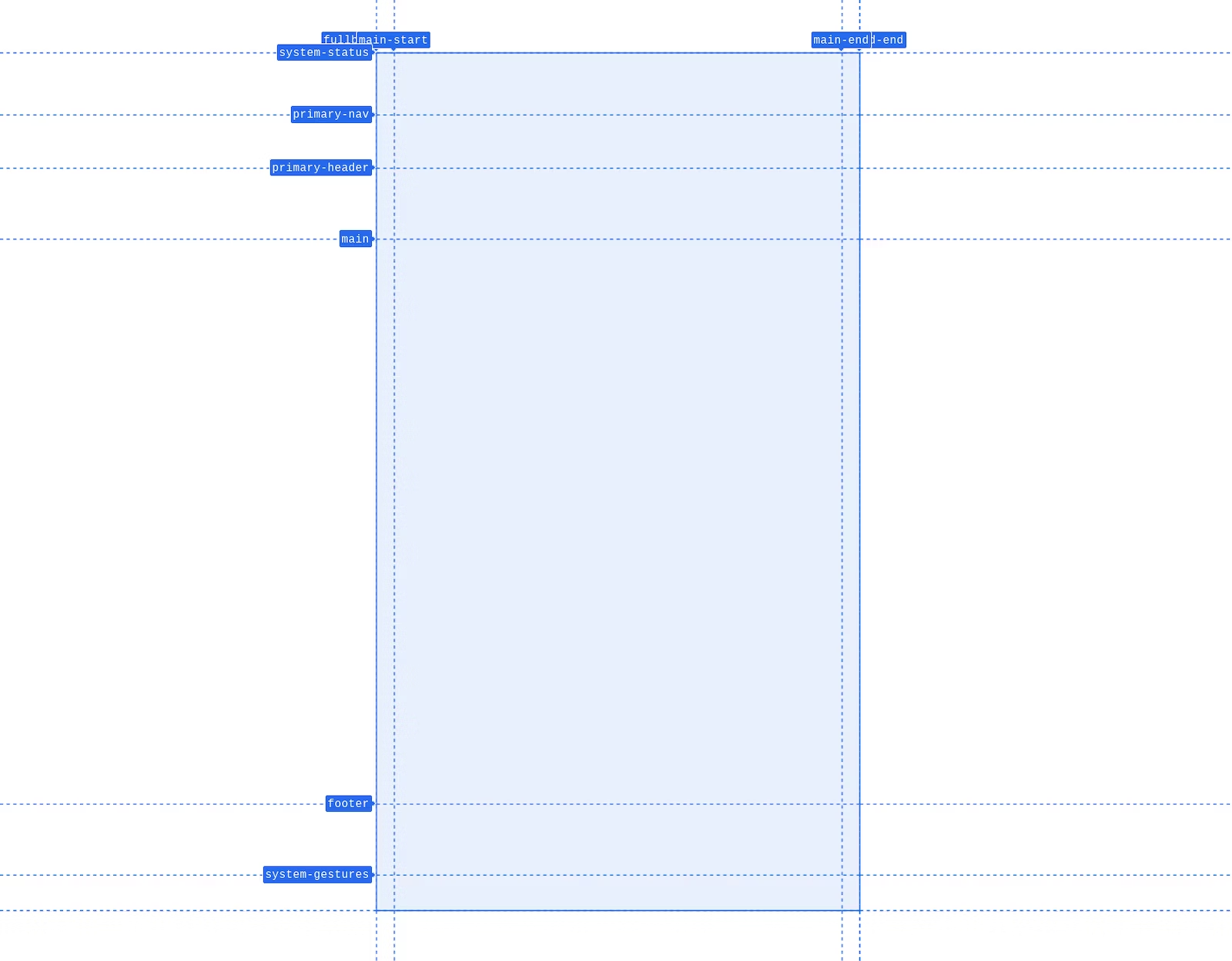
The following CSS creates this grid, with named rows and columns for the device layout. Each row and column has a size.
.device {
    display: grid;
    grid-template-rows:
      [system-status] 3.5rem
      [primary-nav] 3rem
      [primary-header] 4rem
      [main] auto
      [footer] 4rem
      [system-gestures] 2rem
    ;
    grid-template-columns: [fullbleed-start] 1rem [main-start] auto [main-end] 1rem [fullbleed-end];
}
Some additional styles give the following design.
Inside this parent, are various nested elements. The design requires a full
width image under the nav and header rows. The furthest left and right column
line names are fullbleed-start and fullbleed-end. Naming grid lines this way
enables children to align to each simultaneously with the placement
shorthand
of fullbleed. It's very convenient as you'll soon see.

With the overall device layout created with nice named rows and columns, use
subgrid to pass the well named rows and columns to nested grid layouts. This
is that subgrid magic moment. The device layout passes the named rows and
columns to the app container, which then passes it on to every one of its
children.
.device > .app,
.app > * {
    display: grid;
    grid: subgrid / subgrid;

    /* same as */
    grid-template-rows: subgrid;
    grid-template-columns: subgrid;
}
CSS subgrid is a value used in place of a list of grid tracks. The rows and
columns the element is spanning from its parent, are now the same rows and
columns it offers. This makes the line names from the .device grid available
to children of .app, instead of only .app. Elements inside of .app were
not able to reference the grid tracks created by .device before subgrid.
With this all defined, the nested image is now able to go full bleed in the
layout thanks to subgrid. No negative values or tricks, instead a nice
one-liner that says “my layout spans from fullbleed-start to fullbleed-end.”
.app > main img {
    grid-area: fullbleed;
}
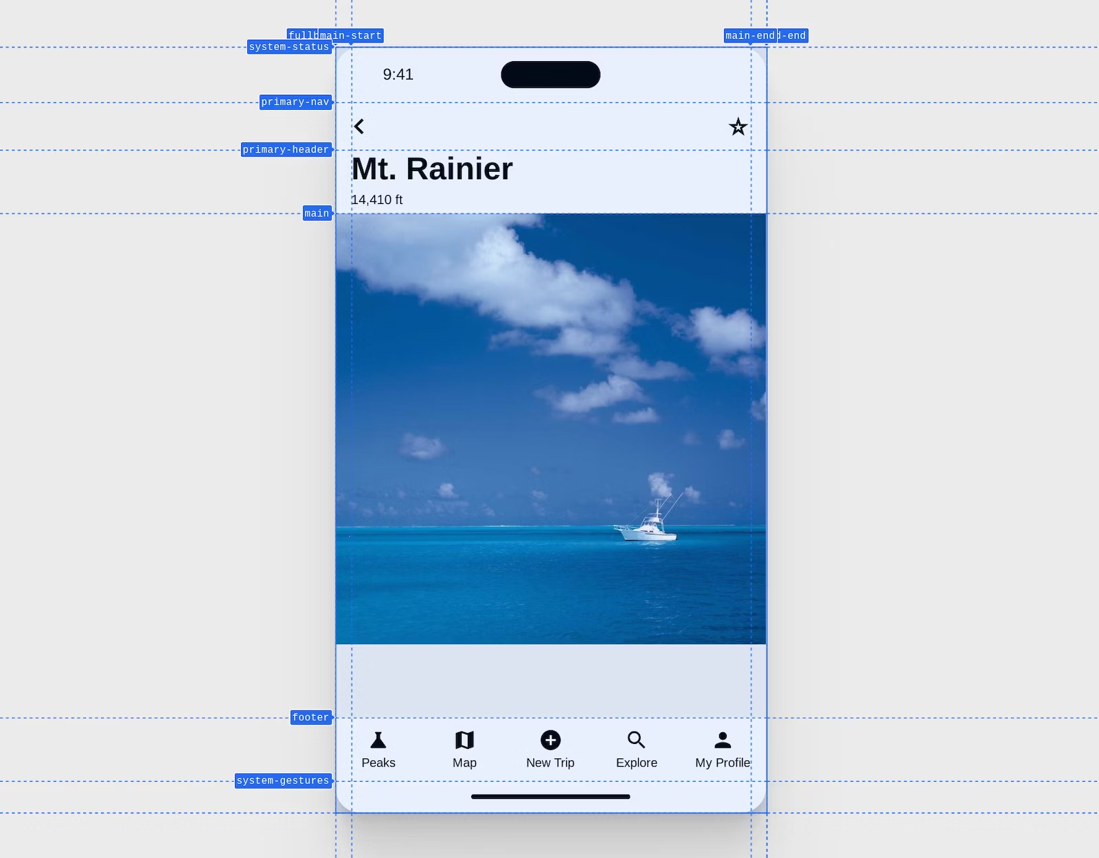
There you have it, a macro grid like designers use, implemented in CSS. This concept can scale and grow with you as needed.
Check for support
Progressive enhancement with CSS and subgrid is familiar and straightforward.
Use @supports and inside the parenthesis ask the browser if it understands
subgrid as a value for template columns or rows. The following example checks if
the grid-template-columns property supports the subgrid keyword, which if
true, means that subgrid can be used
@supports (grid-template-columns: subgrid) {
  /* safe to enhance to */
}
Devtools
Chrome, Edge, Firefox and Safari all have great CSS grid DevTools, and Chrome, Edge and Firefox have specific tools for helping with subgrid. Chrome announced their tools in 115 while Firefox has had them for a year or more.

The subgrid badge acts like the grid badge but visually distinguishes which grids are subgrids and which aren't.
Resources
This list is a compilation of subgrid articles, demos and overall inspiration for getting started. If you're looking for the next step for your subgrid education, have fun exploring all these great resources!
- MDN
- Rachel Andrew with aligned captions
- Rachel Andrew with 10 great examples
- Rachel Andrew with a site of examples
- Ahmad Shadeed article
- Michelle Barker at CSS Day 2022
- Cards
- Chris Coyier with forms
- Facundo Corradini with form alignment
- Chris Coyier with aligning list item markers
- Michelle Barker popping out of container to align with parent grid
- Miriam Suzanne showing named line names and subgrid interactions
- Kevin Powell with named area basics
- Kevin Powell with aligned lists
- Shannon Moeller with aligned lists
- Kevin Powell with a page level grid passed down to components
- Elad Shechter with a devtool overlay and fallback
- Aaron Iker with a nice typographic use of subgrid for baseline alignment of footnotes
- Adam Argyle with a fullbleed image inside an article
