Many people use a keyboard—or software or hardware that mimics the functionality of a keyboard, such as a switch device—as their primary means of navigation. This may be due to personal preference, efficiency, or broken hardware.
People with temporary physical limitations, such as sprained wrist or fine motor disabilities like carpal tunnel, may choose to use a keyboard to navigate. Low-vision or blind users may use a keyboard for navigation combined with their magnification or screen reader software. However, they may use different keyboard shortcut commands to navigate a screen than a sighted user would.
Some people without disabilities may also choose to navigate using a keyboard.
Keyboard support for all of these disabilities and circumstances is critical. A large part of keyboard accessibility is centered around focus. Focus refers to the element on the screen actively receiving input from the keyboard.
In this module, we concentrate on HTML structure and CSS styling for keyboard and focusable elements. The JavaScript module includes more information on focus management and keystrokes for interactive elements.
Focus order
The elements that a keyboard user can navigate to are called focusable elements. Focus order, also called tab or navigation order, is the order in which elements receive focus. The default focus order must be logical, intuitive, and match the visual order of a page.
For most languages, the focus order starts at the top of the page and ends at the bottom, traveling from left to right. However, some languages are read right to left, so the primary language of the page may warrant a different focus order.
By default, focus order includes naturally focusable HTML elements, such as links, checkboxes, and text inputs. Naturally focusable HTML elements include built-in tab order support and basic keyboard event handling.
You can update the focus order to include any elements that don't normally receive focus, such as non-interactive HTML elements, custom components, or elements with ARIA, and override the natural focus semantics.
Tabindex
The focus order begins with elements that have a positive tabindex attribute (if there are any) and moves from the smallest positive number to the largest (such as 1, 2, 3). It then proceeds through elements with a tabindex of zero according to their order in the DOM. Any elements with a negative tabindex are removed from the natural focus order.
When a tabindex
of zero (tabindex="0") is applied to normally unfocusable elements, they are
added into the natural focus order of the page according to the way they appear
in the DOM. However, unlike naturally focusable HTML elements, you must
provide additional keyboard support
for them to be fully accessible.
Similarly, if you have an element that normally is focusable but is
inactive—such as a button that is inoperative until an input field is filled
in—you should add a negative tabindex (tabindex="-1") to this element. Adding
a negative tabindex signals to assistive technologies and keyboards that this
button should be removed from the natural focus order. But don't worry—you can
use JavaScript to add the focus back to the element when needed.
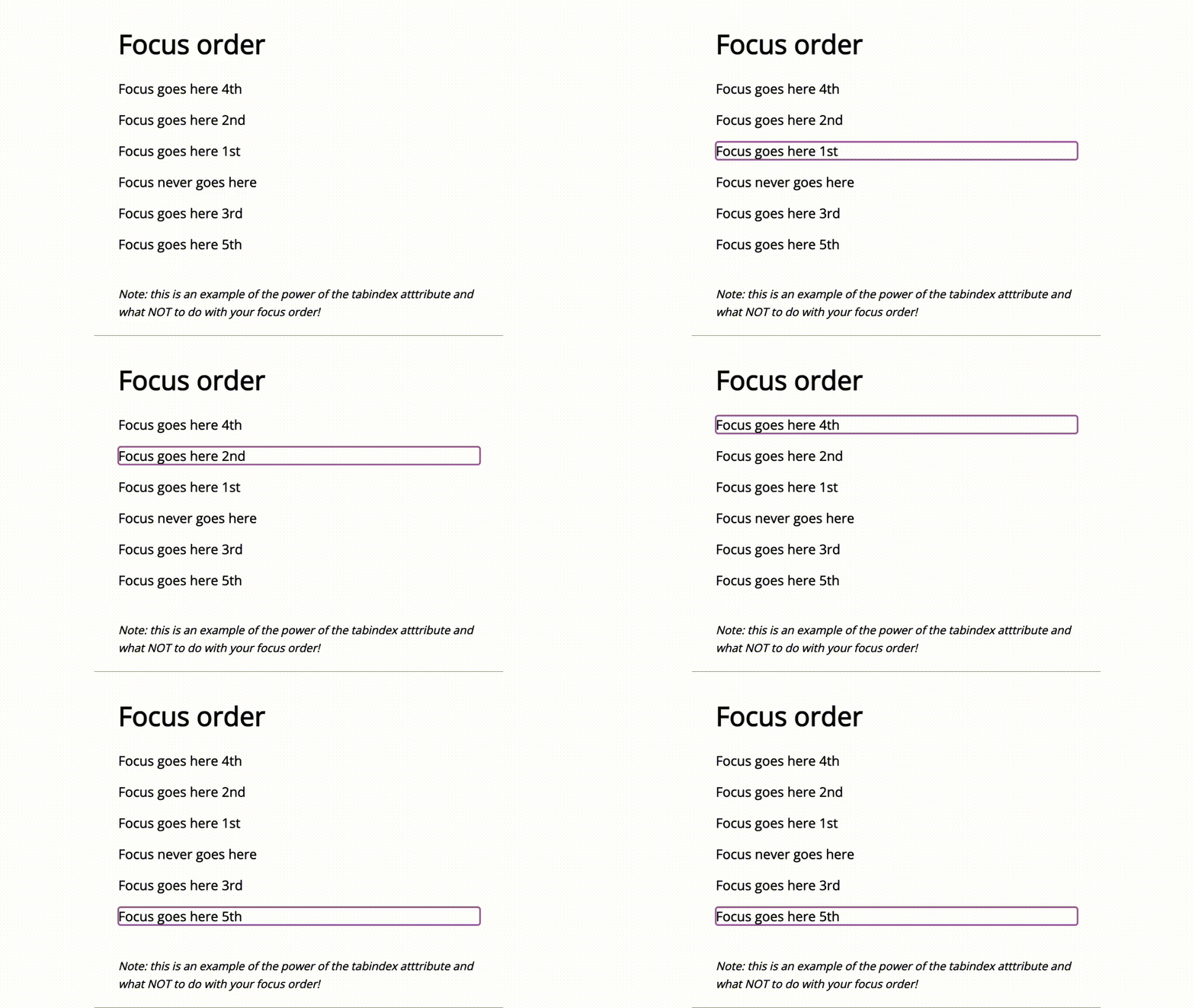
In this example, a tabindex attribute was added to elements that don't
naturally receive focus. The order of the elements was manipulated using
tabindex to illustrate the power it can have on focus order. This is an
example of what not to do!

Skip links
Most websites today have a long list of menu links in the page's main header consistent from page to page. This is great for general navigation but can make it difficult for keyboard-only users to easily get to the website's main content without having to tab multiple times.
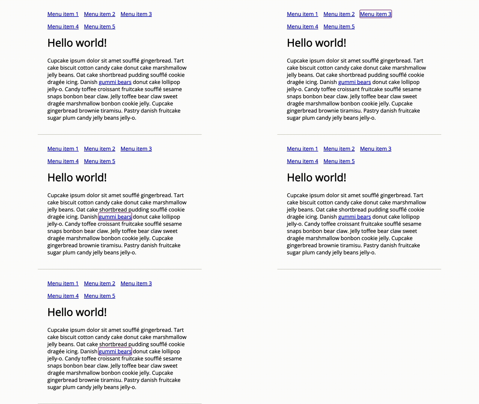
One way to jump over redundant or unuseful groups of links is to add a skip link. Skip links are anchor links that jump to a different section of the same page, using that section's ID, instead of sending the user to another page on the website or an external resource. Skip links are typically added as the first focusable element a user will encounter when arriving at a website and can be visible or visually hidden until a user tabs to it, depending on what the design calls for.
When a user presses the tab key, and an active skip link is in place, it sends the keyboard focus to the skip link. The user can click the skip link and jump past the header section and main navigation. If they choose not to click the skip link and continue to tab down the DOM, they'll be sent to the next focusable element.
Like all links, it's important that the skip link includes context about the
link's purpose. Adding the phrase "Skip to main content," lets the user know
where the link is taking them. There are many code options to choose from when
providing additional context to your links, such as
aria-labelledby,
aria-label, or adding it
to the text content of the <a> element, as demonstrated in the example.

Focus indicator
As you just learned, focus order is an important aspect of keyboard accessibility. It's also important to decide how that focus is styled. Because even if the focus order is excellent, how could a user know where they are on the page without the proper styling?
A visible focus indicator is critical in informing users about where they are at all times on the page. This is especially important for your sighted keyboard-only users. Focus Not Obscured (Minimum) ensures that the focus indicator is not hidden beneath other components.
Browser default styling
Today, every modern web browser has a different default visual styling that applies to focusable elements on your website or app, some better visible than others. As a user tabs through the page, this styling is applied as the element receives keyboard focus.
If you allow the browser to handle the focus styling, it's important to review
your code to confirm that your theme won't override the browser's default
styling. An override is often written as "outline: 0" or "outline: none" in
your style sheet. This tiny piece of code can remove the browser's default focus
indicator styling, which makes it very difficult for users to navigate your
website or app.
Not recommended — no outline
a:focus {
  outline: none; /* don't do this! */
}
Recommended — styled outline
a:focus {
  outline: auto 5px Highlight; /* for non-webkit browsers */
  outline: auto 5px -webkit-focus-ring-color; /* for webkit browsers */
}
Custom styles
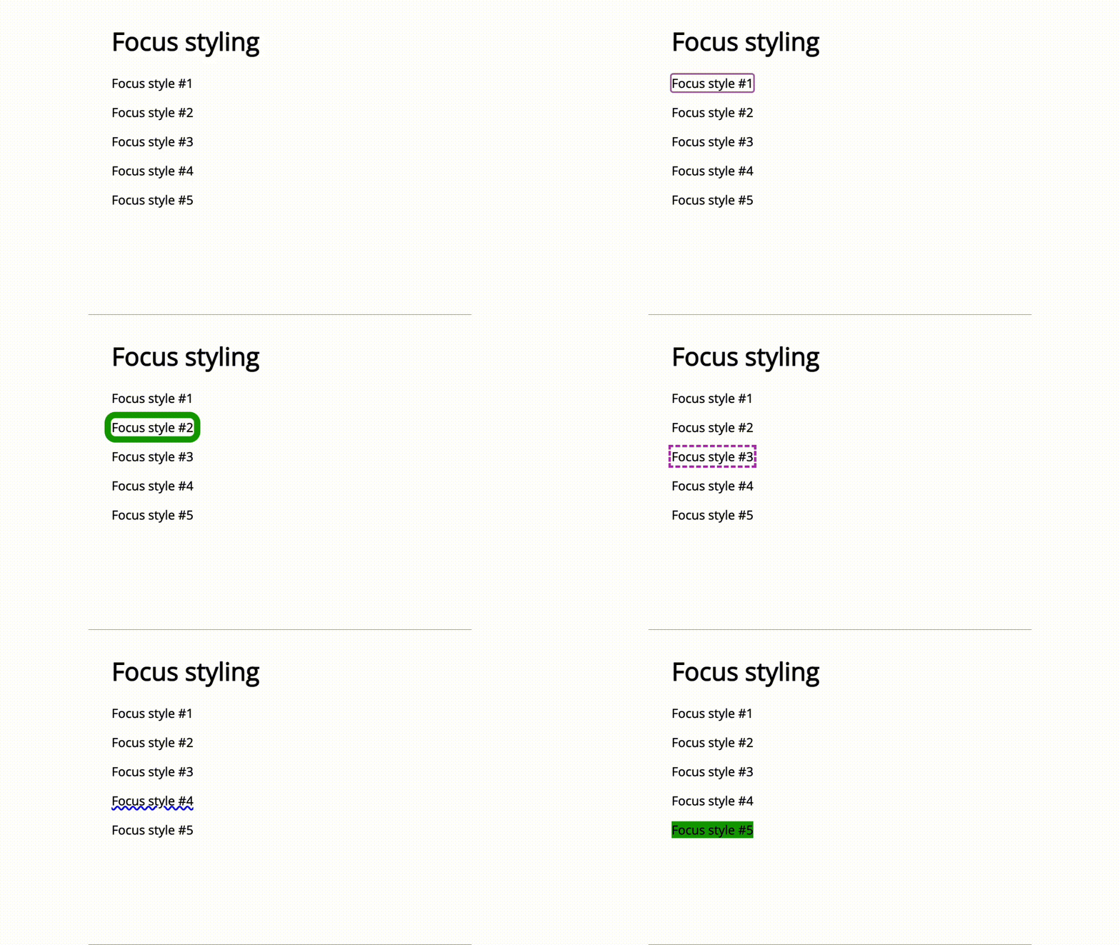
Of course, you can go beyond the default browser style and create a custom focus indicator that complements your theme. When creating a custom focus indicator, you have a lot of freedom to be creative!
A focus indicator shape can take on many forms, be it an outline, a border, an underline, a box, a background change, or some other obvious stylistic change that does not rely on color alone to indicate the keyboard's focus is active on that element.
You could change a focus indicator style to ensure it can be seen. For example, when a page has a white background, you could set the button focus indicator to a blue background. When the page has a blue background, you could set that same button focus style to a white background.
You could change the focus element style based on element type. For example, you could use a dotted underline for body links but choose a rounded border for a button element.

There is no rule about how many focus indicator styles you have on one page—but be sure to keep it to a reasonable number to avoid unnecessary confusion.
