

The order of content in your document is important for the accessibility of your site. A screen reader reads out content based on the document order, using the HTML elements to give additional meaning to that content.
A person navigating the site with a keyboard, rather than a touchscreen or mouse, tabs around the document. They jump from active element to active element, tabbing between links and form fields, in the order the elements exist in the document.
Therefore, starting with a well-structured document and using the right HTML elements is a key part of creating an accessible site. However, it's possible to undo some of that good work when you start using CSS.
Source versus visual order
Website navigation is often marked up as a list of links. You can use Flexbox to turn these into a horizontal bar. In the following example, I have created this commonly used pattern. Click into the example, and tab between the links. The focus moves in a logical direction from left to right, the order that we read in English.
Say you've created this navigation pattern and then were asked to move
Contact Us, which is second in the source, to the end. You could use the
Flexbox order property to move its location.
Try tabbing through the items in the next example, which uses the order
property to rearrange the items.
The focus jumps to the final item and then back again. As far as the tab order is concerned that item is the second item. Visually however, it's the last item.
The example highlights the problem that we face if we rearrange and reorder content using CSS. The right fix for this problem is to change the order of the links in the source, rather than emulating that change using CSS.
Which CSS properties can cause reordering?
Any layout method that lets you to move elements around can cause this problem. The following CSS properties commonly cause content reordering problems:
- Using
position: absoluteand taking an item out of flow visually. - The
orderproperty in Flexbox and Grid layout. - The
row-reverseandcolumn-reversevalues forflex-directionin Flexbox. - The
densevalue forgrid-auto-flowin Grid Layout. - Any positioning by line name or number, or with
grid-template-areasin Grid Layout.
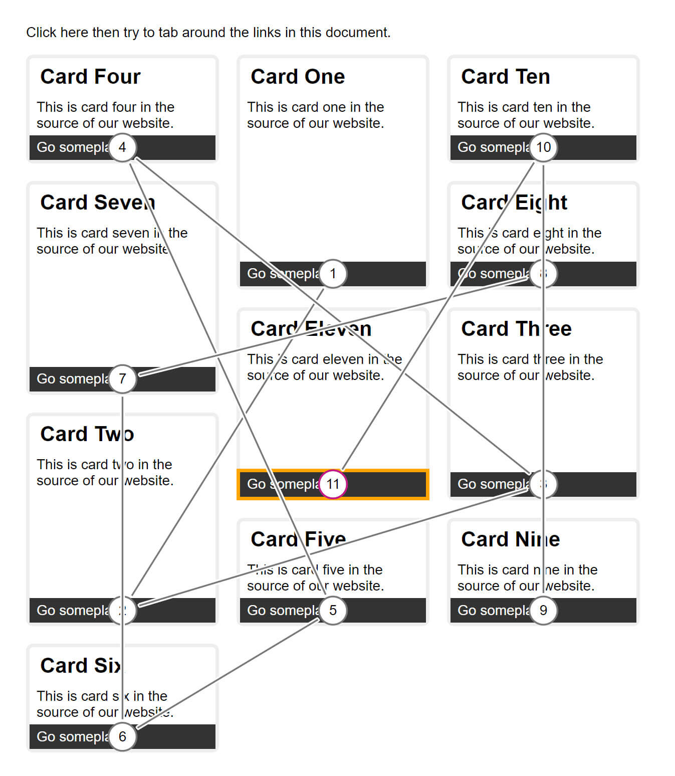
In the next example, I created a layout using CSS Grid and positioned the items using line numbers, without considering where they are in the source.
Try tabbing around this example, and see how the focus jumps about. This makes for a very confusing experience, especially if this is a long page.
Testing for the problem
A quick test is to keyboard navigate through your page. Can you get to everything? Are there any strange jumps as you do so?
For a visual demonstration of content reordering, try the Tab Stop checker in a the Chrome Extension, Accessibility Insights. The screenshot shows the CSS Grid example in that tool. You can see how the focus has to jump around the layout.
Content reordering and responsive web design
If you only have one presentation of your content, then you should be able to maintain a logically ordered source that reflects the layout. This can be harder when you consider the layout at different breakpoints. For example, it might make sense to move an element to the bottom of the layout on smaller screens.
At this time, there isn't a good solution for that particular problem. In most situations, developing mobile-first can help you keep your source and layout in order. The right prioritizations for mobile are often right for your content at-large. The key is to know when there's a possibility of the content reordering. Test to make sure that the end experience isn't too jarring at each breakpoint.