
The CSS Podcast - 011: Grid
A really common layout in web design is a header, sidebar, body and footer layout.
Over the years, there have been many methods to solve this layout, but with CSS grid, not only is it relatively straightforward, but you have lots of options. Grid is exceptionally useful at combining the control that extrinsic sizing provides with the flexibility of intrinsic sizing, which makes it ideal for this sort of layout. This is because grid is a layout method designed for two-dimensional content. That is, laying things out in rows and columns at the same time.
When creating a grid layout you define a grid with rows and columns. Then you place items onto that grid, or allow the browser to auto-place them into the cells you have created. There's a lot to grid, but with an overview of what is available you'll be making grid layouts in no time.
Overview
So what can you do with grid? Grid layouts have the following features. You'll learn about all of them in this guide.
- A grid can be defined with rows and columns. You can choose how to size these row and column tracks or they can react to the size of the content.
- Direct children of the grid container will be automatically placed onto this grid.
- Or, you can place the items in the precise location that you want.
- Lines and areas on the grid can be named to make placement easier.
- Spare space in the grid container can be distributed between the tracks.
- Grid items can be aligned within their area.
Grid terminology
Grid comes with a bunch of new terminology as it's the first time CSS has had a real layout system.
Grid lines
A grid is made up of lines, which run horizontally and vertically. If your grid has four columns, it will have five column lines including the one after the last column.
Lines are numbered starting from 1, with the numbering following the writing mode and script direction of the component. This means that column line 1 will be on the left in a left-to-right language such as English, and on the right in a right-to-left language such as Arabic.

Grid tracks
A track is the space between two grid lines. A row track is between two row lines and a column track between two column lines. When we create our grid we create these tracks by assigning a size to them.

Grid cell
A grid cell is the smallest space on a grid defined by the intersection of row and column tracks. It's just like a table cell or a cell in a spreadsheet. If you define a grid and don't place any of the items they will automatically be laid out one item into each defined grid cell.

Grid area
Several grid cells together. Grid areas are created by causing an item to span over multiple tracks.

Gaps
A gutter or alley between tracks. For sizing purposes these act like a regular track. You can't place content into a gap but you can span grid items across it.

Grid container
The HTML element which has display: grid applied,
and therefore creates a new grid formatting context for the direct children.
.container {
  display: grid;
}
Grid item
A grid item is an item which is a direct child of the grid container.
<div class="container">
  <div class="item"></div>
  <div class="item"></div>
  <div class="item"></div>
</div>
Rows and columns
To create a basic grid you can define a grid with three column tracks, two row tracks and a 10 pixel gap between the tracks as follows.
.container {
    display: grid;
    grid-template-columns: 5em 100px 30%;
    grid-template-rows: 200px auto;
    gap: 10px;
}
This grid demonstrates many of the things described in the terminology section. It has three column tracks. Each track uses a different length unit. It has two row tracks, one using a length unit and the other auto. When used as a track sizing auto can be thought of as being as big as the content. Tracks are auto sized by default.
If the element with a class of .container has child items,
they will immediately lay out on this grid. You can see this in action in the
following demo:
The grid overlay in Chrome DevTools can help you understand the various parts of the grid.
Open the demo in Chrome.
Inspect the element with the grey background, which has an ID of container.
Highlight the grid by selecting the grid badge in the DOM, next to the .container element.
Inside the Layout tab under Overlay display settings, select Show line numbers in the drop-down to see the line numbers on your grid.

Intrinsic sizing keywords
In addition to the length and percentage dimensions as described in the section on sizing units, grid tracks can use intrinsic sizing keywords. These keywords are defined in the Box Sizing specification and add additional methods of sizing boxes in CSS, not just grid tracks.
min-contentmax-contentfit-content()
The min-content
keyword will make a track as small as it can be without the track content overflowing.
Changing the example grid layout to have three column tracks all at min-content size
will mean they become as narrow as the longest word in the track.
The max-content
keyword has the opposite effect.
The track will become as wide enough for all of the content to display in one long unbroken string.
This might cause overflows as the string won't wrap.
The fit-content()
function acts like max-content at first.
However, once the track reaches the size that you pass into the function,
the content starts to wrap.
So fit-content(10em) will create a track that is less than 10em,
if the max-content size is less than 10em,
but never larger than 10em.
In the next demo try out the different intrinsic sizing keywords by changing the sizing of the grid tracks.
The fr unit
We have existing length dimensions, percentages, and also these new keywords.
There is also a special sizing method which only works in grid layout.
This is the fr unit,
a flexible length which describes a share of the available space in the grid container.
The fr unit works in a similar way to using flex: auto in flexbox.
It distributes space after the items have been laid out.
Therefore to have three columns which all get the same share of available space:
.container {
  display: grid;
  grid-template-columns: 1fr 1fr 1fr;
}
As the fr unit shares out available space,
it can be combined with a fixed size gap or fixed size tracks.
To have a component with a fixed size element and the second track taking up whatever space is left,
you can use as a tracklisting of grid-template-columns: 200px 1fr.
Using different values for the fr unit will share the space in proportion. Larger values getting more of the spare space. In the following demo, change the value of the third track.
The minmax() function
' d='M96 183a64 64 0 0 1-23-23L17 64a128 128 0 0 0 111 192l55-96a64 64 0 0 1-87 23Z'/%3E%3Cpath fill='url(%23b)' d='M192 128a64 64 0 0 1-9 32l-55 96A128 128 0 0 0 239 64H128a64 64 0 0 1 64 64Z'/%3E%3Ccircle cx='128' cy='128' r='52' fill='%231a73e8'/%3E%3Cpath fill='url(%23c)' d='M96 73a64 64 0 0 1 32-9h111a128 128 0 0 0-222 0l56 96a64 64 0 0 1 23-87Z'/%3E%3C/svg%3E)
' xlink:href='%23A'%3E%3Cstop offset='.76' stop-opacity='0'/%3E%3Cstop offset='.95' stop-opacity='.5'/%3E%3Cstop offset='1'/%3E%3C/radialGradient%3E%3CradialGradient id='F' cx='2523' cy='4680' r='20243' gradientTransform='matrix(-.03715 .99931 -2.12836 -.07913 13579 3530)' xlink:href='%23A'%3E%3Cstop offset='0' stop-color='%2335c1f1'/%3E%3Cstop offset='.11' stop-color='%2334c1ed'/%3E%3Cstop offset='.23' stop-color='%232fc2df'/%3E%3Cstop offset='.31' stop-color='%232bc3d2'/%3E%3Cstop offset='.67' stop-color='%2336c752'/%3E%3C/radialGradient%3E%3CradialGradient id='G' cx='24247' cy='7758' r='9734' gradientTransform='matrix(.28109 .95968 -.78353 .22949 24510 -16292)' xlink:href='%23A'%3E%3Cstop offset='0' stop-color='%2366eb6e'/%3E%3Cstop offset='1' stop-color='%2366eb6e' stop-opacity='0'/%3E%3C/radialGradient%3E%3Cpath id='H' d='M24105 20053a9345 9345 0 01-1053 472 10202 10202 0 01-3590 646c-4732 0-8855-3255-8855-7432 0-1175 680-2193 1643-2729-4280 180-5380 4640-5380 7253 0 7387 6810 8137 8276 8137 791 0 1984-230 2704-456l130-44a12834 12834 0 006660-5282c220-350-168-757-535-565z'/%3E%3Cpath id='I' d='M11571 25141a7913 7913 0 01-2273-2137 8145 8145 0 01-1514-4740 8093 8093 0 013093-6395 8082 8082 0 011373-859c312-148 846-414 1554-404a3236 3236 0 012569 1297 3184 3184 0 01636 1866c0-21 2446-7960-8005-7960-4390 0-8004 4166-8004 7820 0 2319 538 4170 1212 5604a12833 12833 0 007684 6757 12795 12795 0 003908 610c1414 0 2774-233 4045-656a7575 7575 0 01-6278-803z'/%3E%3Cpath id='J' d='M16231 15886c-80 105-330 250-330 566 0 260 170 512 472 723 1438 1003 4149 868 4156 868a5954 5954 0 003027-839 6147 6147 0 001133-850 6180 6180 0 001910-4437c26-2242-796-3732-1133-4392-2120-4141-6694-6525-11668-6525-7011 0-12703 5635-12798 12620 47-3654 3679-6605 7996-6605 350 0 2346 34 4200 1007 1634 858 2490 1894 3086 2921 618 1067 728 2415 728 2952s-271 1333-780 1990z'/%3E%3Cuse fill='url(%23B)' xlink:href='%23H'/%3E%3Cuse fill='url(%23D)' opacity='.35' xlink:href='%23H'/%3E%3Cuse fill='url(%23C)' xlink:href='%23I'/%3E%3Cuse fill='url(%23E)' opacity='.4' xlink:href='%23I'/%3E%3Cuse fill='url(%23F)' xlink:href='%23J'/%3E%3Cuse fill='url(%23G)' xlink:href='%23J'/%3E%3C/svg%3E)
' gradientUnits='userSpaceOnUse'%3E%3Cstop offset='.2' stop-color='%239059ff' stop-opacity='0'/%3E%3Cstop offset='.3' stop-color='%238c4ff3' stop-opacity='.1'/%3E%3Cstop offset='.8' stop-color='%237716a8' stop-opacity='.5'/%3E%3Cstop offset='1' stop-color='%236e008b' stop-opacity='.6'/%3E%3C/radialGradient%3E%3CradialGradient id='ff-g' cx='239.1' cy='34.6' r='171.6' gradientUnits='userSpaceOnUse'%3E%3Cstop offset='0' stop-color='%23ffe226'/%3E%3Cstop offset='.1' stop-color='%23ffdb27'/%3E%3Cstop offset='.3' stop-color='%23ffc82a'/%3E%3Cstop offset='.5' stop-color='%23ffa930'/%3E%3Cstop offset='.7' stop-color='%23ff7e37'/%3E%3Cstop offset='.8' stop-color='%23ff7139'/%3E%3C/radialGradient%3E%3CradialGradient id='ff-h' cx='374' cy='-74.3' r='732.2' gradientUnits='userSpaceOnUse'%3E%3Cstop offset='.1' stop-color='%23fff44f'/%3E%3Cstop offset='.5' stop-color='%23ff980e'/%3E%3Cstop offset='.6' stop-color='%23ff5634'/%3E%3Cstop offset='.7' stop-color='%23ff3647'/%3E%3Cstop offset='.9' stop-color='%23e31587'/%3E%3C/radialGradient%3E%3CradialGradient id='ff-i' cx='304.6' cy='7.1' r='536.4' gradientTransform='rotate(84 303 4)' gradientUnits='userSpaceOnUse'%3E%3Cstop offset='0' stop-color='%23fff44f'/%3E%3Cstop offset='.1' stop-color='%23ffe847'/%3E%3Cstop offset='.2' stop-color='%23ffc830'/%3E%3Cstop offset='.3' stop-color='%23ff980e'/%3E%3Cstop offset='.4' stop-color='%23ff8b16'/%3E%3Cstop offset='.5' stop-color='%23ff672a'/%3E%3Cstop offset='.6' stop-color='%23ff3647'/%3E%3Cstop offset='.7' stop-color='%23e31587'/%3E%3C/radialGradient%3E%3CradialGradient id='ff-j' cx='235' cy='98.1' r='457.1' gradientUnits='userSpaceOnUse'%3E%3Cstop offset='.1' stop-color='%23fff44f'/%3E%3Cstop offset='.5' stop-color='%23ff980e'/%3E%3Cstop offset='.6' stop-color='%23ff5634'/%3E%3Cstop offset='.7' stop-color='%23ff3647'/%3E%3Cstop offset='.9' stop-color='%23e31587'/%3E%3C/radialGradient%3E%3CradialGradient id='ff-k' cx='355.7' cy='124.9' r='500.3' gradientUnits='userSpaceOnUse'%3E%3Cstop offset='.1' stop-color='%23fff44f'/%3E%3Cstop offset='.2' stop-color='%23ffe141'/%3E%3Cstop offset='.5' stop-color='%23ffaf1e'/%3E%3Cstop offset='.6' stop-color='%23ff980e'/%3E%3C/radialGradient%3E%3ClinearGradient id='ff-a' x1='446.9' y1='76.8' x2='47.9' y2='461.8' gradientUnits='userSpaceOnUse'%3E%3Cstop offset='.1' stop-color='%23fff44f'/%3E%3Cstop offset='.1' stop-color='%23ffe847'/%3E%3Cstop offset='.2' stop-color='%23ffc830'/%3E%3Cstop offset='.4' stop-color='%23ff980e'/%3E%3Cstop offset='.4' stop-color='%23ff8b16'/%3E%3Cstop offset='.5' stop-color='%23ff672a'/%3E%3Cstop offset='.5' stop-color='%23ff3647'/%3E%3Cstop offset='.7' stop-color='%23e31587'/%3E%3C/linearGradient%3E%3ClinearGradient id='ff-l' x1='442.1' y1='74.8' x2='102.6' y2='414.3' gradientUnits='userSpaceOnUse'%3E%3Cstop offset='.2' stop-color='%23fff44f' stop-opacity='.8'/%3E%3Cstop offset='.3' stop-color='%23fff44f' stop-opacity='.6'/%3E%3Cstop offset='.5' stop-color='%23fff44f' stop-opacity='.2'/%3E%3Cstop offset='.6' stop-color='%23fff44f' stop-opacity='0'/%3E%3C/linearGradient%3E%3C/defs%3E%3Cpath d='M479 166c-11-25-32-52-49-60a249 249 0 0 1 25 73c-27-68-73-95-111-155a255 255 0 0 1-8-14 44 44 0 0 1-4-9 1 1 0 0 0 0-1 1 1 0 0 0-1 0c-60 35-81 101-83 134a120 120 0 0 0-66 25 71 71 0 0 0-6-5 111 111 0 0 1-1-58c-25 11-44 29-58 44-9-12-9-52-8-60l-8 4a175 175 0 0 0-24 21 210 210 0 0 0-22 26 203 203 0 0 0-32 73l-1 2-2 15a229 229 0 0 0-4 34v1a240 240 0 0 0 477 40l1-9c5-41 0-84-15-121zM202 355l3 1-3-1zm55-145zm198-31z' fill='url(%23ff-a)'/%3E%3Cpath d='M479 166c-11-25-32-52-49-60 14 26 22 53 25 72v1a207 207 0 0 1-206 279c-113-3-212-87-231-197-3-17 0-26 2-40-2 11-3 14-4 34v1a240 240 0 0 0 477 40l1-9c5-41 0-84-15-121z' fill='url(%23ff-b)'/%3E%3Cpath d='M479 166c-11-25-32-52-49-60 14 26 22 53 25 72v1a207 207 0 0 1-206 279c-113-3-212-87-231-197-3-17 0-26 2-40-2 11-3 14-4 34v1a240 240 0 0 0 477 40l1-9c5-41 0-84-15-121z' fill='url(%23ff-c)'/%3E%3Cpath d='m362 195 1 1a130 130 0 0 0-22-29C266 92 322 5 331 0c-60 35-81 101-83 134l9-1c45 0 84 25 105 62z' fill='url(%23ff-d)'/%3E%3Cpath d='M257 210c-1 6-22 26-29 26-68 0-80 41-80 41 3 35 28 64 57 79l4 2 7 3a107 107 0 0 0 31 6c120 6 143-143 57-186 22-4 45 5 58 14-21-37-60-62-105-62l-9 1a120 120 0 0 0-66 25l17 16c16 16 58 33 58 35z' fill='url(%23ff-e)'/%3E%3Cpath d='M257 210c-1 6-22 26-29 26-68 0-80 41-80 41 3 35 28 64 57 79l4 2 7 3a107 107 0 0 0 31 6c120 6 143-143 57-186 22-4 45 5 58 14-21-37-60-62-105-62l-9 1a120 120 0 0 0-66 25l17 16c16 16 58 33 58 35z' fill='url(%23ff-f)'/%3E%3Cpath d='m171 151 5 3a111 111 0 0 1-1-58c-25 11-44 29-58 44 1 0 36 0 54 11z' fill='url(%23ff-g)'/%3E%3Cpath d='M18 261a242 242 0 0 0 231 197 207 207 0 0 0 206-279c8 56-20 110-64 146-86 71-169 43-186 31l-3-1c-50-24-71-70-67-110-42 0-57-35-57-35s38-28 89-4c46 22 90 4 90 4 0-2-42-19-58-35l-17-16a71 71 0 0 0-6-5l-5-3c-18-11-52-11-54-11-9-12-9-51-8-60l-8 4a175 175 0 0 0-24 21 210 210 0 0 0-22 26 203 203 0 0 0-32 73c0 1-9 38-5 57z' fill='url(%23ff-h)'/%3E%3Cpath d='M341 167a130 130 0 0 1 22 29 46 46 0 0 1 4 3c55 50 26 121 24 126 44-36 72-90 64-146-27-68-73-95-111-155a255 255 0 0 1-8-14 44 44 0 0 1-4-9 1 1 0 0 0 0-1 1 1 0 0 0-1 0c-9 5-65 92 10 167z' fill='url(%23ff-i)'/%3E%3Cpath d='M367 199a46 46 0 0 0-4-3l-1-1c-13-9-36-18-58-15 86 44 63 193-57 187a107 107 0 0 1-31-6 131 131 0 0 1-11-5c17 12 99 39 186-31 2-5 31-76-24-126z' fill='url(%23ff-j)'/%3E%3Cpath d='M148 277s12-41 80-41c7 0 28-20 29-26s-44 18-90-4c-51-24-89 4-89 4s15 35 57 35c-4 40 16 85 67 110l3 1c-29-15-54-44-57-79z' fill='url(%23ff-k)'/%3E%3Cpath d='M479 166c-11-25-32-52-49-60a249 249 0 0 1 25 73c-27-68-73-95-111-155a255 255 0 0 1-8-14 44 44 0 0 1-4-9 1 1 0 0 0 0-1 1 1 0 0 0-1 0c-60 35-81 101-83 134l9-1c45 0 84 25 105 62-13-9-36-18-58-14 86 43 63 192-57 186a107 107 0 0 1-31-6 131 131 0 0 1-11-5l-3-1 3 1c-29-15-54-44-57-79 0 0 12-41 80-41 7 0 28-20 29-26 0-2-42-19-58-35l-17-16a71 71 0 0 0-6-5 111 111 0 0 1-1-58c-25 11-44 29-58 44-9-12-9-52-8-60l-8 4a175 175 0 0 0-24 21 210 210 0 0 0-22 26 203 203 0 0 0-32 73l-1 2-2 15a279 279 0 0 0-4 34v1a240 240 0 0 0 477 40l1-9c5-41 0-84-15-121zm-24 13z' fill='url(%23ff-l)'/%3E%3C/svg%3E)
' xlink:href='%23s-b'%3E%3Cstop offset='0' stop-color='%2324a5f3' stop-opacity='0' /%3E%3Cstop offset='1' stop-color='%231e8ceb' /%3E%3C/radialGradient%3E%3CradialGradient id='s-j' cx='109.3' cy='13.8' r='93.1' gradientTransform='matrix(-.02 1.1 -1.04 -.02 137 -115)' xlink:href='%23s-b'%3E%3Cstop offset='0' stop-opacity='0' /%3E%3Cstop offset='1' stop-color='%235488d6' stop-opacity='0' /%3E%3Cstop offset='1' stop-color='%235d96eb' /%3E%3C/radialGradient%3E%3C/defs%3E%3Crect width='220' height='220' x='22' y='-107' fill='url(%23s-a)' ry='49' transform='matrix(.57 0 0 .57 187 256)' /%3E%3Cg transform='translate(194 190)'%3E%3Ccircle cx='67.8' cy='67.7' fill='url(%23s-c)' paint-order='stroke fill markers' r='54' /%3E%3Ccircle cx='-69.9' cy='69.3' fill='url(%23s-i)' transform='translate(138 -2)' r='54' /%3E%3C/g%3E%3Cellipse cx='120' cy='14.2' fill='url(%23s-j)' rx='93.1' ry='93.7' transform='matrix(.58 0 0 .58 192 250)' /%3E%3Cg transform='matrix(.58 0 0 .57 197 182)'%3E%3Cpath fill='%23cac7c8' d='M46 192h1l72-48-7-9-66 57Z' /%3E%3Cpath fill='%23fbfffc' d='M46 191v1l66-57-7-9-59 65Z' /%3E%3Cpath fill='url(%23s-d)' d='m119 144-7-9 66-57-59 66Z' /%3E%3Cpath fill='%23fb645c' d='m105 126 7 9 66-57-1-1-72 49Z' /%3E%3C/g%3E%3Cpath stroke='%23fff' stroke-linecap='round' stroke-miterlimit='1' stroke-width='1.3' d='m287 278 3-2m-12-17 8-2m-8-3h4m-4-13 8 2m-8 3h4m-1-13 7 3m-4-11 7 4m-2-11 6 6m0-12 6 7m1-11 4 6m4-10 3 7m5-9 2 7m15-7-1 7m10-5-3 7m11-4-4 7m11-2-5 6m16 7-7 4m10 4-7 3m10 6-8 1m8 16-8-2m5 10-7-3m4 11-7-4m2 11-6-5m0 11-5-6m-2 11-4-7m-4 11-3-8m-6 10-1-8m-16 8 2-8m-10 5 3-7m-11 4 4-7m-11 2 5-6m-8 3 3-3m4 8 2-3m5 8 2-4m6 7 1-4m8 5v-4m8 4v-4m9 3-1-4m9 1-2-4m9 0-2-4m9-2-3-3m8-4-3-2m8-5-4-2m7-6-4-1m5-8h-4m4-8h-4m3-9-4 1m1-9-4 2m-1-9-3 2m-2-9-3 3m-4-8-2 3m-5-8-2 4m-6-6-1 3m-8-5v4m-8-4v4m-9-2 1 3m-9 0 2 3m-9 1 2 3m-9 2 3 3m-8 4 3 2m-8 5 4 2m-7 6 4 1m-4 25 4-1m-2 5 7-3m-6 7 4-2m-2 6 7-4m-13-21h8m41-41v-8m0 99v-8m49-42h-8' transform='translate(-65 8)' /%3E%3C/svg%3E)
This function means that you can set a minimum and a maximum size for a track.
This can be quite useful.
If we take the previous example of the fr unit which distributes remaining space,
it could be written out using
minmax() as minmax(auto, 1fr).
Grid looks at the intrinsic size of the content,
then distributes available space after giving the content enough room.
This means that you might not get tracks that each have an equal share
of all space available in the grid container.
To force a track to take an equal share of the space in the grid container minus gaps use minmax.
Replace 1fr as a track size with minmax(0, 1fr).
This makes the minimum size of the track 0 and not the min-content size.
Grid will then take all of the available size in the container,
deduct the size needed for any gaps,
and share the rest out according to your fr units.
repeat() notation
If you want to create a 12 column track grid with equal columns, you could use the following CSS.
.container {
    display: grid;
    grid-template-columns:
      minmax(0,1fr),
      minmax(0,1fr),
      minmax(0,1fr),
      minmax(0,1fr),
      minmax(0,1fr),
      minmax(0,1fr),
      minmax(0,1fr),
      minmax(0,1fr),
      minmax(0,1fr),
      minmax(0,1fr),
      minmax(0,1fr),
      minmax(0,1fr);
}
Or, you could write it out using
repeat():
.container {
    display: grid;
    grid-template-columns: repeat(12, minmax(0,1fr));
}
The repeat() function can be used to repeat any section of your track listing.
For example you can repeat a pattern of tracks.
You can also have some regular tracks and a repeating section.
.container {
    display: grid;
    grid-template-columns: 200px repeat(2, 1fr 2fr) 200px; /*creates 6 tracks*/
}
auto-fill and auto-fit
You can combine everything you have learned about track sizing,
minmax(), and repeat,
to create a useful pattern with grid layout.
Perhaps you don't want to specify the number of column tracks,
but instead want to create as many as will fit in your container.
You can achieve this with repeat() and the auto-fill or auto-fit keywords.
In the following demo, grid will create as many 200 pixel tracks as will fit in the container.
Open the demo in a new window and see how the grid changes as you change the size of the viewport.
In the demo we get as many tracks as will fit.
The tracks are not flexible however.
You will get a gap on the end until there is enough space for another 200 pixel track.
If you add the minmax() function,
you can request as many tracks as will fit with a minimum size of 200 pixels and a maximum of 1fr.
Grid then lays out the 200 pixel tracks and whatever space is leftover is distributed equally to them.
This creates a two-dimensional responsive layout with no need for any media queries.
There is a subtle difference between auto-fill and auto-fit.
In the next demo play with a grid layout using the syntax explained previously,
but with only two grid items in the grid container.
Using the auto-fill keyword you can see that empty tracks have been created.
Change the keyword to auto-fit and the tracks collapse down to 0 size.
This means that the flexible tracks now grow to consume the space.
The auto-fill and auto-fit keywords otherwise act in exactly the same way.
There is no difference between them once the first track is filled.
Auto-placement
You have already seen grid auto-placement at work in the demos so far. Items are placed on the grid one per cell in the order that they appear in the source. For many layouts this might be all you need. If you need more control then there are a couple of things you might like to do. The first is to tweak the auto-placement layout.
Placing items in columns
The default behavior of grid layout is to place items along the rows.
You can instead cause the items to place into columns using grid-auto-flow: column.
You need to define row tracks otherwise the items will create intrinsic column tracks,
and layout out all in one long row.
These values relate to the writing mode of the document.
A row always runs in the direction a sentence runs in the writing mode of the document or component.
In the next demo you can change mode the value of grid-auto-flow and the writing-mode property.
Spanning tracks
You can cause some or all of the items in an auto-placed layout to span more than one track.
Use the span keyword plus the number of lines to span as a value for grid-column-end or grid-row-end.
.item {
    grid-column-end: span 2; /* will span two lines, therefore covering two tracks */
}
As you have not specified a grid-column-start,
this uses the initial value of auto and is placed according to the auto-placement rules.
You can also specify the same thing using the shorthand grid-column:
.item {
    grid-column: auto / span 2;
}
Filling gaps
An auto-placed layout with some items spanning multiple tracks
may result in a grid with some unfilled cells.
The default behavior of grid layout with a fully auto-placed layout
is to always progress forward.
The items will be placed according to the order they are in the source,
or any modification with the order property.
If there is not enough space to fit an item,
grid will leave a gap and move to the next track.
The next demo shows this behavior.
The checkbox will apply the dense packing mode.
This is enabled by giving grid-auto-flow a value of dense.
With this value in place,
grid will take items later in the layout and use them to fill gaps.
This may mean that the display becomes disconnected from the logical order.
Placing items
You have a lot of functionality from CSS Grid already. Now, take a look at how to position items on the grid we have created.
The first thing to remember is that CSS Grid Layout is based on a grid of numbered lines. The simplest way to place things onto the grid is to place them from one line to another. You'll discover other ways of placing items in this guide, but you always have access to those numbered lines.
The properties that you can use to place items by line number are:
They have shorthands which allow you to set both start and end lines at once:
To place your item set the start and end lines of the grid area that it should be placed into.
.container {
    display: grid;
    grid-template-columns: repeat(4, 1fr);
    grid-template-rows: repeat(2, 200px 100px);
}

.item {
    grid-column-start: 1; /* start at column line 1 */
    grid-column-end: 4; /* end at column line 4 */
    grid-row-start: 2; /*start at row line 2 */
    grid-row-end: 4; /* end at row line 4 */
}
Chrome DevTools can give you a visual guide to the lines in order to check where your item is placed.
The line numbering follows the writing mode and direction of the component. In the next demo change the writing mode or direction to see how the placement of the items stays consistent to the way that text flows.
Stacking items
Using line-based positioning you can place items into the same cell of the grid.
This means that you can stack items,
or cause one item to partly overlap another.
Items which come later in the source will be displayed on top of items that come earlier.
You can change this stacking order using z-index just as with positioned items.
Negative line numbers
When you create a grid using grid-template-rows and grid-template-columns
you create what is known as the explicit grid.
This is a grid that you have defined and given size to the tracks.
Sometimes you will have items which display outside this explicit grid.
For example,
you might define column tracks and then add several rows of grid items without ever defining row tracks.
The tracks would be auto sized by default.
You also might place an item using grid-column-end that is outside of the explicit grid defined.
In both of these cases grid will create tracks to make the layout work,
and these tracks are referred to as the implicit grid.
Most of the time it will make no difference if you are working with an implicit or explicit grid. However, with line-based placement you may run into the main difference between the two.
Using negative line numbers you can place items from the end line of the explicit grid.
This can be useful if you want an item to span from the first to the last column line.
In that case you can use grid-column: 1 / -1.
The item will stretch right across the explicit grid.
This only works for the explicit grid however. Take a layout of three rows of auto-placed items where you would like the very first item to span to the end line of the grid.

You might think that you can give that item grid-row: 1 / -1.
In the following demo, you can see that this doesn't work.
The tracks are created in the implicit grid,
there is no way to reach the end of the grid using -1.
Sizing implicit tracks
The tracks created in the implicit grid will be auto-sized by default.
However if you want to control the sizing of the rows,
use the
grid-auto-rows property,
and for columns
grid-auto-columns.
To create all implicit rows at a minimum size of 10em and a maximum size of auto:
.container {
    display: grid;
    grid-auto-rows: minmax(10em, auto);
}
To create implicit columns with a pattern of 100px and 200px wide tracks. In this case the first implicit column will be 100px, the second 200px, the third 100px, and so on.
.container {
    display: grid;
    grid-auto-columns: 100px 200px;
}
Named grid lines
It can make it easier to place items into a layout if the lines have a name rather than a number. You can name any line on your grid by adding a name of your choosing between square brackets. Multiple names can be added, separated by a space inside the same brackets. Once you have named lines they can be used instead of the numbers.
.container {
    display: grid;
    grid-template-columns:
      [main-start aside-start] 1fr
      [aside-end content-start] 2fr
      [content-end main-end]; /* a two column layout */
}

.sidebar {
    grid-column: aside-start / aside-end;
    /* placed between line 1 and 2*/
}

footer {
    grid-column: main-start / main-end;
    /* right across the layout from line 1 to line 3*/
}
Grid Template Areas
You can also name areas of the grid and place items onto those named areas. This is a lovely technique as it lets you see what your component looks like right there in the CSS.
To start, give the direct children of your grid container a name using the
grid-area property:
header {
    grid-area: header;
}

.sidebar {
    grid-area: sidebar;
}

.content {
    grid-area: content;
}

footer {
    grid-area: footer;
}
The name can be anything you like other than the keywords auto and span.
Once all of your items are named,
use the
grid-template-areas
property to define which grid cells each item will span.
Each row is defined within quotes.
.container {
    display: grid;
    grid-template-columns: repeat(4,1fr);
    grid-template-areas:
        "header header header header"
        "sidebar content content content"
        "sidebar footer footer footer";
}
There are a few rules when using grid-template-areas.
- The value must be a complete grid with no empty cells.
- To span tracks repeat the name.
- The areas created by repeating the name must be rectangular and cannot be disconnected.
If you break any of the previous rules, the value is treated as invalid and thrown away.
To leave whitespace on the grid use a . or multiples with no whitespace between them.
For example to leave the very first cell on the grid empty I could add a series of . characters:
.container {
    display: grid;
    grid-template-columns: repeat(4,1fr);
    grid-template-areas:
        "....... header header header"
        "sidebar content content content"
        "sidebar footer footer footer";
}
As your entire layout is defined in one place,
it makes it straightforward to redefine the layout using media queries.
In the next example I have created a two column layout which moves to three columns
by redefining the value of grid-template-columns and grid-template-areas.
Open the example in a new window to play with the viewport size and see the layout change.
You can also see how the grid-template-areas property relates to writing-mode and direction,
as with other grid methods.
Shorthand properties
There are two shorthand properties which allow you to set many of the grid properties in one go. These can look a little confusing until you break down exactly how they go together. Whether you want to use them or prefer to use longhands is up to you.
grid-template
The grid-template
property is a shorthand for grid-template-rows, grid-template-columns and grid-template-areas.
The rows are defined first,
along with the value of grid-template-areas.
Column sizing is added after a /.
.container {
    display: grid;
    grid-template:
      "head head head" minmax(150px, auto)
      "sidebar content content" auto
      "sidebar footer footer" auto / 1fr 1fr 1fr;
}
grid property
The grid
shorthand can be used in exactly the same way as the grid-template shorthand.
When used in this way it will reset the other grid properties that it accepts to their initial values.
The full set being:
grid-template-rowsgrid-template-columnsgrid-template-areasgrid-auto-rowsgrid-auto-columnsgrid-auto-flow
You can alternately use this shorthand to define how the implicit grid behaves, for example:
.container {
    display: grid;
    grid: repeat(2, 80px) / auto-flow  120px;
}
Subgrid
Any grid item can also become its own grid container by adding display: grid.
By default, this nested grid has its own track sizing, separate from the parent
grid. By using subgrid, your child grid container will inherit the track sizing,
line names, and gap from the parent grid, making it easier to align items by
using shared grid lines.
To use the parent's grid columns on a nested grid, set
grid-template-columns: subgrid. To use the parent's grid rows on a nested
grid, set grid-template-rows: subgrid. You can also use subgrid for both
rows and columns.
In the following demo, there is a grid with a class of gallery that has a few
flexible columns. Since it does not have a grid-template-rows definition, the
row sizing comes from the content. The grid items within the gallery are also
grid containers which are set to start at the next available row (auto) and
span two tracks. Finally, subgrid is used for the grid-template-rows property
which allows the separate gallery-item grids to share the same grid track
sizing. If you comment out this line, you will see how the captions are no
longer aligned.
Applying subgrid to columns and rows
When applying subgrid to both row and column, the subgrid uses the parent's grid tracks in both dimensions. In the following code snippet, there is an explicit grid with four columns and four rows with different track sizes.
.container {
  display: grid;
  gap: 1em;
  grid-template-columns: auto 2fr 1fr auto;
  grid-template-rows: 5fr 1fr 2fr 1fr;
}
One of the grid items also has display: grid and is set to span two columns
and three rows of the parent grid. Before the subgrid value is added, the
items within the nested grid don't line up with the grid items in the parent grid.
.subgrid-container {
  display: grid;
  grid-column: auto / span 2;
  grid-row: auto / span 3;
}

Once subgrid is applied, the grid items within the subgrid inherit the gap set on the parent grid and flows its grid items using the columns and tracks of the parent grid.
.subgrid-container {
  display: grid;
  grid-column: auto / span 2;
  grid-row: auto / span 3;
  grid-template-columns: subgrid;
  grid-template-rows: subgrid;
}

Within the subgrid, you can apply the same properties and values for any grid item. For example, you can extend a grid item within the subgrid to take up two grid columns.
.featured-subgrid-item {
  grid-column: span 2;
}
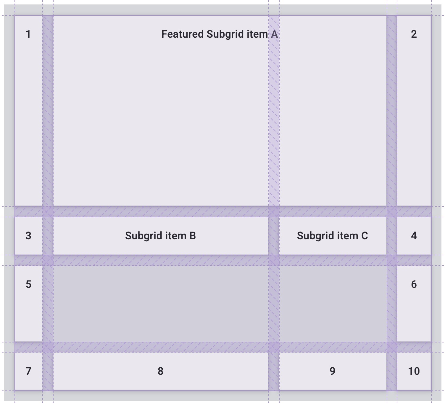
This also works for grid rows.
.subgrid-item {
  grid-row: span 2;
}
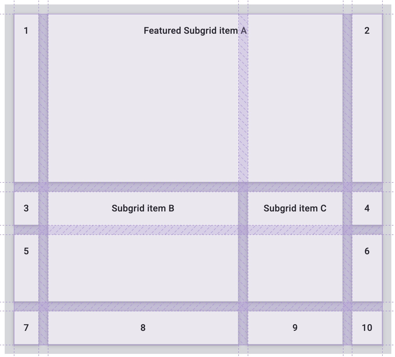
Here is the CodePen demo using subgrid in both dimensions:
Alignment
Grid layout uses the same alignment properties that you learned about in the guide to
flexbox.
In grid the properties which begin with justify- are always used on the inline axis,
the direction in which sentences run in your writing mode.
The properties which begin with align- are used on the block axis,
the direction in which blocks are laid out in your writing mode.
justify-contentandalign-content: distribute additional space in the grid container around or between tracks.justify-selfandalign-self: are applied to a grid item to move it around inside the grid area it is placed in.justify-itemsandalign-items: are applied to the grid container to set all of thejustify-selfproperties on the items.
Distributing extra space
In this demo the grid is larger than the space needed to lay out the fixed width tracks.
This means we have space in both the inline and block dimensions of the grid.
Try different values of align-content and justify-content to see how the tracks behave.
Note how the gaps become larger when using values such as space-between,
and any grid item spanning two tracks also grows to absorb the additional space added to the gap.
Moving content around
Items with a background color appear to completely fill the grid area they are placed in,
because the initial value for justify-self and align-self is stretch.
In the demo change the values of justify-items and align-items to see how this changes the layout.
The grid area is not changing size,
instead the items are being moved around inside the defined area.
Check your understanding
Test your knowledge of grid
Which of the following are CSS grid terms?
main {
  display: grid;
}
What is the default layout direction of a grid?
grid-auto-flow: column was present, than a grid would layout as columns.What is the difference between auto-fit and auto-fill?
auto-fit will stretch cells to fit the container, where auto-fill won't.auto-fill places as many items into the template as possible, without stretching. Fit makes them fit.auto-fit will stretch a container to fit the children, where auto-fill makes the children fit to the container.What is min-content?
min-content is relative to the words and images in the box.min-content is referring to.min-content.What is max-content?
max-content is referring to.min-content.What is auto-placement?
grid-area and are placed on that cell.True or false: You can only create a subgrid in one dimension (row or column).
Resources
This guide has given you an overview of the different parts of the grid layout specification. To find out more, take a look at the following resources.