Installing your Progressive Web App (PWA) can make it easier for users to find and use. Even with browser promotion, some users don't realize that they can install a PWA, so it can be helpful to provide an in-app experience that you can use to promote and enable installation of your PWA.
This article is by no means exhaustive, but offers a starting point for different ways to promote the installation of your PWA. Regardless of which pattern, or patterns you use, they all lead to the same code that triggers the install flow, documented in How to provide your own in-app install experience.
Best practices
There are some best practices that apply no matter which promotional patterns you're using on your site.
- Keep promotions outside of the flow of your user journeys. For example, in a PWA login page, put the call to action below the login form and submit button. Disruptive use of promotional patterns reduces the usability of your PWA and negatively impacts your engagement metrics.
- Include the ability to dismiss or decline the promotion. Remember the user's preference if they do this and only re-prompt if there's a change in the user's relationship with your content such as if they signed in or completed a purchase.
- Combine techniques in different parts of your PWA, but be careful not to overwhelm or annoy your user with install promotion.
- Only show the promotion after the
beforeinstallpromptevent has fired.
Automatic browser promotion
When certain criteria are met, most browsers automatically indicate to the user that your Progressive Web App is installable. For example, desktop Chrome shows an install button in the omnibox.
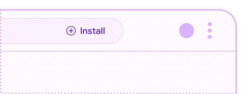
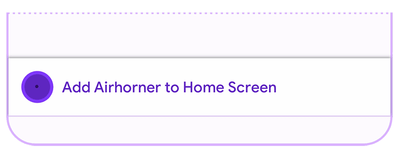
Chrome for Android shows a mini infobar to the user, though this can be
prevented by calling preventDefault() on the beforeinstallprompt event.
If you do not call preventDefault(), the banner will be shown the first time
a user visits your site and meets the installability criteria on Android,
and then again after approximately 90 days.
User interface promotional patterns
User interface promotional patterns can be used for almost any kind of PWA and appear in places such as site navigation and banners. As with any other type of promotional pattern, it's important to be aware of the user's context to minimize disruption of the user's journey.
Sites which are thoughtful about when they trigger promotion UI achieve a larger number of installs and avoid interfering with the journeys of users who aren't interested in installation.
Simple install button
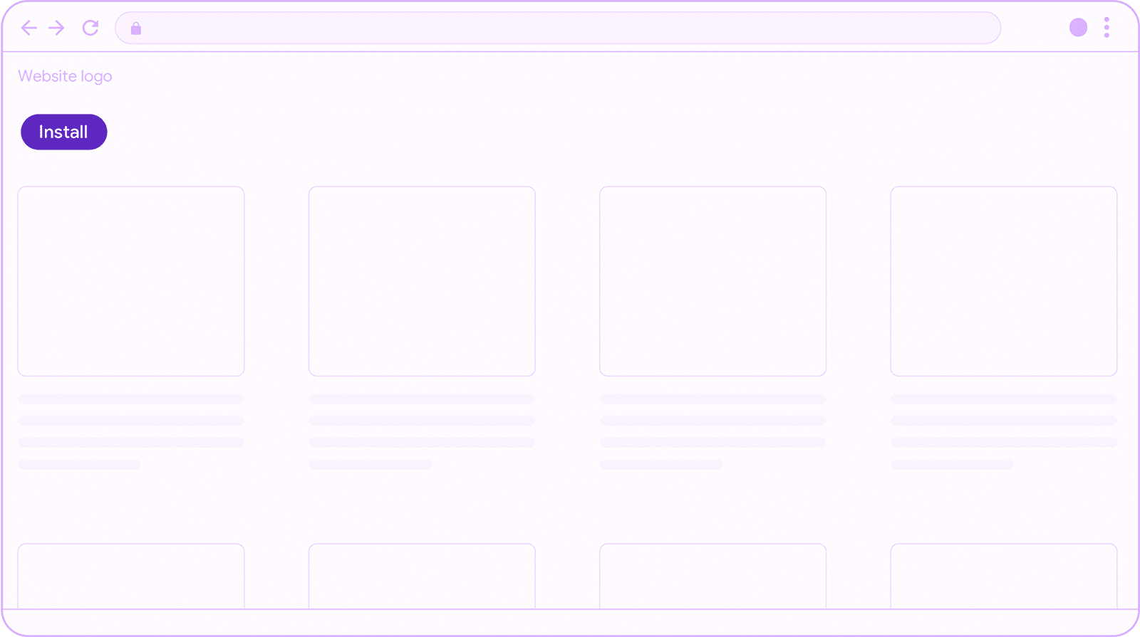
The simplest possible UX is to include an 'Install' or 'Get app' button at an appropriate location in your web content. Ensure the button doesn't block other important functionality and is out of the way of the user's journey through your application.
Fixed header
This is an install button that is part of the header of your site. Other
header content often includes site branding such as a logo and the hamburger
menu. Headers may be position:fixed or not depending on your site's
functionality and user needs.
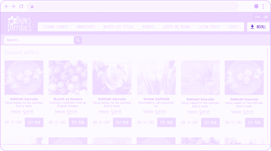
When used appropriately, promoting PWA installation from the header of your site is a great way to make it easier for your most loyal customers to return to your experience. Pixels in your PWA header are precious, so make sure your installation call to action is appropriately sized, of greater importance than other possible header content, and unintrusive.
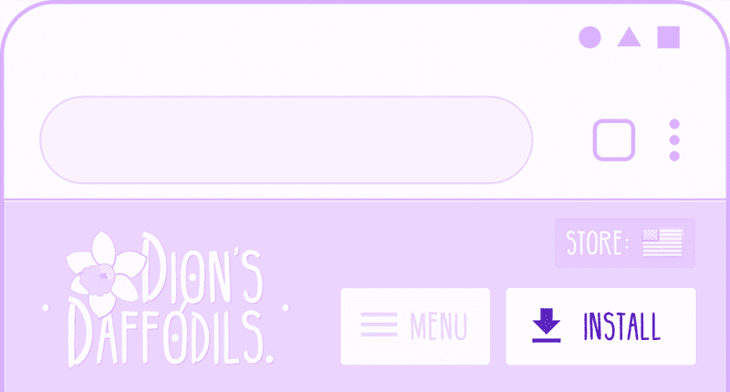
Make sure you:
- Do not show the install button unless the
beforeinstallprompthas been fired. - Evaluate the value of your installed use case for your users. Consider selective targeting to only present your promotion for users that are likely to benefit from it.
- Use precious header space efficiently. Consider what else would be helpful to offer your user in the header, and weigh the priority of the install promotion relative to other options.
Navigation menu
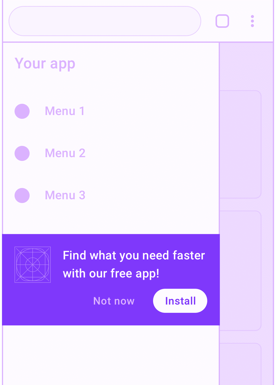
The navigation menu is a great place for promoting the installation of your app since users who open the menu are signaling engagement with your experience.
Make sure you:
- Avoid disrupting important navigational content. Put the PWA install promotion below other menu items.
- Offer a short, relevant pitch for why the user would benefit from installing your PWA.
Landing page
The purpose of a landing page is to promote your products and services, so this is one place where it is appropriate to go large when promoting the benefits of installing your PWA.
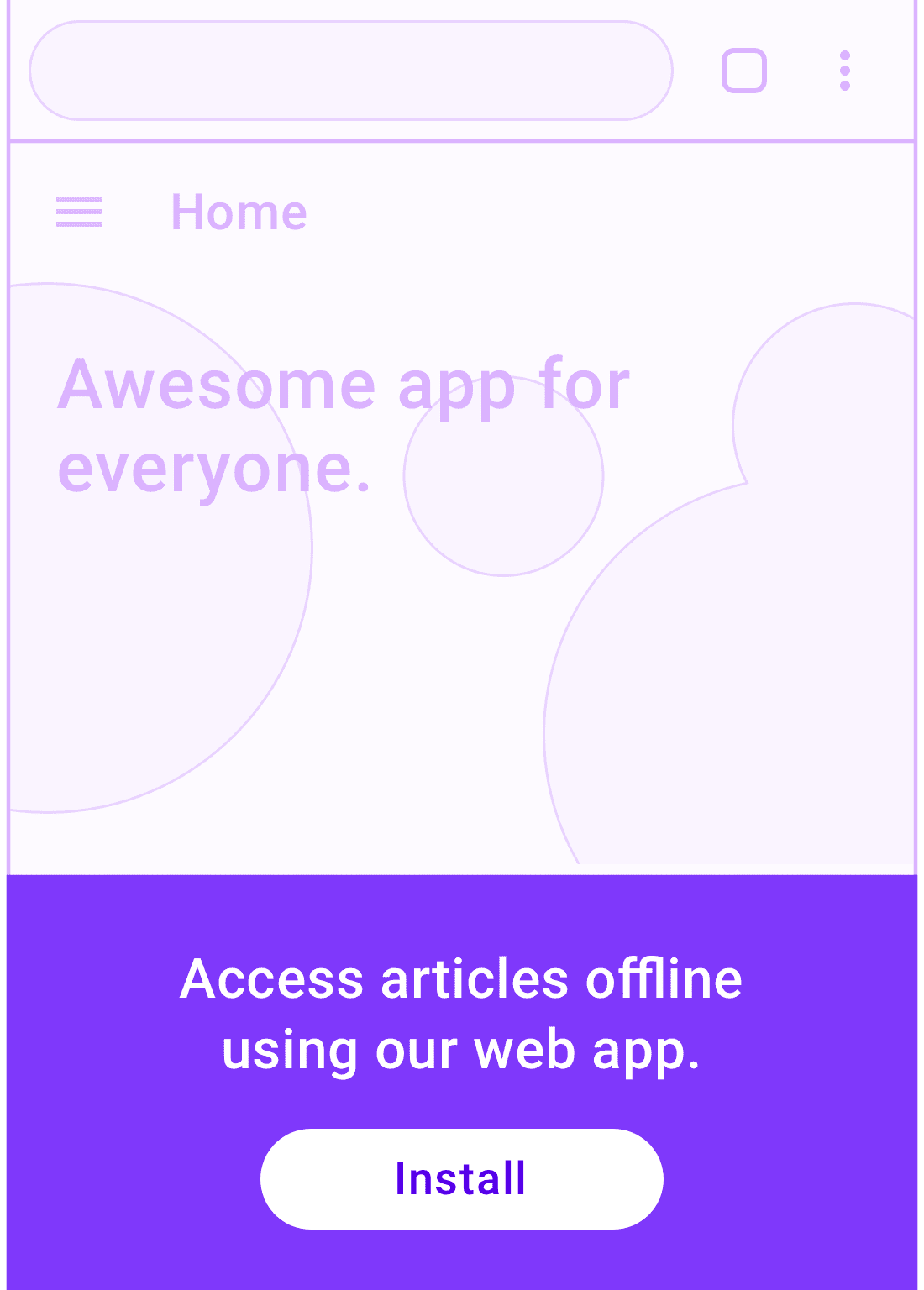
First, explain your site's value proposition, then let visitors know what they'll get from installation.
Make sure you:
- Appeal to features that matter most to your visitors and emphasize keywords that might have brought them to your landing page.
- Make your install promotion and call to action eye catching, but only after you've made your value proposition clear. This is your landing page, after all.
- Consider adding an install promotion in the part of your app where users spend most of their time.
Install banner
Most users have encountered installation banners in mobile experiences and are familiar with the interactions offered by a banner. Banners should be used carefully because they can disrupt the user.
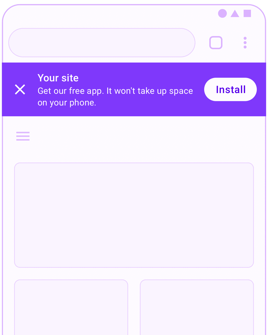
Make sure you:
- Wait until the user has demonstrated interest in your site before showing a banner. If the user dismisses your banner, don't show it again unless the user triggers a conversion event that indicates a higher level of engagement with your content such as a purchase on an e‑commerce site or signing up for an account.
- Provide a brief explanation of the value of installing your PWA in the banner. For example, you can differentiate the install of a PWA from an iOS/Android app by mentioning that it uses almost no storage on the user's device or that it will install instantly without a store redirect.
Temporary UI
Temporary UI, such as the Snackbar design pattern, notifies the user, and allows them to easily complete an action, in this case, installing the app. When used properly, these kinds of UI patterns don't interrupt the user flow, and are typically automatically dismissed if ignored by the user.
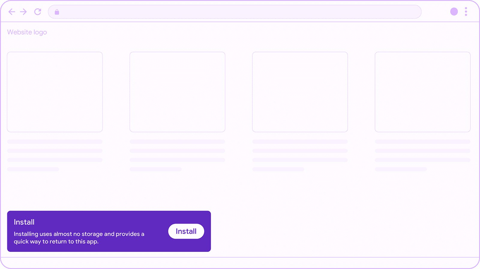
Show the snackbar after a few interactions with your app. If it appears on page load, or out of context, it can be easily missed, or lead to cognitive overload. When this happens, users will simply dismiss everything they see. Remember, new users to your site may not be ready to install your PWA. Therefore, it's best to wait until you have strong interest signals from the user before using this pattern, for example, repeat visits, a user sign in, or similar conversion event.
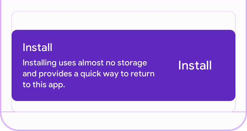
Make sure you:
- Show the snackbar for between 4 and 7 seconds to give users enough time to see and react to it, and without getting in the way.
- Avoid showing it over other temporary UI such as banners, etc.
- Wait until you have strong interest signals from the user before using this pattern, for example, repeat visits, a user sign in, or similar conversion event.
After conversion
Immediately after a user conversion event, for example after a purchase on an e‑commerce site, is an excellent opportunity to promote the installation of your PWA. The user is clearly engaged with your content, and a conversion often signals that the user will engage with your services again.
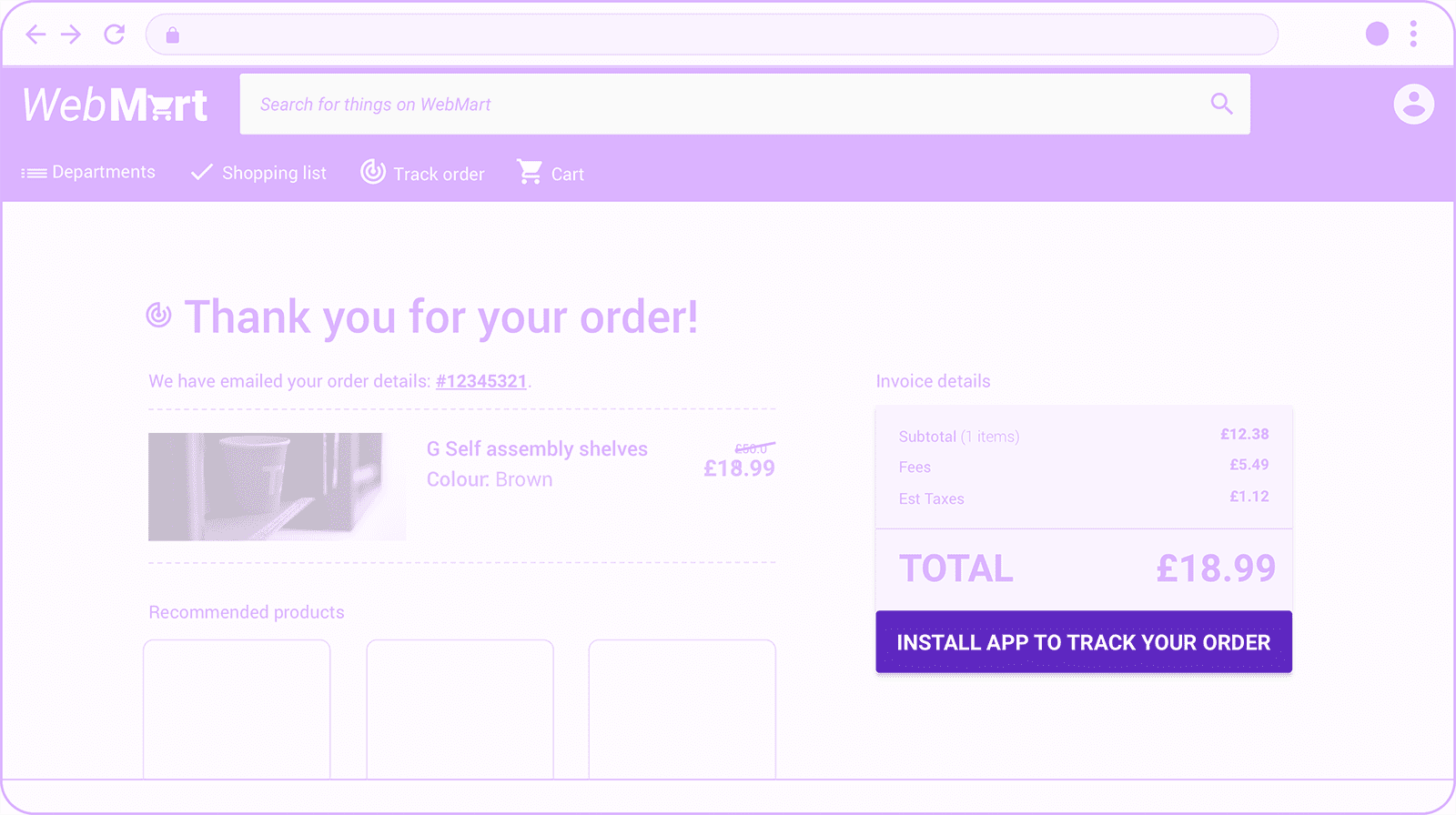
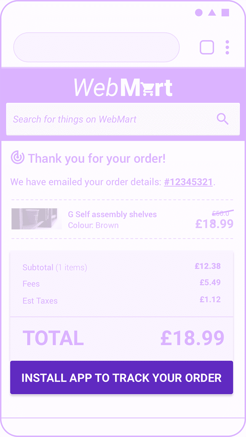
Booking or checkout journey
Show an install promotion during or after a sequential journey such as after booking or checkout flows. If you're displaying the promotion after the user has completed the journey, you can often make it more prominent since the journey is completed.
Make sure you:
- Include a relevant call to action. Which users will benefit from installing your app and why? How is it relevant to the journey they are currently on?
- If your brand has unique offers for installed app users, mention them.
- Keep the promotion out of the way of next steps in your journey or you can negatively affect journey completion rates. In the e‑commerce example above, notice how the key call to action to checkout is above the app install promotion.
Sign up, sign in, or sign out flow
This promotion is a special case of the journey promotional pattern where the promotion card can be more prominent.
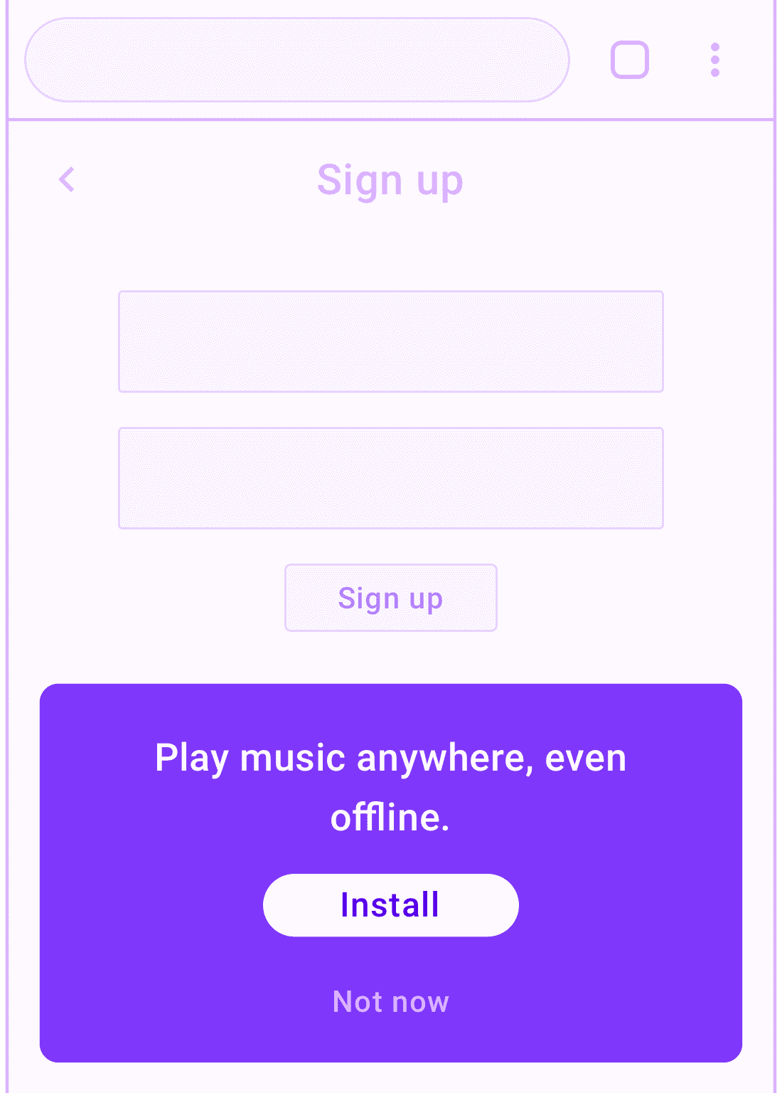
These pages are usually only viewed by engaged users, where the value proposition of your PWA has already been established. There's also often not a lot of other useful content to place on these pages. As a result, it's less disruptive to make a larger call-to-action as long as it's not in the way.
Make sure you:
- Avoid disrupting the user's journey inside the sign up form. If it's a multi-step process, you might want to wait until the user has completed the journey.
- Promote features most relevant to a signed-up user.
- Consider adding an additional install promotion within the signed-in areas of your app.
Inline promotional patterns
Inline promotional techniques interweave promotions with site content. This is often more subtle than promotion in the user interface, which has tradeoffs. You want your promotion to stand out enough that interested users will notice it, but not so much that it detracts from the quality of your user experience.
In-feed
An in-feed install promotion appears between news articles or other lists of information cards in your PWA.
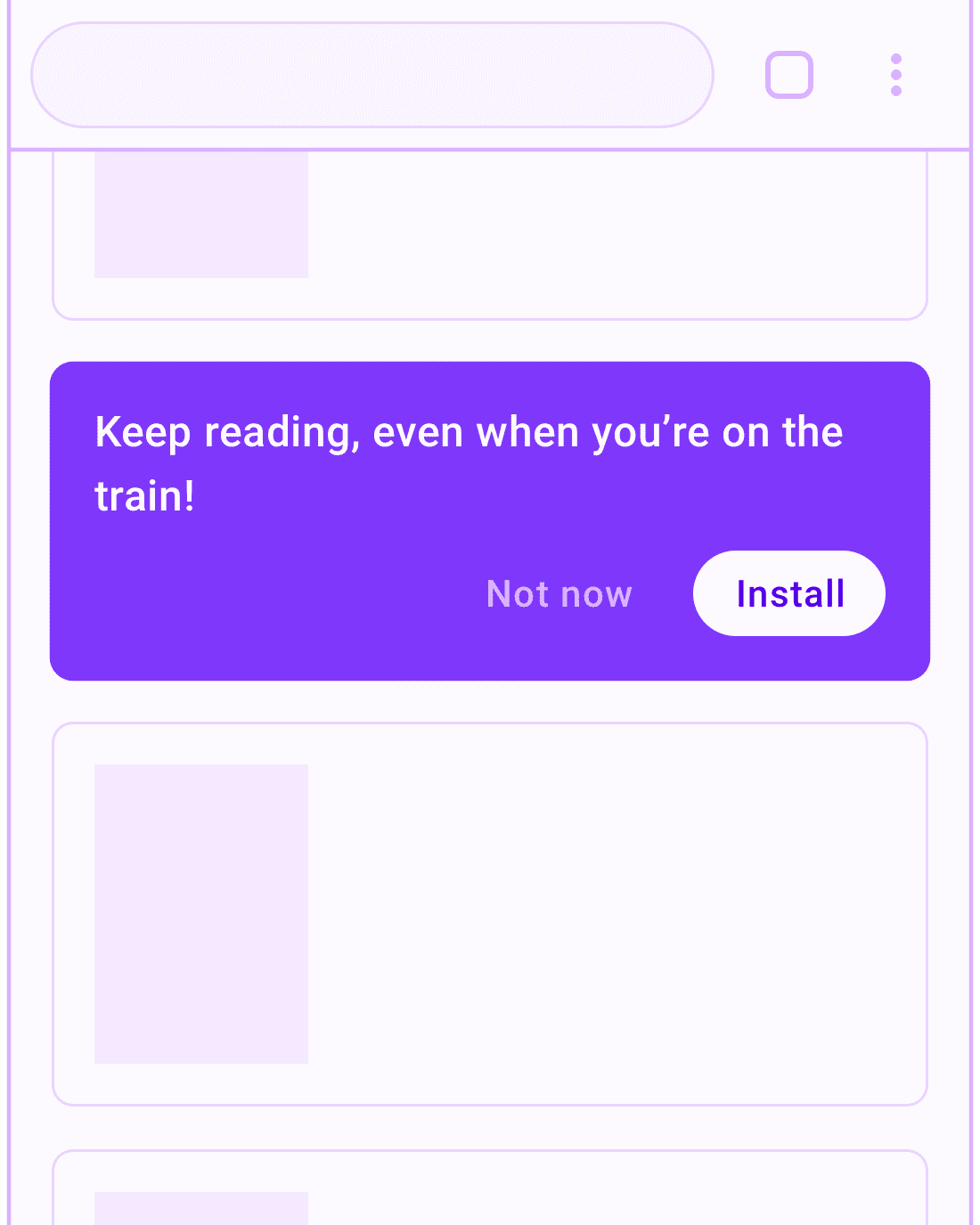
Your goal is to show users how to access the content they're enjoying more conveniently. Focus on promoting features and functionality that will be helpful to your users.
Make sure you:
- Limit the frequency of the promotions to avoid annoying users.
- Give your users the ability to dismiss the promotions.
- Remember your user's choice to dismiss.


