
A solid foundation
A solid foundation is the base requirement for building great PWAs. To implement this foundation you need to design and code for the constraints of the web using a couple of principles:
- Use mobile as a focusing constraint. Make sure each view of your design focuses only on the essential content and interactions.
- Emphasize content and core functionality in the design process.
- Progressively enhance when needed. Start by building a component's core content and functionality with the most straightforward, most widely available tools. Make it accessible. Then, test for advanced features you'd like to use and enhance your component with them.
- Offer a fast and good user experience focused on user-centric web performance metrics, get real user metrics, and push performance for all your users, no matter their network connection, input type, CPU, or GPU power.
By following these principles and enhancing with modern patterns and web features, you can create great and fast experiences with truly intrinsic designs. Designs that are powered by constraints instead of pixels, allowing every user access to your content and core functionality in a way that's best suited for their particular browsing context.
Responsive web design
Since Ethan Marcotte's 2010 A List Apart article, Responsive Web Design, designers and developers have been encouraged to create experiences that flex, making user interfaces that work across a spectrum of screen sizes and devices.
Somewhere along the way, though, that became shortened to mobile, tablet, and desktop sizes, with widths heavily influenced by iOS screen sizes. With modern CSS and a renewed focus on responsive design's original intent, we can put the squish back in squishy sites.
Responsive web design introduces three technical ingredients:
- Fluid grids
- Flexible media
- Media queries
Ethan concludes that these technical requirements aren't enough; the way forward also requires a different way of thinking.
The mobile user myth
In the early days of responsive design assumptions were made in the name of making sites easier to design. For example, small experiences were for phones, and they had a 320px width, medium experiences were for tablets, and they had a 1024px width, and anything larger than that was for desktops. Small screens had touch abilities, large screens didn't. Phone users were rushed and distracted and therefore needed a "light" experience.
None of this is true; they are mobile myths perpetuated by the assumption that a user's needs are fundamentally different based solely on screen size or device type. This doesn't hold up to scrutiny.
Take, for example, a social network PWA that you can install today on mobile and desktop. On desktop, many users can keep a narrow window with the feed at one side of the screen while working, and assuming they are on a mobile device because of the available width would be wrong.
The PWA world that is out of the browser's tab is even adding new challenges to a responsive design world, such as the mini-mode and working with foldable devices.
Mini-mode
With a PWA installed on a desktop device, a window can get really small; smaller than a browser's window, smaller than a mobile viewport. This is something new on the web: we can support a mini-mode, a window that can be as small as 200x100 CSS pixels.
When creating a PWA these days, it's a good idea to think about what to offer in mini-mode, thanks to responsive web design, such as just control buttons on a music player, dashboard information, or quick actions.
On desktop, a PWA can be rendered in a smaller window than the smallest window you've ever designed for the browser. It adds a new breakpoint for your responsive web design: the mini-mode.
Foldables and hybrid
Foldable and hybrid devices are also common these days:
- Small clamshell phones.
- Foldable devices that can be used as phones or tablets.
- Laptops that can be transformed into tablets.
- Tablets that can act as laptops with keyboard and trackpad.
- Phones then can be converted to desktop with a hub.
While the challenge exists for every website, with a Progressive Web App you are in control and responsible for the window when the app is installed. Therefore, your design should react and offer the best experience in every context.
Everything first
But where should you get started? Mobile first, content first, offline first? When designing for the flexibility of the web, which is it? Well, the answer is yes, everything first. The term mobile first has been interpreted in many ways since Luke Wroblewski first coined it in 2009: from emulating platform-specific UI and UX patterns on the web to building mobile apps before building web apps to just using min-width media queries and calling it a day. Its original intent, though, is this: mobile forces you to focus. As Luke said:
Mobile devices require software development teams to focus on only the most important data and actions in an application. There simply isn't room in a 320 by 480-pixel screen for extraneous, unnecessary elements. You have to prioritize. So when a team designs Mobile First, the result is an experience focused on the key tasks users want to accomplish without the detours and interface debris that litter today's desktop-accessed websites. That's a good user experience and good for business.
Luke Wroblewski
Focus each view of your website on only the essential tasks a user wants to accomplish there, and don't add more stuff to the idea just because they have more screen real estate.
The second principle is hinted at in Responsive Web Design: the "gradient of different experiences." A single, identical, pixel-perfect experience for every single user shouldn't be the goal of your work; it's all but impossible.
Instead of thinking about your web experiences as a fixed thing, think of it as a set of recommendations that the user's device will use to build the best experience for their current context. To do so, progressive enhancement needs to be embraced.
Progressive enhancement
Progressive Enhancement is a pattern that lets us write code that runs everywhere, starting from standard HTML, CSS, and JavaScript, and adding layers of capabilities on top of that with proper fallbacks when an API is not available.
How do you enhance? Feature detection is a pattern where you perform a test for support and react based on that test results. There are several built-in web platform tools and practices for doing this.
Using @supports, check for browser support of a CSS feature, and apply rules based on the result.
This applies to both CSS properties and values; if a property is supported and a value is not, it will fail, as will an unsupported property. JavaScript code can access this through the CSSSupportsRule.
Most new web platform features are attached to existing objects, so 'feature' in object style detection works well in JavaScript, as will other similar lookups, like checking for properties or methods on elements.
Avoid device detection
You should directly test for feature support instead of making support assumptions based on the User-Agent string.
User-agent strings have never been truly reliable. They rely on having near-perfect knowledge of every browser, operating system, and device combination in existence to "guess right". Even then they are susceptible to user spoofing, for example, desktop site redirects on mobile browsers are often as simple as spoofing a desktop user-agent string.
Moreover, browsers are working on freezing their User-Agent strings, with user-agent strings for feature detection specifically called out as a reason for deprecation, making them even more unreliable than they previously were for identifying a user and device.
Content first
Another principle of designing for the web is: start with your content first. For example, a real-time stock ticker with a graph of a stock's prices is, at its core, a table of stocks with their price over some time, maybe with a link to refresh the site.
That can then be enhanced with JavaScript and fetch requests to update the table's values on a timer or enhanced with sockets to provide real-time push-based updates. It can be enhanced again to graph the results, maybe with CSS, maybe with SVG, maybe with Canvas. But the core starts with content.
Intrinsic design
- Mobile as a focusing constraint for user experience.
- Emphasizing content and core functionality in the design process.
- Progressively enhancing with advanced functionality where available.
These principles combine to give us something new: intrinsic design. In her talk Designing Intrinsic Layouts, Jen Simmons talks about using modern CSS tools, like Grid, Flexbox, flow layout, and writing modes, to design and build user interfaces. With these tools, she says:
You can really make the layout be intrinsic to the content that we have and the design that we want to do.
Jen Simmons
This new CSS allows designers to regain some control over layout but do so in a way that aligns with the latest web design principles. Instead of creating fixed forms based on fixed screen sizes, you define content-based rules by which layout happens by tapping into intrinsic properties of that content, like how small or large it can be, the size of the text, and the available space, all at once. They allow you to realize your design as it interacts with your content without needing to control every pixel's placement.
Intrinsic layouts bring the conversation about control on the web full-circle, giving it definition. Control on the web isn't about dictating devices or screen sizes or colors or fonts or layouts or capabilities for each visitor to your site. Control on the web is about writing the rules a browser will use to assemble your experience, building it uniquely for each user in your Progressive Web App.
Web performance
The last but not least important foundation for our PWA is Web Performance. Having a great experience for users is mandatory; it will lead to more conversions in every possible way.
Web performance involves several steps:
- Understand the key user-centric metrics available.
- Set goals for every metric.
- Measure our PWA.
- Improve our metrics by applying techniques and best practices statically in our code or server.
- Measure again.
- Improve the experience to each user, live, based on the user's context.
Web performance metrics today measure how fast your content appears on the screen, but also how interactive your website is and how users perceive the experience.
Core Web Vitals
During the past decade, we've been dealing with different metrics to measure success in web performance. Today, a set of recommended metrics known as Core Web Vitals focus on three key areas affecting performance and the user experience:
- Loading—represented by Largest Contentful Paint (LCP).
- Interactivity—represented by Interaction to Next Paint (INP).
- Visual Stability—represented by Cumulative Layout Shift (CLS).
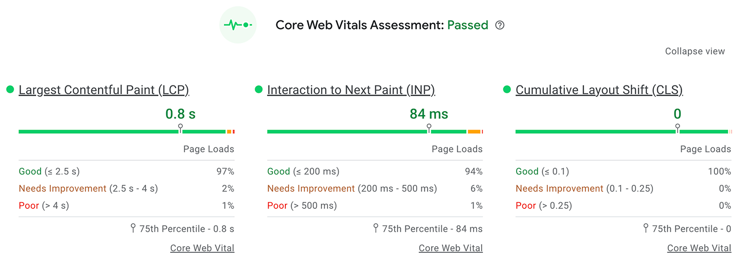
With Core Web Vitals, you can see at a glance, how good or bad is your PWA regarding performance and user experience.
PWA foundations
It's important that your PWA has a solid foundation in responsive design, mobile and everything first, intrinsic design, and web performance as a foundation for a great experience for all your users.